25 Matching Annotations
  1. Mar 2025
  2. Feb 2025
  3. Jan 2025
    1. EP® DEsignation Become an Environmental Professional (EP®) Increase your influence and safeguard stakeholder trust by earning the only nationally recognized designation for environmental practitioners. Take Eligibility Quiz

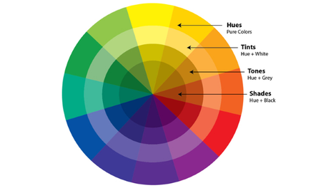
      Great Colour Contrast: Eco Canada uses good colour contrast, making text readable even for users with low vision or colour blindness. This ensures that foreground content (black/green) stands out clearly against the (white) background, improving accessibility for all users. The bolded headings as well as pop of colour for links is also a good distinction that's easy to navigate.

  4. Aug 2024
  5. Apr 2024
  6. Feb 2023
    1. In terms of the colours used on the website I would say they are simple but effective. The white, grey and green backgrounds are easy for everyone to see easily. And the font colouring chose was good and does not clash with the background. I also like how the button to schedule an appointment is in a bright blue, making it catch your eye as soon as you open the web page.

  7. Feb 2020
  8. Oct 2019
    1. The colours black & white have opposing meaning in western and eastern cultures

      west culture:

      • black = finality, death, formality
      • white = purity, peace

      east culture:

      • white = death
      • black = wealth, health, prosperity
    2. Think of each colour in context of its environment, for example do you have a mostly grey, white or muted colours on your website then make your call to action button(s) green or red

      There is no universal guide in choosing website colours. Go with your own intuition

    3. We are using colour to communicate the value of our product or service
      • Red – Passionate, Aggressive, Important
      • Orange – Playful, Energetic, Cheap
      • Yellow – Happy, Friendly, Warning
      • Green – Natural, Stable, Prosperous
      • Blue – Serene, Trustworthy, Inviting
      • Violet – Luxurious, Mysterious, Romantic
      • Pink – Feminine, Young, Innocent
      • Black – Powerful, Sophisticated, Edgy
      • Brown – Earthy, Sturdy, Rustic
      • Grey – Neutral, Formal, Gloomy
      • White – Clean, Virtuous, Healthy
      • Beige – Accentuates surrounding colours
    4. There are 2 primary colour systems (to reproduce colour) we use on a daily basis additive & subtractive. Anything that emits light (sun, screen or projector) uses additive and everything else reflects colour and uses subtractive colour

      2 primary colour systems: 2 primary colour systems

    5. The colour wheel is where you need to start when planning a colour scheme or branding for your business and for sales and marketing campaigns. The colour wheel consists of primary, secondary and tertiary colours.
      1. Primary: can not be made from any other colours
      2. Secondary: formed by mixing the primary colours
      3. Tertiary: formed by mixing primary and secondary colours colour wheel