156 Matching Annotations
- Jun 2026
-
search.catalog.loc.gov search.catalog.loc.gov
-
Olympia typewriter song [sound recording]. - Record details - Library of Congress Catalog <br /> accessed on 2026-06-29T13:10:26
-
-
www.reddit.com www.reddit.com
-
Chuck Goldstein, was a members of The Modernaires singing group from the early/mid 30's until 1942. In 1940, they began singing with Glenn Miller and his orchestra. The day after Glenn disbanded the orchestra in 1942 (so he could join the Army), Chuck had left The Modernaires to pursue his own career. I believe around 1945 he formed a new singing group... That being Four Chicks and Chuck! They sung a few commercials, but they also did other songs. They sung with Kate Smith a decent amount. They weren't a long lasting group though, only going until around 1953. After that, Chuck formed Chuck Goldstein Productions, which focused on commercial jingles.
See also: Olympia Typewriter Song
-
-
typecast.munk.org typecast.munk.org
-
“Paris When It Sizzles (Richard Quine, 1964). There’s an Olympia SM7 in it that should have gotten equal billing alongside William Holden and Audrey Hepburn.
-
- May 2026
-
www.reddit.com www.reddit.com
-
www.reddit.com www.reddit.com
-
Congratulations and welcome to the club! Definitely the machine of a serious writer or novelist. These were the workhorses of newspapers and magazines through the 70s and 80s. In my mind, it's the last truly great manual typewriter ever manufactured.
Well known users of the Olympia SG3 included: Ingeborg Bachmann, Jimmy Breslin, Paddy Chayefsky, Philip K. Dick, Harlan Ellison, Michael Ende, Howard Fast, Jim Lehrer, Elmore Leonard, William E. Leuchtenburg, Terrence McNally, James Michener, Dudley Randall, and Wallace Stegner
Robert Redford used one in the movie ALL THE PRESIDENT'S MEN.

If you need a manual: https://site.xavier.edu/polt/typewriters/tw-manuals.html
Ribbon is still easily found: https://site.xavier.edu/polt/typewriters/tw-faq.html#q1
The Olympia SG3 uses 1/2" wide (12.7mm) typewriter ribbon, which has been standardized as DIN2103, in combination with the Group 1 spool, designated as DIN 32755. (Doesn't need eyelets.)
Other useful resources available at: https://boffosocko.com/research/typewriter-collection/
reply to u/Prudent_Highway_1855 at https://www.reddit.com/r/typewriters/comments/1tdy2eu/my_first_typewriter/
-
-
typewriterdatabase.com typewriterdatabase.com
-
James, thanks for the research and advertisements. Having just picked up one of these in lovely condition, I would generally agree with your assessment on the delineation of the two models: a "Report Electric" and a "Report de Luxe (SKE)".
Currently the TWdB has three different pages for what one might call the Olympia Report de Luxe (SKE) and which could be concatenated into a single model on one page:
-
"Olympia Report" https://typewriterdatabase.com/Olympia.Report.61.bmys with two exemplars from '75 and '78 which are explicitly badged as "Olympia Report de Luxe" on the hood
-
"Olympia Report deLuxe" https://typewriterdatabase.com/Olympia.Report+deLuxe.61.bmys which are all the badged the same, but somehow seem to have left the space between the "de" and "Luxe" out.
-
"Olympia SKE Report de Luxe" https://typewriterdatabase.com/Olympia.SKE+Report+de+Luxe.61.bmys which are all badged as "Report de Luxe" on the hood, but which include the SKE in the name because of the sticker on the side.
Personally, for ease of internet search most are likely to search for "Olympia Report de Luxe" though some may see the sticker near the power cord that reads "Typewriter Model SKE" (either on their physical machine or photos on eBay, Goodwill, etc.), so listing it in the database as "Olympia Report de Luxe (SKE)" may make the search most fruitful.
If the renaming of these three pages, which seem to be for a single model, does occur it would be useful to do a 403 redirect from the original pages to the final page so that the search engine optimization for these pages isn't lost. Adding a note to the model on the main Olympia page will help to clear up the details for future typewriter hunters as well.
Reply to https://typewriterdatabase.com/1973-olympia-report-electric.27118.typewriter
-
-
-
www.newyorker.com www.newyorker.com
-
What Makes the Hanx Writer Click?<br /> by [[Silvia Killingsworth]] in The New Yorker<br /> accessed on 2026-05-11T14:49:13
-
-
slate.com slate.com
-
Rosenbaum, Ron. 1999. “The Last Luddite Gets Wired.” Slate. https://slate.com/news-and-politics/1999/05/the-last-luddite-gets-wired-4.html (May 11, 2026).
-
But there’s something about the sharp staccato sound of my Olympia Report Deluxe–like successive volleys of rifle shots rather than the mouselike scribble-scrabble of the keyboard pad–that I feel reluctant to abandon.
-
Actually, that typewriter, my Olympia Report Deluxe, or rather Deluxes (I have three of them because they’re no longer manufactured, and I need one for backup and one to cannibalize for parts) are the real reason I’ve rejected switching to a computer for so long.
-
-
www.freesound.org www.freesound.org
-
Olympia Electric Typewriter - May 17 2008.wav<br /> by [[lonemonk]] on Freesound<br /> accessed on 2026-05-11T14:04:41
-
-
-
The Quiet Cult of the Olympia Report deLuxe Electric Typewriter<br /> by [[Wilson Rothman]] and [[Steven Levy]]<br /> accessed on 2026-05-11T13:13:15
-
-
www.youtube.com www.youtube.com
-
www.facebook.com www.facebook.com
-
https://www.facebook.com/groups/TypewriterCollectors/posts/10163594865434678/
Green 1958 Olympia SM3 with custom math keyboard:

-
-
www.nashvilletypewriter.com www.nashvilletypewriter.com
-
www.facebook.com www.facebook.com
- Apr 2026
-
www.facebook.com www.facebook.com
-
https://www.facebook.com/groups/1794856020751839/posts/4430134563890625
Saving for the commentary on the Brooksaw Antiques platen recovery using 3-D printing.
-
-
www.ebay.com www.ebay.com
-
www.facebook.com www.facebook.com
-
www.facebook.com www.facebook.com
-
https://www.facebook.com/groups/721704878218903/posts/3070114496711251
Colloquial suggestion that Olympia SM7s have a wider variety of typefaces...
-
For 7 years Olympia produced the SM3/4, to the tune of 1.4 million copies. , while the SM9 was in production for 15 years and over 4.6 million copies. The SM7 was in production for 3 years, with a little over 682,000 units produced.
Double check these numbers before using, but...
https://www.facebook.com/groups/721704878218903/posts/3070114496711251
-
-
www.youtube.com www.youtube.com
-
https://www.youtube.com/shorts/tDj9H92SQNI
Olympia SM4, SM5, SM7, SM8, SM9 case restoration
-
-
www.reddit.com www.reddit.com
-
www.facebook.com www.facebook.com
-
“Century of the Typewriter” has illustrations of nearly 200 keyboard latyouts used by Olympia.
https://www.facebook.com/groups/705152958470148/posts/1244830544502384
-
- Mar 2026
-
www.reddit.com www.reddit.com
-
Today I learnt that the flange nut that holds the carriage lock pawl to the frame of the Olympia SM3 is an eccentric nut, so you can adjust the position of the pawl up or down, forwards or backwards. While I can very much understand why it would need adjusted up or down, so it lines up with the slots in the carriage rail, I could not, at first, figure out why you'd want it adjusted back/forwards. That is, until I put it back together and the little tab where the spring attaches started binding against the frame, jamming the carriage lock in the open position. Hopefully this will help fellow tinkerers who might be tempted to form the tab out, with the risk of damaging the carriage pawl on their machine.
via u/guneeyoufix at https://www.reddit.com/r/typewriters/comments/1s73hcz/sm3_did_you_know/
-
-
www.vescovorestauri.it www.vescovorestauri.it
-
1963, Olympia SG1 - bishop restoration<br /> by [[Alessio Vescovo]]<br /> accessed on 2026-03-11T11:05:46
-
-
www.reddit.com www.reddit.com
-
reply to u/KingCollectA at https://reddit.com/r/typewriters/comments/1rpr1ha/got_quite_lucky_finding_a_free_olympia_sg1_had_to/
Typically the SG1 has at least 3 serial numbers. Two matching ones on the main body (one hiding deep inside), and the third on the bottom portion of the carriage, which may or may not match the other two. (The carriages were meant to be easily swappable for machines with the same CPI/escapement sizes.) Removing the carriage will usually reveal the body serial number (typically a 7-XXXXXXXXX) format which you can compare with the grid of serial number ranges to see where yours fits in at https://typewriterdatabase.com/olympia.61.typewriter-serial-number-database.
I just got mine and have finished most of its servicing, though one or two small adjustments remain for it to be where I want it to be. Beyond this, it's been spectacular. See also: https://boffosocko.com/tag/Olympia-sg1/
-
-
www.reddit.com www.reddit.com
-
https://old.reddit.com/r/typewriters/comments/1rl3u5p/olympia_sm_4_case/
Olympia SM4 case with viny cover stripped off.

Compare with https://www.reddit.com/r/typewriters/comments/1fkmj9d/i_refinished_my_olympia_sm3_case_a_while_agoheres/
-
-
typewriter.boardhost.com typewriter.boardhost.com
-
"Mazak" in the UK but more widely known (at least in the US, where it was developed) and in its original form as "Zamak", this metal is notorious for disintegrating (not "exploding" as some earlier poster claimed). It is also known as "pot metal" and, unhelpfully, "white metal".
Mazak, aka pot metal, aka Zamak, is notorious for disintegrating over time. It's what can cause tab brakes on the Olympia SM7 to freeze up.
via M. Höhne at https://typewriter.boardhost.com/viewtopic.php?id=253&p=3
-
-
www.youtube.com www.youtube.com
-
Olympia SM7 Typewriter - How to Remove and Repair a Stuck Tab Brake<br /> by [[The Write Typer]] YouTube<br /> accessed on 2026-03-03T23:50:21
Swelling pot metal or swollen cork can cause the tab brakes on the Olympia SM7 to seize up. One can file down the cork, or even remove one of the four brake elements and still have the system work. The brake drum is held in with an e-clip.
-
-
www.youtube.com www.youtube.com
-
Addressing a COMMON FLAW in the Olympia SM7 typewriter that will ruin your day. Drawband Tab System<br /> by [[HotRodTypewriter]] on YouTube<br /> accessed on 2026-03-03T23:41:58
Remedies for frozen tab brake system on Olympia SM7 typewriters:<br /> Drill a hole and lubricate<br /> Remove all together<br /> Remove and attempt to adjust swollen cork and then attempt to reinstall (patience testing)
-
-
www.facebook.com www.facebook.com
-
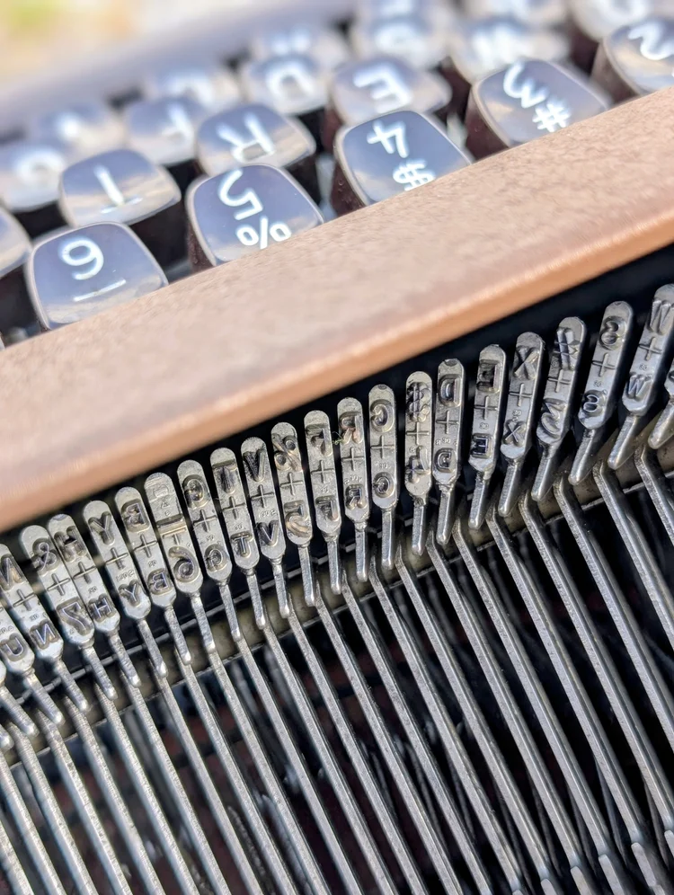
It indicates the motion or distance between upper a lower case letters on the typeface.
https://www.facebook.com/groups/olympiasg1/posts/1506621080656301/
also:
Greg Riutzel:<br /> That's how I see it. I measured it once. I put the ribbon in stencil, typed a lower case "h" and marked approx where the top of the type slug was on the paper. Then repeated with an upper case "H". The marks were just a tad over 7.5 mm apart checking with a rule. No precision of course but close.
The number printed on the ring in the basket of Olympia typewriters, just above and to the left of the word "De Luxe" is the distance from the baseline of the bottom slug character to the baseline of the top slug character.
In many instances it will be 7.6. I'm curious what other typefaces show and if this thesis holds?
-
-
www.facebook.com www.facebook.com
-
https://www.facebook.com/groups/olympiasg1/posts/1594417881876620/
Variety of suggestions for filling in Olympia typewriter keys.
-
-
typewriter.boardhost.com typewriter.boardhost.com
-
On an SG1 and an SG3 here, the right margin stop locks the printing keys as expected at x characters after the bell but not the spacebar nor tab, which both ring the bell and then blow right past the margin stop. Additionally, when the End-Of-Line lock stops the printing keys, I can continue spacing past the margin and then after about three spaces on the SG1 and about eight on the SG3 the printing keys are again active.
via M. Höhne at https://typewriter.boardhost.com/viewtopic.php?pid=27528#p27528
-
-
typewriter.boardhost.com typewriter.boardhost.com
-
Although the 'Mazac' tab. brake shoe problem is common, I cannot say that I have seen this before on an SG1 margin. Interestingly, there is a similar 'exploding Mazac' problem on the ribbon reverse arm of the Olympia Model 8 post-war. The factory probably had no idea at the time that this 'easy to die cast' metal would do this in years to come.
via Tom Lucas (aka thetypewriterman), professional repair person at https://typewriter.boardhost.com/viewtopic.php?pid=32384#p32384
re: cracking house on tab sets for SG1<br />

-
the disintegrating tab. brake shoes ! I have seen this on SM portables too - they have the same tab. brake. As a temporary measure, you could try filing the worst of the expansion off and re-fitting. You can also sometimes get away with having just three brake shoes instead of four.
via Tom Lucas (aka thetypewriterman), professional repair person at https://typewriter.boardhost.com/viewtopic.php?pid=32375#p32375

-
-
typewriter.boardhost.com typewriter.boardhost.com
-
www.youtube.com www.youtube.com
-
Olympia SG-3 German Typewriter, Replaced Paper Injector Broken Handle, Remove Platen Knob<br /> by [[Phoenix Typewriter]] on YouTube<br /> accessed on 2026-03-03T02:20:00
-
-
site.xavier.edu site.xavier.edu
-
Users of the Olympia SG3 included:<br /> - Ingeborg Bachmann<br /> - Jimmy Breslin<br /> - Paddy Chayefsky<br /> - Philip K. Dick<br /> - Harlan Ellison<br /> - Michael Ende<br /> - Howard Fast<br /> - Jim Lehrer<br /> - Elmore Leonard<br /> - William E. Leuchtenburg<br /> - Terrence McNally<br /> - James Michener<br /> - Dudley Randall<br /> - Wallace Stegner
-
Users of the Olympia SG1 included: - Charles Bukowski<br /> - William S. Burroughs<br /> - August Derleth<br /> - Bob Dylan<br /> - Harlan Ellison<br /> - Roger Kahn<br /> - Stan Lee<br /> - Mack McCormick<br /> - Joseph Stefano (screenwriter of Psycho)<br /> - Jacqueline Susann
-
-
www.youtube.com www.youtube.com
-
Olympia SG1 1953-72 cleaning (technical restoration)
Partial/very modest teardown and cleaning of an Olympia SG1. Only beginner level. No flush of machine or real blow out.
Interestingly he uses a steel brush to get rid of the brown adhesive where the felt used to be, but doesn't replace it.
Also demonstration of cleaning corrosion off of screw heads with steel brush on a vice.
Carriage work starts at 06:17. He opens it up and then gives up after a modest wipe down. He does show some
Uses a toothpick to oil the joints, but only shows a modest portion of the process.
-
-
www.youtube.com www.youtube.com
-
Olympia Typewriter, Replaced Felt On Inside of Top Lid Cover, Repair Detail<br /> by [[Phoenix Typewriter]] on YouTube<br /> accessed on 2026-02-28T23:33:24
Duane Jensen replaces the felt in the hood of an Olympia SG1. Create a paper template, trace it out onto felt and cut it. Glue it in with contact cement. Some stores felt with self-adhesive on them as well.
-
-
www.ebay.com www.ebay.com
-
3-D printed rubber washers for Olympia SG1 body frame. https://www.ebay.com/itm/317432465869
These appear to be the replacements for catalog part number 34280 - 5x.6 for the spacing washer (rubber) 5mm ID, 12mm OD, 4mm thick on page 61 of the Ames Supply catalog at https://site.xavier.edu/polt/typewriters/OlympiaSG1parts.pdf
-
- Feb 2026
-
www.facebook.com www.facebook.com
-
https://www.facebook.com/photo.php?fbid=10162847550852775&set=p.10162847550852775&type=3
Olympia quality control sheets had sections for:<br /> - shift (Hh Hh Hh)<br /> - type specimen for all the characters<br /> - Black ribbon test in two lines of all characters<br /> - Red ribbon test in two lines of all characters<br /> - Stencil Test <br /> - Final Proof: "Olympia-Qualitaet findet in der ganzen Welt Anerkennung - sie verbuergt besseres Schreiben."<br /> - Line Spacing: the letter "m" at all settings<br /> - Back Spacer: "rrrrRRRR"
-
- Jan 2026
-
www.youtube.com www.youtube.com
-
Re-inserting the carriage of an Olympia SM3 timestamp 17:32
Not shown in the video is the reinstallation of the square screw and nut at the end of the carriage to hold the carriage into the machine.
Tags
Annotators
URL
-
-
www.reddit.com www.reddit.com
-
www.facebook.com www.facebook.com
-
www.youtube.com www.youtube.com
-
Olympia SF Companion adjustments<br /> by [[Typewriter Justice]]
-
- Dec 2025
-
www.reddit.com www.reddit.com
-
reply to u/rawbran30 at https://old.reddit.com/r/typewriters/comments/1py74mf/internet_hype_trendeffect_and_brand_popularity/
Olympias were imported into the US from the 50s into the 70s and were manufactured at peak typewriter engineering and manufacturing methods before machines slowly got cheaper and cheaper in terms of materials and craftsmanship through the 60s and into the early 80s before typewriters were subsumed by the word processor market.
Compared to Smith-Coronas and Remingtons of the 50s and early 60s (their peaks), Olympias are slightly better manufactured in terms of fit and finish. They're also slightly more modern looking in terms of body shapes and colors compared to other machines, which also helps to drive up price amongst collectors.
Now is an Olympia SM3 or SM9 really so much better than a Smith-Corona Silent Super that they should enjoy an almost 2x jump in price for an unserviced model? Potentially not, but if this is your issue, then buy something from a professional shop that's been cleaned, oiled, and adjusted and a lot of the price differential evaporates.
-
-
www.facebook.com www.facebook.com
- Oct 2025
-
typewriterdatabase.com typewriterdatabase.com
-
Yellow painted machines like this one are often script. So there's a spotter's tip for you.
-
-
www.youtube.com www.youtube.com
-
The Elusive Olympia SM6? The Missing Link? Or just a regular old SM2? - YouTube<br /> by [[HotRodTypewriter]]<br /> accessed on 2025-10-26T16:16:00
Another version seen here: https://www.reddit.com/r/typewriters/comments/1ognqwh/olympia_monica/ via u/jbhusker (who subsequently deleted his post and photos of the machine as well as the italic typeface)
-
-
www.showbiz411.com www.showbiz411.com
-
UPDATED Watch Woody Allen's Interview with Bill Maher: "Sunset Boulevard" (the Movie) is "Fun Junk," "Streetcar" is "Perfect" - Showbiz411<br /> by [[Roger Friedman]]<br /> accessed on 2025-10-22T10:20:51
-
-
www.reddit.com www.reddit.com
-
https://www.reddit.com/r/typewriters/comments/1o9bpgu/isnt_it_woddys_long_lost_ribbon_cover/

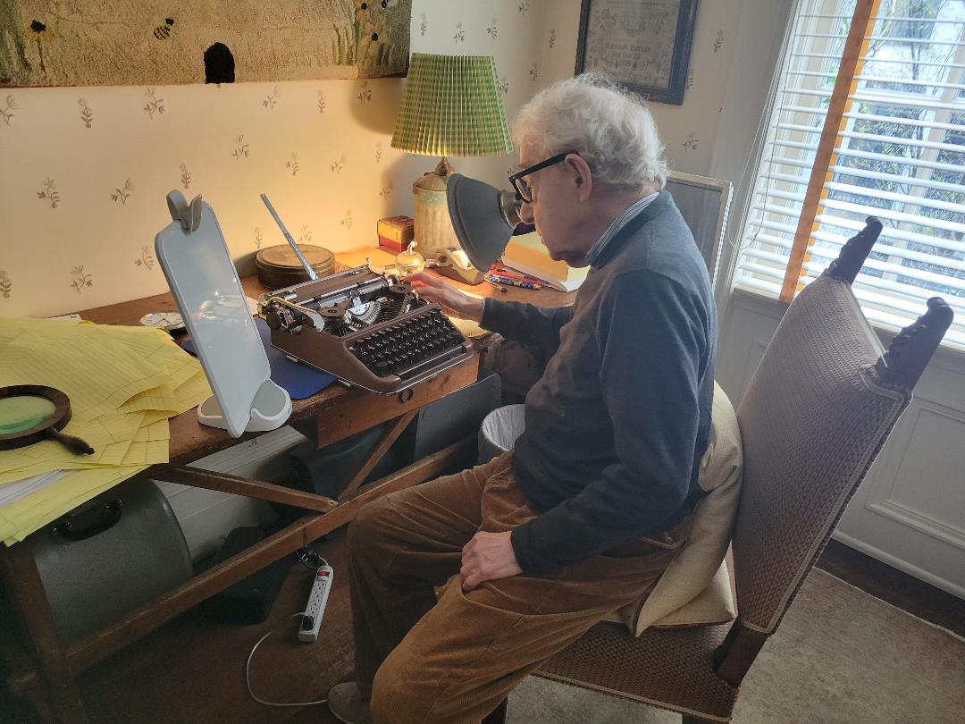
Woody Allen reported in a documentary that he'd lost his cover for his Olympia SM3, but it appears to be on his desk in this undated photo.
-
- Sep 2025
-
-
Wilhelmshaven: The Emperor's beloved city destroyed in the war<br /> by [[NDR.de]]<br /> accessed on 2025-09-30T15:02:51
I found a video about Wilhelmshaven in 1965 in the vintage section of a German broadcast service. The video is all German. It was made in 1965 and shows how the city developed through the decades. It is 17 minutes long, and the time from 6:30 to 8:30 is dedicated to Olympia Typewriters. You'll see a breathtaking amount of SG1s, workers correcting the letter alignment, workers taking measures on machines, and workers assembling machines in a huge workshop with a deafening typewriter rattle going on. <br /> via r/typewriters u/andrebartels1977 at https://www.reddit.com/r/typewriters/comments/1nun0is/olympia_nerds/
-
-
www.youtube.com www.youtube.com
-
Adler J3 Typewriter - YouTube<br /> by [[Joe Van Cleave]]<br /> accessed on 2025-09-27T15:42:43
The rubber gromets/bushings of the Adler J3 are often an issue with their cases when they've aged.
Joe also compares this with the Olympia SM3 and an Optima Super typewriter (poorly designed)
John Lewis is closing his typewriter shop in Arizona soon.
-
-
www.reddit.com www.reddit.com
-
https://www.reddit.com/r/typewriters/comments/1kjam1u/ribbon_material_makes_a_big_difference/
Cotton versus nylon on an Olympia SM9

-
-
www.reddit.com www.reddit.com
-
reply to u/Educational-Big-7383 at https://old.reddit.com/r/typewriters/comments/1nkb6ga/why_olympia/
It probably doesn't hurt that Olympia was manufacturing some of the best machines at the height of typewriter manufacturing including the use of great materials (strength, durability), design, and general craftsmanship in the 20th century.
Many of these also tended to be late models which were sold in cases, so they tend to be younger, cleaner, and in much nicer condition that the majority of other typewriters out there, and condition really matters a lot when attempting to compare models. As an extreme, but illustrative comparison, a 1930s Royal portable that was pounded out and left in a barn isn't going to hold a candle to an SM3 that was lightly used and lovingly kept in a closet.
-
-
xoverit.blogspot.com xoverit.blogspot.com
-
Olympia SM series (part 1, 1948-1964)<br /> by [[x over it]]<br /> accessed on 2025-09-05T17:14:33
-
-
www.laurenzvangaalen.nl www.laurenzvangaalen.nl
- Aug 2025
-
-
www.youtube.com www.youtube.com
-
Olympia SG Typewriter Platen Knob Shaft Bent, Repaired, Straightened<br /> by [[Duane Jensen]] of [[Phoenix Typewriter]]<br /> accessed on 2025-08-18T08:17:57
-
-
typewriterdatabase.com typewriterdatabase.com
-
It is a beautiful blue SG 1 equipped with the special wide feet for an extra-wide 620 mm or 880 mm platen.
https://typewriterdatabase.com/1963-olympia-sg1.16258.typewriter
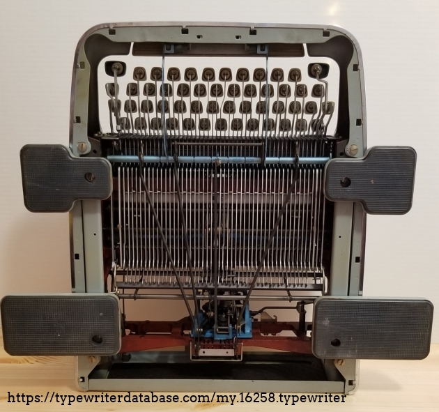
Wide feet for large platens on a heavy standard typewriter!
-
-
typecast.munk.org typecast.munk.org
-
https://typecast.munk.org/2011/04/23/1964-nomda-blue-book-olympia-font-styles/
The following were the available Olympia type sizes as listed in the 1964 NOMDA Blue Book:
- 10 pitch (2.6 m/m) pica
- 11 pitch (2.3 m/m) elite
- 12 pitch (2.1 m/m) elite
- 17 pitch (1.5 m/m, calculated)
Not in the NOMDA Blue Book, but found in the wild on a 1971 Olympia SG-3: - 6 pitch (4.2 m/m) with typeface: Basic Writing No. 67
-
-
davistypewriters.blogspot.com davistypewriters.blogspot.com
-
Portable Typewriters Today - February 2015<br /> by [[Will Davis]] on 2015-02-10<br /> accessed on 2025-08-05T16:35:48
Tags
- Olivetti Lettera 35I
- Generation 3000
- Olivetti Lettera 25
- Carol Wright catalog
- Ashok Matta
- typewriter distribution
- Sharper Image
- Hammacher Schlemmer
- typewriter history
- Rover Traveller C
- Silver-Seiko typewriters
- Generation Marketing Group
- Zhangjiagang Feiteng Typewriter Co., Ltd.
- Royal typewriters
- Olivetti MS25 Premier
- mail order catalogs
- Ningbo Duodashi
- Nakajima
- Rover 5000
- Royal Epoch
- Olympia Carina
- Rover typewriters
- UNIS typewriters
- Chang Kong typewriters
- read
- Dr. Leonard's Health Care catalog
- Ideal (Jinan) Machinery Co., Ltd.
- Flying typewriters
- Skymall
- Marshall MT-99
- Marshall Sewing Machine Industrial
- Olympia Traveller C
- Shanghai Weilv Mechanism Company
- Rover 8000
- Ningbo Duodashi Manufacturing Co.
Annotators
URL
-
- Jul 2025
-
www.youtube.com www.youtube.com
-
Electric Repair Tip: Drive Belt Replacements by [[Sarah Everett]] of [[Just My Typewriter]]
-
-
www.reddit.com www.reddit.com
-
Small differences in typewriter cases for the Olympia SM3: - Older versions (circa 1954) were simply painted inside and didn't have the flocking - Older versions also had Bakelite handles rather than the flexible plastic strap - Older versions also didn't have the plastic curved feet molded into the (typewriter half of the) bottom of the case.
-
-
www.reddit.com www.reddit.com
-
Not exactly, no. Ro85 and Ro87 (Pica and Elite Cubic) are very close to OP's type sample but the W's have sloped sides and the numerals are different. It's not a copy of Sentorial either, the most apparent differences are the Capital Q and K. I could not find Ro83 in any of my catalogs either, it's a bit weird. I've seen RaRo slugs on Olympias before, it's possible this was something they only did for them. Ro87 Elite-Cubic: https://i.imgur.com/3seKddd.jpeg Olympia Senatorial: https://i.imgur.com/yuTlzQh.jpeg
-
-
typecast.munk.org typecast.munk.org
-
6 pitch would be 4.2 m/m
-
-
www.printables.com www.printables.com
-
www.reddit.com www.reddit.com
- Jun 2025
-
-
https://www.reddit.com/r/typewriters/comments/1lhemm3/olympia_sm9_1973_model_platen_and_feed_roller/
Notes for platen removal on an Olympia SM9.
-
-
www.facebook.com www.facebook.com
-
site.xavier.edu site.xavier.edu
-
Olympia SG1 service manual: text, illustrations Olympia SG1 parts catalog and price list (1961)
Repair manual and parts catalogs and price list for Olympia SG1 typewriters
-
Olympia SG1 Olympia SG1 (Dutch)
manuals for the Olympia SG1 typewriter
-
-
www.reddit.com www.reddit.com
-
www.reddit.com www.reddit.com
-
https://www.reddit.com/r/typewriters/comments/1l0o9ax/what_is_the_difference_if_any_between_de_luxe/
Differences in Olympia SG1 typewriters
-
- May 2025
-
www.youtube.com www.youtube.com
-
Olympia SG1 Typewriter by [[Joe Van Cleave]]
Tags
Annotators
URL
-
-
onmilwaukee.com onmilwaukee.com
-
The one on the cover of your book, the Hermes 3000, is that your favorite? Absolutely. It’s a rock solid portable. I have four of them. I also like the Hermes Rocket, Olympias, Olivettis. I use them constantly.
-
-
typecast.munk.org typecast.munk.org
-
www.reddit.com www.reddit.com
- Apr 2025
-
www.youtube.com www.youtube.com
-
Olympia Typewriter Spacers 3D printed with TPU Filament by [[Subham Kumar]]
-
-
www.thingiverse.com www.thingiverse.com
- Mar 2025
-
www.reddit.com www.reddit.com
-
www.reddit.com www.reddit.com
-
The long, thin spring-loaded metal flap labeled the "paper conductor" on the SM3 and SM4 and labeled the "erasing table" on the SM2 are all the same part. They serve a few functions.
They can be used for erasing mistakes certainly and help to keep dust and debris from going into the carriage and rollers.
The "paper conductor" description sounds like a fun translation of something from German into English, but this part also prevents the paper which goes under the paper bail and forces it up and back to the paper table and the paper support. Presumably without it, a slightly curved piece of paper might be misrouted to go right back into the platen a second time as the paper advances.
This sort of paper conductor/dust shield can also be found on some later 1960s+ Smith-Corona (SCM) machines. For example, see the Galaxie II which calls that part the erasure table.
-
- Feb 2025
-
www.youtube.com www.youtube.com
-
Olympia SM-3 Vintage Typewriter, Repaired Adjusted Shift Lock by [[Phoenix Typewriter]]
Tags
Annotators
URL
-
-
www.reddit.com www.reddit.com
-
Typewriter Market: It may be better if you didn't get an Olympia SM3 typewriter today.
I'm not out to shame people for their purchases, just to caution uninitiated typewriter purchasers and budding collectors who aren't carefully watching the market.
Olympia SM3s are well-touted and excellent typewriters. They've recently been selling on ShopGoodwill in unknown condition for $120-150 based only on photos.
Earlier today, an Olympia SM3 sold for $334! So what gives? Why did this go for over twice as much as the average? To the uninitiated, the seasoned collector can look at this machine carefully and realize that even without seeing a type sample or a close up photo of the slugs that this machine is quietly hiding a script typeface of some kind. This means that two bidders would have paid an almost $200 premium for a script typeface, and one of them managed to snipe it for $1 with minutes left. Generally I see script machines going for $100-150 over similar machines without script.
Sadly, the high price on this machine earlier in the day may have suckered others into thinking these machines are significantly more valuable as it seems two other Olympia SM3s right after it both went for:<br /> * $202.03 https://shopgoodwill.com/item/222707079 * $202.03 https://shopgoodwill.com/item/222546519
And they were bid over 200 by the same two people while the "smarter" money stopped with bids at $137 on both.
Of course, neither of these later two machines have a script face, but at least two bidders were potentially reeled in by the much higher sales price of the script machine earlier in the day. This means that they've overpayed at least $50 above market for each, possibly thinking that they may have gotten a great deal. Sadly they didn't, they just overpayed the market average. The person who was sniped on both managed to save themselves $100+ today because I imagine they'll be able to get equivalent machines in the coming month for closer to under $150.
Incidentally another later Olympia portable (usually in the $75-120 range) earlier in the day went for a more reasonable $232 with a stated/photographed cursive typeface: https://shopgoodwill.com/item/222546740 This one was a stronger deal in the current market as they only paid about $110 above average for that machine to get the script typeface. The tough part is that because the description stated "cursive", they didn't have the benefit of possibly picking up a script machine with less competition.
While this is an interesting microcosm example of the current (overheated?) typewriter market (at least in the US), I hope all the buyers of these machines enjoy their purchases. If they're your first Olympias, and they need some work to get back to fighting shape, I've put together a guide: https://boffosocko.com/2024/07/14/aggregated-resources-and-playlist-for-a-crash-course-on-the-olympia-sm3-portable-typewriter/
-
- Dec 2024
-
www.reddit.com www.reddit.com
-
www.youtube.com www.youtube.com
-
Olympia SM-3 Typewriter Ribbon Lift Adjustment Cuts Off by [[Phoenix Typewriter]]
Adjustment for the tops of letters being cut off, particularly on Olympias and Underwoods. Sometimes happens with the first capitalized letter after typing lowercase.
Tags
Annotators
URL
-
-
www.youtube.com www.youtube.com
-
The 2023 Rover Typewriter: Worst Machine Ever? by [[Typewriter Chicago]]
I know Michaels was carrying the We R Memory Keepers typewriter, but hadn't heard about Home Depot carrying them.
Rover made by Shanghai Weilv Mechanism Company still making typewriters (bad quality control, plastic, poor alignment). These are variously rebadged as: - the Rover - the Royal Epoch - We R Memory Keepers (Michaels, Home Depot) - Royal Classic (metal shell) - Maplefield (Target, Walmart, Michaels) - The Oliver Typewriter Company
Will Davis has determined that they're all based on the Olympia Carina.
-
- Sep 2024
-
www.reddit.com www.reddit.com
-
 via https://reddit.com/r/typewriters/comments/1fkmj9d/i_refinished_my_olympia_sm3_case_a_while_agoheres/
The traditional curvy Olympia SM3 cases can be stripped down to bare wood and stained and refinished with beautiful results.
-
-
www.reddit.com www.reddit.com
-
reply to u/NoDoctor4602 at https://old.reddit.com/r/typewriters/comments/1fjrjns/ive_spent_a_few_days_searching_for_any_concrete/
In the mid to late-1950's and after several typewriter manufacturers made limited runs of gold plated typewriters for special anniversaries or for bonuses to salespeople. They're uncommon, but not rare. I've seen at least 6 or seven pop up on auction sites in the last 6 months. If you really want one, watch the lower end of Facebook Marketplace, ShopGoodwill, Craigslist, et al. where one will assuredly pop up for a much more reasonable price. I'm not sure if it was this one or another I've seen since April, but one of these went up for sale on ShopGoodwill.com recently and sold for about $600. A week later it was listed on eBay for several thousand just like this one. Given the timeframe, I doubt they spent any time cleaning, oiling, or adjusting it in any fashion—it was a pure flip. I've also seen this recently with Royal typewriters with a less common, but highly collectible Vogue typeface: a Royal P sold for about $900 there and was listed on eBay shortly after for over $1,500 with no indication that it was cleaned or adjusted. (If you watch some of the sites carefully, you can pick up a Vogue machine for under $100 easily enough depending on the type and condition.)
In my mind, as a collector, I'd try to find one in the wild and clean it up or I'd want it in stunning restored condition for over $2k. You might be just as well off picking up a working model for $100-$150 and gold plating the pieces yourself. It would probably be cheaper in the long run and you'd have a better machine in better condition. Some sucker with money to burn will eventually buy a Gold Olympia SM3 for over $2,000.
Here's a vew posts/videos as examples of gold plated machines:<br /> - A video of another Gold Olympia: https://www.youtube.com/watch?v=JnUHgyABjw0<br /> - Royal QDL https://typespec.com/weve-got-gold-in-them-thar-hills/<br /> - https://www.huffpost.com/entry/kasbah-mod-typewriters_n_1453776
If you're looking for something great that you'll use, I recommend visiting a repair shop that has some stock to try out some machines to see if you'd like their touch/fee/aesthetics first. Visiting a type-in or two might give you some experience with a wide variety of typewriter models as well. Then try to find a rare or exceptional version that's worth putting some money into. Why put so much into an Olympia if it turns out you're an Olivetti, Royal, or Smith-Corona person? https://site.xavier.edu/polt/typewriters/tw-repair.html (I desperately love Royals, but Smith-Coronas and Remingtons are much more forgiving of my mediocre typing technique, a fact which pains me dearly and cost a few hundred dollars and some sweat equity in cleaning and tuning machines to discover). Incidentally, I'll mention that for about $2,000 you could easily purchase a wide variety of about two dozen machines (even with shipping) and be able to get something truly exceptional in terms of condition and function.
Incidentally, the higher prices of $250-600 for repaired/refurbished/restored machines being sold by repair shops are usually what Harry Beercan is using as a pricing guide when he's selling his grandmother's musty, broken, old typewriter online not knowing that several hundred dollars in labor and parts has been calculated into the selling price.
-
- Aug 2024
-
www.reddit.com www.reddit.com
-
I came across this note and saved it for you and all other Olympia SMx users; I do not know who the author is: "Can I just say, having been in the typewriter trade since 1975, PLEASE take it from me that the Group 1 (or Group 1001) ribbon intended for Olympia, Adler, Facit and many other makes DOES NOT have eyelets !! The ribbon mechanism is designed to trip and reverse when the ribbon gets taut as one spool becomes full and the other totally empty. Someone may well have fitted an eyeletted ribbon to a Group 1 spool as a bodge to get over a sluggish or badly adjusted ribbon reverse mechanism - to give the reversing fork an extra 'nudge'. The factory did not intend the ribbon to be reversed this way." In my experience, eyelets will often slip through the reversing arms and then hang up on the vibrator. You don't have to buy eyeletless ribbons; you can just cut them off the ends of your current ribbon and reattach to the spools.
-
-
www.reddit.com www.reddit.com
-
https://old.reddit.com/r/typewriters/comments/1f3b3gg/whats_molykote/lkckuwc/
Molykote BR2<br /> Shell grease 6430<br /> Molykote A Depot Fat Technical white oil
Mobil grease 28 (replacement for IBM No. 23 grease in IBM Selectrics) contains clay thickener which many greases don't have Mobil 1 0W-30 (or 0W-20)
See also: https://archive.org/details/olympia-sge-30-spare-parts-catalog-german/page/n23/mode/2up
-
-
www.reddit.com www.reddit.com
-
www.facebook.com www.facebook.com
-
www.youtube.com www.youtube.com
-
Willy Wonka's Golden Typewriter - Rare Olympia SM3 & SM4 Typewriters by [[Lazy Dog Typewriters]]
Tags
Annotators
URL
-
-
myoldtypewriter.com myoldtypewriter.com
-
New Punch List: Olympia SG1 by [[maryech]]
-
- Jul 2024
-
www.youtube.com www.youtube.com
-
The Minimal Complete Typewriter Collection by [[Joe Van Cleave]]
Joe Van Cleave's personal six categories in a (his) typewriter collection: - Standard manual - medium-sized portable (largest segment in the collector's space) - lightweight portable or ultra-portable - typebar electric - IBM Selectric - Electronic typewriter (thermal typewriter), portable, quiet, battery operation.
Joe's minimal collection based on what he's got in his collection currently and the condition that they're in: - Royal KMM (his only standard) - Hermes 3000 (boxy middle era) - Olympia Splendid 33 (he's also got a Royal Mercury & Groma Kalibri) - Olympia Reporter - Selectric I (the only one he's got) cloth, ribbon cartridge system, no lift-off correction - Canon Typestar 220
Some of Joe's most important criteria in a typewriter: he prefers an elite face, 1 1/2 spacing, and bichrome setting.
At the time of this recording Joe had 30 typewriters.
-
-
www.youtube.com www.youtube.com
-
Olympia SM3 Carriage removal timestamp 5:14
Actual removal process timestamp 10:46
-
Mainspring and drawband for Olympia SM3 tips just after 5:14 in the video
-
Olympia SM3 Carriage replacement timestamp 17:32
-
Olympia SM3 (1/2/4/5/7) Silent Return Spring Fix Part 5: Complete Olympia Service and Repair Series by [[The HotRod Typewriter Co.]]
Removal of SM3 carriage with one screw and bolt.
Repairing silent return spring (also works for Hermes and other European models) which operates via friction. American models don't have this sort of mechanism, so one will always get the zipper sound moving the carriage back.
-
-
www.youtube.com www.youtube.com
-
Olympia SM-3 SM-4 Typewriter Platen Roller Variable Ratchet Disassembly Repair Fix Plunger by [[Phoenix Typewriter]]
-
-
www.youtube.com www.youtube.com
-
1958 Olympia SM3 Final Type Test -Part6: COMPLETE Olympia SM3 service and set up guide. by [[The HotRod Typewriter Co.]]
Gerren prefers cotton ribbons in pica machines because the larger typeface can better handle the ink.
-
-
www.youtube.com www.youtube.com
-
Part 4: COMPLETE Olympia SM3 Service and Repair Series: STICKY RIBBON LIFTER by [[The HotRod Typewriter Co.]]
The universal bar lifts the ribbon vibrator.
Adjustment points to adjust the ribbon lift heights for issues with red/black on bichrome use.
Maximum travel of the universal bar adjustment screws on crossbar that attaches to springs. timestamp 5:29
Screws at the ends of the cross bar which are attached to the key springs can be adjusted slightly to provide for heavier or lighter touch control. Timestamp 6:07
-
-
www.youtube.com www.youtube.com
-
Adjustment screw for the Olympia SM3 on feet shift set up is just to the side of the ribbon spool/cup. Gerren indicates that he's never been able to do this adjustment properly with the typewriter body on, so it's much easier to do with it off.
The bottom adjustment point (through the side of the frame) allows one to set the base line for the on foot for the lower case letters while the top one sets the upper case.
Gerren credits Phoenix Typewriter for most of the material he's learned in terms of fixing typewriters.
Bill at Philly Typewriter has an apprentice program, but there aren't many shops that do this. (Gerren makes a joke that it's free (child) labor.)
Trip point adjustments
The trip point is the point at which the typebar trips the movement of the escapement.
The adjustment point for it is reachable by removing the small protecting plate on the bottom at the back of the machine. The escapement trigger is just underneath it.
The lower one (top if the machine is upside down) is for the lower case; the top one is for the upper case.
Screwing the screw in will cause the trip to occur sooner.
Spacebar adjustment mechanisms [13:00]
There are two, one set in the front of the bottom of the typewriter and two screws in the back, right near the escapement.
If the spacebar is hit too many times while cleaning and repairing, the spacebar won't work properly and will need some minor adjustment when the body is put back on.
He shows at the end how to remove the keytops of the individual keys.
The final check is the shift lock mechanism to make sure its aligned properly.
-
-
www.youtube.com www.youtube.com
-
Part 3.5: COMPLETE Olympia SM3 service guide and tutorial: NICE RACK! Jammed carriage issues by [[The HotRod Typewriter Co.]]
-
-
www.youtube.com www.youtube.com
-
Quick Tip- Platen Shim Install Olympia SM3 SM4 SM Portable Typewriters by [[The HotRod Typewriter Co.]]
Tags
Annotators
URL
-
-
www.youtube.com www.youtube.com
-
Eraser Table Spring install Olympia SM3/4 by [[The HotRod Typewriter Co.]]
-
-
www.youtube.com www.youtube.com
-
Script Olympia SM3 Disassembled in 5 minutes. Time Lapsed by [[The HotRod Typewriter Co.]]
Basic breakdown of the Olympia SM3 body parts, platen, etc. for cleaning.
Steps: - platen, etc...
Tags
Annotators
URL
-
-
www.youtube.com www.youtube.com
-
Typewriter Video Series - Episode 173: Olympia SG-3 by [[Joe Van Cleave]]
Tags
Annotators
URL
-
-
-
Olympia SM Typewriter Wash, Scrub Clean Lid Cover, Restore Paint by [[Phoenix Typewriter]]
Simple Green gets off most dirt and nicotine as well as some White Out. Duane uses Nu-Trol Control Cleaner (for electronics) as a mild specialty cleaner for tougher White Out cleaning.
-
-
www.youtube.com www.youtube.com
-
Step-by-Step Tutorial: How to Use an Olympia SM4, SM3, or SM2 typewriter - Works for SM1 & SM5. by [[Mr and Mrs Vintage Typewriter]]
-
-
www.youtube.com www.youtube.com
-
Part 3: COMPLETE Olympia SM3 Service/Set Up Guide- Carriage Adjustments/ Ring and Cylinder by [[The HotRod Typewriter Co.]]
Not mentioned in the video is that, at least on his model, most of the common adjustment points have screws or nuts which have a brassy look rather than silvery almost as a means of highlighting them as subtle adjustment points for improving the performance of the machine.
Sometimes the carriage lock mechanism on the Olympia SM3 may not clear the carriage rail completely and this can result in it rubbing on the returns which results in a zipper or grinding sound. Forming the bar that connects the lever to the mechanism can quickly remedy this issue. See timestamp 2:17
Fore and aft adjustments on carriages
Side to side adjustment on carriage:
Forward and backward carriage adjustments (on both sides):
Adjustment for the spacing between the carriage rails:
This adjustment is rarely done unless there is something drastically wrong with the machine Details at timestamp
Adjustment on the carriage stoppers for how much bounce the carriage shift might have as well as how high or low the carriage sits at it's lowest point using the triangle sliding bracket on each side of the carriage with two screws. If these force the carriage too high, it can affect where the type sits in terms of potentially interfering with the bichrome settings to make letters (especially the tallest ones) have two colors when they should only have one. Details at timestamp 8:14
Adjustment on the rear springs for how light or heavy the carriage shift may be. Raise the spring and then adjust the small "nut" on the top. Details at timestamp 9:52
Ring and Cylinder adjustment for Olympia SM3<br /> Details at timestamp
Gerren doesn't seem to understand (or perhaps doesn't discuss it) some of the mechanics behind this adjustment beyond the distance of the platen to the typeface, but the usual suggestion is that the typeface shouldn't actually strike the paper and/or the platen. Ideally there should be just enough space between the typeface and the platen that an addition sheet of paper can be easily slid between the two along with the ribbon and another sheet of paper. This will allow the typeface to just kiss the ribbon and force the ink onto the front sheet of paper. Doing this will help to protect the integrity of the paper being typed on (ie, no deep imprints being pressed into the paper -- often seen with the period), as well as the integrity of the platen (preventing chips and imprints into the rubber, especially if it has been hardened), and the longer term integrity of the ribbon which can tend to be cut into by the typeface if it's too close.
From a physics perspective there is some minor amount of flex in the typebar arm between where the "hammer" at the bottom of the typebar hits the "anvil" (aka ring) and the top of the typeface which, when typing at speed will tend to "throw" the typeface a tad farther than it would hit when the hammer hits the anvil when simply holding it against the ring manually.
-
-
www.youtube.com www.youtube.com
-
Part 2: COMPLETE Olympia SM3 Typewriter Service/repair- SO YOU WANT TO BE A MECHANICAL ENGINEER?!? by [[The HotRod Typewriter Co.]]
An excellent video in terms of coming to understand the functionality of a typewriter versus how the pieces interact to effectuate those functionalities.
-
-
www.youtube.com www.youtube.com
-
COMPLETE Olympia SM1/2/3/4/5/7 Typewriter Build/Service/Tune up Series- Part 1 by [[The HotRod Typewriter Co.]]
-
-
www.youtube.com www.youtube.com
-
Typewriter Video Series -- Episode 262: Olympia SG1 by [[Joe Van Cleave]]
-
-
www.facebook.com www.facebook.com
-
https://www.facebook.com/groups/typewritermaintenance/permalink/2310899869147449/
Details for helping to remove the platen on an Olympia SG1
-
-
www.youtube.com www.youtube.com
-
Tips for Removing and Installing Olympia SM3/SM4 spring loaded typewriter keys by [[The HotRod Typewriter Co.]]
-
-
myoldtypewriter.com myoldtypewriter.com
-
www.mrmrsvintagetypewriters.com www.mrmrsvintagetypewriters.com
-
myoldtypewriter.com myoldtypewriter.com
-
Out with the Old, In with the New: Olympia SM by [[myoldtypewriter]]
They recommend fixing the Olympia SM3 spacer issue with:
Danco 1/2 rubber washer Universal (item #198804, model #88569) -- 00 trade size with 1/2" OD and 3/16" ID. https://www.lowes.com/pd/Danco-10-Pack-1-2-Rubber-Washer/3380002
-
-
clickthing.blogspot.com clickthing.blogspot.com
-
The Amazing Floating Olympia by [[Michael P. Clemens]] aka clickthing
Michael recommends using 1/4" flat bibb washers with 9/16" OD to replace the rubber washers on the Olympia SM3, which notoriously are squished and need replacement. The general symptom is that the carriage sits low on the machine and scrapes or hangs on the sides of the body beneath it.
-
-
www.youtube.com www.youtube.com
-
munk.org munk.org
-
1964 NOMDA Blue Book: Olympia Font Styles
https://munk.org/typecast/2011/04/23/1964-nomda-blue-book-olympia-font-styles/
-
-
www.youtube.com www.youtube.com
-
Olympia SM3 & 9 Comparison by [[Joe Van Cleave]]
-
- Jun 2024
-
strokeandbore.wordpress.com strokeandbore.wordpress.com
-
Subtle differences between the two models.
-
-
-
writingball.blogspot.com writingball.blogspot.com
-
One to get rid of<br /> by [[Richard Polt]]
-
- May 2024
-
www.showbiz411.com www.showbiz411.com
-
Woody Allen Has Used the Same Typewriter for 50 Years! by [[Roger Friedman]] in Showbiz411
Referenced documentary is from PBS: American Masters Woody Allen: A Documentary (2011)
-
-
www.youtube.com www.youtube.com
-
He wrote everything with his Olympia SM3 typewriter. He lost the hood "30 years ago".
He literally cuts and staples pieces of typescripts together.
-
- Apr 2024
-
-
Pearl S. Buck and the 1930s RoyalStandard (with white keys) she used towrite The Good Earth, Jack Kerouac’sroad-weary Underwood Standard S,George Orwell’s Remington No. 2,Patricia Highsmith’s Olympia, Marga-ret Mitchell’s Remington No. 3 (whichher husband bought secondhand andshe relied on to type Gone With theWind and countless pieces of corre-spondence with fans).
-
- Mar 2024
-
slate.com slate.com
-
As strange as it sounds today, German klein (“small” or portable) typewriters were among the most sought-after souvenirs for soldiers fighting in World War II. Think of it: Adjusted for inflation, top-of-the-line portable typewriters cost roughly the same as your MacBook Pro today, and their usable lives were measured not in months or years, but decades and generations. Consequently, thousands of Uranias, Gromas, Erikas, Rheinmetalls, Continentals, Olympias, and other high-quality, precision-made German machines were looted from Nazi military and government offices, businesses, and even from civilian homes, whether their owners were dead or alive. “War trophy” is of course a pleasant euphemism: It denotes a reward for heroism, bravery, and sacrifice, while simultaneously acknowledging that even the good guys steal, pillage, and destroy amid the haze of total war.
-
-
shopgoodwill.com shopgoodwill.com
-
Olympia
https://shopgoodwill.com/item/192255013<br /> 2024-03-02 sold<br /> $112.00<br /> 8 bids<br /> (broken space bar)
Tags
Annotators
URL
-
- Jul 2023
-
www.theoi.com www.theoi.com
-
As you go from Scillus along the road to Olympia, before you cross the Alpheius,there is a mountain with high, precipitous cliffs. It is called Mount Typaeum. It is a law of Elis to cast down it any women who are caught present at the Olympic games, or even on the other side of the Alpheius, on the days prohibited to women. However, they say that no woman has been caught, except Callipateira only; some, however, give the lady the name of Pherenice and not Callipateira.
Speaks of the mountain that overlooked Olympia. Speaks of Mount Typaeum being on the way towards Olympia.
Tags
Annotators
URL
-
- Jan 2023
-
www.theoi.com www.theoi.com
-
But a law was passed that for the future trainers should strip before entering the arena.
After the situation in which the woman disguised herself as a gymnastics trainer in order to be allowed in to Olympia, they had to pass a law that trainers now must strip nude before entering to ensure they are not imitating the opposite sex.
-
Outside the Altis, but on the right of the Leonidaeum, is an altar of Artemis of the Market,
Alter of Artemis mentioned next to Leonidaeum
-
Now return back again to the Altis opposite the Leonidaeum. [5.15.2] The Leonidaeum is outside the sacred enclosure, but at the processional entrance to the Altis, which is the only way open to those who take part in the processions. It was dedicated by Leonidas, a native, but in my time the Roman governors of Greece used it as their lodging.
Leonidaeum is described.
-
Quite close to the entrance to the stadium are two altars; one they call the altar of Hermes of the Games, the other the altar of Opportunity
Alters near the stadium.
-
To the right of the entrance of the temple of Zeus, on the north side, lies the Pelopium. It is far enough removed from the temple for statues and other offerings to stand in the intervening space, and beginning at about the middle of the temple it extends as far as the rear chamber. It is surrounded by a stone fence, within which trees grow and statues have been dedicated.
Temple of pelopium
-
The temple and the image were made for Zeus from spoils, when Pisa was crushed in war by the Eleans,20 and with Pisa such of the subject peoples as conspired together with her. The image itself was wrought by Pheidias, as is testified by an inscription written under the feet of Zeus:– Pheidias, son of Charmides, an Athenian, made me. The temple is in the Doric style, and the outside has columns all around it. It is built of native stone. [5.10.3] Its height up to the pediment is sixty-eight feet, its breadth is ninety-five, its length two hundred and thirty. The architect was Libon, a native. The tiles are not of baked earth, but of Pentelic marble cut into the shape of tiles. The invention is said to be that of Byzes of Naxos, who they say made the images in Naxos on which is the inscription:–
Description of the Temple of Zeus
-
By the time you reach Olympia the Alpheius is a large and very pleasant river to see, being fed by several tributaries, including seven very important ones. The Helisson joins the Alpheius passing through Megalopolis; the Brentheates comes out of the territory of that city; past Gortyna, where is a sanctuary of Asclepius, flows the Gortynius; from Melaeneae, between the territories of Megalopolis and Heraea, comes the Buphagus; from the land of the Clitorians the Ladon; from Mount Erymanthus a stream with the same name as the mountain.
Description of the river near Olympia
-
As you go from Scillus along the road to Olympia, before you cross the Alpheius,there is a mountain with high, precipitous cliffs. It is called Mount Typaeum.
The starting point for the description of Olympia and from view we have at the start.
-
She, being a widow, disguised herself exactly like a gymnastic trainer, and brought her son to compete at Olympia. Peisirodus, for so her son was called, was victorious, and Callipateira, as she was jumping over the enclosure in which they keep the trainers shut up, bared her person. So her sex was discovered, but they let her go unpunished out of respect for her father, her brothers and her son, all of whom had been victorious at Olympia. But a law was passed that for the future trainers should strip before entering the arena.
Trainers must strip before entering after Callipateira disguised herself like a gymnastic trainer.
-
-
www.theoi.com www.theoi.com
-
] As you go to the stadium along the road from the Metroum, there is on the left at the bottom of Mount Cronius a platform of stone, right by the very mountain, with steps through it. By the platform have been set up bronze images of Zeus.
Stadium Mentioned
-
here is also by the wall of the Altis a Zeus turned towards the setting of the sun; it bears no inscription, but is said to be another offering of Mummius made from the plunder of the Achaean war. [5.24.9] But the Zeus in the Council Chamber
Mention of a wall and council chamber
-
eside the Pelopium is a pillar of no great height with a small image of Zeus on it; one hand is outstretched. Opposite this are other offerings in a row, and likewise images of Zeus and Ganymedes.
Another Description of a piller
-
These I saw myself as they were being dug out. A temple of no great size in the Doric style they have called down to the present day Metroum,51 keeping its ancient name. No image lies in it of the Mother of the gods, but there stand in it statues of Roman emperors. The Metroum is within the Altis, and so is a round building called the Philippeum. On the roof of the Philippeum is a bronze poppy which binds the beams together.
Town Hall and Metroum Descriptions
-
In the temple of Hera is an image of Zeus, and the image of Hera is sitting on a throne with Zeus standing by her, bearded and with a helmet on his head. They are crude works of art. The figures of Seasons next to them, seated upon thrones, were made by the Aeginetan Smilis.41 Beside them stands an image of Themis, as being mother of the Seasons. It is the work of Dorycleidas, a Lacedaemonian by birth and a disciple of Dipoenus and Scyllis.
Further Description of the Temple of Hera
-
TEMPLE OF OLYMPIAN HERA [5.16.1] XVI. It remains after this for me to describe the temple of Hera and the noteworthy objects contained in it.
Temple of Hera Described.
-
- Sep 2022
-
www.theoi.com www.theoi.com
-
Scillus along the road to Olympia
Beginning point.
Tags
Annotators
URL
-