- Dec 2024
-
www.reddit.com www.reddit.com
-
I haven't researched where the color-coding thing started, though I suspect content creators/influencers online in the last decades as a means of making their content "pretty" rather than necessarily functional.
Historically commonplaces were based on huge varieties of topics/subject headings, so colors and symbols were not frequently used. Most who needed greater organization or search capabilities indexed their commonplaces. One of the most popular means was detailed by philosopher John Locke in 1685. Here's some pointers to his work in this area in my own digital commonplace using Hypothesis: https://hypothes.is/users/chrisaldrich?q=tag%3A%22commonplace+books%22+tag%3A%22John+Locke%22
reply to u/_cold_one at https://old.reddit.com/r/commonplacebook/comments/1hhavye/20_topics_colour_coding/
-
- Oct 2024
-
Local file Local file
-
To mark Main Headingsyou might have coloured Cards, for instance, blue Cards,or else larger Cards.
Using larger cards for main headings as Miles suggests (1905/1899) is very similar to using tabbed dividers. When were these invented for separating groups?
The original tags from antiquity did this sort of functionality as they stuck out from the shelves as a finding aid.
-
A great help towards Arrangement and Clearnessis to have Cards of different sizes and shapes, and ofdifferent colours, or with different marks on them
Miles goes against the grain of using "cards of equal size", but does so to emphasize the affordance of using them for "Arrangement and Clearness".
-
- Sep 2024
-
www.scope.org.uk www.scope.org.uk
-
Scope Awards nominations are now open for 2025
- Color scheme. The design shows consideration for accessibility. The website uses colorblind-friendly palettes with two master colors, such as blue and red, and shades derived from those two colors. Strong contrast between text and the background color ensures good readability for visually challenged users. Using colorblind-friendly colors ensures that the content would be perceivable to a wide range of users.
-
- Aug 2024
-
xkcd.com xkcd.com
-
954 most common RGB monitor colors
The 954 most common RGB monitor colors, as defined by several hundred thousand participants in the xkcd color name survey.
Some boring notes on data handling:
For the sake of anyone who might use this, I also snapped three of the 954 colors to corners of the color space when they were hovering almost on the corners and the data was fuzzy; e.g. I moved black from #000102 to #000000. But mostly I left it alone.
There were about 40,000 women and 100,000 men in the main data set used for this, which could in principle skew things (if men are overrepresented and disagree with women over what a particular color is) but when I reran the analysis with the genders separated the results were roughly the same.
There are a couple of 'again's and 'darker's which are survey artifacts (e.g. 'green again' or 'darker blue') that I missed while cleaning up the table. I can't regen it now, but I've deleted them from rgb.txt.
The algorithm used the hillclimbing setup when there were enough data points available, but for the lowest ones on this list, it used a simple geometric mean of the color values.
I've normalized the 'gray' spelling to 'grey' since that was more popular among my users, and when colors varied by punctuation (blue-green vs blue green) I used the most popular version. I left "darkgreen" separate from "dark green", because it wasn't always obvious to me that it was a different color word. I also pulled most of the spam and a few other non-color entries. Following Crayola's lead, I also decided to leave out 'skin' and its derivatives from the final list, since that seems to be a whole can of worms; judging from the RGB values, though, my readership skews white and nerdy.
-
-
- Jul 2024
-
scholarworks.arcadia.edu scholarworks.arcadia.edu
-
Economic Policy Institute,by the year 2032 the majority of the working class willbe composed of people of colo
for - stats - whites become minority percentage of US working class by 2032
stats - whites become minority percentage of US working class by 2032 - From Economic Policy Institute
to - People of color will be a majority of the American working class in 2032 -
-
-
www.epi.org www.epi.org
-
for - from - demographic trends - U.S. - people of color in majority of working class by 2032
summary - These statistics show a major U.S. labor force trend of - people of color constituting the majority of the working class by 2032, -10 years earlier than predicted by the U.S. census bureau. - This is a source of racial tensions in the United States being fanned by the far-right - The bigger picture is that - the working class has universally been ignored and - class inequality has been the result of a complex set of variables that - are fundamental structural issues common to both major political parties
from - Backfire: How the Rise of Neoliberalism Facilitated the Rise of The Far-Right - https://hyp.is/F6XYujyREe-TaldInE8OGA/scholarworks.arcadia.edu/cgi/viewcontent.cgi?article=1066&context=thecompass
-
The age cohort projected to make the earliest transition to majority-minority is the one that includes workers age 25 to 34. These are today’s 18- to 27-year-olds and for them, the projected transition year is 2021.
for - stats - 25 to 34 year old people of color is earliest U.S. working class cohort to transition in the year 2021.
-
The prime-age working-class cohort, which includes working people between the ages of 25 and 54, is projected to be majority people of color in 2029.
for - stats - majority of U.S. working class will be people of color by 2029
stats - majority of U.S. working class will be people of color by 2029 - prime-age U.S. working class cohort is age 25 to 54
-
the working class is projected to become majority people of color in 2032
for stats - U.S. working class projected to become majority people of color by 2032.
stats - U.S. working class projected to become majority people of color by 2032. - source: U.S. Bureau of Labor Statistics
Tags
- stats - 25 to 34 year old people of color is earliest U.S. working class cohort to transition in the year 2021.
- from - Backfire: How the Rise of Neoliberalism Facilitated the Rise of The Far-Right
- demographic trends - U.S. - people of color in majority of working class by 2032
- stats - majority of U.S. working class will be people of color by 2029
- stats - U.S. working class projected to become majority people of color by 2032.
Annotators
URL
-
- Jun 2024
-
Local file Local file
-
even after my colortheory was entirely disproved and gave me no confidence to expectkindness on “blue” days or to watch out for “red” days
Explicit evidence that his colour theory never worked. Oliver cannot be condensed
-
- Apr 2024
-
-
No
Given Bold, Italic, Colored are syntactic representation of semantics that we do capture - they can overlap.
Moreover, in Bob's user-defined mapping from semantics to syntax, Bob's "important" can be bold, while Alice's "important" can be italic.
-
-
www.cell.com www.cell.com
-
ModeloBiocolores
BiocoloresSciBot
LorosBIOColores
AmarilloBIOcolores
Este es un bonito ejemplo de coloración resultado de pigmentación y color estructural en aves
https://docs.google.com/presentation/d/1JBWiw4_E06UW0uiwGurK7i52iSJZCIx4I--RLY7LNdY/edit?usp=sharing
-
-
academic.oup.com academic.oup.com
-
ColorEstructuralBiocolores
AzulBIocolores
IridiscenciaBiocolores
VariableBiocolores
RevisionBIOcolores
Marcar todas las plantas con iridiscencia y color estructural
act:todo
https://www.zotero.org/groups/5400707/revisiones_biocolores/items/ZKXM854I/item-list
-
-
www.tandfonline.com www.tandfonline.com
-
RevisionBIOcolores
BIOdiseñoBIOColores
https://www.zotero.org/groups/5400707/revisiones_biocolores/items/X5WKF5AR/item-list
-
-
www.jstage.jst.go.jp www.jstage.jst.go.jp
-
- Feb 2024
-
Local file Local file
-
American contributors were underlined in red in Murray’saddress books.
-
- Jan 2024
-
-
Collection in Focus: Sir Isaac Newton's Pocket Memorandum Book<br /> by The Morgan Library & Museum
https://www.youtube.com/watch?v=h0Zpo5yla7w
More details and a digitized version of this memorandum book at https://www.themorgan.org/collection/isaac-newton/memorandum-book
-
-
what-colour-is-that.glitch.me what-colour-is-that.glitch.me
-
-
mathstodon.xyz mathstodon.xyzMastodon1
-
Christian Lawson-Perfect @christianp@mathstodon.xyz@liseo there are lots of ways of representing colours numerically. The most basic way that computers use is to use a number between 0 and 255 for each of the red, green and blue components, called RGB encoding. The problem with that is that colours that look close to each other don't necessarily have close RGB values. There are other colour spaces which try to get closer to the ideal of having similar colours close together. Oklab, which I use in this tool, is currently the best for that.
https://mastodon.social/@christianp@mathstodon.xyz/111759984202211741
Is there a way to mathematically encode colors, similar to RGB perhaps, such that the colors in nearby neighborhoods all have values close to each other?
-
- Dec 2023
-
www.reddit.com www.reddit.com
- Nov 2023
-
royalsocietypublishing.org royalsocietypublishing.org
-
RevisionBIOcolores
InsectosBIOcolores
https://www.zotero.org/lmichan/collections/J6GEZUVI/items/U7QC66QR/item-list
-
- Oct 2023
-
opuntiavisual.org opuntiavisual.org
-
-
developer.mozilla.org developer.mozilla.org
-
-
```css :root { color-scheme: light dark; }
body { background: light-dark(#333, #ccc); } ```
-
- Sep 2023
-
-
Ukraine war: US to give Kyiv long-range ATACMS missiles - media reports
the color contrast between text and background elements on bbc.com have sufficient contrast, making content readable for users with visual impairments.
Tags
Annotators
URL
-
-
ryanholiday.net ryanholiday.net
-
The colors represent categories, you are correct. So, for instance, with the War book, blue cards would be about politics, yellow strictly war, green the arts and entertainment, pink cards on strategy, etc. I could use this in several ways. I could glance at the cards for one chapter and see no blue or green cards and realize a problem. I could also take out all the cards of one color to see which story I liked best, etc. It also made the shoebox look pretty cool.
Robert Greene used a color code for his index cards which also helped him to realize gaps in certain areas. He also liked them because "It also made the shoebox look pretty cool."
-
-
www.eatingwell.com www.eatingwell.com
-
Monday – Blue Tuesday – Green Thursday – Red Friday – White Saturday – Yellow Wondering where Wednesday and Sunday are? Most bread bakeries take a production break on those days.
-
-
zerowidthjoiner.net zerowidthjoiner.net
-
https://zerowidthjoiner.net/movie-barcodes
Movie barcode collection made with a movie barcode generator tool: https://zerowidthjoiner.net/movie-barcode-generator
-
-
myeverymanslibrary.com myeverymanslibrary.com
-
Each Everyman's Library book has a colored cloth binding denoting the period of the work: Scarlet - Contemporary Classics Navy - 20th Century Burgundy - Victorian Literature/19th Century Dark Green - Pre-Victorian/Romantic/18th Century Light Blue - 17th Century and Earlier Celadon Green - Non-Western Classics Mauve - Ancient Classics Sand - Poetry The above information relating to the colored cloth binding of Everyman's Library books is 100% resourced from Random House’s Everyman’s Library page, found immediately below:http://www.randomhouse.com/knopf/classics/about.htm
-
-
www.librarything.com www.librarything.com
-
DCloyceSmithEdited: Mar 23, 2010, 12:22 pm It's a closely held secret: There is in fact no scheme to the color scheme. I can't speak for my predecessors, but I've "chosen" the colors for the last ten years, and the primary considerations have been (1) break up the colors for contiguous authors/titles when the volumes are alphabetized on the shelf (and try to keep additional tan volumes away from all those Henry James volumes), and (2) balance the collection as a whole. A couple of times, an author's son or daughter has specifically requested a cloth color, and of course I'll accommodate their decision. (And sometimes, the colors do pick themselves, like green cloth for the American Earth volume.)For the record, here are the color breakdowns through the Emerson volumes (not including the Twain Anthology and the Lincoln Anthology, when we used unique colors):Red -- 52 Blue -- 51 Green -- 48 Tan -- 50 (counting the Franklin as 2 volumes)David
https://www.librarything.com/topic/87541
No real rhyme or reason for Library of America book covers.
-
- May 2023
-
ugmonk.com ugmonk.comAnalog1
-
While the today / next / someday cards are labeled, they're also color coded (white, light tan, tan) to help distinguish them.
Though not defined in the Analog system, these differently colored cards could also be used to indicate different sorts of data, though one would need to potentially ignore the pre-printed labels of "Today", "Next", "Someday".
-
-
-
Introducing BOOX Tab Ultra C: Let the Colors Help You Work Better
They're primarily touting one of the few e-ink tablets that does color (beginning in 2023), but it's fascinating to see the Boox marketing department using this video to sell the idea of color on a screen as a tool for thought this way.
It's subtle and something we take for granted, so they have a point, but somehow odd none the less, perhaps because of its ubiquity.
Let the colors help you think, organize, and work better.
Let the colors help you work better.
Colors inspire
Tags
Annotators
URL
-
- Mar 2023
-
developer.mozilla.org developer.mozilla.org
-
-
// Good source to illustrate how we construct our perceptual realities
-
-
www.thespruce.com www.thespruce.com
Tags
Annotators
URL
-
-
www.verywellmind.com www.verywellmind.com
-
-
People often describe the color as sexy, powerful, and mysterious.
-
- Feb 2023
-
aeon.co aeon.co
-
One online company, Books by the Foot, offers to ‘curate a library that matches both your personality and your space’, promising to provide books ‘based on colour, binding, subject, size, height, and more to create a collection that looks great’.
-
- Jan 2023
-
Tags
Annotators
URL
-
- Dec 2022
- Oct 2022
-
archive.org archive.org
-
Unlike many manuals on note taking, Goutor suggest a few methods of note categorization beyond adding typical headwords. These include adding top or side edge notches using a paper punch, colored cards, or adding colored flags. However he does note some potential problems and limitations of these methods including being cumbersome or limiting (by colors available, for example). (p31-32)
-
- Aug 2022
-
occidental.substack.com occidental.substack.com
-
https://occidental.substack.com/p/the-adlernet-guide-part-ii?sd=pf
Description of a note taking method for reading the Great Books: part commonplace, part zettelkasten.
I'm curious where she's ultimately placing the cards to know if the color coding means anything in the end other than simply differentiating the card "types" up front? (i.e. does it help to distinguish cards once potentially mixed up?)
-
-
www.centerforhealthsecurity.org www.centerforhealthsecurity.org
-
Brunson EK, Schoch-Spana M, Carnes M, Hosangadi D, Long R, Ravi S, Taylor M, Trotochaud M, Veenema TG, on behalf of the CommuniVax Coalition. Carrying Equity in COVID-19 Vaccination Forward: Guidance Informed by Communities of Color. Baltimore, MD: Johns Hopkins Center for Health Security; 2021.
-
-
www.abebooks.com www.abebooks.com
-
Launched in 1924, Penguin paperbacks were designed to be affordable and easy to carry. Penguin founder Allen Lane wanted to make quality literature accessible to everyone. Today, vintage Penguins can be picked up cheaply and are easy to find. They also look impressive on any bookshelf thanks to their color scheme. Orange for fiction, green for crime, pink for travel and adventure, dark blue for biographies and memoirs, red for drama, purple for essays, and yellow for miscellaneous.
https://www.abebooks.com/books/top-rare-collectors-valuable-inexpensive/affordable-collectible.shtml?cm_mmc=nl--nl--C220823-MRC-tolkieAATRADE-_-b2img&abersp=1
-
-
-
level 1averyswellidea · 15 hr. agoI’ve opted for putting quotes on a different colored paper in the main box. This way they appear in the context of topic I related them to. I’m using green slips for Bible quotes and grey slips for everything else (books, websites, videos, etc.). As I come upon them later, it’s clear where they came from so I don’t mistake someone else’s brilliance (or the Word of God) for my own drivel.
https://www.reddit.com/r/antinet/comments/wuey71/when_taking_bib_notes_what_do_you_do_with_quotes/
This is a clever use of color in a zettelkasten.
What other uses of color as indicators or for memory would be useful?
The use of color to distinguish the word of God over his own drivel is particularly hilarious!
-
- Jul 2022
-
docdrop.org docdrop.org
-
Imagine that when you reading The Odyssey in a WorldLiterature class, you found you were interested in
Or maybe you were interested in color the way former British Prime Minister William Gladstone was? https://en.wikipedia.org/wiki/Studies_on_Homer_and_the_Homeric_Age
Or you noticed a lot of epithets (rosy fingered dawn, wine dark sea, etc.) and began tallying them all up the way Milman Parry did? https://en.wikipedia.org/wiki/Milman_Parry
How might your notes dramatically change how we view the world?
Aside: In the Guy Ritchie film Sherlock Holmes (2009), Watson's dog's name was Gladstone, likely a cheeky nod to William Gladstone who was active during the setting of the movie's timeline.
-
-
Local file Local file
-
Newton’s discovery of the differing refrangibility of colors indicated to him how telescope lenseswould always produce ill-focused images because of chromatic aberration. In order to avoid the use oflarge lenses, he devised the reflecting telescope
Because light of different colors refracts at different angles, attempting to focus light using curved lenses will cause the focus point of each to be slightly different and thus not focus in total.
This chromatic aberration means that one cannot build large functional refracting telescopes.
As a result of this discovery about chromatic aberration in optics, Isaac Newton built reflecting telescopes instead. A large mirror collects the light and reflects it through a very thin lens, which doesn't accentuate refraction the way very large and thick lenses would have in a refracting telescope.
-
-
docdrop.org docdrop.org
-
when we attribute sensory experiences to 00:06:39 ourselves for instance like the experience of red or the experience of seeing blue the model is external properties and we think of there as being inner properties just like those external properties that somehow we are 00:06:52 um we are seeing immediately
This comment suggests a Color BEing Journey. How can we demonstrate in a compelling way that color is an attribute of the neural architecture of the person and NOT a property of the object we are viewing?
See Color Constancy Illusion here:
David Eagleman in WIRED interview https://hyp.is/go?url=http%3A%2F%2Fdocdrop.org%2Fvideo%2FMJBfn07gZ30%2F&group=world
Beau Lotto, TED Talk https://hyp.is/go?url=http%3A%2F%2Fdocdrop.org%2Fvideo%2Fmf5otGNbkuc%2F&group=world
Andrew Stockman, TEDx talk on how we see color: https://hyp.is/go?url=http%3A%2F%2Fdocdrop.org%2Fvideo%2F_l607r2TSwg%2F&group=world
Science shows that color is an experience of the subject, not a property of the object: https://youtu.be/fQczp0wtZQQ but what Jay will go on to argue, is that this explanation itself is part of the COGNITIVE IMMEDIACY OF EXPERIENCE that we also take for granted.
-
-
-
so this is white light passing through a dispersive prison and this is a visible spectrum from about 420 nanometers in the violet through 500 nanometers and 00:00:18 the green 580 yellow 610 and orange and 650 red and some of the slides that have this along the bottom axis so how dependent I'll be in color what do you 00:00:30 think we depend on color a lot a little lots okay
- Title: How do we see colours?
- Author: Andrew Stockman
- Date: 2016
Many different color illusions Good to mine for BEing Journeys
-
-
-
I want to start with a game. Okay? And to win this game, all you have to do is see the reality that's in front of you as it really is, all right? So we have two panels here, of colored dots. And one of those dots is the same in the two panels. And you have to tell me which one. Now, I narrowed it down to the gray one, the green one, and, say, the orange one. 00:00:41 So by a show of hands, we'll start with the easiest one. Show of hands: how many people think it's the gray one? Really? Okay. How many people think it's the green one? And how many people think it's the orange one? Pretty even split. Let's find out what the reality is. Here is the orange one. (Laughter) Here is the green one. And here is the gray one. 00:01:16 (Laughter) So for all of you who saw that, you're complete realists. All right? (Laughter) So this is pretty amazing, isn't it? Because nearly every living system has evolved the ability to detect light in one way or another. So for us, seeing color is one of the simplest things the brain does. And yet, even at this most fundamental level, 00:01:40 context is everything. What I'm going to talk about is not that context is everything, but why context is everything. Because it's answering that question that tells us not only why we see what we do, but who we are as individuals, and who we are as a society.
- Title: Optical illusions show how we see
- Author: Beau Lotto
- Date: 8 Oct, 2009
The opening title is very pith:
No one is an outside observer of nature, each of us is defined by our ecology.
We need to unpack the full depth of this sentence.
Seeing is believing. This is more true than we think.Our eyes trick us into seeing the same color as different ones depending on the context. Think about the philosophical implications of this simple finding. What does this tell us about "objective reality"? Colors that we would compare as different in one circumstance are the same in another.
Evolution helps us do this for survival.
-
-
docdrop.org docdrop.org
-
so here's a straightforward question what color are the strawberries in this photograph the red right wrong those strawberries are gray if you don't 00:00:12 believe me we look for one of the reddest looking patches on this image cut it out now what color is that it's great right but when you put it back on 00:00:25 the image it's red again it's weird right this illusion was created by a Japanese researcher named Akiyoshi Kitaoka and it hinges on something called color constancy it's an incredible visual 00:00:39 phenomenon by which the color of an object appears to stay more or less the same regardless of the lighting conditions under which you see it or the lighting conditions under which your brain thinks you're seeing it
Title: Why your brain thinks these strawberries are red Author: WIRED Date:2022
Color Constancy
Use this for BEing journey
-
-
icla2022.jonreeve.com icla2022.jonreeve.com
-
yellow
The Moonstone, which is established as a harbinger of misfortune, is also often described as yellow. Here, yellow again takes a negative, sickly, and dangerous association. The use of yellow as color symbolism could be worth tracking.
Tags
Annotators
URL
-
- Jun 2022
-
-
So, if some of you are still feeling a bit too certain, I'd like to do this one. So, if we have the lights down. And what we have here -- Can everyone see 25 purple surfaces on your left, 00:15:03 and 25, call it yellowish, surfaces on your right? So now, what I want to do, I'm going to put the middle nine surfaces here under yellow illumination, by simply putting a filter behind them. Now you can see that changes the light that's coming through there, right? Because now the light is going through a yellowish filter and then a purplish filter. I'm going to do the opposite on the left here. 00:15:31 I'm going to put the middle nine under a purplish light. Now, some of you will have noticed that the consequence is that the light coming through those middle nine on the right, or your left, is exactly the same as the light coming through the middle nine on your right. Agreed? Yes? Okay. So they are physically the same. 00:15:56 Let's pull the covers off. Now remember -- you know that the middle nine are exactly the same. Do they look the sa
BEing journey 9 color illusion
-
let me show you how quickly our brains can redefine normality, even at the simplest thing the brain does, which is color. 00:05:29 So if I could have the lights down up here. I want you to first notice that those two desert scenes are physically the same. One is simply the flipping of the other. Now I want you to look at that dot between the green and the red. And I want you to stare at that dot. Don't look anywhere else. We're going to look at it for about 30 seconds, which is a bit of a killer in an 18-minute talk. (Laughter) But I really want you to learn. 00:05:55 And I'll tell you -- don't look anywhere else -- I'll tell you what's happening in your head. Your brain is learning, and it's learning that the right side of its visual field is under red illumination; the left side of its visual field is under green illumination. That's what it's learning. Okay? Now, when I tell you, I want you to look at the dot between the two desert scenes. So why don't you do that now? (Laughter) 00:06:21 Can I have the lights up again? I take it from your response they don't look the same anymore, right? (Applause) Why? Because your brain is seeing that same information as if the right one is still under red light, and the left one is still under green light. That's your new normal. Okay? So, what does this mean for context? It means I can take two identical squares, put them in light and dark surrounds, and the one on the dark surround looks lighter than on the light surround. 00:06:47 What's significant is not simply the light and dark surrounds that matter. It's what those light and dark surrounds meant for your behavior in the past.
BEing journey 4 Color persistence Try noticing this throughout your life to see how often it occurs.
-
- May 2022
-
developer.mozilla.org developer.mozilla.org
-
```html
Choose your monster's colors:
<div> <input type="color" id="head" name="head" value="#e66465"> <label for="head">Head</label> </div> <div> <input type="color" id="body" name="body" value="#f6b73c"> <label for="body">Body</label> </div>```
```js colorPicker.addEventListener("input", updateFirst, false); colorPicker.addEventListener("change", watchColorPicker, false);
function watchColorPicker(event) { document.querySelectorAll("p").forEach(function(p) { p.style.color = event.target.value; }); } ```
-
-
casesandberg.github.io casesandberg.github.io
Tags
Annotators
URL
-
- Apr 2022
-
linuxhint.com linuxhint.com
-
How to Change Colors on LS in Bash
How to set LS_COLORS
Tags
Annotators
URL
-
-
-
For the leading Frenchhumanist Guillaume Budé (1468–1540), seven volumes of notes are extant, justa fraction of his original output, replete with color- coded inks and marginal sym-bols that remain unexplained;
-
- Mar 2022
-
www.gutenberg.org www.gutenberg.org
-
I was not less fanatically a Negro, but "Negro" meant a greater, broader sense of humanity and world-fellowship. I felt myself standing, not against the world, but simply against American narrowness and color prejudice, with the greater, finer world at my back urging me on.
This stood out to me a lot they felt more like a person than being judge off the color of there skin sad that color prejudice is a thing. It is not the world world that thinks this way it’s simple minded narrow viewing individual that feel this way.
-
- Dec 2021
-
www.theguardian.com www.theguardian.com
- Nov 2021
-
docdrop.org docdrop.org
-
so let's look at some results from neuroscience and look at some of the brain basics because at this point we want to ask how do we make sense of all of this how does it work 00:37:00 what are we doing and what is the present state of the research on it so here are some basics color is not in the world there are no colors out there in 00:37:13 the world there is no green ingress okay there is no blue in the sky there is no red in the sunset our in the Rose etc 00:37:26 color is our product of several different things there are wavelength reflectances that is each object reflect certain wavelengths but individual wavelengths aren't colors colors are 00:37:41 something new since you know and they go across many wavelengths so there are we wave length reflectances color depends upon things in you in your retina there 00:37:53 are certain color cones that respond to certain ranges of wavelengths you have to have the color cones to see color if you don't have all your color or your three color cones your works called 00:38:05 colorblind next there are neural circuitry connected to those color cones and that neural circuitry is what computes color color doesn't exist without the color 00:38:18 cones the neural circuitry and the reflectances in the world it's an interaction between the world and you and your through your body and brain but the color is only in your mind in your 00:38:32 brain in your understanding of the world it isn't out there independent of you that's wild
Color is a great example to teach how the subject / object duality is not real. Color emerges out of the human observer and elements within the observer that interact with photons.
-
- May 2021
-
brainbaking.com brainbaking.com
-
My wife taught me to add some color after some pages are filled and the more I do that, the more I like browsing through the journal. Watercolor is still too heavy for most notebooks and I don’t bother to bring colored pencils on location. That’s a relaxing activity to do at home.
Color also adds creativity and additional loci to one's pages which also can help to make them more memorable.
-
-
www.npr.org www.npr.org
-
Why Black And Latino People Still Lag On COVID Vaccines—And How To Fix It. (n.d.). NPR.Org. Retrieved May 6, 2021, from https://www.npr.org/sections/health-shots/2021/04/26/989962041/why-black-and-latino-people-still-lag-on-covid-vaccines-and-how-to-fix-it
-
- Mar 2021
-
danallosso.substack.com danallosso.substack.com
-
the ancient Greeks lacked a word for blue. This explains the "wine-dark sea" of Homer
-
- Feb 2021
-
www.jstor.org www.jstor.orgCronos:2
-
his is seen particularly in the colour palette, specifically in the use of greys and blues for death scenes and de la Guardia’s warehouse/factory, which provide an updated allusion to the gothic castles and aristocratic homes of Hammer productions.
color
-
‘the red ones are es-pecially good today’
color
Tags
Annotators
URL
-
-
www.nature.com www.nature.com
- Nov 2020
-
icla2020b.jonreeve.com icla2020b.jonreeve.com
-
bottle-green
Green is used intensively in this short story. There is the Norwegian sailor with green eyes, the green field, the greenish suit, and here a pair of bottle-green eyes.
Tags
Annotators
URL
-
- Oct 2020
-
icla2020b.jonreeve.com icla2020b.jonreeve.com
-
pink-and-white marble with orange-trees outside the doors in gold-and-black tubs.
Interesting use of color here. Also note that the the orange here isn't referring to the color but the fruit - which came first anyway? Mansfield's vivid use of color is notable in both its frequency and contrast. The stark contrast of "pink-and-white" to "gold-and-black" for example does a good job of highlighting the eclectic aesthetic of the casino, making the entire scene seem one step removed from normal reality.
-
black-and-gold town
As a side note, this story took place in the city of Monte Carlo, the center of the gambling industry. The "black-and-gold" here implies the extravagant lifestyles in the city in addition to what the city looked like at night.
-
- Sep 2020
-
icla2020b.jonreeve.com icla2020b.jonreeve.com
-
scarlet
As always, color is a great indicator of the character's emotion. The gradual change in color corresponds to the change in emotion/mood. Analyzing color helps grab the emotion (it seems the deeper the color is, the stronger the emotion in this case).
-
- Jul 2020
-
-
A Path to Reproductive Justice: Research, Practice and Policies. (2020, July 15). https://www.youtube.com/watch?v=8YYQ_bKQij0&feature=emb_logo
-
-
www.youtube.com www.youtube.com
-
Racism: The Ultimate Underlying Condition. (2020, June 18). https://www.youtube.com/watch?v=Cozo8lj_RTA&feature=emb_logo
-
-
www.apha.org www.apha.org
-
APHA. (n.d.) Advancing Racial Equity Webinar Series. https://www.apha.org/racial-equity
-
- Jun 2020
-
medium.com medium.com
-
Spiegelhalter, D. (2020, June 15). What have been the fatal risks of Covid, particularly to children and younger adults? Medium. https://medium.com/wintoncentre/what-have-been-the-fatal-risks-of-covid-particularly-to-children-and-younger-adults-a5cbf7060c49
-
- May 2020
-
twitter.com twitter.com
-
Mathias Bynens en Twitter: “New accessibility feature in @ChromeDevTools: simulate vision deficiencies, including blurred vision & various types of color blindness. 🔥 Find out how people with vision deficiencies experience your web app, and resolve contrast issues you didn’t even know you had! https://t.co/QKLQmEhhMM” / Twitter. (n.d.). Twitter. Retrieved April 28, 2020, from https://twitter.com/mathias/status/1237393102635012101
-
- Apr 2020
-
www.ithinkso.co www.ithinkso.co
-
Videoda Renk Düzeltme ve Renk Sınıflandırma Renk bir şeylere sadece görsel cazibe katmaz ayrıca insan zihni üzerinde duygusal ve psikolojik etkileri de vardır ve görsel iletişimde, özellikle videoda kilit bir rol oynar. Bu nedenle, videonuzu oluştururken gerçekten renge dikkat etmeniz gerekir. Videoda rengin kullanımı ile ilgili teknik ve yaratıcı bazı noktalar vardır. Video prodüksiyonunda renkle çalışırken, yaygın olarak kullanılan terimler “renk düzeltme” ve “renk sınıflandırma”dır. Gelin bu kavramlara beraber bakalım.
-
- Jan 2020
-
www.everydesigns.com www.everydesigns.com
-
Color Psychology- Build your Brand Image using Color Theory January 9, 2020 shivkumar Logo & Branding Color, psychology and branding are all very different things, but when we combine all of them, you get a guide that helps businesses in building their brand using color psychology. Why You Should Care About Color Psychology? Human behavior has always been a very interesting area of study for many scientists, questions like-Why everyone has different opinion about certain things? Why do women and men think differently? And thousands of different questions needed to be answered. One of the questions that scientists have been researching about is colors and its effect. Humans are one of the few species that can see colors. The other species like monkeys, ground squirrels, some birds, insects etc. can see few colors but not as good as humans. So, it becomes essential for us to find out why. Color influences our daily behaviors in many ways. We react differently when we look at certain colors. It creates a physiological change in your body’s biochemistry, which leads to certain decision like buying it or not. Using this knowledge, we can help businesses in building their brand image by addressing the psychological behavior of a customer. Taking this path for influencing the customers, make it an easier and effective approach for business as it saves money, time and other resources. What is Color Theory? Color theory is a guide that designers use to mix, match and combine to create visual effects in their designs. There are 18 decillion numbers of colors that is, 1 followed by 33 zeros, it becomes extremely hard to create a guide and include all those colors in a book. Since designers are more creative people, and providing them with a study material containing details about these colors can be overwhelming for them. So, Color theory was introduced that helps a designer to create his/her own color that they want. If you want to understand the color theory, we need to understand what a color wheel is? Color Wheel for Better Understanding of Color Psychology Color wheel is an arrangement of different colors and illustrates the relationship between primary, secondary and tertiary colors. In order to understand color psychology, we need to understand what colors are, which can only be done using color wheel. Components of Color Wheel The color wheel contains different colors and can be categorized as follows- Primary Colors Primary Color consists of three colors that make all the other colors. The three colors are red, blue and yellow. These colors are also used to make secondary colors. Secondary Colors Secondary colors are purple, green and orange which are placed between two primary colors. The secondary colors are formed by mixing the primary colors, which is as follows- Red+ Blue= PurpleBlue + Yellow= GreenRed+ Yellow= Orange Tertiary Colors Tertiary Colors are a combination of primary and secondary colors. The color formed is similar to the primary color but with a difference in its tone. There are six tertiary colors which are as follows- Red-OrangeYellow-OrangeYellow-GreenBlue-GreenBlue- PurpleRed-Purple Saturated Color or Hue Saturated Colors or Hue are those colors that are pure in nature meaning the colors are untouched. In this color scheme, no other colors are mixed with the original color to form a pure color. Tone Adding grey color to the base color gives a toned color. For example-adding grey to red increases the tone of red and you achieve a different color. Since, grey is made up of black and white, altering the percentage of black and white in the grey gives different grey color which in turn alters the red color. Tone is often used to decrease the intensity of the color. Tints Adding white color into the base color gives a tinted color. For example-adding white color to red forms a different color, which lightens the brightness of the color red. You get a pinkish color which is also one of the favorite colors of women. Tints are often used to decrease the brightness of the color. Shade When black is added to the base color, we get a different shade of the color. For example- adding black color to red color, form a maroonish red which is a darker form of red color. Shades are often used to intensify and decrease the brightness of the color. Warm and Cool Color Since white light is made up of seven colors therefore, whenever the light hits the surface of the color, it absorbs some colors and reflects others. For example- when light hits a blue color surface, it absorbs all the color but reflects the blue color, giving it its blue color. Colors can be distinguished into two broad categories based on the amount of light it reflects and absorbs. Warm colors and Cool colors, as the name suggests, warm colors are hot in nature and cool colors are cool in nature. You can find the difference between warm and cool color by drawing a line in between the color wheel. Neutral Colors Neutral Color are those colors that are neither warm nor cool hence, they are named cool. These colors are hidden in the color wheel and cannot be found easily. Neutral colors include black, white, gray, brown and beige. They are called neutral colors because of their distinction from the other colors. Neutral colors are used to create shade, tone, tint and other color alteration. Color Schemes for Branding Your Business Now, we know what colors are and different types of colors that can be used for branding. Creating a brand design is more than just using colors, but, it is using colors for a purpose that tells a story. Using a color combination of two or three colors helps in creating a design that is lively and conveys a story. The color wheel helps us in finding these combinations that go well with each other. There are few general geometric combinations that look very good and can hold true for any color. These geometric shapes when moved from color to color, the other colors also match accordingly. Complementary Colors Complementary colors are those colors that are placed opposite to each other in a color wheel. This combination is best when you want to make things stand out like on a CTA button, CTA Text etc. It visually registers better when we use complementary color because of the contract created by the color. Opposite attracts which makes these color schemes more appealing to the eyes and can be used to instantly attract the attention. As the above image shows, the complementary color (Left Side) helped the CTA button to get highlighted easily, whereas, on the right side, we have to add shadow to make it look distinct and still the design cannot do the job that a complementary design does. You can use the complementary color scheme in the logo design to make your logo different and help it to stand out from the crowd. These colors are versatile and are best for marketing your business. You can use this color scheme to create your website as well as a logo that complements each other. Split Complementary Colors Split complementary colors are best if you want to use three colors. In this color scheme, the contrast is not complementary but still creates a distinction that gets registered. Using split complementary colors in the designs is quite tricky and might come as funky. So, if you are a business that deals with professionals, businesses must keep away from these colors. As the above image shows a web page design that uses three split complementary colors. The design has a base color as rose pink and purple as supporting complementary color. The CTA buttons are yellow-greenish (Rio Grande) color. They complement each other and at the same time do not create intensity that complementary colors do. Analogous Colors Analogous means similar or comparable. Analogous colors are a group of three colors placed next to each other in the color wheel. These colors have the potential to create a seamless look that relaxes you. This type of color scheme is subtle yet alluring which makes it best choice for interior decoration, posters design, paintings etc. Monochromatic Colors Monochromatic colors are those colors that use tone, tints or shades of a single color. The use of monochromatic colors is to add sophistication and elegance to the design. They are also seamless and can be used for product package design, website design, photography etc. The best way to use the monochromatic colors is with a neutral color to create a distinction that is necessary for certain designs. Using Triad, Tetradic, and Polychromatic Color Schemes for Branding There are lot of colors and different color models to follow. Marketing your brand has multiple channels and each channel has its own design requirement. Since, design and art are subjective, it is not necessary to follow just two are three colors. You can use multiple color schemes to create a design for your brand. These color schemes are named as triad, tetradic, and polychromatic colors which means three colors, four colors and multiple colors respectively. There are two different channels when it comes to marketing and these are Digital marketing and print marketing. Both of these channel uses different model for designs. CMYK Color Model CMYK stands for cyan, magenta, yellow, and key (black). This model is used for the printing process which uses ink plates with the same color. All the branding materials that require you to print like business card design, flyer, ad poster etc. must follow this color model to get the best results. RGB Color Model RGB stands for red, green and blue. This model is used for marketing over digital medium. Since the screens of our devices RGB pixels for displaying the image, it is the best choice to create a design based on RGB model. Choose the Best Colors for Your Business There are overwhelming numbers of colors in the world. There are so many options to choose from. What should I choose? Well! It depends on different factors like demographic, culture, gender etc. but we can narrow down our search for the best color for branding your business image by learning about the psychology of colors and how they emotionally affect our choices. Color Psychology of Red Red is a powerful color and can grab instant attention. It contains high energy and can be associated with attraction, love, anger, strength, power and many other emotions. A business that needs to create stimulates physical senses like hunger, lust and passion. Psychologically, it energizes the physical body and increases blood circulation and heart rate, which makes it the best option for the food industry. Some of the businesses using the color red are McDonalds, KFC, Coca Cola, etc. Color Psychology Negative Effect of Red Red is a very powerful color and requires a balancing color which cancels out the negative effect. Some of the negative traits that are associated with red color are danger, anger, aggressiveness etc. therefore, it becomes extremely important for you to balance this emotion by adding colors like white, blue, yellow etc. Color Psychology of Blue Blue is the most used color for branding as it is the safest due to its quality. It evokes calmness and serenity feelings which make it the best option for business. Many studies suggest that, blue color is also the most preferred color for men. A business that wants to create trust and sincere feelings in their customer heart should use this color. Some of the businesses using the color red are Facebook, Samsung, HP, Intel etc. Color Psychology Negative Effect of Blue Blue can create a feeling of aloofness and sadness and can lead to loss of appetite which makes it the worst option for the food industry. To balance these emotions, you need to pair it with a complementary color or neutral color like white. Color Psychology of Green Green color is nature’s color and therefore, associates it with growth and vitality. We can find green color in nature and when we see green color, we often get an image of leaf, plat or tree in our head. It is a very relaxing color and evokes a feeling of safety and compassion. It is also associated with money because of the use of green color in Dollar. You can find many businesses related to finance industry to have green or blue color logo design because of its association with growth, nature, security etc. Some of the businesses using the color green are Subway, Starbucks, TD Ameritrade etc. Color Psychology Negative Effect of Green The color green can induce a feeling of jealousy, which works sub consciously. Jealousy is a negative emotion but, if used correctly, can increase your business growth. Cultural significance is really important when dealing with the color green as different culture has different meaning associated with this color. Color Psychology of Yellow The color yellow is the brightest color of all the visible color spectrum, filling it with energy and optimism. It can grab instant attention and increase metabolism due to its energetic nature. Traffic signs and warning signs are all written in red and yellow. Some of the businesses using the color yellow are McDonalds, Lays, IKEA, Nikon, IMDB etc. Color Psychology Negative Effect of Yellow Aggressiveness is also associated with the color yellow, therefore, often balanced with black or white. Some of the compatible colors of yellow are blue, red, orange etc. Color Psychology of Orange Orange is the combination of red and yellow making it energetic like them. It can grab attention and can induce feelings like excitement, enthusiasm, and warmth. Halloween is associated with orange color, therefore, it can have a cartoonish and dark assessment by the viewer. Some of the businesses using the color orange are Amazon, Modzilla, Harley Davidson, JBL etc. Color Psychology Negative Effect of Orange We see orange colors in nature either on a flower, fruits, vegetable or on the dying leaves during autumn season. This makes it a contradicting color which makes it a controversial. It gets balanced when using it with colors like white, black, blue etc. Color Psychology of Purple Purple is a royal color that can be found as the go-to choice of many historical figures. You can find many royal prince and princess dressed with a beautiful silk and muslin clothes colored purple. Wisdom and prosperity is indicated by using purple color. Some of the businesses using purple color are Cadbury, Yahoo, Twitch, FedEx etc. Color Psychology Negative Effect of Purple Purple is also associated with mysteriousness and Premiumness which makes it unopened or approachable to everyone. If your business image demands you to be open then it becomes very difficult for you to use this color. You can use the color with other colors to get past this feeling and create the balance. Color Psychology of Gold Gold, as the name suggests, is a royal and rich color. Gold as a metal is a high priced metal that makes it one of the most valuable things on earth. This quality can also be noted when we use the gold color in our designs. It expresses charm, confidence, luxury, and treasure which makes it valuable. Some of the businesses using the color gold are Royal Stag, Bacardi etc. Color Psychology Negative Effect of Gold Since it is associated with premium class and rich features, this color is not for everyone. If your customer base is a premium class, then you can use this logo, and if you want to be approachable to every section of the society, then you must use some other color. Color Psychology of Silver Silver is a metallic color that is associated with strength and power and therefore, is often used by card manufacturers. It’s glamorous, modern, sleek, high-tech etc. making it an appealing choice for a young audience. Some of the businesses using the silver in their brand image are Audi, Jaguar, Lexus, Toyota, Honda etc. Color Psychology Negative Effect of Silver Silver can be a little cold and impersonal, which makes it un-connecting. This color sets a fence around it making it un-approachable which can be good as well as bad depending on your customer base. For a luxury brand, the customer base is the premium class of society, making it acceptable. Color Psychology of Black Black is the darkest and most powerful color of all. It is the most mysterious and sophistication oriented color making it the best option for premium and popular brands. Some of the businesses using the black color are Nike, Addidas, Gucci, Puma, Apple Inc. etc. Color Psychology Negative Effect of Black Black can be aloof, secretive, sad, and negative feelings that can intrigue your inner insecurity. It has the potential of depressing you and creating a void within. It is necessary for you to use this color with caution and to balance it with a color like white, yellow etc. The color black can match any color, making it versatile color choice. Color Psychology of White White is opposite of the color black and is innocent and self-sufficient. It’s a neat, pure, simple color that evokes the same feeling. Some of the businesses using the color white are Vans, WordPress, Wikipedia, etc. Color Psychology Negative Effect of White White is often connected with boring and un-impressive features. The color white when used alone can easily pass you conscious mind, but, when used with other colors can create an influential design that can get instant attention. Color Psychology for Marketing and Branding There are many studies that show that color has a huge influence in creating a brand. Human beings are visual animals making it one of the most used channels to influence. Branding and marketing depend highly on visual imagery to promote their brand image and products. Color appeals to the psychological part of the human brain and creates an influential patch for brands to adapt. The right color for your brand depends on many factors like brand voice, brand image, demographic, culture, industry and much more.
Color psychology plays an important role in building a brand image. Branding and marketing use colors to influence customers and branding.
-
- Dec 2019
-
drive.google.com drive.google.com
-
I’m convinced that white people also need to better understand white racial identity to engage anti-racism.
What does "white racial identity" even mean? I am white, so I fit this category. I am also a woman, which means there are other biases I am faced with that my male colleagues do not experience.
I grew up in a small town among a citizenry that was typically middle class, yet I was several rungs below most of them on the socio-economic ladder. How does my "whiteness" in that experience compare to that of my white peers? What about my experience in a small town vs those who grew up in urban environments?
Identity is a very complex construct and involves so many facets that I find it too simplistic to lump it into "white" vs "people of color." The experience and identity of someone from India is different from that of one from Mexico or Nigeria, yet we can (and often do) call all of those "people of color."
Are we asking the right questions?
-
- Jul 2018
-
www.newyorker.com www.newyorker.com
-
To be perceived as an individual, to not be associated with anything negative because of your skin color, she notes, is a privilege largely afforded to white people;
-
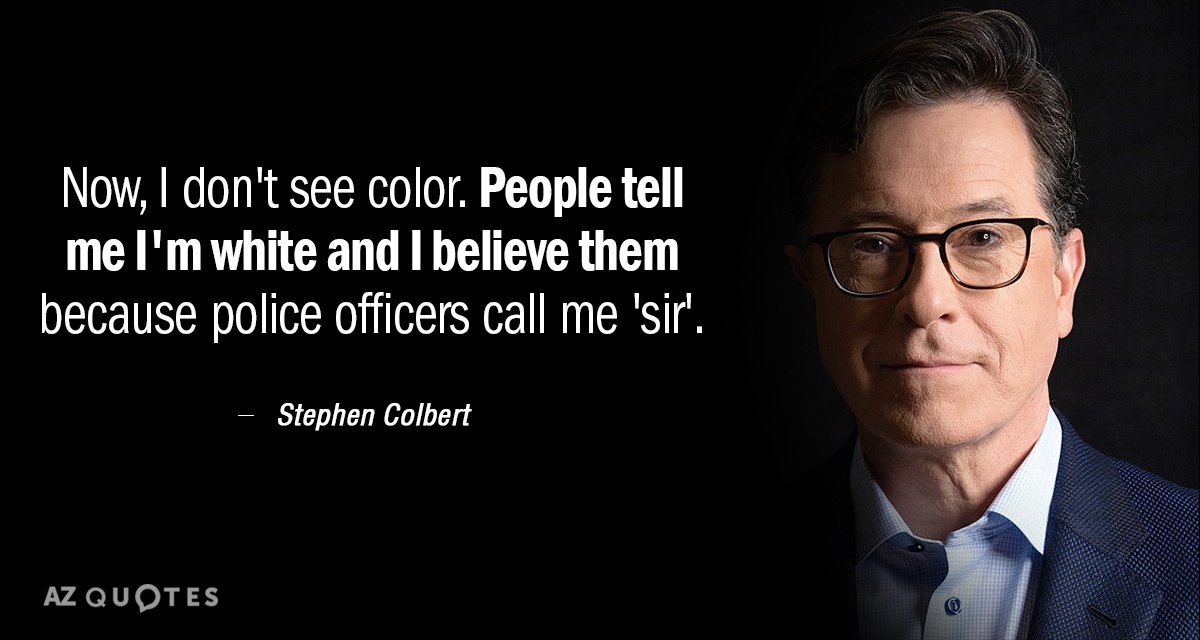
Whites profit off of an American political and economic system that showers advantages on racial “winners” and oppresses racial “losers.” Yet, DiAngelo writes, white people cling to the notion of racial innocence, a form of weaponized denial that positions black people as the “havers” of race and the guardians of racial knowledge. Whiteness, on the other hand, scans as invisible, default, a form of racelessness. “Color blindness,” the argument that race shouldn’t matter, prevents us from grappling with how it does.
-
-
montrealgazette.com montrealgazette.com
-
“I don’t feel badly at all,” she said. “I’m doing this with such a big heart, dignity, precision and research. I waited a long time to find the right way to make this work. I don’t see colour; to me, it doesn’t exist, physically or in music.
-
-
runestone.academy runestone.academy
-
Hint: you can find a list of permitted color names at https://www.w3schools.com/colors/colors_names.asp. It includes some quite unusual ones, like “PeachPuff” and “HotPink”.
Visit this website and look at the long list of colors available and their corresponding HEX values. Identify the names of the colors with HEX values #0000FF, #00FF00, #FF0000, #00FFFF, #FF00FF, and #FFFF00.
-
- Mar 2018
-
www.bhg.com www.bhg.com
-
gold
Color
-
-
www.bhg.com www.bhg.com
-
white
color
-
purple-pink
color
-
pink
color
-
white
color
-
-
ds-pages.swarthmore.edu ds-pages.swarthmore.edu
-
The group has long been internally divided by dilemma as to whether its striving upward, should be aimed at strengthening its inner cultural and group bonds, both for intrinsic progress and for offensive power against caste; or whether it should seek escape wherever and however possible into the surrounding American culture.
I feel like either path invites criticism. When nonwhite communities strengthen their own boundaries and attempt to celebrate their culture, they are criticized as being disruptive and not making an effort to "become American." Yet people of color are also actively discouraged from integrating into white spaces due to fear and unfamiliarity, or are accused of whitewashing themselves. There's no winning here for people of color.
-
- Feb 2018
-
-
4.5:1
Should say 3:1 for large-scale text
-
or through other visual (non-color) differentiation (shape, position, size)
Using shape, position, and size still excludes those with visual disabilities
-
- Dec 2017
-
unix.stackexchange.com unix.stackexchange.com
-
There are many color schemes which are usually distributed together with vim
-
- Apr 2017
-
learn.arcgis.com learn.arcgis.com
-
For the third Text Color, choose the same color you chose for the previous text.
If we must use the same color we used for the previous text color, it is easier to just copy and paste the previous color's item code number (the short phrase beginning with a hashtag).
-
- Feb 2017
-
static1.squarespace.com static1.squarespace.com
-
One can imagine a man who is totally deaf and has never had a sensation of sound: and music.
Locke identifies a similar problem in his own writing, but unlike Nietzsche, refuses to address it further: "Words having naturally no signification, the idea which each stands for must be learned and retained, by those who would exchange thoughts, and hold intelligible discourse with others...Those [words] which are not intelligible at all, such as names standing for any simple ideas which another has not organs of faculties to attain; as the names of colours to a blind man, or sounds to a deaf man need not here be mentioned...for if we examine them, we shall find that the names of mixed modes are most liable to doubtfulness and imperfection."
Although Locke doesn't delve much deeper into this, I do like how he notes that some words are used to describe "mixed modes" like music and color. Nietzsche addresses this concept below, saying that although a man might be deaf, he can still "feel" music (via vibrations) and therefore might understand sound in a way that is divergent from the conventional manner. I'm also reminded of Rickert's piece, in which he noted that Homer could never identify the color "blue" as we understand it today, instead calling the color of the sea "purple" or "wine red."
-
-
static1.squarespace.com static1.squarespace.com
-
Though black their skins as shades of night Their hearts are pure, their souls are white
I can fully understand how this poem would help to win over the whites among her crowd, but it seems to be a bit like she is giving in to the idea that white is better than black. It comes off to me that she is stating they are not equals unless the souls reflect as white.
Tags
Annotators
URL
-
- Nov 2016
-
scalar.ace.fordham.edu scalar.ace.fordham.edu
-
limits
This is a shot of the pier near Fairway, on the Hudson, overlooking New Jersey
-
- Jul 2016
-
en.wikipedia.org en.wikipedia.org
-
Test Solar
-
- May 2016
-
tex.stackexchange.com tex.stackexchange.com
-
\hypersetup{hidelinks=true}
[Lyx ver.2.1.4/Win7 Pro] To use this: go to Document > Settings > LaTeX Preamble and paste just this line into the corresponding text box. Lyx will add this to the underlying document preamble and this removes those ugly borders around clickable hyperlinks, and citation indices.
-
- Jan 2016
-
www.elysee.fr www.elysee.fr
-
le bleu et le rouge
J'aurais aimé savoir quel bleu et quel rouge sont utilisés sur le drapeau.
Tags
Annotators
URL
-
- Jul 2015
-
-
More and more, designers, and even just people in their day-to-day lives, are using color in a more original way.
I've recently been struggling with the realization that I look better in simple, classic tones like black and dark blues and the like but I really love walking around in outrageous colorblocking.
I could probably go with dropping the brightness a little bit, but keeping the hue diversity.
-
- Jun 2015
-
caseyboyle.net caseyboyle.net
-
All such arguments involve invent- ing a "back story," a narrative of events preceding those specified in the thema, that explains the motivations of the defendant or plaintiff, thereby casting their actions as described in the tltema in a more sympathetic or invidious light
Vanessa Beasley: understanding the backstory so well that you're able to paint the picture.
-
While colors are brighter and give more immediate plea- sure in new paintings than old, in excess these can cause satiety, causing us to turn back to the faded austerity of older paintings.
Later, Hume also describes color in similar terms while referencing taste: Taste is a “productive faculty, and gilding or staining all natural objects with the colours, borrowed from internal sentiment, raises, in a manner, a new creation.” (Enquiry ... Principle Morals)
Tags
Annotators
URL
-
-
caseyboyle.net caseyboyle.net
-
The snail's vein was removed, mixed with salt, and boiled until most of the flesh had been deposited. Varying the mixtures and boiling times produced different shades of colour.
-
exposed the limitations of assuming that colour is straightfor- wardly a visual phenomenon
-
Russian has two distinct terms for our colour blue;
Others may know more about this, but my Russian friends told me that one of the Russian words for "light blue" (голубой) is used as slang for homosexual. The other word (синий) is used more often for object-oriented color. This may be localized to Moscow, where I lived.
-
colour as an object-centred
interesting that we still teach children to learn colors this way via picture books that use objects (red apple) or physical features of the environment (blue sky) to create color associations
-
- Mar 2015
-
learning2whistle.com learning2whistle.com
-
And as I grew in age, I began to discover that the old teachers who spoke of the need to, “Forgive seventy times seven,” knew something quite profound that had even become lost within the tradition, the Jewish and Essene traditions, of my day. For, you see, to forgive means “to choose to release another from the perceptions that you’ve been projecting upon them.” It is, therefore, an act of forgiving one’s self of one’s projections. And as we begin to forgive, even unto seventy times seven times, each time you forgive you take yourself deeper into the purity of your own consciousness. You begin to see how profoundly you have been coloring, and therefore affecting, all of your relationships, through the simple act of not being aware of the power of projection.
Definition of Forgiveness
-