- Oct 2024
-
www.lazaruscorporation.co.uk www.lazaruscorporation.co.uk
-
In his post Raw dog the open web! Jason says (quite correctly): www.fromjason.xyz Monoculture is winning. The Fortune 500 has shrink-wrapped our zeitgeist and we are suffocating culturally. But, we can fight back by bookmarking a web page or sharing a piece of art unsanctioned by our For Your Page. To do that we must get out there and raw dog that open web. In our current digital landscape, where a corporate algorithm tells us what to read, watch, drink, eat, wear, smell like, and sound like, human curation of the web is an act of revolution. A simple list of hyperlinks published under a personal domain name is subversive. Curation is punk.
I love how this blogpost creates a highlighted link to the original post which they're quoting along with the commanding words "View in context at www.fromjason.xyz".
-
- Jun 2024
- May 2024
-
github.com github.com
-
This plugin provides 2 customViews for navigating a zettelkasten using Luhmann-style IDs and key word indexes.
-
- Apr 2024
-
archive.org archive.org
-
[Narrator]: The power of the MC 68000 permitted another breakthrough:the common user interface.[Bill Atkinson]: On Lisa we make each of the programs have a similar user interface,so that what you've learned from using one programcarries over and you feel naturally how to use the next.
While the idea of a common user interface on computers may have felt like a selling point when facing a new scary machine with a variety of functionalities, did it really save that much time, effort, and learning curve? Particularly with respect to the common office tools it was replacing?
The common user interface was really more a benefit to the company and all the companies which programmed for it at scale. The benefits are like Melvil Dewey's standardization of the Dewey Decimal Classification which allowed libraries everywhere to work on the same system rather than needing to reinvent their own individually.
This sort of innovation with scalability is helpful as humans are far better at imitation than innovation.
-
-
journal.jatan.space journal.jatan.space
-
Introducing a network for thoughtful conversations by [[Jatan Mehta]]
-
- Jan 2024
- Dec 2023
-
Local file Local file
-
I've noticed that sometime in December 2023, Hypothes.is has updated their public software to include the page number of the pdf annotations are made in into their user interface.
-
- Nov 2023
-
www.johnpe.art www.johnpe.art
-
https://www.johnpe.art/2023/10/31/making-webmentions-look-more-conversational/
-
-
www.youtube.com www.youtube.com
-
posted reply:
I appreciate that you're centering some of the Cornell notes workflow into a linked note taking system. I don't think many (any?) of the note taking platforms have made it easy for students to quickly or easily create questions from their Cornell notes and build them into a spaced repetition practice. I've seen a handful transfer their work into other platforms like Anki, Mnemosyne, etc. for this purpose, but it would be interesting to see Protolyst and others offer this as out of the box functionality for following up on Cornell notes workflows. I've not seen it mentioned in any parts of the note taking space, but Cornell notes are essentially a Bibliography note/card (where the source is typically a lecture) + fleeting notes which stem from it (in a Niklas Luhmann-artig zettelkasten framing) out of which one would build their permanent notes as well as create questions for spaced repetition and review. User interfaces like that of Protolyst could potentially leverage these common workflows to great advantage.
-
Next Step for your Cornell Notes? by Dr Maddy<br /> https://www.youtube.com/watch?v=QZFrR-u9Ovk
Like that someone in the space is thinking about taking Cornell notes and placing them into the linked note taking framing.
She doesn't focus enough on the questions or the spaced repetitions pieces within Cornell. How might this be better built into a UI like Protolyst, Obsidian, etc.? Where is this in people's note taking workflows?
-
-
www.youtube.com www.youtube.com
-
SIMPLER First Zettelkasten from Scratch by Dr Maddy https://www.youtube.com/watch?v=TRrKO6TNN6w
Protolyst has an "atom" functionality for short quick notes.
The UI of Protolyst looks nice, but I wonder how well it holds up when one is at 10,000 notes? Is it still as simple?
Tags
Annotators
URL
-
- Oct 2023
-
www.reddit.com www.reddit.com
-
What is it with index cards ? .t3_17ck5la._2FCtq-QzlfuN-SwVMUZMM3 { --postTitle-VisitedLinkColor: #9b9b9b; --postTitleLink-VisitedLinkColor: #9b9b9b; --postBodyLink-VisitedLinkColor: #989898; } So I posted a while ago about my journey into the zettlekasten and I have to admit I still enjoy using this system for notes.I must say, I am an avid note taker for a long time. I write ideas, notes from books, novels, poems and so much more. I mainly used to use notebooks, struggle a while with note taking apps and now I mainly use two kind of things : index cards (A6) and an e-ink tablet (the supernote) for different purpose of course, the index cards for the zettelkasten and the e-ink tablet for organization and my work. To be honest I used to consider myself more a notebooks kind of person than an index cards one (and I am from France we don't use index cards but "fiche bristol" which are bigger than A6 notecards, closer to an A5 format)Still, there is something about index cards, I cannot tell what it is, but it feels something else to write on this, like my mind is at ease and I could write about ideas, life and so many stuff covering dozens of cards. I realize that after not touching my zettelkasten for a few week (lack of time) and coming back to it. It feels so much easier to write on notecards than on notebooks (or any other place) and I can't explain it.Anyone feeling the same thing ?
reply to u/Sensitive-Binding at https://www.reddit.com/r/antinet/comments/17ck5la/what_is_it_with_index_cards/
Some of it may involve the difference in available space versus other forms of writing on larger pages of paper. Similarly, many find that there is less pressure to write something short on Twitter or similar social media platforms because there is less space in the user interface that your mind feels the need to fill up. One can become paralyzed by looking at the larger open space on a platform like WordPress with the need to feel like they should write more.
With index cards you fill one up easily enough, and if there's more, you just grab another card and repeat.
cross reference with Fermat's Last Theorem being easier to suggest in a margin than actually writing it out in full.
-
- Sep 2023
-
-
Which note taking app for a Luhmann Zettlekasten
I've not tried it myself or seen an example, but given the structure, it would seem like Reveal.js might give you the the sort of functionality you're looking for while having many other affordances one might look for in a digital and/or online zettelkasten.
inspired by question by u/Plastic-Lettuce-7150 at https://www.reddit.com/r/Zettelkasten/comments/168cmca/which_note_taking_app_for_a_luhmann_zettlekasten/
-
- Jul 2023
-
erinflotodesigns.com erinflotodesigns.com
-
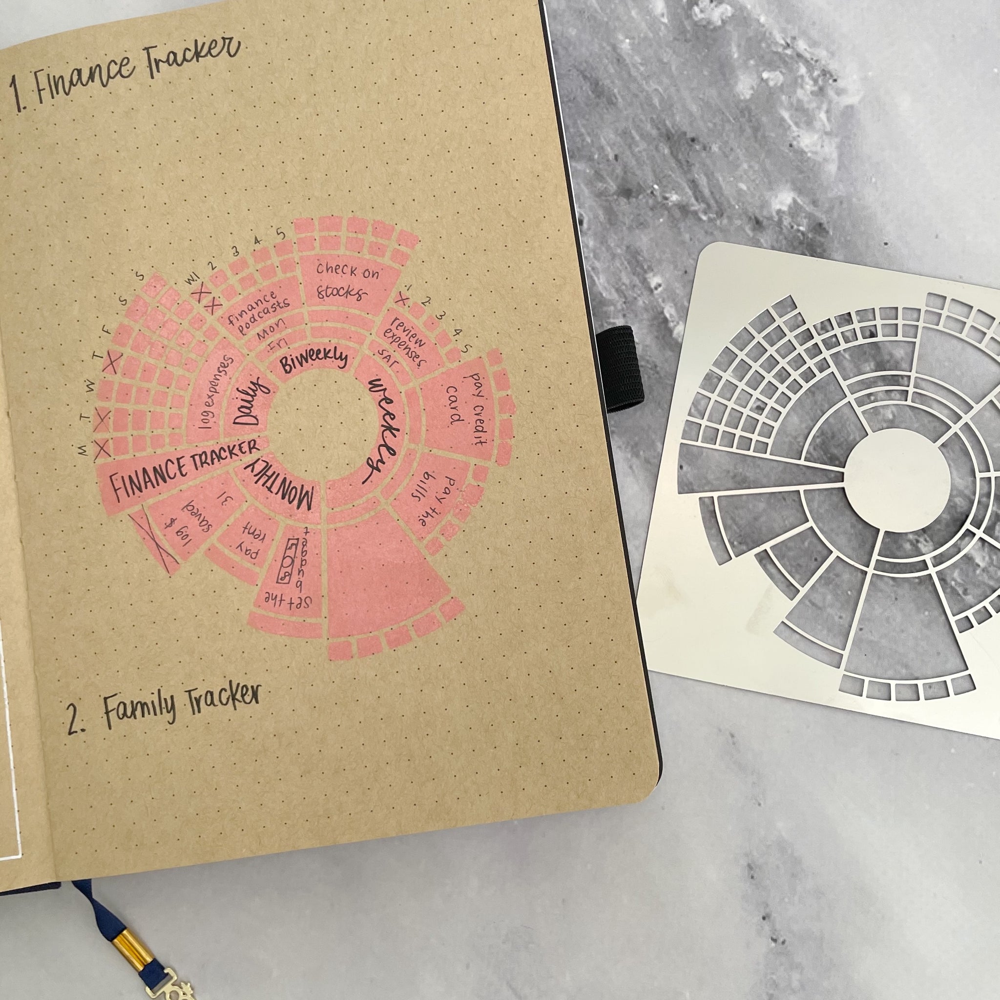
Erin Floto has a metal stencil for a chronodex circular design for use in bullet journals. It's a form of circular calendar with the inner circle containing space for daily, bi-weekly, weekly, monthly and longer time horizons with succeeding rings of the circle containing space for data related to the inner categories. Some of the exterior rings also include numbered squares representing days of the month or week on which a task should be done or for which a habit on an interior part of the circle might be tracked.
The chronodex, a portmanteau of chrono (time) and index, idea is fairly simple, but can be quite complex. For actual use, one may need to be able to spin the visualization around to read and understand it.
Other stencils with habit trackers, etc: https://erinflotodesigns.com/collections/metal-stencils
-
- May 2023
-
www.youtube.com www.youtube.com
-
Tagging and linking with AI (Napkin.one) by Nicole van der Hoeven
https://www.youtube.com/watch?v=p2E3gRXiLYY
Nicole underlines the value of a good user interface for traversing one's notes. She'd had issues with tagging things in Obsidian using their #tag functionality, but never with their [[WikiLink]] functionality. Something about the autotagging done by Napkin's artificial intelligence makes the process easier for her. Some of this may be down to how their user interface makes it easier/more intuitive as well as how it changes and presents related notes in succession.
Most interesting however is the visual presentation of notes and tags in conjunction with an outliner for taking one's notes and composing a draft using drag and drop.
Napkin as a visual layer over tooling like Obsidian, Logseq, et. al. would be a much more compelling choice for me in terms of taking my pre-existing data and doing something useful with it rather than just creating yet another digital copy of all my things (and potentially needing sync to keep them up to date).
What is Napkin doing with all of their user's data?
-
-
www.napkin.one www.napkin.one
-
Circling back around to this after a mention by Tim Bushell at Dan Allosso's Book Club this morning. Nicole van der Hoeven has been using it for a while now and has several videos.
Though called Napkin, which conjures the idea of (wastebook) notes scribbled on a napkin, is a card-based UI which has both manual and AI generated tags in a constellation-like UI. It allows creating "stacks" of notes which are savable and archivable in an outline-esque form (though the outline doesn't appear collapsible) as a means of composition.
It's got a lot of web clipper tooling for saving and some dovetails for bringing in material from Readwise, but doesn't have great data export (JSON, CSV) at the moment. (Not great here means that one probably needs to do some reasonably heavy lifting to do the back and forth with other tools and may require programming skills.)
At present, it looks like just another tool in the space but could be richer with better data dovetailing with other services.
-
- Apr 2023
-
on.substack.com on.substack.com
-
In Notes, writers will be able to post short-form content and share ideas with each other and their readers. Like our Recommendations feature, Notes is designed to drive discovery across Substack. But while Recommendations lets writers promote publications, Notes will give them the ability to recommend almost anything—including posts, quotes, comments, images, and links.
Substack slowly adding features and functionality to make them a full stack blogging/social platform... first long form, then short note features...
Also pushing in on Twitter's lunch as Twitter is having issues.
-
- Mar 2023
-
forum.zettelkasten.de forum.zettelkasten.de
-
I found the format of these Hypothes.is notes to be much more readable than the notes on the same topic in Evernote.
https://forum.zettelkasten.de/discussion/comment/17617#Comment_17617
There is definitely something here from a usability (and reusability) perspective when notes are broken down into smaller pieces the way that is encouraged by Hypothes.is or by writing on index cards.
Compare: - ://www.evernote.com/shard/s170/sh/d69cf793-1f14-48f4-bd48-43f41bd88678/DapavVTQh954eMRGKOVeEPHm7FxEqxBKvaKLfKWaSV1yuOmjREsMkSHvmQ - https://via.hypothes.is/https://www.otherlife.co/pkm/
The first may be most useful for a note taker who is personally trying to make sense of material, but it becomes a massive wall of text that one is unlikely to re-read or attempt to reuse at a later date. If they do attempt to reuse it at a later date, it's not clear which parts are excerpts of the original and which are the author's own words. (This page also looks like it's the sort of notes, highlighting, and underlining recommended by Tiago Forte's Building a Second Brain text using progressive summarization.)
The second set, are more concrete, more atomic, more understandable, and also as a result much more usable.
-
-
-
TheSateliteCombinationCard IndexCabinetandTelephoneStand
A fascinating combination of office furniture types in 1906!
The Adjustable Table Company of Grand Rapids, Michigan manufactured a combination table for both telephones and index cards. It was designed as an accessory to be stood next to one's desk to accommodate a telephone at the beginning of the telephone era and also served as storage for one's card index.
Given the broad business-based use of the card index at the time and the newness of the telephone, this piece of furniture likely was not designed as an early proto-rolodex, though it certainly could have been (and very well may have likely been) used as such in practice.
I totally want one of these as a side table for my couch/reading chair for both storing index cards and as a temporary writing surface while reading!
This could also be an early precursor to Twitter!
Folks have certainly mentioned other incarnations: - annotations in books (person to self), - postcards (person to person), - the telegraph (person to person and possibly to others by personal communication or newspaper distribution)
but this is the first version of short note user interface for both creation, storage, and distribution by means of electrical transmission (via telephone) with a bigger network (still person to person, but with potential for easy/cheap distribution to more than a single person)
Tags
- evolution of technology
- intellectual history
- rolodexes
- telephones
- Grand Rapids Michigan
- user interface
- audience
- telegraph
- card index filing cabinets
- zettelkasten boxes
- Adjustable Table Company
- postcards
- technology
- card index for business
- annotations
- office furniture
- satelite stands
Annotators
-
- Feb 2023
-
forum.zettelkasten.de forum.zettelkasten.de
-
One of the benefits of journaling on an index card is that the small space is much less intimidating than a large blank sheet, particularly when one isn't in the mood but feels like they ought to write. This is similar to the idea that many people find that microblogs (Twitter, Mastodon, Tumblr) are much easier to maintain than a long form blog.
-
-
forums.thebrain.com forums.thebrain.com
-
Thoughts on Vulcan (Philosophy and Commentary) by Harlan (developer)
Mentioned by Jerry Michalski
-
-
wordcraft-writers-workshop.appspot.com wordcraft-writers-workshop.appspot.com
-
Wordcraft Writers Workshop by Andy Coenen - PAIR, Daphne Ippolito - Brain Research Ann Yuan - PAIR, Sehmon Burnam - Magenta
cross reference: ChatGPT
-
The novel workflows that a technology enables are fundamental to how the technology is used, but these workflows need to be discovered and refined before the underlying technology can be truly useful.
This is, in part, why the tools for thought space should be looking at intellectual history to see how people have worked in the past.
Rather than looking at how writers have previously worked and building something specific that supports those methods, they've taken a tool designed for something else and just thrown it into the mix. Perhaps useful creativity stems from it in a new and unique way, but most likely writers are going to continue their old methods.
-
In addition to specific operations such as rewriting, there are also controls for elaboration and continutation. The user can even ask Wordcraft to perform arbitrary tasks, such as "describe the gold earring" or "tell me why the dog was trying to climb the tree", a control we call freeform prompting. And, because sometimes knowing what to ask is the hardest part, the user can ask Wordcraft to generate these freeform prompts and then use them to generate text. We've also integrated a chatbot feature into the app to enable unstructured conversation about the story being written. This way, Wordcraft becomes both an editor and creative partner for the writer, opening up new and exciting creative workflows.
The interface of Wordcraft sounds like some of that interface that note takers and thinkers in the tools for thought space would appreciate in their
Rather than pairing it with artificial intelligence and prompts for specific writing tasks, one might pair tools for though interfaces with specific thinking tasks related to elaboration and continuation. Examples of these might be gleaned from lists like Project Zero's thinking routines: https://pz.harvard.edu/thinking-routines
Tags
- prompt engineering
- tools for creativity
- artificial intelligence for writing
- freeform prompting
- LaMDA
- creativity catalysts
- in-context learning
- creativity techniques
- Wordcraft
- creativity
- tools for thought
- thinking routines
- continuation
- text editors
- PAIR (Google)
- workflows
- programmed creativity
- human computer interaction
- user interface
- Project Zero
- ChatGPTedu
- digital amanuensis
- affordances
- technology
- elaboration
- chatbots
- design thinking
- read
Annotators
URL
-
- Jan 2023
-
500ish.com 500ish.com
-
Mastodon Brought a Protocol to a Product Fight
-
- Nov 2022
-
twitter.com twitter.com
-
I've only just noticed it now, but there is a "Verified" tab in my Twitter Notifications page to filter out notifications from verified users.
Tags
Annotators
URL
-
-
simonwillison.net simonwillison.net
-
Mastodon is just blogs and Google Reader, skinned to look like Twitter.
And this, in part, is just what makes social readers so valuable: a tight(er) integration of a reading and conversational interface.
https://simonwillison.net/2022/Nov/8/mastodon-is-just-blogs/
-
-
twitter.com twitter.com
-
https://twitter.com/codexeditor/status/1590314248370286593
Index card and file folder influenced computer user interfaces.
-
-
pinafore.social pinafore.social
-
https://pinafore.social/
Pinafore is a web client for Mastodon, designed for speed and simplicity.
<small><cite class='h-cite via'>ᔥ <span class='p-author h-card'>Jessica Smith</span> in Small Web - Jayeless.net (<time class='dt-published'>07/03/2021 23:34:42</time>)</cite></small>
-
- Oct 2022
-
-
https://readwise.io/reader/shared/01ge4efpkxh985s8eszbb9dr2e/
Simple user interface example of highlighting and annotations on an article in Readwise Reader.
-
-
www.denizcemonduygu.com www.denizcemonduygu.com
-
https://www.denizcemonduygu.com/philo/browse/
History of Philosophy: Summarized & Visualized
This could be thought of as a form of digital, single-project zettelkasten dedicated to philosophy. It's got people, sources, and ideas which are cross linked in a Luhmann-sense (without numbering) though not in a topical index-sense. Interestingly it has not only a spatial interface and shows spatial relationships between people and ideas over time using a timeline, but it also indicates—using colored links—the ideas of disagreement/contrast/refutation and agreement/similarity/expansion.
What other (digital) tools of thought provide these sorts of visualization affordances?
-
-
natto.dev natto.dev
-
Natto https://natto.dev<br /> built by Paul Shen https://twitter.com/_paulshen
-
-
www.loom.com www.loom.com
-
https://www.loom.com/share/a05f636661cb41628b9cb7061bd749ae
Synopsis: Maggie Delano looks at some of the affordances supplied by Tana (compared to Roam Research) in terms of providing better block-based user interface for note type creation, search, and filtering.
These sorts of tools and programmable note implementations remind me of Beatrice Webb's idea of scientific note taking or using her note cards like a database to sort and search for data to analyze it and create new results and insight.
It would seem that many of these note taking tools like Roam and Tana are using blocks and sub blocks as a means of defining atomic notes or database-like data in a way in which sub-blocks are linked to or "filed underneath" their parent blocks. In reality it would seem that they're still using a broadly defined index card type system as used in the late 1800s/early 1900s to implement a set up that otherwise would be a traditional database in the Microsoft Excel or MySQL sort of fashion, the major difference being that the user interface is cognitively easier to understand for most people.
These allow people to take a form of structured textual notes to which might be attached other smaller data or meta data chunks that can be easily searched, sorted, and filtered to allow for quicker or easier use.
Ostensibly from a mathematical (or set theoretic and even topological) point of view there should be a variety of one-to-one and onto relationships (some might even extend these to "links") between these sorts of notes and database representations such that one should be able to implement their note taking system in Excel or MySQL and do all of these sorts of things.
Cascading Idea Sheets or Cascading Idea Relationships
One might analogize these sorts of note taking interfaces to Cascading Style Sheets (CSS). While there is the perennial question about whether or not CSS is a programming language, if we presume that it is (and it is), then we can apply the same sorts of class, id, and inheritance structures to our notes and their meta data. Thus one could have an incredibly atomic word, phrase, or even number(s) which inherits a set of semantic relationships to those ideas which it sits below. These links and relationships then more clearly define and contextualize them with respect to other similar ideas that may be situated outside of or adjacent to them. Once one has done this then there is a variety of Boolean operations which might be applied to various similar sets and classes of ideas.
If one wanted to go an additional level of abstraction further, then one could apply the ideas of category theory to one's notes to generate new ideas and structures. This may allow using abstractions in one field of academic research to others much further afield.
The user interface then becomes the key differentiator when bringing these ideas to the masses. Developers and designers should be endeavoring to allow the power of complex searches, sorts, and filtering while minimizing the sorts of advanced search queries that an average person would be expected to execute for themselves while also allowing some reasonable flexibility in the sorts of ways that users might (most easily for them) add data and meta data to their ideas.
Jupyter programmable notebooks are of this sort, but do they have the same sort of hierarchical "card" type (or atomic note type) implementation?
Tags
- idea links
- scientific note taking
- building blocks
- Beatrice Webb
- Maggie Delano
- Boolean algebra
- integrated thinking environments
- Roam Research
- user interface
- cascading idea sheets
- Jupyter
- super tags
- watch
- card index as database
- programmable notes
- CSS
- integrated development environment
- category theory
- Tana
- types of notes
Annotators
URL
-
-
www.reddit.com www.reddit.com
-
Posted byu/Kshkn16 hours agoRate my idea for a new product
One might suggest that the freedom, flexibility, and customization of these systems is actually an unuseful time suck for many users which only encourages shiny object syndrome. From a design perspective, try starting out building a system that works for you before beginning on design for others. Research and looking at the user interfaces offered by the competition will helpful as well. Which are the most popular? fun to use? Why? What actual affordances do those interfaces and functionalities allow? are they truly productive?
Possibly more productive, what sorts of standards can you leverage to make people's pre-existing notes more useful? Can you take pre-existing stores of .txt or .md files and provide different views or perspectives on them? This will allow people to pick and choose which applications might work with their stores of data to provide different views or perspectives on them. Why reinvent a text editor or tools like Logseq or Obsidian when you can leverage the local stores of data to provide the sorts of services you're not seeing in the broader space? For example, on the "social media" side, there are existing solutions for taking your locally stored notes, putting them into the cloud and displaying them on the web, but the various steps are highly technical and require a relatively large amount of work and admin tax to maintain. A service that allows one to point at their local store of data and automatically host it on a website and keep it synced would be a major boon for the non-technical user.
Separately, Matuschak did not invent evergreen notes. The first clear cut instantiation I've seen in the literature is from Konrad Gessner in 1548, and honestly even his idea really stems from a longstanding tradition of working with commonplace sententiae preceding his work. (see https://hypothes.is/a/uEboYlOwEeykkotYs594LA) Matuschak simply applied the definition/idea of "evergreen" (meaning easily reusable) articles or content from journalism to describe his notes which could be reused in various contexts. (Example: Why rewrite an article on how to decorate and entertain for the holidays, when you can reuse the same article you've been publishing for years, perhaps along with some updated photos?) "Atomic" notes is another variation on this same theme, but is one which underlies the ability to re-use notes in combination with one or more other notes to generate new ideas.
-
-
archive.org archive.org
-
I love that he closes the pamphlet again with a nod to comfort and ease of use.
...what this pamphlet has sought to do is to make it possible for the researcher to develop a way of doing things which will be as productive and as comfortable as possible.
-
...the usefulness of a note-taking system has an ultimate limit beyond which it becomes self-defeating. [...] After all, the ultimate purpose of the exercise is not to produce beautiful notes displaying the researcher's technical prowess, but rather usable notes to build the mosaic.<br /> —Jacques Goutor (p33)
-
Unlike many note taking manuals, Goutor advises that within the small list of rules and standards which he's laid out, one should otherwise default to maximizing the comfort of their note taking system. This may be as small as using one's favorite writing instruments or inks. (p28)
It's nice to see him centering self-care and small things which contribute to the researchers' mental health within note taking design and user interface.
-
-
Local file Local file
-
This search for order pushes one to seek out under-lying patterns and trends, to find relations that may betypical and causal.
Finding order and relations (and their particular types), is a form of linking ideas found in some of the more complex zettelkasten and knowledge management spaces. It's not as explicit here and he doesn't seem to be focusing on stating or writing explicit links within his notes. He does, however, place some focus on the quality and types of links he's making (or at least thinking about), something which isn't frequently seen in the current PKM space. For example, no one is creating user interfaces that show links between ideas which are opposite (or in opposition or antonym relation) to each other.
-
- Aug 2022
-
render.plexus.earth render.plexus.earth
-
https://render.plexus.earth/
-
-
maggieappleton.com maggieappleton.com
-
Half the time I begin typing something, I'm not even sure what I'm writing yet. Writing it out is an essential part of thinking it out. Once I've captured it, re-read it, and probably rewritten it, I can then worry about what to label it, what it connects to, and where it should 'live' in my system.
One of my favorite things about Hypothes.is is that with a quick click, I've got a space to write and type and my thinking is off to the races.
Sometimes it's tacitly (linked) attached to another idea I've just read (as it is in this case), while other times it's not. Either way, it's coming out and has at least a temporary place to live.
Later on, my note is transported (via API) from Hypothes.is to my system where I can figure out how to modify it or attach it to something else.
This one click facility is dramatically important in reducing the friction of the work for me. I hate systems which require me to leave what I'm doing and opening up another app, tool, or interface to begin.
-
-
www.kevinmarks.com www.kevinmarks.com
-
https://www.kevinmarks.com/memex.html
I got stuck over the weekend, so I totally missed Kevin Marks' memex demo at IndieWebCamp's Create Day, but it is an interesting little UI experiment.
I'll always maintain that Vannevar Bush really harmed the first few generations of web development by not mentioning the word commonplace book in his conceptualization. Marks heals some of this wound by explicitly tying the idea of memex to that of the zettelkasten however. John Borthwick even mentions the idea of "networked commonplace books". [I suspect a little birdie may have nudged this perspective as catnip to grab my attention—a ruse which is highly effective.]
Some of Kevin's conceptualization reminds me a bit of Jerry Michalski's use of The Brain which provides a specific visual branching of ideas based on the links and their positions on the page: the main idea in the center, parent ideas above it, sibling ideas to the right/left and child ideas below it. I don't think it's got the idea of incoming or outgoing links, but having a visual location on the page for incoming links (my own site has incoming ones at the bottom as comments or responses) can be valuable.
I'm also reminded a bit of Kartik Prabhu's experiments with marginalia and webmention on his website which plays around with these ideas as well as their visual placement on the page in different methods.
MIT MediaLab's Fold site (details) was also an interesting sort of UI experiment in this space.
It also seems a bit reminiscent of Kevin Mark's experiments with hovercards in the past as well, which might be an interesting way to do the outgoing links part.
Next up, I'd love to see larger branching visualizations of these sorts of things across multiple sites... Who will show us those "associative trails"?
Another potential framing for what we're all really doing is building digital versions of Indigenous Australian's songlines across the web. Perhaps this may help realize Margo Neale and Lynne Kelly's dream for a "third archive"?
-
- Jul 2022
-
en.wikipedia.org en.wikipedia.org
-
His major work in recent years has been on information visualization, originating the treemap concept for hierarchical data.[30]
-
-
www.houstonchronicle.com www.houstonchronicle.com
-
https://www.houstonchronicle.com/projects/2022/roe-opinion-annotated/
An interesting example of visual user interface of highlights and marginalia on a news site to help tell and report on a story.
-
- Jun 2022
-
docs.google.com docs.google.com
-
https://docs.google.com/document/d/1N4LYLwa2lSq9BizDaJDimOsWY83UMFqqQc1iL2KEpfY/edit
P.R.O.B.E. rubric participation (exceeds, meets fails), respectful, open, brave, educational
Mentioned in the chat at Hypothes.is' SOCIAL LEARNING SUMMIT: Spotlight on Social Reading & Social Annotation
in the session on Bringing the Margins to Center: Introduction to Social Annotation
Looking at the idea of rubrication, I feel like I ought to build a Tampermonkey or Greasemonkey script that takes initial capitals on paragraphs and makes them large, red, or even illuminated. Or perhaps something that converts the CSS of Hypothes.is and makes it red instead of yellow?
What if we had a collection of illuminated initials and some code that would allow for replacing capitals at the start of paragraphs? Maybe a repository like giphy or some of the meme and photo collections for reuse?
-
-
www.scientificamerican.com www.scientificamerican.com
-
"The implicit feel of where you are in a physical book turns out to be more important than we realized," says Abigail Sellen of Microsoft Research Cambridge in England and co-author of The Myth of the Paperless Office. "Only when you get an e-book do you start to miss it. I don't think e-book manufacturers have thought enough about how you might visualize where you are in a book."
How might we design better digital reading interfaces that take advantage of a wider range of modes of thinking and reading?
Certainly adding audio to the text helps to bring in benefits of orality, but what other axes are there besides the obvious spatial benefits?
-
In turn, such navigational difficulties may subtly inhibit reading comprehension.
If digital user interfaces and navigational difficulties inhibited reading comprehension in the modern age, what did similar interfaces do to early reading practices?
What methods do we have to tease out data of these sorts of early practices?
What about changes in modes of reading (reading out loud vs. reading quietly)?
I'm reminded of this as a hyperbolic answer, but still the root question may be an apt one:
-
-
blog.mojeek.com blog.mojeek.com
-
https://blog.mojeek.com/2022/02/search-choices-enable-freedom-to-seek.html
User interface options in multiple search provider selection
-
-
spencergreenhalgh.com spencergreenhalgh.com
-
You can use click on the < button in the top-right of your browser window to read and write comments on this post with Hypothesis. You can read more about how I use this software here.
Spencer's example of user interface below his posts to indicate how readers might comment on his website.
-
- May 2022
-
via3.hypothes.is via3.hypothes.is
-
However, what if we replace “ human face ” in this decisive quotewith “interface,” that is, the interface between man and apparatus?
This wording seems quite profound.
It means that by creating a personification of our tools, we can more easily communicate with them.
Do people personify their computers? I remember in the late 80s and early 90s computer workstations, especially in university settings, having personified names.
Link this to the personification of rocks w.r.t. talking rocks and oral traditions.
-
-
Local file Local file
-
V$A*$*=0"$1&$10+'('+,Y$0)#1+'&2$1&4$=*'&2$1$&-+#7--@$0-&*+'+=+#4$1$C-4#$-.$)#18+'C#$'&+#).10#V
-
- Apr 2022
-
-
In an ever-increasing sphere of digital print, why can't publishers provide readers a digitally programmed selection of footnote references in texts?
This digital version of Annie Murphy Paul's book has endnotes with links from the endnotes back to the original pages, but the opposite links from the reading don't go to the endnotes in an obvious way.
I'd love to be able to turn on/off a variety of footnote options so that I can see them on the pages they appear, as pop up modals, or browse through them in the end notes after-the-fact as I choose. This would allow me to have more choice and selection from a text based on what I want to get out of it rather than relying on a publisher to make that choice for me.
Often in publishing a text written for the broad public will "hide" the footnotes at the end of the text in unintuitive ways where as more scholarly presses will place them closer to their appearance within the text. Given the digital nature of texts, it should be possible to allow the reader to choose where these items appear to suit their reading styles.
Tags
Annotators
-
-
-
Another fourteenth- century manuscript of Hautfuney’s index to Vincent of Beauvais’s Speculum historiale. The absence of rubrication and the narrower columns make the entries harder to identify although the two indexes contain the same information.
-
- Mar 2022
-
github.com github.com
-
Is there a setting (or would it be possible to add one) so I can change the width of the sidebar with the annotations? On my bigger monitor it's ok, but on my normal screen I can barely see the actual PDF and the side bar covers almost half the screen. Also, I had a very hard time getting the plugin to actually find the file. It couldn't find it anywhere aside from the same folder the annotation note is in. (I tried a different folder in the vault, as well as an absolute path on my PC.) Aside from that, love the plugin! Thanks :)
The ability to resize the Hypothes.is drawer is already built into the Hypothes.is interface natively. In the top left of the drawer there is a ">" tab that you can drag to resize the annotations window to suit your needs. Clicking on it will allow you to open and close the pane as needed. If it's closed (the icon appears as "<"), you can highlight and choose "annotate" or "highlight" and it will automatically re-open the Hypothes.is interface.
-
-
www.cs.umd.edu www.cs.umd.edu
-
A major advance in user interfaces that supports creative exploration would the capacity to go back in time, to review and manipulate the history of actions taken during an entire session. Users will be able to see all the steps in designing an engine and change an early design decision. They will be able to extract sections of the history to replay them or to convert into permanent macros that can be applied in similar situations. Extracting and replaying sections of history is a form of direct man ipulation programming. It enables users to explore every alternative in a decision-making situation, and then chose the one with the most favorable outcomes.
While being able to view the history of a problem space from the perspective of a creation process is interesting, in reverse, it is also an interesting way to view a potential learning experience.
I can't help but think about the branching tree networks of knowledge in some math texts providing potential alternate paths through the text to allow learners to go from novice to expert in areas in which they're interested. We need more user interfaces like this.
-
Learning how to learn is often listed as a goal of education, but acquiring the goal-directed discipline, critical thinking skills, and cognitive self-awareness that support collection of knowledge is difficult. Advanced user interfaces may be able to help users better formulate their information needs, identify what information gaps impede them, and fabricate plans to satisfy their needs. Often as information is acquired, the users's knowledge shifts enough to require a reformulation of their plans. Information visualization interfaces and hypertext environments are a first step in supporting incidental learning, exploratory browsing, and then rapid reformulation of plans. As a refined theory of knowledge acquisition emerges, improved tools will f ollow.
-
Since any powerful tool, such as a genex, can be used for destructive purposes, the cautions are discussed in Section 5.
Given the propensity for technologists in the late 90s and early 00s to have rose colored glasses with respect to their technologies, it's nice to see at least some nod to potential misuses and bad actors within the design of future tools.
-
Users who expe rience empowering designs that are comprehensible, predictable, and controllable, may be inspired to pursue quality in their work products.
This sounds a lot like the management philosophy of W. Edwards Deming who encouraged managers to empower workers to take ownership of their craft and work.
Tags
- tools for creativity
- EdTech
- work
- tools for learning
- learning how to learn
- information gaps
- Weapons of Math Destruction
- user interface
- W. Edwards Deming
- state-space exploration
- cautionary tales
- technology
- human resources
- techno-utopianism
- pedagogy
- genex
- management
- technology for destruction
- syllabi
Annotators
URL
-
- Feb 2022
-
www.denizcemonduygu.com www.denizcemonduygu.com
-
-
x28newblog.wordpress.com x28newblog.wordpress.com
-
https://x28newblog.wordpress.com/2019/12/11/inspiring-or-distracting/
<small><cite class='h-cite via'>ᔥ <span class='p-author h-card'> Matthias Melcher
<small><cite class='h-cite via'>ᔥ <span class='p-author h-card'> Matthias Melcher </span> in Matthias Melcher on Twitter: "@ChrisAldrich I agree. The simple zettelkasten is a TOOL for thought, but many people want a prosthesis for thought. See https://t.co/N9lDSM7guD" / Twitter (<time class='dt-published'>02/05/2022 15:27:06</time>)</cite></small>
in response to zettelkasten overreach,
-
- Jan 2022
-
julian.digital julian.digital
-
As John Palmer points out in his brilliant posts on Spatial Interfaces and Spatial Software, “Humans are spatial creatures [who] experience most of life in relation to space”.
This truism is certainly much older than John Palmer, but an interesting quote none-the-less.
It could be useful to meditate on the ideas of "spatial interfaces" and "spatial software" as useful affordances within the application and design spaces.
-
- Dec 2021
-
collect.readwriterespond.com collect.readwriterespond.com
-
zettelkasten.de zettelkasten.de
-
Even more important is that all this isn’t about the software. It is about the system you set up. Some software nudges you, sometimes even pushes you, towards system design decisions. Take Wikis as an example. Most of them have two different modes: The reading mode. The editing mode. The reading mode is the default. But most of the time you should create, edit and re-edit the content. This default, this separation of reading and editing, is a small but significant barrier on producing content. You will behave differently. This is one reason I don’t like wikis for knowledge work. They are clumsy and work better for different purposes.
Most wikis have a user interface problem between their read and edit modes. Switching between the two creates additional and unnecessary friction for placing content and new information into them.
-
-
worrydream.com worrydream.comQuotes1
-
Bret Victor: email (9/3/04) Interface matters to me more than anything else, and it always has. I just never realized that. I've spent a lot of time over the years desperately trying to think of a "thing" to change the world. I now know why the search was fruitless -- things don't change the world. People change the world by using things. The focus must be on the "using", not the "thing". Now that I'm looking through the right end of the binoculars, I can see a lot more clearly, and there are projects and possibilities that genuinely interest me deeply.
Specifically highlighting that the "focus must be on the 'using', not the 'thing'".
This quote is very reminiscent of John M. Culkin's quote (often misattributed to McLuhan) "We shape our tools and thereafter they shape us."
<small><cite class='h-cite via'>ᔥ <span class='p-author h-card'>Linus Lee</span> in Towards a research community for better thinking tools | thesephist.com (<time class='dt-published'>12/01/2021 08:23:07</time>)</cite></small>
-
- Aug 2021
-
wiki.c2.com wiki.c2.com
-
This is one of the points made in TheMythOfThePaperlessOffice -- that workplaces often shift from more efficient paper-based technologies to less efficient electronic technologies (electronic technologies can be either more or less efficient, of course) because computers symbolize The Future, Progress, and a New Way Of Doing Things. An office on the move, that's what an office that uses cutting-edge technology is. Not an office that is stuck in the past. And the employees are left to cope with the less productive, but shinier, New Way. -- ApoorvaMuralidhara
New technologies don't always have the user interface to make them better than old methods.
-
- Feb 2021
-
psyarxiv.com psyarxiv.com
-
Anderson, Ian, and Wendy Wood. ‘Habits and the Electronic Herd: The Psychology behind Social Media’s Successes and Failures’. PsyArXiv, 23 November 2020. https://doi.org/10.31234/osf.io/p2yb7.
-
- Jun 2020
-
doi.org doi.org
-
Willem, L., Hoang, T. V., Funk, S., Coletti, P., Beutels, P., & Hens, N. (2020). SOCRATES: An online tool leveraging a social contact data sharing initiative to assess mitigation strategies for COVID-19 [Preprint]. Epidemiology. https://doi.org/10.1101/2020.03.03.20030627
-
- May 2020
- Apr 2020
-
www.troyhunt.com www.troyhunt.com
-
This is one possible path to take in that you simply reject the registration and ask the user to create another password. Per NIST's guidance though, do explain why the password has been rejected:
-
- Jan 2020
-
contemporary-home-computing.org contemporary-home-computing.org
-
Invisible and Very Busy - Olia Lialina
-
- Dec 2019
-
github.com github.com
-
TUI
I assume this means text-based UI?? First time I've seen this term.
-
-
plaintext-productivity.net plaintext-productivity.net
-
Avoiding complicated outlining or mind-mapping software saves a bunch of mouse clicks or dreaming up complicated visualizations (it helps if you are a linear thinker).
Hmm. I'm not sure I agree with this thought/sentiment (though it's hard to tell since it's an incomplete sentence). I think visualizations and mind-mapping software might be an even better way to go, in terms of efficiency of editing (since they are specialized for the task), enjoyment of use, etc.
The main thing text files have going for them is flexibility, portability, client-neutrality, the ability to get started right now without researching and evaluating a zillion competing GUI app alternatives.
-
-
-
Might be a little too low-level (even with GUIs) for some teams of users. GPG and Git both require some setup and experience in these tools, or the willingness to learn. Porting a GPG key from machine to machine is not trivial.
-
- Sep 2019
-
greensock.com greensock.com
Tags
Annotators
URL
-
- Aug 2019
-
www.smashingmagazine.com www.smashingmagazine.com
- Dec 2017
-
blog.prototypr.io blog.prototypr.io
-
A mental map (or cognitive map) is our mental representation of a place. It includes features we consider important, and is likely to exclude features we consider unimportant.
(Urban planner Kevin Lynch, early 1960s)<br> Elements of mental maps
- paths
- edges - boundaries and endings
- nodes - focal points like squares and junctions
- districts
- landmarks
Modern maps could use augmented and virtual reality to help clarify those elements, making a place easier to navigate and use. But they can also add useless noise that makes the place seem more confusing than it actually is.
-
- May 2017
-
onsmalltalk.com onsmalltalk.com
-
Neither Apple nor Microsoft really captured the essence of what made the Smalltalk system powerful. They used it as a model to make computers more accessible, but they left out the aspect of letting people bend the system to their will, to customize it to be just what they want. Their systems were really an object-oriented facade over a traditional, non-object-oriented system. They lacked a consistent metaphore of everything being an object. The web has been even more stultifying in this regard (I mean the web interface), though Firefox has helped some, so I hear, with the concept of browser extensions.
Tags
Annotators
URL
-
- Mar 2017
-
www.mightymeta.co.uk www.mightymeta.co.uk
-
Jessica Helfand in her essay The Dematerialism of Screen Space (2001) critiques the phenomenon of design practise being led by developments in software engineering. She argues that designers should take the initiative: “design must submit to a series of commands and regulations as rigourous as those that once defined Swiss typography. Aesthetic innovation, if it indeed exists at all, occurs within ridiculously preordained parameters: a new plug-in, a modified code, the capacity to make picture and words ‘flash’ with a mouse in a non-sensical little dance. We are all little filmmakers, directing on a pathetically small screen – yet broadcasting to a potentially infinite audience. This in itself is conflicting (not to mention corrupting), but more importantly, what are we making? What are we inventing? What are we saying that has not been said before?” Helfand here is referring to the web, but her argument applies equally well to designing tablet publications. Designers of book and magazine apps should be asking themselves those last three questions. Since tablet publishing conventions are in the process of being formed (like child invention), we have a unique opportunity right now to influence their direction.
-
Some key themes arise from the two NNG reports on iPad usability: App designers should ensure perceived affordances / discoverability There is a lack of consistency between apps, lots of ‘wacky’ interaction methods. Designers should draw upon existing conventions (either OS or web) or users won’t know what to do. These are practical interaction design observations, but from a particular perspective, that of perceptual psychology. These conclusions are arrived at through a linear, rather than lateral process. By giving weight to building upon existing convention, because they are familiar to the user, there is a danger that genuinely new ideas (and the kind of ambition called for by Victor Bret) within tablet design will be suppressed. Kay’s vision of the Dynabook came from lateral thinking, and thinking about how children learn. Shouldn’t the items that we design for this device be generated in the same way?
The idea of lateral thinking here is the key one. Can informatics be designed by nurturing lateral thinking? That seems related with the Jonas flopology
-
The document argues that the use of illusionary surfaces and objects will lead to a more intuitive and pleasurable experience for the user. It also, yet again, looks to prior conventions for solutions rather than starting afresh.
-
- Nov 2016
-
cognitivemedium.com cognitivemedium.com
-
Every theorem of mathematics, every significant result of science, is a challenge to our imagination as interface designers. Can we find ways of expressing these principles in an interface? What new objects and new operations does a principle suggest? What a priori surprising relationship between those objects and operations are revealed by the principle? Can we find interfaces which vividly reveal those relationships, preferably in a way that is unique to the phenomenon being studied?
-
Speech, writing, math notation, various kinds of graphs, and musical notation are all examples of cognitive technologies. They are tools that help us think, and they can become part of the way we think -- and change the way we think.
Computer interfaces can be cognitive technologies. To whatever degree an interface reflects a set of ideas or methods of working, mastering the interface provides mastery of those ideas or methods.
Experts often have ways of thinking that they rarely share with others, for various reasons. Sometimes they aren't fully aware of their thought processes. The thoughts may be difficult to convey in speech or print. The thoughts may seem sloppy compared to traditional formal explanations.
These thought processes often involve:
- minimal canonical examples - simple models
- heuristics for rapid reasoning about what might work
Nielsen considers turning such thought processes into (computer) interfaces. "Every theorem of mathematics, every significant result of science, is a challenge to our imagination as interface designers. Can we find ways of expressing these principles in an interface? What new objects and operations does a principle suggest?"
-
- Apr 2016
-
boingboing.net boingboing.net
-
Hotel shower and lighting controls should be easy to find and easy to use. Why are they so often not?
-
- Feb 2016
-
userinterfaces.aalto.fi userinterfaces.aalto.fi
-
A study of typing strategies among both touch-typists and self-taught typists.
http://10fastfingers.com/typing-test/english<br> Test your typing speed by typing a series of random words for one minute.
Tags
Annotators
URL
-
- Nov 2015
-
www.hopesandfears.com www.hopesandfears.com
-
There is a lot of evidence that quite subtle changes to user interfaces can have dramatic effects on how the interfaces are used. For example, the size of a search box or the text that accompanies it can considerably influence the queries that people submit.
-- David Elsweller
-
The whole gendered usage of hearts seems to have escaped Twitter. So does the fact that people fave (with stars) in complex ways - they are bookmarks, they are likes, they are nods of the head. But they are not indicators of love. I feel very weird loving tweets by random men I've only just started a conversation with. Not that there's anything wrong with feminine. But women - and men, in their own ways - are well-aware of how feminized visual signals get read by others, and in an identity space like Twitter, I suspect that will really minimize usage. Or at least until we all get used to it.
-- Bonnie Stewart
-
- Jul 2015
-
citeseerx.ist.psu.edu citeseerx.ist.psu.edu
-
The on-line annotations were also more likely to be anchored in complete sentences.
This seems odd. Maybe the interface in some way pushed them toward this? For instance, I sometimes think the way that Hypothesis shows the quote in the annotation card severs it from its context in such a way as to make it seem out of place when highlighting just that portion seemed fine inline.
-
- Nov 2014
-
openscience.com openscience.com
-
the interface currently works quite slowly, much slower than regular web content.
This may be browser-side speed. Most of the heavy lifting of the application is done in the client.
-