Eroglu, D. (2020). Revealing Dynamics, Communities, and Criticality from Data. Physical Review X, 10(2). https://doi.org/10.1103/PhysRevX.10.021047
3,954 Matching Annotations
- Jun 2020
-
-
Cantwell, G. T., Liu, Y., Maier, B. F., Schwarze, A. C., Serván, C. A., Snyder, J., & St-Onge, G. (2020). Thresholding normally distributed data creates complex networks. Physical Review E, 101(6), 062302. https://doi.org/10.1103/PhysRevE.101.062302
-
-
twitter.com twitter.com
-
hedonometer on Twitter: “Yesterday was the saddest day in the history of @Twitter https://t.co/91VP3Ywtnr” / Twitter. (n.d.). Twitter. Retrieved June 1, 2020, from https://twitter.com/hedonometer/status/1266774310565425154
-
-
featuredcontent.psychonomic.org featuredcontent.psychonomic.org
-
Lewandowsky, S. (2020, June 1). A tale of two island nations: Lessons for crisis knowledge management. Psychonomic Society Featured Content. https://featuredcontent.psychonomic.org/a-tale-of-two-island-nations-lessons-for-crisis-knowledge-management/
-
- May 2020
-
twitter.com twitter.com
-
🔥Kareem Carr🔥 on Twitter: “I want to talk about bugs in statistical analyses. I think many data analysts worry unnecessarily about this. I do think it’s important to put a good faith effort into avoiding bugs, but I know data analysts that live in terror of hearing there’s a bug in published work. 1/6” / Twitter. (n.d.). Twitter. Retrieved May 30, 2020, from https://twitter.com/kareem_carr/status/1266029701392412673
-
-
www.thelancet.com www.thelancet.com
-
Verity, R., Okell, L., Dorigatti, I., Winskill, P., Whittaker, C., Walker, P., Donnelly, C., Ferguson, N., & Ghani, A. (2020). COVID-19 and the difficulty of inferring epidemiological parameters from clinical data – Authors’ reply. The Lancet Infectious Diseases, 0(0). https://doi.org/10.1016/S1473-3099(20)30443-6
-
-
psyarxiv.com psyarxiv.com
-
Hanel, P. H. P. (2020). Conducting High Impact Research With Limited Financial Resources (While Working From Home) [Preprint]. PsyArXiv. https://doi.org/10.31234/osf.io/s3fcu
-
-
-
Crchartier, ~. (2020, March 13). The PSA Calls for Rapid and Impactful Study Proposals on COVID-19. Psychological Science Accelerator. https://psysciacc.org/2020/03/13/the-psa-calls-for-rapid-and-impactful-study-proposals-on-covid-19/
-
-
projekte.uni-erfurt.de projekte.uni-erfurt.de
-
Betsch, C., Wieler, L., Bosnjak, M., Ramharter, M., Stollorz, V., Omer, S., Korn, L., Sprengholz, P., Felgendreff, L., Eitze, S., & Schmid, P. (2020). Germany COVID-19 Snapshot MOnitoring (COSMO Germany): Monitoring knowledge, risk perceptions, preventive behaviours, and public trust in the current coronavirus outbreak in Germany. https://doi.org/10.23668/PSYCHARCHIVES.2776
-
-
www.psychologicalscience.org www.psychologicalscience.org
-
Social Scientists Scramble to Study Pandemic, In Real Time. (n.d.). Association for Psychological Science - APS. Retrieved April 20, 2020, from https://www.psychologicalscience.org/news/social-scientists-scramble-to-study-pandemic-in-real-time.html
-
-
www.tandfonline.com www.tandfonline.com
-
Bostrom, A., Böhm, G., O’Connor, R. E., Hanss, D., Bodi-Fernandez, O., & Halder, P. (2020). Comparative risk science for the coronavirus pandemic. Journal of Risk Research, 0(0), 1–10. https://doi.org/10.1080/13669877.2020.1756384
-
-
-
EU Datathon 2020—EU Datathon—Publications Office of the EU. (n.d.). Retrieved May 5, 2020, from https://op.europa.eu/en/web/eudatathon
-
-
psyarxiv.com psyarxiv.com
-
Peikert, A., & Brandmaier, A. M. (2019). A Reproducible Data Analysis Workflow with R Markdown, Git, Make, and Docker. https://doi.org/10.31234/osf.io/8xzqy
-
-
www.cebm.net www.cebm.net
-
UK Data for Assessing COVID-19 Activity. (n.d.). CEBM. Retrieved May 12, 2020, from https://www.cebm.net/covid-19/covid-19-uk-data-for-assessing-the-way-out-of-lockdown/
-
-
docs.google.com docs.google.com
-
arxiv.org arxiv.org
-
Alshaabi, T., et al. (2020 March 27). How the world's collective attention is being paid to a pandemic: COVID-19 related 1-gram time series for 24 languages on Twitter. Cornell University. arXiv:2003.12614
-
-
covid.deepset.ai covid.deepset.ai
-
Corona Scholar: Scientific COVID-19 Knowledge
-
-
newsroom.ibm.com newsroom.ibm.com
-
IBM. (2020 April 02). IBM offers "Watson Assistant for Citizens" to provide responses to COVID-19 questions. newsroom.IBM.com. https://newsroom.ibm.com/2020-04-02-IBM-Offers-Watson-Assistant-for-Citizens-to-Provide-Responses-to-COVID-19-Questions
-
-
link.springer.com link.springer.com
-
Munn, Z., Peters, M. D. J., Stern, C., Tufanaru, C., McArthur, A., & Aromataris, E. (2018). Systematic review or scoping review? Guidance for authors when choosing between a systematic or scoping review approach. BMC Medical Research Methodology, 18(1), 143. https://doi.org/10.1186/s12874-018-0611-x
-
-
psyarxiv.com psyarxiv.com
-
Ryan, W., & Evers, E. (2020). Logarithmic Axis Graphs Distort Lay Judgment. https://doi.org/10.31234/osf.io/cwt56
-
-
-
Spiegelhalter, D. (2020, May 26). Is SARS-CoV-2 viral load lower in young children than adults? Medium. https://medium.com/@d_spiegel/is-sars-cov-2-viral-load-lower-in-young-children-than-adults-8b4116d28353
-
-
www.theguardian.com www.theguardian.com
-
Davey, M. (2020, May 28). Questions raised over hydroxychloroquine study which caused WHO to halt trials for Covid-19. The Guardian. https://www.theguardian.com/science/2020/may/28/questions-raised-over-hydroxychloroquine-study-which-caused-who-to-halt-trials-for-covid-19
-
-
-
Rosenblatt, S. F., Smith, J. A., Gauthier, G. R., & Hébert-Dufresne, L. (2020). Immunization Strategies in Networks with Missing Data. ArXiv:2005.07632 [Physics, q-Bio]. http://arxiv.org/abs/2005.07632
-
-
www.nature.com www.nature.com
-
Zdeborová, L. (2020). Understanding deep learning is also a job for physicists. Nature Physics, 1–3. https://doi.org/10.1038/s41567-020-0929-2
-
-
twitter.com twitter.com
-
Jo Wood on Twitter: „Yesterday saw by far the highest ever use of London @SantanderCycles and possibly highest volume of cycling ever seen in the capital. / Twitter. (n.d.). Twitter. Retrieved May 27, 2020, from https://twitter.com/jwolondon/status/1265197657385025536
-
-
www.thelancet.com www.thelancet.com
-
Rybniker, J., & Fätkenheuer, G. (2020). Importance of precise data on SARS-CoV-2 transmission dynamics control. The Lancet Infectious Diseases, S1473309920303595. https://doi.org/10.1016/S1473-3099(20)30359-5
-
-
www.digital-democracy.org www.digital-democracy.org
-
-
The data that organizations and individuals have committed to digital memory stands to ultimately control them.
-
by practicing data minimalism and actively considering your data decisions
-
learn how to be a data steward or data ally. Help organizations proactively think about what data they collect and how it is governed after its collected. Help organizations get their collective head around all the data they possess, how they curate it, how they back it up, and how over time they minimize it.
-
-
twitter.com twitter.com
-
Carl T. Bergstrom on Twitter
-
-
www.jmir.org www.jmir.org
-
Farooq, A., Laato, S., & Islam, A. K. M. N. (2020). Impact of Online Information on Self-Isolation Intention During the COVID-19 Pandemic: Cross-Sectional Study. Journal of Medical Internet Research, 22(5), e19128. https://doi.org/10.2196/19128
-
-
github.com github.com
-
The diagram was generated with rails-erd
-
-
github.com github.com
-
Domain Model
-
-
www.collinsdictionary.com www.collinsdictionary.com
-
a new generation of dictionaries that were based on real examples of English - the type of English that people speak and write every day
-
-
leedsunilibrary.wordpress.com leedsunilibrary.wordpress.com
-
The Ethics of Online Research. (2018, August 30). Leeds University Library Blog. https://leedsunilibrary.wordpress.com/2018/08/30/the-ethics-of-online-research/
-
-
www.nytimes.com www.nytimes.com
-
Roberts, D. C. (2020, May 22). Putting the Risk of Covid-19 in Perspective. The New York Times. https://www.nytimes.com/2020/05/22/well/live/putting-the-risk-of-covid-19-in-perspective.html
-
-
ourworldindata.org ourworldindata.orgAbout1
-
About. (n.d.). Our World in Data. Retrieved May 25, 2020, from https://ourworldindata.org/about
-
-
-
Fansher, M., Adkins, T., Lalwani, P., Quirk, M., Boduroglu, A., Lewis, R., … Jonides, J. (2020, May 19). How well do ordinary Americans forecast the growth of COVID-19?. https://doi.org/10.31234/osf.io/2d5r9
-
-
-
Borgonovi, F., & Pokropek, A. (2020). Can we rely on trust in science to beat the COVID-19 pandemic? [Preprint]. PsyArXiv. https://doi.org/10.31234/osf.io/yq287
-
-
rainbowtabl.es rainbowtabl.es
-
With a single source IP address it's possible to quickly determine the type of devices on their network, and the social networks they frequent – Google, YouTube, Facebook, Soichat.com, TikTok, Line (a chat application), among many other domains.
-
-
covid19.gleamproject.org covid19.gleamproject.org
-
COVID-19 Modeling: Italy
-
-
codeguard.zendesk.com codeguard.zendesk.com
-
Not necessarily. Hosting companies tend to keep your backups in the same place as your primary files. You don’t carry around a copy of your birth certificate along with the actual one – you keep the real one safe at home for emergencies. So why not do the same for your backups? CodeGuard provides safe, offsite backup that is 100% independent from your hosting provider.
-
-
hypothes.is hypothes.is
-
Register Today For Data Science Certification. Learn the Best Data Science Course from our Top Tutors. Study and Get A Certified Data Science Course. Enroll For Data Science Certification and Get 24/7 support and all time study Material. Land in your Dream Job by registering to this Course.
-
-
science.sciencemag.org science.sciencemag.org
-
Salje, H., Tran Kiem, C., Lefrancq, N., Courtejoie, N., Bosetti, P., Paireau, J., Andronico, A., Hozé, N., Richet, J., Dubost, C.-L., Le Strat, Y., Lessler, J., Levy-Bruhl, D., Fontanet, A., Opatowski, L., Boelle, P.-Y., & Cauchemez, S. (2020). Estimating the burden of SARS-CoV-2 in France. Science, eabc3517. https://doi.org/10.1126/science.abc3517
-
-
covidtracking.com covidtracking.com
-
The COVID Tracking Project. https://covidtracking.com/
-
-
twitter.com twitter.com
-
The COVID Tracking Project - Twitter
-
-
www.annualreviews.org www.annualreviews.org
-
Edelmann, A., Wolff, T., Montagne, D., & Bail, C. A. (2020). Computational Social Science and Sociology. Annual Review of Sociology, 46(1), annurev-soc-121919-054621. https://doi.org/10.1146/annurev-soc-121919-054621
-
-
www.iubenda.com www.iubenda.com
-
In other words, it’s the procedure to prevent Google from “cross-referencing” information from Analytics with other data in its possession.
-
-
wordpress.org wordpress.org
-
Now personal data exports include users session information and users location data from the community events widget. Plus, a table of contents!See progress as you process export and erasure requests through the privacy tools.
-
-
www.sciencedirect.com www.sciencedirect.com
-
Lourenco, S. F., & Tasimi, A. (2020). No Participant Left Behind: Conducting Science During COVID-19. Trends in Cognitive Sciences, S1364661320301157. https://doi.org/10.1016/j.tics.2020.05.003
-
-
-
Dahl Fitjar, R. (2020, May 9). The density and connectedness of cities now appear as weaknesses. LSE Business Review. https://blogs.lse.ac.uk/businessreview/2020/05/09/the-density-and-connectedness-of-cities-now-appear-as-weaknesses/
-
-
bfi.uchicago.edu bfi.uchicago.edu
-
Brzezinski, A., Kecht, V., Van Dijcke, D., Wright, A. (2020) Belief in Science Influences Physical Distancing in Response to COVID-19 Lockdown Policies. BFI. https://bfi.uchicago.edu/working-paper/belief-in-science-influences-physical-distancing-in-response-to-covid-19-lockdown-policies/
-
-
gitlab.com gitlab.com
-
The redirects will be available as long as the original path is not claimed by another group, user or project.
-
-
forum.gitlab.com forum.gitlab.com
-
science-sciencemag-org.ezproxy.redlands.edu science-sciencemag-org.ezproxy.redlands.edu
-
Aspesi, C., & Brand, A. (2020). In pursuit of open science, open access is not enough. Science, 368(6491), 574–577. https://doi.org/10.1126/science.aba3763
-
-
github.com github.com
-
EBM Data Lab - Risk Factors Research
-
-
www.nature.com www.nature.com
-
Vespignani, A., Tian, H., Dye, C. et al. Modelling COVID-19. Nat Rev Phys (2020). https://doi.org/10.1038/s42254-020-0178-4
Tags
- complex network
- computational modeling
- challenge
- is:article
- epidemiology
- policy
- containment measures
- superspreading
- contact tracing
- forecast
- pharmaceutical
- emergency
- intervention
- prediction
- quarentine
- COVID-19
- open data
- antibody testing
- mathematics
- China
- lang:en
- modeling
- isolation
- war time
- public health
- transmission dynamics
- infection
Annotators
URL
-
-
ai.googleblog.com ai.googleblog.com
-
Tsitsulin, A. & Perozzi B. Understanding the Shape of Large-Scale Data. (2020 May 05). Google AI Blog. http://ai.googleblog.com/2020/05/understanding-shape-of-large-scale-data.html
-
-
www.pnas.org www.pnas.org
-
Bento, A. I., Nguyen, T., Wing, C., Lozano-Rojas, F., Ahn, Y.-Y., & Simon, K. (2020). Evidence from internet search data shows information-seeking responses to news of local COVID-19 cases. Proceedings of the National Academy of Sciences, 202005335. https://doi.org/10.1073/pnas.2005335117
-
-
twitter.com twitter.com
-
ReconfigBehSci Post
-
-
weather.com weather.com
-
They collect very little data so their "export" feature is very simplistic: just an in-browser JSON dump of localStorage and cookies.
Browser Data
We use data on your browser to offer features on this website. We do not store this data, but we can offer a view of your browser data at any time.
View Browser Data
-
-
www.iubenda.com www.iubenda.com
-
users must also be informed of the breach (within the same time frame) unless the data breached was protected by encryption (data rendered unreadable for the intruder), or, in general, the breach is unlikely to result in a risk to individuals’ rights and freedoms.
-
The GDPR permits data transfers of EU resident data outside of the European Economic Area (EEA) only when in compliance with set conditions.
-
Because consent under the GDPR is such an important issue, it’s mandatory that you keep clear records and that you’re able to demonstrate that the user has given consent; should problems arise, the burden of proof lies with the data controller, so keeping accurate records is vital.
-
This right only applies to personal data and as such does not apply to genuinely anonymous data (data that can’t be linked back to the individual).
-
The records should include: who provided the consent;when and how consent was acquired from the individual user;the consent collection form they were presented with at the time of the collection;which conditions and legal documents were applicable at the time that the consent was acquired.
-
Non-compliant Record Keeping Compliant Record Keeping
-
-
www.iubenda.com www.iubenda.com
-
If you’re switching from another cookie management solution to ours, you may want to migrate the consents you’ve already collected. This is useful for ensuring that users who have already given their consent under the previous solution are not presented with the cookie banner, and the related request for consent, again.
-
-
www.iubenda.com www.iubenda.com
-
If, for example, you want to migrate consents from a previous provider, you could call this method inside the onBeforePreload callback when consent is already given by another platform.
-
-
www.iubenda.com www.iubenda.com
-
Services generally fall into two categories: Services related to your own data collection activities (eg. contact forms)Services related to third-party data collection activities (eg. Google Analytics)
-
-
www.iubenda.com www.iubenda.com
-
Consent means offering individuals real choice and control. Genuine consent should put individuals in charge, build trust and engagement, and enhance your reputation.
-
-
www.dataprotection.ie www.dataprotection.ie
-
www.technologyreview.com www.technologyreview.com
-
A flood of coronavirus apps are tracking us. Now it’s time to keep track of them. (n.d.). MIT Technology Review. Retrieved May 12, 2020, from https://www.technologyreview.com/2020/05/07/1000961/launching-mittr-covid-tracing-tracker/
-
-
arxiv.org arxiv.org
-
Qian, Y., Expert, P., Panzarasa, P., & Barahona, M. (2020). Geometric graphs from data to aid classification tasks with graph convolutional networks. ArXiv:2005.04081 [Physics, Stat]. http://arxiv.org/abs/2005.04081
-
-
testandtrace.com testandtrace.com
-
What U.S. States Are Ready To Test & Trace? (n.d.). #TestAndTrace: The Best Contact Tracing Resource. Retrieved May 12, 2020, from https://testandtrace.com/state-data/
Tags
Annotators
URL
-
-
psycnet.apa.org psycnet.apa.org
-
Can we count on parents to help their children learn at home? (2020, May 8). Evidence for Action. https://blogs.unicef.org/evidence-for-action/can-we-count-on-parents-to-help-their-children-learn-at-home/
-
-
www.theguardian.com www.theguardian.com
-
Davis, N. (2020, May 4). Report on face masks’ effectiveness for Covid-19 divides scientists. The Guardian. https://www.theguardian.com/world/2020/may/04/scientists-disagree-over-face-masks-effect-on-covid-19
Tags
- effectiveness
- is:news
- physical distancing
- social distancing
- Data Evaluation and Learning for Viral Epidemics
- COVID-19
- protective mask
- medical equipment
- Delve
- lang:en
- face mask
- doubt
- concern
- critical
- transmission reduction
- pre-symptomatic
- Royal Society
- asymptomatic
- expert
- protection
- evidence
Annotators
URL
-
-
www.ncbi.nlm.nih.gov www.ncbi.nlm.nih.gov
-
Wang, C., Li, W., Drabek, D. et al. A human monoclonal antibody blocking SARS-CoV-2 infection. Nat Commun 11, 2251 (2020). https://doi.org/10.1038/s41467-020-16256-y
-
-
podcastnotes.org podcastnotes.org
-
“If you are a non-college graduate man you have a less than 50/50 shot of ever being married in your life” – Andrew YangIn the 1970s and ‘80s, there were about 17 million manufacturing jobs in the USToday, there are about 12 million of those jobsMore women are graduating from college than men58% of college graduates in the US are women
-
Today, 40% of children are born to unmarried mothersBack in the 70s and 80s, it was only 15%
-
-
www.iubenda.com www.iubenda.com
-
In practice, the TCF provides a standardized process for getting users’ informed consent and allows the seamless signaling of users’ s consent preferences across the advertising supply chain.
-
-
github.com github.com
-
"Content Relations"
-
-
developer.enonic.com developer.enonic.com
-
References to other content are specified by this input type.
-
-
en.wikipedia.org en.wikipedia.org
-
The goal of the W3C Semantic Web Education and Outreach group's Linking Open Data community project is to extend the Web with a data commons by publishing various open datasets as RDF on the Web and by setting RDF links between data items from different data sources.
-
The above diagram shows which Linking Open Data datasets are connected, as of August 2014.
-
-
en.wikipedia.org en.wikipedia.org
-
Copyleft licenses are institutions which support a knowledge commons of executable software.
-
-
-
docs.google.com docs.google.com
-
agilitycms.com agilitycms.com
-
Easily create one-to-one and one-to-many relationships between content items.
Tags
Annotators
URL
-
-
www.economist.com www.economist.com
-
Countries are using apps and data networks to keep tabs on the pandemic. (2020 March 26). The Economist. https://www.economist.com/briefing/2020/03/26/countries-are-using-apps-and-data-networks-to-keep-tabs-on-the-pandemic?fsrc=newsletter&utm_campaign=the-economist-today&utm_medium=newsletter&utm_source=salesforce-marketing-cloud&utm_term=2020-05-07&utm_content=article-link-1
-
-
psyarxiv.com psyarxiv.com
-
Hartman, T. K., Stocks, T. V. A., McKay, R., Gibson Miller, J., Levita, L., Martinez, A. P., Mason, L., McBride, O., Murphy, J., Shevlin, M., bennett, kate m, & Bentall, R. (2020). The Authoritarian Dynamic During the COVID-19 Pandemic: Effects on Nationalism and Anti-Immigrant Sentiment [Preprint]. PsyArXiv. https://doi.org/10.31234/osf.io/4tcv5
-
-
www.economicmodeling.com www.economicmodeling.com
-
stackoverflow.com stackoverflow.com
-
Sure, anti-spam measures such as a CAPTCHA would certainly fall under "legitimate interests". But would targeting cookies? The gotcha with reCAPTCHA is that this legitimate-interest, quite-necessary-in-today's-world feature is inextricably bundled with unwanted and unrelated Google targeting (cookiepedia.co.uk/cookies/NID) cookies (_ga, _gid for v2; NID for v3).
-
Many 3rd parties has some magic parameter which blocks the cookie, but doesn't block the functionality of the element, and I'm looking for something like that. For example brightcove player has a data attribute. Video is working, cookies are not set.
-
-
www.fastcompany.com www.fastcompany.com
-
Google encouraging site admins to put reCaptcha all over their sites, and then sharing the resulting risk scores with those admins is great for security, Perona thinks, because he says it “gives site owners more control and visibility over what’s going on” with potential scammer and bot attacks, and the system will give admins more accurate scores than if reCaptcha is only using data from a single webpage to analyze user behavior. But there’s the trade-off. “It makes sense and makes it more user-friendly, but it also gives Google more data,”
-
For instance, Google’s reCaptcha cookie follows the same logic of the Facebook “like” button when it’s embedded in other websites—it gives that site some social media functionality, but it also lets Facebook know that you’re there.
-
But this new, risk-score based system comes with a serious trade-off: users’ privacy.
-
-
www.termsfeed.com www.termsfeed.com
-
Lots of definitions. Pretty good, but a lot of it is obvious.
-
One of the GDPR's principles of data processing is storage limitation. You must not store personal data for longer than you need it in connection with a specified purpose.
-
But it also requires that you keep personal data well-organized and accessible to those who require access to it.
-
Don't collect personal data that you don't need. "Data minimization" is a crucially important principle under the GDPR, and can also make you less susceptible to data breaches,
-
-
-
www.iubenda.com www.iubenda.com
-
there’s no need to send consent request emails — provided that this basis of processing was stated in your privacy policy and that users had easy access to the notice prior to you processing their data. If this information was not available to users at the time, but one of these legal bases can currently legitimately apply to your situation, then your best bet would be to ensure that your current privacy notice meets requirements, so that you can continue to process your user data in a legally compliant way.
-
Here’s why sending GDPR consent emails is tricky and should be handled very carefully.
-
-
ico.org.uk ico.org.uk
-
Are we a controller?
-
Are we a processor?
-
-
-
they sought to eliminate data controllers and processors acting without appropriate permission, leaving citizens with no control as their personal data was transferred to third parties and beyond
-
-
gdpr-info.eu gdpr-info.eu
-
the data subject has explicitly consented to the proposed transfer, after having been informed of the possible risks of such transfers for the data subject due to the absence of an adequacy decision and appropriate safeguards;
-
In the absence of an adequacy decision pursuant to Article 45(3), or of appropriate safeguards pursuant to Article 46, including binding corporate rules, a transfer or a set of transfers of personal data to a third country or an international organisation shall take place only on one of the following conditions:
These conditions are individually sufficient and jointly necessary (https://hyp.is/e0RRFJCfEeqwuR_MillmPA/en.wikipedia.org/wiki/Necessity_and_sufficiency).
Each of the conditions listed is a sufficient (but, by itself, not necessary) condition for legal transfer (T) of personal data to a third country or an international organisation. In other words, if any of those conditions is true, then legal transfer is also true.
On the other hand, the list of conditions (C; let C be the disjunction of the conditions a-g: a or b or c ...) are jointly necessary for legal transfer (T) to be true. That is:
- T cannot be true unless C (one of a or b or c ...) is true
- if C is false (there is not one of a or b or c ... that is true), then T is false
- T ⇒ C
- C ⇐ T
-
-
-
Consent receipt mechanisms can be especially helpful in automatically generating such records.
-
With that guidance in mind, and from a practical standpoint, consider keeping records of the following: The name or other identifier of the data subject that consented; The dated document, a timestamp, or note of when an oral consent was made; The version of the consent request and privacy policy existing at the time of the consent; and, The document or data capture form by which the data subject submitted his or her data.
-
Where a processing activity is necessary for the performance of a contract.
Would a terms of service agreement be considered a contract in this case? So can you just make your terms of service basically include consent or implied consent?
-
“Is consent really the most appropriate legal basis for this processing activity?” It should be taken into account that consent may not be the best choice in the following situations:
-
-
kantarainitiative.org kantarainitiative.org
-
“Until CR 1.0 there was no effective privacy standard or requirement for recording consent in a common format and providing people with a receipt they can reuse for data rights. Individuals could not track their consents or monitor how their information was processed or know who to hold accountable in the event of a breach of their privacy,” said Colin Wallis, executive director, Kantara Initiative. “CR 1.0 changes the game. A consent receipt promises to put the power back into the hands of the individual and, together with its supporting API — the consent receipt generator — is an innovative mechanism for businesses to comply with upcoming GDPR requirements. For the first time individuals and organizations will be able to maintain and manage permissions for personal data.”
-
CR 1.0 is an essential specification for meeting the proof of consent requirements of GDPR to enable international transfer of personal information in a number of applications.
-
Its purpose is to decrease the reliance on privacy policies and enhance the ability for people to share and control personal information.
-
-
en.wikipedia.org en.wikipedia.org
-
generic-sounding term may be interpreted as something more specific than intended: I want to be able to use "data interchange" in the most general sense. But if people interpret it to mean this specific standard/protocol/whatever, I may be misunderstood.
The definition given here
is the concept of businesses electronically communicating information that was traditionally communicated on paper, such as purchase orders and invoices.
limits it to things that were previously communicated on paper. But what about things for which paper was never used, like the interchange of consent and consent receipts for GDPR/privacy law compliance, etc.?
The term should be allowed to be used just as well for newer technologies/processes that had no previous roots in paper technologies.
-
-
www.axiell.com www.axiell.com
-
“A processor is responsible for processing personal data on behalf of a controller.”
-
“A controller determines the purposes and means of processing personal data.” This is you.
-
-
www.iubenda.com www.iubenda.com
-
EU law prohibits the personal data of EU citizens from being transferred outside the EU to countries which do not ensure an adequate level of protection for that data.
-
This framework serves the purpose of protecting Europeans’ personal data after the transfer to the US and correlates with GDPR requirements for Cross Boarder Data Transfers.
-
-
www.iubenda.com www.iubenda.com
-
It’s useful to remember that under GDPR regulations consent is not the ONLY reason that an organization can process user data; it is only one of the “Lawful Bases”, therefore companies can apply other lawful (within the scope of GDPR) bases for data processing activity. However, there will always be data processing activities where consent is the only or best option.
-
Under EU law (specifically the GDPR) you must keep and maintain “full and extensive” up-to-date records of your business processing activities, both internal and external, where the processing is carried out on personal data.
-
However, even if your processing activities somehow fall outside of these situations, your information duties to users make it necessary for you to keep basic records relating to which data you collect, its purpose, all parties involved in its processing and the data retention period — this is mandatory for everyone.
-
-
www.iubenda.com www.iubenda.com
-
If you’re a controller based outside of the EU, you’re transferring personal data outside of the EU each time you collect data of users based within the EU. Please make sure you do so according to one of the legal bases for transfer.
Here they equate collection of personal data with transfer of personal data. But this is not very intuitive: I usually think of collection of data and transfer of data as rather different activities. It would be if we collected the data on a server in EU and then transferred all that data (via some internal process) to a server in US.
But I guess when you collect the data over the Internet from a user in a different country, the data is technically being transferred directly to your server in the US. But who is doing the transfer? I would argue that it is not me who is transferring it; it is the user who transmitted/sent the data to my app. I'm collecting it from them, but not transferring it. Collecting seems like more of a passive activity, while transfer seems like a more active activity (maybe not if it's all automated).
So if these terms are equivalent, then they should replace all instances of "transfer" with "collect". That would make it much clearer and harder to mistakenly assume this doesn't apply to oneself. Or if there is a nuanced difference between the two activities, then the differences should be explained, such as examples of when collection may occur without transfer occurring.
-
whose personal data you collect and process as “controller” (that is the word that GDPR uses for whoever determines the purposes and means of the processing of personal data).
-
If you profile your users, you have to tell them. Therefore, you must pick the relevant clause from the privacy policy generator.
-
If you’re selling products and keep record of users’ choices for marketing purposes, dividing them into meaningful categories, such as by age, gender, geographical origin etc., you’re profiling them.
-
-
science.sciencemag.org science.sciencemag.org
-
Drew, D. A., Nguyen, L. H., Steves, C. J., Menni, C., Freydin, M., Varsavsky, T., Sudre, C. H., Cardoso, M. J., Ourselin, S., Wolf, J., Spector, T. D., Chan, A. T., & Consortium§, C. (2020). Rapid implementation of mobile technology for real-time epidemiology of COVID-19. Science. https://doi.org/10.1126/science.abc0473
-
-
www.bmj.com www.bmj.com
-
Response to “Modelling the pandemic”: Reconsidering the quality of evidence from epidemiological models. (2020). https://www.bmj.com/content/369/bmj.m1567/rr-0
-
-
www.nytimes.com www.nytimes.com
-
Stephens-Davidowitz, S. (2020, April 5). Opinion | Google Searches Can Help Us Find Emerging Covid-19 Outbreaks. The New York Times. https://www.nytimes.com/2020/04/05/opinion/coronavirus-google-searches.html
-
-
doi.org doi.org
-
Randazzo, W., Truchado, P., Ferrando, E. C., Simon, P., Allende, A., & Sanchez, G. (2020). SARS-CoV-2 RNA titers in wastewater anticipated COVID-19 occurrence in a low prevalence area. MedRxiv, 2020.04.22.20075200. https://doi.org/10.1101/2020.04.22.20075200
-
-
onlinelibrary.wiley.com onlinelibrary.wiley.com
-
Dey, S. K., Rahman, M. M., Siddiqi, U. R., & Howlader, A. (n.d.). Analyzing the epidemiological outbreak of COVID-19: A visual exploratory data analysis approach. Journal of Medical Virology, n/a(n/a). https://doi.org/10.1002/jmv.25743
-
-
www.tandfonline.com www.tandfonline.com
-
Fenton, N. E., Neil, M., Osman, M., & McLachlan, S. (2020). COVID-19 infection and death rates: The need to incorporate causal explanations for the data and avoid bias in testing. Journal of Risk Research, 0(0), 1–4. https://doi.org/10.1080/13669877.2020.1756381
-
-
featuredcontent.psychonomic.org featuredcontent.psychonomic.org
-
Hill, H. (2020 April 9). COVID-19: Does the British public condone cell phone data being used to monitor social distancing? Psychonomic Society. https://featuredcontent.psychonomic.org/covid-19-does-the-british-public-condone-cell-phone-data-being-used-to-monitor-social-distancing/
-
-
twitter.com twitter.com
-
David Garcia on Twitter
-
-
leoferres.info leoferres.info
-
Ferres, L. (2020 April 10). COVID19 mobility reports. Leo's Blog. https://leoferres.info/blog/2020/04/10/covid19-mobility-reports/
-
-
psyarxiv.com psyarxiv.com
-
Fenton, N., Hitman, G. A., Neil, M., Osman, M., & McLachlan, S. (2020). Causal explanations, error rates, and human judgment biases missing from the COVID-19 narrative and statistics [Preprint]. PsyArXiv. https://doi.org/10.31234/osf.io/p39a4
-
-
www.iubenda.com www.iubenda.com
-
you can think “sold” here as “shared with third parties for any profit, monetary or otherwise”
-
The right to data portability Under certain conditions, users have the right to obtain (in a machine-readable format) and use their personal data for their own purposes.
-
under most legislations you’re required to inform extensively about the processing activities, their purposes and the rights of users.
-
Full and extensive records of processing are expressly required in cases where your data processing activities are not occasional, where they could result in a risk to the rights and freedoms of others, where they involve the handling of “special categories of data” or where your organization has more than 250 employees — this effectively covers almost all data controllers and processors.
-
Meet specific requirements if transferring data outside of the EAA. The GDPR permits data transfers of EU resident data outside of the European Economic Area (EEA) only when in compliance with set conditions.
-
Users have the right to access to their personal data and information about how their personal data is being processed.
-
-
ico.org.uk ico.org.uk
-
If you have fewer than 250 employees, you only need to document processing activities that: are not occasional; or
-
Most organisations are required to maintain a record of their processing activities, covering areas such as processing purposes, data sharing and retention; we call this documentation.
-
-
ico.org.uk ico.org.uk
-
the GDPR restricts transfers of personal data outside the EEA, or the protection of the GDPR, unless the rights of the individuals in respect of their personal data is protected in another way
-
-
www.itgovernance.co.uk www.itgovernance.co.uk
-
Similarly, the GDPR introduces the concept of ‘pseudonymous data’ – personal data that cannot be attributed to the data subject without some additional information.
-
-
www.itgovernance.co.uk www.itgovernance.co.uk
-
According to Gemalto’s Breach Level Index, only 4% of data breaches since 2013 have involved encrypted data.
-
-
www.iubenda.com www.iubenda.com
-
it buys, receives, sells, or shares the personal information of 50,000 or more consumers annually for the business’ commercial purposes. Since IP addresses fall under what is considered personal data — and “commercial purposes” simply means to advance commercial or economic interests — it is likely that any website with at least 50k unique visits per year from California falls within this scope.
-
-
gdpr-info.eu gdpr-info.eu
-
epjdatascience.springeropen.com epjdatascience.springeropen.com
-
Vilella, S., Paolotti, D., Ruffo, G. et al. News and the city: understanding online press consumption patterns through mobile data. EPJ Data Sci. 9, 10 (2020). https://doi.org/10.1140/epjds/s13688-020-00228-9
-
-
www.mozilla.org www.mozilla.org
-
All you need is a commitment to make data decisions thoughtfully.
-
Lean Data Practices Staying lean and being smart about how you collect data can build trust with your users and ultimately help grow your business.
-
-
extensionworkshop.com extensionworkshop.com
-
You must disclose how the add-on collects, uses, stores and shares user data in the privacy policy field on AMO. Mozilla expects that the add-on limits data collection whenever possible, in keeping with Mozilla’s Lean Data Practices and Mozilla’s Data Privacy Principles, and uses the data only for the purpose for which it was originally collected.
-
-
www.medrxiv.org www.medrxiv.org
-
Modi, C., Boehm, V., Ferraro, S., Stein, G., & Seljak, U. (2020). Total COVID-19 Mortality in Italy: Excess Mortality and Age Dependence through Time-Series Analysis. MedRxiv, 2020.04.15.20067074. https://doi.org/10.1101/2020.04.15.20067074
-
-
www.thelancet.com www.thelancet.com
-
Leon, D. A., Shkolnikov, V. M., Smeeth, L., Magnus, P., Pechholdová, M., & Jarvis, C. I. (2020). COVID-19: A need for real-time monitoring of weekly excess deaths. The Lancet, 395(10234), e81. https://doi.org/10.1016/S0140-6736(20)30933-8
-
-
arxiv.org arxiv.org
-
Müller, M., Derlet, P. M., Mudry, C., & Aeppli, G. (2020). Using random testing to manage a safe exit from the COVID-19 lockdown. ArXiv:2004.04614 [Cond-Mat, Physics:Physics, q-Bio]. http://arxiv.org/abs/2004.04614
-
-
-
Van den Akker, O., Weston, S. J., Campbell, L., Chopik, W. J., Damian, R. I., Davis-Kean, P., Hall, A. N., Kosie, J. E., Kruse, E. T., Olsen, J., Ritchie, S. J., Valentine, K. D., van ’t Veer, A. E., & Bakker, M. (2019). Preregistration of secondary data analysis: A template and tutorial [Preprint]. PsyArXiv. https://doi.org/10.31234/osf.io/hvfmr
-
-
statmodeling.stat.columbia.edu statmodeling.stat.columbia.edu
-
Statistical Modeling, Causal Inference, and Social Science. (2020 April 22). Blog Post: New analysis of excess coronavirus mortality; also a question about poststratification. https://statmodeling.stat.columbia.edu/2020/04/22/analysis-of-excess-coronavirus-mortality-also-a-question-about-poststratification/
-
-
link.aps.org link.aps.org
-
Krönke, J., Wunderling, N., Winkelmann, R., Staal, A., Stumpf, B., Tuinenburg, O. A., & Donges, J. F. (2020). Dynamics of tipping cascades on complex networks. Physical Review E, 101(4), 042311. https://doi.org/10.1103/PhysRevE.101.042311
-
-
www.reddit.com www.reddit.com
-
git clone $my_git_remote while read line ; do apt install $line ; done < dpkg_selections.out
-
-
catalog.data.gov catalog.data.gov
-
ourworldindata.org ourworldindata.org
-
Coronavirus Pandemic (COVID-19) – the data. (n.d.). Our World in Data. Retrieved May 4, 2020, from https://ourworldindata.org/coronavirus-data
-
-
psyarxiv.com psyarxiv.com
-
Olthof, M., Hasselman, F., & Lichtwarck-Aschoff, A. (2020, May 1). Complexity In Psychological Self-Ratings: Implications for research and practice. Retrieved from psyarxiv.com/fbta8
-
-
psyarxiv.com psyarxiv.com
-
Horstmann, K. T., Rauthmann, J. F., Sherman, R. A., & Ziegler, M. (2020, April 30). Unveiling an Exclusive Link: Predicting Behavior with Personality, Situation Perception, and Affect in a Pre-Registered Experience Sampling Study. Retrieved from psyarxiv.com/ztw2n
-
- Apr 2020
-
www.theverge.com www.theverge.com
-
Some password managers will automatically import passwords from your browser
-
-
blog.revolutionanalytics.com blog.revolutionanalytics.com
-
R 4.0.0 now available, and a look back at R’s history. (n.d.). Revolutions. Retrieved April 30, 2020, from https://blog.revolutionanalytics.com/2020/04/r-400-is-released.html
-
-
psyarxiv.com psyarxiv.com
-
Edelsbrunner, P. A., & Thurn, C. (2020, April 22). Improving the Utility of Non-Significant Results for Educational Research. https://doi.org/10.31234/osf.io/j93a2
-
-
en.wikipedia.org en.wikipedia.org
-
en.wikipedia.org en.wikipedia.org
-
en.wikipedia.org en.wikipedia.org
Tags
Annotators
URL
-
-
www.cnbc.com www.cnbc.com
-
But now, I think there’s still some lack of clarity from consumers on exactly what they need to do
-
I think that the importance of people understanding what is going on with their data, and not having a surprised reaction that somebody has their information.
-
-
iapp.org iapp.org
-
Finally, from a practical point of view, we suggest the adoption of "privacy label," food-like notices, that provide the required information in an easily understandable manner, making the privacy policies easier to read. Through standard symbols, colors and feedbacks — including yes/no statements, where applicable — critical and specific scenarios are identified. For example, whether or not the organization actually shares the information, under what specific circumstances this occurs, and whether individuals can oppose the share of their personal data. This would allow some kind of standardized information. Some of the key points could include the information collected and the purposes of its collection, such as marketing, international transfers or profiling, contact details of the data controller, and distinct differences between organizations’ privacy practices, and to identify privacy-invasive practices.
-
If the PIA identifies risks or high risks, based on the specific context and circumstances, the organization will need to request consent.
-
Privacy impact assessments or data protection impact assessments under the EU GDPR, before the collection of personal data, will have a key role
-
U.K. Information Commissioner Elizabeth Denham clearly states that consent is not the "silver bullet" for GDPR compliance. In many instances, consent will not be the most appropriate ground — for example, when the processing is based on a legal obligation or when the organization has a legitimate interest in processing personal data.
-
data processing limited to purposes deemed reasonable and appropriate such as commercial interests, individual interests or societal benefits with minimal privacy impact could be exempt from formal consent. The individual will always retain the right to object to the processing of any personal data at any time, subject to legal or contractual restrictions.
-
organizations may require consent from individuals where the processing of personal data is likely to result in a risk or high risk to the rights and freedoms of individuals or in the case of automated individual decision-making and profiling. Formal consent could as well be justified where the processing requires sharing of personal data with third parties, international data transfers, or where the organization processes special categories of personal data or personal data from minors.
-
First, organizations must identify the lawful basis for processing prior to the collection of personal data. Under the GDPR, consent is one basis for processing; there are other alternatives. They may be more appropriate options.
Tags
- standardization
- comparison
- personal data processing: consent
- personal data processing
- personal data processing: consent not needed
- comparison table
- data privacy
- legal grounds for lawful processing of personal data: legitimate interests
- due diligence
- differences
- legal grounds for lawful processing of personal data
Annotators
URL
-
-
www.iubenda.com www.iubenda.com
-
purposes are grouped into 5 categories (strictly necessary, basic interactions & functionalities, experience enhancement, measurement, targeting & advertising)
-
-
en.wikipedia.org en.wikipedia.org
Tags
Annotators
URL
-
-
www.veeam.com www.veeam.com
-
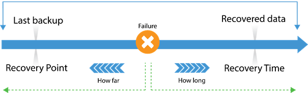
RPO limits how far to roll back in time, and defines the maximum allowable amount of lost data measured in time from a failure occurrence to the last valid backup. RTO is related to downtime and represents how long it takes to restore from the incident until normal operations are available to users
RPO RTO
-
-
www.brucebnews.com www.brucebnews.com
-
Before we get to passwords, surely you already have in mind that Google knows everything about you. It knows what websites you’ve visited, it knows where you’ve been in the real world thanks to Android and Google Maps, it knows who your friends are thanks to Google Photos. All of that information is readily available if you log in to your Google account. You already have good reason to treat the password for your Google account as if it’s a state secret.
-
-
-
Etilé, F., Johnston, D., Frijters, P., & Shields, M. (2020, April 16). Psychological Resilience to Major Socioeconomic Life Events. https://doi.org/10.31234/osf.io/vp48c
-
-
www.cnet.com www.cnet.com
-
Alas, you'll have to manually visit each site in turn and figure out how to actually delete your account. For help, turn to JustDelete.me, which provides direct links to the cancellation pages of hundreds of services.
-
-
panopticlick.eff.org panopticlick.eff.org
-
When you visit a website, you are allowing that site to access a lot of information about your computer's configuration. Combined, this information can create a kind of fingerprint — a signature that could be used to identify you and your computer. Some companies use this technology to try to identify individual computers.
-
-
www.teamviewer.com www.teamviewer.com
-
www.tomsguide.com www.tomsguide.com
-
security.googleblog.com security.googleblog.com
-
Our approach strikes a balance between privacy, computation overhead, and network latency. While single-party private information retrieval (PIR) and 1-out-of-N oblivious transfer solve some of our requirements, the communication overhead involved for a database of over 4 billion records is presently intractable. Alternatively, k-party PIR and hardware enclaves present efficient alternatives, but they require user trust in schemes that are not widely deployed yet in practice. For k-party PIR, there is a risk of collusion; for enclaves, there is a risk of hardware vulnerabilities and side-channels.
-
Privacy is at the heart of our design: Your usernames and passwords are incredibly sensitive. We designed Password Checkup with privacy-preserving technologies to never reveal this personal information to Google. We also designed Password Checkup to prevent an attacker from abusing Password Checkup to reveal unsafe usernames and passwords. Finally, all statistics reported by the extension are anonymous. These metrics include the number of lookups that surface an unsafe credential, whether an alert leads to a password change, and the web domain involved for improving site compatibility.
-