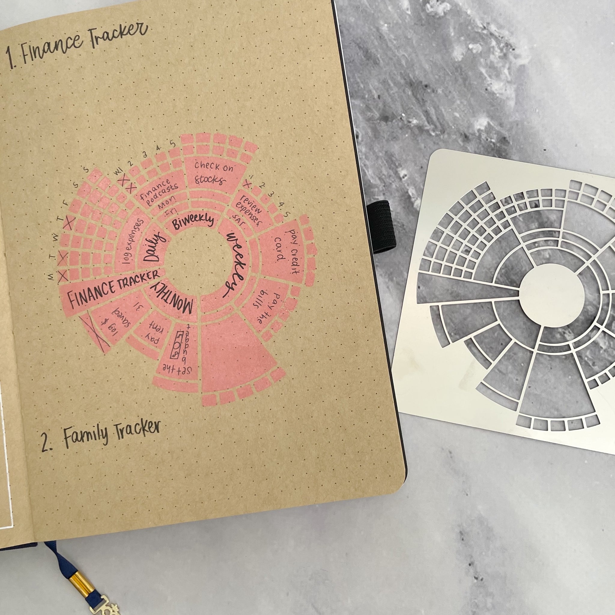
508 Matching Annotations
  1. Apr 2020
    1. There is a fundamental difference between these two kinds of content: the user comments are stored in our databases, which means their Markdown syntax can be normalized (e.g. by adding or removing whitespace, fixing the indentation, or inserting missing Markdown specifiers until they render properly). The Markdown documents stored in Git repositories, however, cannot be touched at all, as their contents are hashed as part of Git’s storage model.
    1. Did you expect the temp directory to get printed? In the last example, we saw the directories ./temp and ./C/temp got printed, but not now. This is the effect of the -print option. By default, the find command prints all the files matching the criteria. However, once the -print option is specified, it will print files only on explicit print instructions. In this find command, -print is associated in the other side of the OR condition, and hence nothing will get printed from the 1st part of the condition.
    1. One mistake that we made when creating the import/export experience for Blogger was relying on one HTTP transaction for an import or an export. HTTP connections become fragile when the size of the data that you're transferring becomes large. Any interruption in that connection voids the action and can lead to incomplete exports or missing data upon import. These are extremely frustrating scenarios for users and, unfortunately, much more prevalent for power users with lots of blog data.
    1. Thousands of enterprises around the world have done exhaustive security reviews of our user, network, and data center layers and confidently selected Zoom for complete deployment. 

      This doesn't really account for the fact that Zoom have committed some atrociously heinous acts, such as (and not limited to):

  2. Mar 2020
    1. For years, the most used solution was to add an ugly captcha to the form, with some hard to read letters, numbers etc on an image. The user had to type these in an input field. The spambots have a hard time reading these images: problem solved!But this solution is not very user-friendly: it’s ugly, and annoys users so much you might lose conversions.
  3. Feb 2020
    1. To add insult to injury I learn that when Cloudflare automatically detects an anomaly with your domain they permanently delete all DNS records. Mine won't be difficult to restore, but I'm not sure why this is necessary. Surely it would be possible for Cloudflare to mark a domain as disabled without irrevocably deleting it? Combined with the hacky audit log, I'm left with the opinion that for some reason Cloudflare decided to completely half-ass the part of their system that is responsible for deleting everything that matters to a user.

      ...and this is why some companies should not grow to become too big for the good of their customers.

  4. Jan 2020
  5. Dec 2019
  6. plaintext-productivity.net plaintext-productivity.net
    1. Avoiding complicated outlining or mind-mapping software saves a bunch of mouse clicks or dreaming up complicated visualizations (it helps if you are a linear thinker).

      Hmm. I'm not sure I agree with this thought/sentiment (though it's hard to tell since it's an incomplete sentence). I think visualizations and mind-mapping software might be an even better way to go, in terms of efficiency of editing (since they are specialized for the task), enjoyment of use, etc.

      The main thing text files have going for them is flexibility, portability, client-neutrality, the ability to get started right now without researching and evaluating a zillion competing GUI app alternatives.

    1. An ssh public key in a ~/.ssh/authorized_keys file can have a command="" option which forces a particular command to be executed when the key is used to authenticate an ssh connection. This is a security control that mitigates against private key compromise. This is great when you only need to execute a single command. But if you need to perform multiple tasks, you would normally need to create and install a separate key pair for each command, or just not bother making use of forced commands and allow the key to be used to execute any command.
    1. echo "from="${MYIP%% *}",no-port-forwarding,no-X11-forwarding,no-agent-forwarding,no-pty,command="rsync ${SSH_ORIGINAL_COMMAND#* }" $(ssh-keygen -yf ~/.ssh/rsync_rsa)" | ssh targetserver "cat - >>~/.ssh/authorized_keys" Note that the ‘command=’ restriction (http://larstobi.blogspot.ch/2011/01/restrict-ssh-access-to-one-command-but.html) will not apply if ‘/etc/sshd_config’ has already a ‘ForceCommand’ directive.
  7. Nov 2019
  8. Oct 2019
  9. Sep 2019
  10. Aug 2019
    1. "But in moving towards flat design we are losing much of the wisdom that was embedded in the old 3D style of UI, for example: a user must be able to glance at a screen and know what is an interactive element (e.g., a button or link) and what is not (e.g., a label or motto); a user must be able to tell at a glance what an interactive element does (does it initiate a process, link to another page, download a document, etc.?); the UI should be explorable, discoverable and self-explanatory. But many apps and websites, in the interest of a clean, spartan visual appearance, leave important UI controls hidden until the mouse hovers over just the right area or the app is in just the right state. This leaves the user in the dark, often frustrated and disempowered."
  11. Jul 2019
    1. Unfortunately, misguided views about usability still cause significant damage in today's world. In the 2000 U.S. elections, poor ballot design led thousands of voters in Palm Beach, Florida to vote for the wrong candidate, thus turning the tide of the entire presidential election. At the time, some observers made the ignorant claim that voters who could not understand the Palm Beach butterfly ballot were not bright enough to vote. I wonder if people who made such claims have never made the frustrating "mistake" of trying to pull open a door that requires pushing. Usability experts see this kind of problem as an error in the design of the door, rather than a problem with the person trying to leave the room.
  12. Apr 2019
    1. The primary benefit of this would be to make the Hudson River and Public Square park areas more easily accessible to everyone who lives and works east of Hudson Yards. Opening 10th avenue to street facing retail, turning the six lane street two-way, and adding bike lanes would also make it more forgiving.

      Concluding appeal and explanation of the author's call to action. Considering the lack of walkability and limited potential use, they suggest a new design that will maximize access. This also has the benefit of altering the public's sense of that the space is exclusive.

    2. The Javits Center is often used by urbanists as an example of the perils of inhumane design. The unused and un-policed periphery attracts crime and vagrancy while its one entrance opens upon an eight lane street. This combination means that most conference attendees hire a taxi to ferry them to a more hospitable neighborhood.

      This is an excellent example of creation without context, particularly use by target populations. Walkability was so poor that it negatively affected the area.

    3. The only way to reach the Public Square promenade from the street is to climb three flights of stairs onto the High Line, then cross a fairly narrow bridge connection. The street level features a large cafeteria, but like the 10th avenue perimeter, the sidewalks are so narrow and the road so heavily trafficked with vehicles that it is unlikely the street can thrive as a public space.

      Examples of why this space is not user-friendly and basically unwalkable. Those designing the space did not consider practicalities like access.

    4. But over time, they become numb to the novelty of art, and other considerations exert a far greater influence on their experience of the building: things like who uses the space, when the space is used, how the space forms community and how it integrates the the community that surrounds it.

      His argument is user-orientated, criticizing experts in the field who work separately to build components of a shared urban ecosystem. Each architect was chosen for their fame, not their ability to work as part of a team, and spare little consideration about those who will live, work, and move through the space. Most importantly, the question of fostering community is addressed.

      Similar to scholars at the top of their field, these architects place little consideration towards the mass consumption of their work and its context.

    5. Street front retail creates foot traffic in places that might otherwise be desolate and inhospitable during different parts of the day. A diversity of land uses is key in cultivating walkability. For example, New York’s financial district is generally a ghost town after office hours because it lacks residential buildings. Adjacent Battery Park City has the opposite problem; it is so domestic that its streets are empty except during commuting hours.

      Cites two examples of spaces in the city that fail to maximize walkability and reduces user satisfaction/use. Users require mixed-use spaces that promote diverse populations, keeping them from becoming too exclusive and barren during the off hours.

  13. Feb 2019
  14. Jan 2019
  15. www.at-the-intersection.com www.at-the-intersection.com
  16. Nov 2018
    1. Mobile Based User-Centered Learning Environment for Adult Absolute Illiterates

      This study reviewed the education of absolute illiterates globally. It was based on the creation of game-based learning (GBL) which provides a user-friendly learning platform with little cost and little intimidation for the learner. The research also identified 60% of the world's illiterate population residing in rural areas with little access to computers and educational centers. The GBL environments created real world environments that allow learners to practice real-life scenarios in familiar surroundings using 3-D technology. The study also adapted a English language program to meet the needs of various languages. The context of the game is a farmer and a wife then acquire items and count them in their native language. The numbers used in counting are spoken and the game produces the correlating number so the learner becomes familiar with the written form of the letter. In conclusion, the participants identified that the mobile learning was more beneficial than PC applications due to unreliable electrical service at home. The mobile system was also available on demand.and applied to participants real-life usage.

      RATING: 10/10

  17. Oct 2018
  18. cloud.degrowth.net cloud.degrowth.net
  19. Aug 2018
    1. Sen. Mark Warner of Virginia told the AP it is “frustratingly common” for technology companies “to have corporate practices that diverge wildly from the totally reasonable expectations of their users,” and urged policies that would give users more control of their data. Rep. Frank Pallone of New Jersey called for “comprehensive consumer privacy and data security legislation” in the wake of the AP report.
    1. Design is inherently political, but it is not inherently good. With few exceptions, the motivations of a design project are constrained by the encompassing platform or system first, and the experiences and values of its designers second. The result is designers working in a user hostile world, where even seemingly harmless platforms or features are exploited for state or interpersonal surveillance and violence.As people living in societies, we cannot be separated from our political contexts. However, design practitioners research and implement systems based on a process of abstracting their audience through user stories. A user story is “a very high-level definition of a requirement, containing just enough information so that the developers can produce a reasonable estimate of the effort to implement it23.” In most cases, user are grouped through shared financial or biographical data, by their chosen devices, or by their technical or cognitive abilities.When designing for the digital world, user stories ultimately determine what is or is not an acceptable area of human variation. The practice empowers designers and engineers to communicate via a common problem-focused language. But practicing design that views users through a politically-naive lens leaves practitioners blind to the potential weaponisation of their design. User-storied design abstracts an individual user from a person of lived experience to a collection of designer-defined generalisations. In this approach, their political and interpersonal experiences are also generalised or discarded, creating a shaky foundation that allows for assumptions to form from the biases of the design team. This is at odds with the personal lived experience of each user, and the complex interpersonal interactions that occur within a designed digital platform.When a design transitions from theoretical to tangible, individual user problems and motivations become part of a larger interpersonal and highly political human network, affecting communities in ways that we do not yet fully understand. In Infrastructural Games and Societal Play, Eleanor Saitta writes of the rolling anticipated and unanticipated consequences of systems design: “All intentionally-created systems have a set of things the designers consider part of the scope of what the system manages, but any nontrivial system has a broader set of impacts. Often, emergence takes the form of externalities — changes that impact people or domains beyond the designed scope of the system^24.” These are no doubt challenges in an empathetically designed system, but in the context of design homogeny, these problems cascade.In a talk entitled From User Focus to Participation Design, Andie Nordgren advocates for how participatory design is a step to developing empathy for users:“If we can’t get beyond ourselves and our [platforms] – even if we are thinking about the users – it’s hard to transfer our focus to where we actually need to be when designing for participation which is with the people in relation to each other25.”Through inclusion, participatory design extends a design team’s focus beyond the hypothetical or ideal user, considering the interactions between users and other stakeholders over user stories. When implemented with the aim of engaging a diverse range of users during a project, participatory design becomes more political by forcing teams to address weaponised design opportunities during all stages of the process.
  20. Jul 2018
    1. For now, the Solid technology is still new and not ready for the masses. But the vision, if it works, could radically change the existing power dynamics of the Web. The system aims to give users a platform by which they can control access to the data and content they generate on the Web. This way, users can choose how that data gets used rather than, say, Facebook and Google doing with it as they please. Solid’s code and technology is open to all—anyone with access to the Internet can come into its chat room and start coding.
  21. Dec 2017
    1. A mental map (or cognitive map) is our mental representation of a place. It includes features we consider important, and is likely to exclude features we consider unimportant.

      (Urban planner Kevin Lynch, early 1960s)<br> Elements of mental maps

      • paths
      • edges - boundaries and endings
      • nodes - focal points like squares and junctions
      • districts
      • landmarks

      Modern maps could use augmented and virtual reality to help clarify those elements, making a place easier to navigate and use. But they can also add useless noise that makes the place seem more confusing than it actually is.

  22. Oct 2017
  23. Sep 2017
    1. For a technology to evolve in accordance with users’ needs, aiding social and economic development, the focus must move beyond mere adoption. When users appropriate technology and make it their own, new uses and innovations emerge. The appropriation process is a contest for control over a technological system’s configuration, as users, designers, and manufacturers battle over who can use that technology, at what cost, under what conditions, for what purpose, and with what consequences. This confrontation, we argue, constitutes a powerful innovation mechanism.

      La adopción y la apropiación están muy cercanas en los metasistemas como Pharo/Smalltalk, pues que un usuario use una herramienta suele estar muy cercano a la idea de que esté en condiciones de modificarla.

      Para el caso de Grafoscopio, la comunidad de práctica avanza, con miembros relativamente constantes entre edición y edición del Data Week y las Data Rodas y progresivamente miramos cómo modificar la herramienta. Aún así, no hay usos cotidianos de la misma (adopción) y la modificación (apropiación) aún es muy lenta. Sin embargo, el potencial de la herramienta para adaptarse a la comunidad y sus problemas, ha sido mayor que el de otras que se probaron.

  24. May 2017
    1. Neither Apple nor Microsoft really captured the essence of what made the Smalltalk system powerful. They used it as a model to make computers more accessible, but they left out the aspect of letting people bend the system to their will, to customize it to be just what they want. Their systems were really an object-oriented facade over a traditional, non-object-oriented system. They lacked a consistent metaphore of everything being an object. The web has been even more stultifying in this regard (I mean the web interface), though Firefox has helped some, so I hear, with the concept of browser extensions.
  25. Mar 2017
    1. Jessica Helfand in her essay The Dematerialism of Screen Space (2001) critiques the phenomenon of design practise being led by developments in software engineering. She argues that designers should take the initiative: “design must submit to a series of commands and regulations as rigourous as those that once defined Swiss typography. Aesthetic innovation, if it indeed exists at all, occurs within ridiculously preordained parameters: a new plug-in, a modified code, the capacity to make picture and words ‘flash’ with a mouse in a non-sensical little dance. We are all little filmmakers, directing on a pathetically small screen – yet broadcasting to a potentially infinite audience. This in itself is conflicting (not to mention corrupting), but more importantly, what are we making? What are we inventing? What are we saying that has not been said before?” Helfand here is referring to the web, but her argument applies equally well to designing tablet publications. Designers of book and magazine apps should be asking themselves those last three questions. Since tablet publishing conventions are in the process of being formed (like child invention), we have a unique opportunity right now to influence their direction.
    2. Some key themes arise from the two NNG reports on iPad usability: App designers should ensure perceived affordances / discoverability There is a lack of consistency between apps, lots of ‘wacky’ interaction methods. Designers should draw upon existing conventions (either OS or web) or users won’t know what to do. These are practical interaction design observations, but from a particular perspective, that of perceptual psychology. These conclusions are arrived at through a linear, rather than lateral process. By giving weight to building upon existing convention, because they are familiar to the user, there is a danger that genuinely new ideas (and the kind of ambition called for by Victor Bret) within tablet design will be suppressed. Kay’s vision of the Dynabook came from lateral thinking, and thinking about how children learn. Shouldn’t the items that we design for this device be generated in the same way?

      The idea of lateral thinking here is the key one. Can informatics be designed by nurturing lateral thinking? That seems related with the Jonas flopology

    3. The document argues that the use of illusionary surfaces and objects will lead to a more intuitive and pleasurable experience for the user. It also, yet again, looks to prior conventions for solutions rather than starting afresh.
  26. Nov 2016
    1. Every theorem of mathematics, every significant result of science, is a challenge to our imagination as interface designers. Can we find ways of expressing these principles in an interface? What new objects and new operations does a principle suggest? What a priori surprising relationship between those objects and operations are revealed by the principle? Can we find interfaces which vividly reveal those relationships, preferably in a way that is unique to the phenomenon being studied?
    2. Speech, writing, math notation, various kinds of graphs, and musical notation are all examples of cognitive technologies. They are tools that help us think, and they can become part of the way we think -- and change the way we think.

      Computer interfaces can be cognitive technologies. To whatever degree an interface reflects a set of ideas or methods of working, mastering the interface provides mastery of those ideas or methods.

      Experts often have ways of thinking that they rarely share with others, for various reasons. Sometimes they aren't fully aware of their thought processes. The thoughts may be difficult to convey in speech or print. The thoughts may seem sloppy compared to traditional formal explanations.

      These thought processes often involve:

      • minimal canonical examples - simple models
      • heuristics for rapid reasoning about what might work

      Nielsen considers turning such thought processes into (computer) interfaces. "Every theorem of mathematics, every significant result of science, is a challenge to our imagination as interface designers. Can we find ways of expressing these principles in an interface? What new objects and operations does a principle suggest?"

  27. Jul 2016
  28. Apr 2016
  29. Feb 2016
    1. Content organization refers to features that require little effort from the user and that help fellow users receive useful information about the content. These features include the “like” button and options such as ratings (star ratings or a numerical scale) or tagging content with user-suggested keywords.

      Hypothes.is lacks this first step in the ladder. We don't have a like button. Tagging doesn't seem as easy as it could be.

      Maybe when we rethink page level notes, we might prioritize calling user to action there: tag the text; maybe offer a broad statement/description.

    1. Polldaddy for iOS was a great option for this type of assessment. The layout and design are optimized for the iPad’s screen, and survey results are loaded offline. Be-cause an Internet connection is not required to administer a survey, the researcher has more flexibility in location of survey administration.

      Polldaddy did not require wireless internet access, making it a more flexible survey-software option

    2. A two-question survey was designed to pilot the iPadas a survey delivery device in GSU Library. The first survey question was ―Why did you come to the library today? Please choose the primary reason.‖ Ten response options were listed in alphabetical order, and survey takers were allowed to select one option. The tenth response option was ―other,‖ with a text field in which survey takers could enter their own explanations. This question was included because the library is extremely busy, with an average daily door count of 10,000 during a typical semester. The door count data show heavy use of the building, but the library has little means of finding out what visitors do while they are in the buildings. The second survey question was ―What is your major?,‖ which was an open-text field.

      Georgia State Library test-survey (two questions).

    3. Over the past few years, the market research literature has reflected a concern about the quality of face-to-face market research as compared to online surveys and polls. Manfreda, Bosnjak, Berzelak, Haas, and Vehovar (2008) analyzed other studies that compared response rates from Web-based surveys to response rates of at least one other survey delivery method. Web survey responses were, on average, eleven percent lower than the other methods investigated. In their study of face-to-face survey responses as compared to online survey responses, Heerwegh and Looseveldt (2008) concluded that responses to Web surveys were of poorer quality and, overall, less suffi-cient than responses to surveys conducted face-to-face.

      face-to-face surveying produces greater results than web-based surveys.

    1. n Saul Carliner’s LessonsLearned from Museum Exhibit Design, exhibit design is broken into three main stages(2003). The “idea generator,” “exhibit designer, and “idea implementer,”leads each phase respectively (Carliner, 2003). The idea generator determines the main concepts or themes and chooses the content of the exhibit. Then, the exhibit designer takes the concept to prepare physical designs for the new gallery, creating display cases and deciding wall and floor coverings for the overall ambiance. Lastly, the idea implementer brings together everything to create the exhibit. The implementer collects any missing pieces for the gallery, ensures conservation of displayed pieces, and oversees all parts of the assembly(Carliner, 2003)

      Types of museum visitors outlined: idea generators, exhibit designers, idea implementers. Next paragraph introduces that an aspect of exhibit design missing is 'audience targeting' - reaching out to a specific clientele intentionally with an exhibition's design.

  30. Jan 2016
  31. Dec 2015
    1. Users publish coursework, build portfolios or tinker with personal projects, for example.

      Useful examples. Could imagine something like Wikity, FedWiki, or other forms of content federation to work through this in a much-needed upgrade from the “Personal Home Pages” of the early Web. Do see some connections to Sandstorm and the new WordPress interface (which, despite being targeted at WordPress.com users, also works on self-hosted WordPress installs). Some of it could also be about the longstanding dream of “keeping our content” in social media. Yes, as in the reverse from Facebook. Multiple solutions exist to do exports and backups. But it can be so much more than that and it’s so much more important in educational contexts.

  32. Nov 2015
    1. There is a lot of evidence that quite subtle changes to user interfaces can have dramatic effects on how the interfaces are used. For example, the size of a search box or the text that accompanies it can considerably influence the queries that people submit.

      -- David Elsweller

    2. The whole gendered usage of hearts seems to have escaped Twitter. So does the fact that people fave (with stars) in complex ways - they are bookmarks, they are likes, they are nods of the head. But they are not indicators of love. I feel very weird loving tweets by random men I've only just started a conversation with. Not that there's anything wrong with feminine. But women - and men, in their own ways - are well-aware of how feminized visual signals get read by others, and in an identity space like Twitter, I suspect that will really minimize usage. Or at least until we all get used to it.

      -- Bonnie Stewart

  33. Jul 2015
    1. The on-line annotations were also more likely to be anchored in complete sentences.

      This seems odd. Maybe the interface in some way pushed them toward this? For instance, I sometimes think the way that Hypothesis shows the quote in the annotation card severs it from its context in such a way as to make it seem out of place when highlighting just that portion seemed fine inline.

  34. Mar 2015
    1. Although people weren’t used to scrolling in the mid-nineties, nowadays it’s absolutely natural to scroll. For a continuous and lengthy content, like an article or a tutorial, scrolling provides even better usability than slicing up the text to several separate screens or pages.
  35. Jan 2015
  36. Dec 2014
    1. Trying to embed something in here from the atlantic article

      <iframe width="640" height="360" frameborder="0" webkitallowfullscreen="webkitallowfullscreen" allowfullscreen="allowfullscreen" mozallowfullscreen="mozallowfullscreen" src="&lt;a href=" http:="" <a="" href="http://www.theatlantic.com" target="_blank" rel="nofollow noopener">www.theatlantic.com="" video="" iframe="" 384088="" "="" target="_blank" rel="nofollow noopener">http://www.theatlantic.com/video/iframe/384088/"></iframe> OK, that didn't work. How about a YouTube vid? <iframe width="640" height="360" src="//&lt;a href=" http:="" <a="" href="http://www.youtube.com" target="_blank" rel="nofollow noopener">www.youtube.com="" embed="" VX07m-wahOg"="" target="_blank" rel="nofollow noopener">www.youtube.com/embed/VX07m-wahOg" frameborder="0" allowfullscreen=""></iframe> OK, not embeds work so far. Not even images. Inserting images using the image url just gives you a link. Was hoping for the actual image.

  37. Nov 2014