- Dec 2024
-
www.howtomakesenseofanymess.com www.howtomakesenseofanymess.com
Tags
Annotators
URL
-
-
www.writethedocs.org www.writethedocs.org
-
Should we optimize for searching or browsing?¶ Documentarians may have to determine whether users search or browse for content of interest. What you decide may influence how to focus your resources: SEO and search tools or navigation aids. The resolution to this may depend on your users and what they’re looking for… and also your product interface. Some users, those who frequently search online for content, may prefer to search through your documentation (for example, spending 70% of their time on search and 30% navigation). Other users may prefer to use your site’s navigation system (for example, 30% search and 70% navigation). Nonetheless, some documentarians assume that searching is the primary method that all users rely on. Some indicate that it’s important to have both methods available for the users to select what they want to do. Information architecture (IA) helps a docs team to develop content in a structured and comprehensive manner. A navigation methodology can implement the IA of the documentation system. So, if your team has developed a structure for the content, you can use it as a navigation device for your readers. As one person indicated: No documentation should be random pages of text. Readers use the structure to learn relationships between different features, use cases, or topics. Searching and browsing are complementary actions. The method used by any one person may depend on different factors and users may use both. Offer the best of both to satisfy your readers. Search-related resources Search platform tips for documentation websites (WTD Newsleter) Making documentation discoverable in search engines (WTD video) Search engine optimization (SEO) for documentation (WTD page) Information Foraging (Nielsen Norman Group) Navigation- and IA-related resources Many articles available from Nielsen Norman Group Building navigation for your doc site: 5 best practices (WTD video) Complete Beginner’s Guide to Information Architecture (UX Booth) How To Make Sense of Any Mess (book by Abby Covert)
-
- Jul 2024
-
docdrop.org docdrop.org
-
Résumé de la vidéo [00:00:10][^1^][1] - [00:24:31][^2^][2] : Cette vidéo présente une session des Jeudis de l'expérience usagers, où Stéphanie Metou de l'ASP (Agence de Service et de Paiement) explique comment sensibiliser à l'expérience utilisateur par le jeu. Elle introduit le concept d'andragogie et la gamification, détaille la création d'un jeu de cartes éducatif et partage des témoignages sur son efficacité.
Points forts : + [00:00:10][^3^][3] Introduction à l'expérience utilisateur * Présentation des Jeudis de l'expérience usagers * Objectif de sensibiliser à l'expérience utilisateur par le jeu + [00:01:04][^4^][4] Stéphanie Metou et l'ASP * Introduction de Stéphanie Metou et de son rôle à l'ASP * Explication des missions de l'ASP et de son importance + [00:07:05][^5^][5] Création du jeu de cartes * Processus de création d'un jeu de cartes pour apprendre le lexique de l'expérience utilisateur * Utilisation de l'andragogie et de la gamification pour l'éducation des adultes + [00:20:35][^6^][6] Témoignages et impact du jeu * Partage de témoignages sur l'utilisation du jeu * Impact positif sur l'apprentissage et la communication interne
Résumé de la vidéo [00:24:33][^1^][1] - [00:39:27][^2^][2]:
Cette vidéo présente une session des Jeudis de l'expérience usagers, axée sur la sensibilisation à l'expérience utilisateur par le jeu. Elle explique comment un jeu de cartes peut être utilisé pour faciliter l'apprentissage et encourager la communication et la collaboration au sein des équipes.
Points forts: + [00:24:33][^3^][3] L'apprentissage par le jeu * Favorise les échanges et la coopération * Sert d'outil d'accompagnement au changement * Aide à l'acquisition de compétences + [00:25:01][^4^][4] Le jeu comme reflet du parcours utilisateur * Représente les cinq étapes du parcours utilisateur * Intègre le lexique de l'expérience utilisateur * Encourage la communication et la collaboration + [00:27:10][^5^][5] L'andragogie par le jeu * A fait ses preuves dans la formation * Constitue un support précieux pour l'accompagnement au changement * Permet de réfléchir à d'autres modalités de formation ludiques + [00:31:03][^6^][6] La conception du jeu * Basée sur le besoin d'un langage commun * Implique différentes équipes dans sa création * Vise à rendre les agents acteurs de leur apprentissage
-
-
docdrop.org docdrop.org
-
Points forts de la vidéo "Design de services publics : partir du vécu des usagers et des agents pour transformer" avec timestamps
Voici les points forts de la vidéo "Design de services publics : partir du vécu des usagers et des agents pour transformer" avec timestamps :
Introduction (00:00 - 05:22)
- Présentation du thème : le design de services publics et son importance pour améliorer l'action publique.
- Le design comme approche concrète et opérationnelle pour transformer les services publics.
- Nécessité d'une approche fondée sur l'empathie et la compréhension du vécu des usagers.
- Différence entre l'approche traditionnelle descendante et la nouvelle approche centrée sur l'usager.
- Rôle des sciences comportementales et de l'intelligence collective dans la transformation publique.
Le design de service public en pratique (05:22 - 25:22)
- Définition du design de service public : écouter les besoins, imaginer les solutions et tester.
- Immersion sur le terrain pour comprendre les besoins réels des usagers.
- Utilisation de méthodes participatives pour co-construire des solutions avec les acteurs concernés.
- Importance de l'expérimentation et de l'itération pour améliorer continuellement les services.
- Exemple d'un projet de design de service public pour un nouveau vélo de ville.
Collaboration et co-construction (25:22 - 40:22)
- Importance de la collaboration entre les différents acteurs impliqués dans la conception et la mise en œuvre des services publics.
- Rôle des "personnas" pour représenter les différents types d'usagers et leurs besoins.
- Utilisation de la cartographie des parcours utilisateurs pour identifier les points de friction et les opportunités d'amélioration.
- Exemple d'un projet de design de service public pour les femmes victimes de violences conjugales.
Compétences et attractivité du métier de designer de service public (40:22 - 55:22)
- Qualités essentielles d'un designer de service public : curiosité d'esprit, empathie, créativité et compétences techniques.
- Importance de la prise en compte des spécificités territoriales dans la conception des services publics.
- Rôle des laboratoires d'innovation publique pour développer et diffuser les bonnes pratiques en matière de design de service public.
Conclusion (55:22 - 1:25:57)
- Bilan des points clés abordés lors de l'atelier.
- Importance du design de service public pour améliorer la vie des citoyens et des agents publics.
- Invitation à suivre les prochains ateliers sur la transformation publique.
Remarques
- La vidéo met l'accent sur l'importance de l'empathie, de la collaboration et de l'expérimentation dans le processus de design de service public.
- Les intervenants soulignent le rôle crucial des "personnas" et de la cartographie des parcours utilisateurs pour comprendre les besoins des usagers.
- Le design de service public est présenté comme une approche prometteuse pour améliorer l'efficacité et la qualité des services publics.
-
-
docdrop.org docdrop.org
-
Points forts de la vidéo "Jeudis de l'expérience usagers : améliorer les écrits administratifs" avec timestamps
Voici les points forts de la vidéo "Jeudis de l'expérience usagers : améliorer les écrits administratifs" avec des timestamps correspondant à des moments précis de la vidéo :
00:00 - 05:00 : Introduction et contexte
- Présentation des Jeudis de l'expérience usager, un rendez-vous mensuel pour partager des expériences et des témoignages d'experts sur l'expérience usager.
- Thématique du jour : le langage clair dans les écrits administratifs.
- Présentation des intervenants : Éveline Fleuret et Julie Portalis de l'URSSAF, et Sandra Pernet de la DG FIP.
05:00 - 12:00 : L'URSSAF et ses enjeux de communication écrite
- L'URSSAF assure le financement de la protection sociale en France.
- Elle envoie 125 millions de correspondances par an, dont 85 % sont dématérialisées.
- La satisfaction des usagers pour les courriers est de 43%, ce qui est jugé insuffisant.
- L'URSSAF a mis en place une ligne éditoriale et des processus pour améliorer la clarté et la personnalisation de ses écrits.
12:00 - 25:00 : La démarche de refonte des courriers de l'URSSAF
- Création d'un guide pratique "Cosi" pour harmoniser les écrits administratifs.
- Mise en place d'un processus de réécriture des courriers avec l'aide d'une équipe dédiée.
- Utilisation d'outils de mesure de la satisfaction des usagers.
25:00 - 32:00 : Difficultés et perspectives d'amélioration
- Difficulté d'adapter les écrits à la diversité des usagers.
- Importance de la personnalisation et de la clarté du langage.
- Utilisation de l'intelligence artificielle pour simplifier la rédaction des courriers.
32:00 - 35:00 : Conclusion et perspectives
- Remerciements aux intervenants et au public.
- Invitation à participer aux prochains webinaires de la DTP sur le plan téléphone et le langage clair.
- Engagement du programme Service-Public+ pour simplifier le langage administratif.
Points forts de la vidéo Jeudis de l'expérience usagers : améliorer les écrits administratifs avec timestamps de 0h35min à 1h06min
Voici les points forts de la vidéo Jeudis de l'expérience usagers : améliorer les écrits administratifs avec timestamps de 0h35min à 1h06min :
0h35min - 0h45min : Présentation de l'URSAF et de ses enjeux
- L'URSAF assure le financement de la protection sociale en France.
- Elle envoie 125 millions de correspondances par an, dont 85 % sont dématérialisées.
- La satisfaction des usagers pour les courriers papiers est de 43%.
- L'objectif de l'URSAF est d'améliorer la clarté et la personnalisation de ses écrits.
0h45min - 1h00min : La ligne éditoriale de l'URSAF pour les écrits administratifs
- L'URSAF a défini une ligne éditoriale pour ses écrits administratifs, basée sur les principes de responsabilité, de solidarité, de proximité et de proactivité.
- Cette ligne éditoriale est déclinée dans des guides pratiques et des modèles de courriers.
- Un comité d'experts accompagne les directions métiers de l'URSAF dans la rédaction de leurs courriers.
1h00min - 1h06min : Mesurer et améliorer la satisfaction des usagers
- L'URSAF mesure la satisfaction des usagers par le biais d'enquêtes annuelles.
- Elle a mis en place un processus d'amélioration continue pour ses écrits administratifs.
- Ce processus inclut la collecte des retours des usagers, l'analyse des données et la mise en œuvre d'actions correctives.
1h06min - Conclusion
- L'amélioration des écrits administratifs est un enjeu majeur pour l'URSAF.
- La ligne éditoriale et le processus d'amélioration continue mis en place par l'URSAF sont des exemples concrets de son engagement à simplifier la communication avec ses usagers.
-
- Jun 2024
-
docdrop.org docdrop.org
-
tous les passagers dépourvus de Navigo doivent ici s'acquitter d'un billet à 10,30 € contrairement à toutes les nouvelles 00:02:13 stations de la 14 du coup nous on a eu une petite surprise on est arrivé donc on avait notre ticket de métro mais donc apparemment ça suffisait pas du coup pour passer les grilles donc là on va devoir payer un supplément donc de 10,30 00:02:26 € ça aurait été mieux en fait directement de prévenir déjà ce qu'on savait pas éviter sur la cul une deuxième fois pour reprendre un autre ticket c'est dommage qu' personne pour aider pour que ça aille plus vite quoi qu' a pas une telle queue on est un peu 00:02:36 abandonné là on se les bouill c'est ch c'est 40 € on comprend rien donc pas quoi faire il y a pas d'autre choix de toute façon c'est vraiment triste 43 € 43 € pour qu personnes oui c'est pas 00:02:49 très bien expliqué c'est une ligne de métro normale et on arrive au bout et là on charge 10 € de plus par personne pour rentrer avoir su encore une fois j'aurais pris un U relier
-
- Apr 2024
-
-
UX design for kids
-
-
www.ramotion.com www.ramotion.com
-
Children's needs are increasingly recognized in the UI/UX design industry. Important sectors – education, gaming, and healthcare – are now seeking designers specializing in creating interactive solutions for children.
THIS IS DRAGONS DEN GOLD - if I can make a good application I can get more work which I need because I am not rich and want lego.
-
What are some of the best practices for kids’ UX design?
-
What are some top UX design principles when designing for kids?Some important UX design principles when designing for kids are as follows. Simplicity and clarity Interactive and engaging elements Age-appropriate content Safety and privacy Consistent feedback and rewards
There's 5 in this list and there was 4 in the other - I think Safety and Privacy is the one additional but it's also in my proposal because I am concerned about it too.
-
What are the unique UX needs of children?Four critical areas must be considered when designing products and services for children. Cognitive abilities Motor skills Attention span Emotional responses
Oh awesome can I CITE this? It an online Blog okay because this is great.
-
UI/UX designers
-
What is child-centric design in UI/UX?Child-centric design in UI/UX focuses on understanding and meeting the needs of children as the target audience. This approach prioritizes the needs of children, treating them as expert users and targeting their specific concerns as they interact with a product or service.
Child-Centric UX Design
-
What are some top sectors where designing for kids is essential?The following sectors need UX designs for kids. Educational apps
UX design for kids is essential.
Tags
- voice
- safety
- rewards
- responsible UX design
- data
- Child-Centric UX Design
- engaging elements
- vibrant colours
- parental control
- interactive solutions
- clarity
- UX design
- simplicity
- UX design for children
- animations
- UI design
- privacy and data protection
- consistent feedback
- simple
- compelling design
- age appropriate
- sound feedback
- feedback
- Child-centric design
- avoid clutter
- attention span
- interactive
- motor skills
- emotional response
- engaging
- Critical UX preferences for kids
- colours
- avoid distractions
- cognitive ability
Annotators
URL
-
-
bootcamp.uxdesign.cc bootcamp.uxdesign.cc
-
Mobile and tablet apps have become an indispensable part of growing up. As a parent myself, I’ve witnessed firsthand the incredible impact these apps can have on early childhood development.
For a user profile this could be very useful.
-
-
www.nngroup.com www.nngroup.com
-
4.3 Locate primary navigation in a highly noticeable place.
-
- Mar 2024
-
www.ramotion.com www.ramotion.com
-
What are some critical UX preferences for kids?Some necessary UX preferences for kids are as follows. Need for intuitive design Desire for engaging content Importance of feedback
I am still trying to figure out my feedback system...
-
We also list some best practices and design principles to ensure better quality designs for children of different ages.
The ages thing I needed
-
-
mutabit.com mutabit.com
-
Por un lado, este enfoque tiene un potencial real para escapar de la reproducción de categorías sociales existentes como variables que se utilizan para dar forma a la experiencia; puede desestabilizar las categorías sociales existentes y reemplazarlas con una experiencia de usuario (UX) y una personalización de la UI verdaderamente personalizadas y basadas en el comportamiento. Sin embargo, en la práctica, este enfoque también conduce a la reproducción y cosificación de categorías sociales existentes a través de la vigilancia algorítmica, el seguimiento de los usuarios en todos los sitios, la recopilación y venta de sus datos y el desarrollo de burbujas de filtro (que muestran a los usuarios únicamente el contenido con el que creemos que se sienten cómodos). ).
¿cuáles son experiencias de usuario vs categorías sociales existentes?
-
- Dec 2023
-
-
Fifteen months into the regulatory review process, Figma and Adobe no longer see a path toward regulatory approval of our proposed acquisition.Figma and Adobe have reached a joint decision to end our pending acquisition. It’s not the outcome we had hoped for, but despite thousands of hours spent with regulators around the world detailing differences between our businesses, our products, and the markets we serve, we no longer see a path toward regulatory approval of the deal.
https://penpot.app/
https://community.penpot.app/t/export-figma-to-penpot/1684
-
- Nov 2023
-
meyerweb.com meyerweb.com
-
I don't particularly recommend that you just use this in its unaltered state in your own projects. It should be tweaked, edited, extended, and otherwise tuned to match your specific reset baseline.
Aún cuando se trata de un reseteo completo de estilo CSS, proponentes de este método como es the Meyer's Reset recomiendan sobreescribir partes del reseteo con las preferencias personales del diseñador. Esto quiere decir que un reseteo no debe ser un reseteo en blanco, sino un reseteo hacia el estándar o base que el diseñador prefiera.
Tags
Annotators
URL
-
-
www.theodinproject.com www.theodinproject.com
-
To counter this, many developers start their projects with a “CSS Reset”; a file that undoes browser defaults, so that every element behaves the same in every browser.
Para lidear de manera fulminante con las diferencias entre los navegadores con respecto al estilo, los diseñadores aplican un CSS Reset, lo cual elimina cualquier personalización que esté por defecto. Esta solución es radical y no estrictamente necesaria, ya que el diseñador tendra que reescribir muchas de las configuraciones que han sido borradas.
-
The problem with this is that there is no guarantee that different browsers will style everything the same. In general, inconsistencies are going to be pretty minor, but they DO exist.
Aunque existen diversas similitudes, todos los navegadores tienen defaults distintos respecto del CSS de los principales elementos HTML. Esto es algo a tener en cuenta al momento de tratar de dar una experiencia uniforme al usuario porque vas a tener que sobreescribir las diferencias entre navegadores y establecer tu propio estándar.
-
-
pencilandpaper.io pencilandpaper.io
-
Hay una serie de buenas prácticas en la fabricación de tablas que permiten una interacción más eficiente entre el usuario y la data que se busca comunicar. Una buena experiencia entre el usuario y las tablas dentro de una página web dependen en suma del diseño establecido. La fabricación de buenas tablas en la web solo requieren de conocimientos de HTML y CSS.
-
-
gitlab.com gitlab.com
-
It was an intentional decision to make the items in the dropdown of content editor span two lines instead of one. The reason being that sometimes the text can get too long and the dropdown spans the entire width of page which isn't ideal. Also, a slimmer dropdown looks better on mobile devices.
Tags
Annotators
URL
-
- Oct 2023
-
-
While helpful at times, these distinctions fail to acknowledge that the quality of the internal tooling and even the technical infrastructure can profoundly impact your customers. The tools you build for your colleagues affect the customer experience and their relationship with your company and its products.
I wish more companies understood this, especially the part about technical infrastructure. Stability is customer-facing!
-
- Sep 2023
-
help.mailgun.com help.mailgun.com
-
However, if the previous user was also the Account Owner, the previous user will need to promote a different user to the Account Owner role. After that, the previous user can finally be deleted.
-
- Jul 2023
-
www.linkedin.com www.linkedin.comLinkedIn1
-
Steve Jobs said it beautifully: "Design is a funny word. Some people think design means how it looks. But of course, if you dig deeper, it’s really how it works."I’ll say it another way: Design is the act of intentionally trying to influence an outcome.Design is a means of controlling our destiny. Design is a way to reject a status quo we dislike. Design is how we don’t turn into the "this is fine" dogDesign is what we humans have been doing since the dawn of our existence because we were blessed with oh-so-large brains housing that marvelous prefrontal cortex which gave us the ability to plan.Our hunter-gatherer ancestor was designing when she decided to plant seeds to prevent future hunger. Admiral Nelson was designing when he issued a surprise flank formation to overcome a navy twice his size. Taylor Swift was designing when she brushed her hand casually across his and masterminded that last relationship.Design is a sword against chaos. Design is the pixie dust for innovation. Design is the foundation for the pursuit of happiness.
-
- Jun 2023
-
www.codecademy.com www.codecademy.com
-
ingle team can’t develop every possible solution to a given problem.
This is an extremely important concept, no one team can create every solution possible most time workers do what works despite what would, in theory work better. Developing a new work flow involves a series of tests and a change in boundaries that might be risky for the company at large. But no one team knows every solution and multiple teams coming at a problem is good.
-
wide variety of methods for any given project.
Having a variety of methods to get to a solution is exteremely important as a lot of people can come at a problem with different angles and solve it differently. However, this can breed confusion as to which way is the "right" way and which way is the "wrong way" It also may seem like their way might not work but we should do a though examination from their side to see why they think it might work and maybe square that up with the harsh reality.
-
between
yeah
-
-
www.nngroup.com www.nngroup.com
-
I want to point out that it’s disappointingly rare for UX studies to assess the quality of the work produced with the tool that’s being studied. Output is, after all, the goal of much computer use, and the quality of this output is an essential element in judging the user interface.
Agreed, much of user testing focuses on the experience of the user when using the tool and depends upon users speaking to voluntarily making the quality of output part of their evaluation of the tool.
A possible counter: UX research professionals are not subject matter experts in the work deliverables generated in using the tool and not equipped to assess the quality of those deliverables. But that doesn't address the need the author calls out. Solving this will depend on the domain in which the tool is used and connecting with SMEs that can evaluate output in that domain.
In educational technology, we measure the quality of output by measuring the growth in students' mastery against state standards as they use the tool. This is why reporting has become the key feature for EdTech products.
-
-
-
Even most of the emergent gestures in our interfaces are tweaks on tech-first features—@ symbols push Twitter to implement threading, hyperlinks eventually get automated into retweets, quote-tweets go on TikTok and become duets. “Swipe left to discard a person” is one of a handful of new gestures, and it’s ten years old.
Author discusses specific socially oriented interface functions (left/right swiping, @-mentions) that are few and old. There's also the personal notes on new connections in Xing and LinkedIn (later), imo. And the groupings/circles in various platforms. Wrt social, adding qualitative descriptions to a connection to be able to do pattern detection e.g. would be interesting, as is moving beyond just hub with spokes (me and my connections) and allowing me to add connections I see between people I'm connected to. All non-public though, making it unlikely for socmed. Vgl [[Personal CRM as a Not-LinkedIn – Interdependent Thoughts 20210214170304]]
Tags
Annotators
URL
-
- May 2023
-
www.smashingmagazine.com www.smashingmagazine.com
-
www.smashingmagazine.com www.smashingmagazine.com
-
www.smashingmagazine.com www.smashingmagazine.com
-
www.bluelabellabs.com www.bluelabellabs.com
-
Overview of darkpatterns in how brands treat people online. Vgl [[Digital Ethics Malpractices 20190529071619]] en [[Software transparantie over data opslag 20200109075817]]
-
- Mar 2023
- Dec 2022
-
benlog.com benlog.com
-
my strong sense is that we’re currently papering over major UX problems that are linked to core architectural properties.
-
- Nov 2022
-
-
As Beschizza said …“I wanted something where people could publish their thoughts without any false game of social manipulation, one-upmanship, and favor-trading.”It was, as I called it, “antiviral design”.
Definition of "antiviral design"
Later, Thompson says: "[Mastodon] was engineered specifically to create _friction — _to slow things down a bit. This is a big part of why it behaves so differently from mainstream social networks."
The intentional design decisions on Mastodon slow user activity.
-
- Oct 2022
-
-
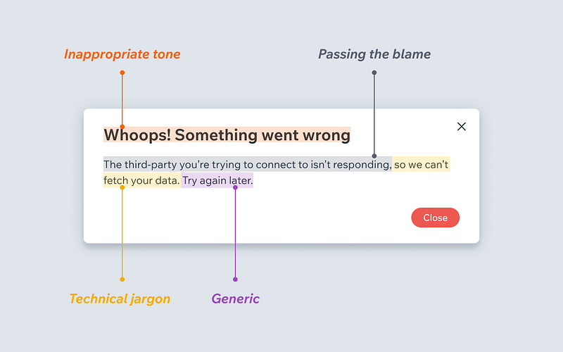
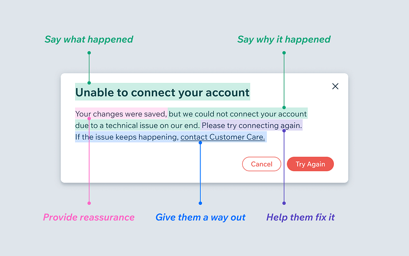
What makes a good error message
-
What makes a bad error message
-
- Sep 2022
-
app.kognity.com app.kognity.com
-
When solving a linear equation, there is one unique solution for the unknown.
Death by scrolling
-
-
citeseerx.ist.psu.edu citeseerx.ist.psu.edu
-
As this quote implies, formalisms are often difficult for people to use because they need to takemany extra steps (and make additional decisions) to specify anything.
I wonder if the formalisms were more carefully baked into the affordances and interactions if it could feel like less work. Since you're getting something for the formalism rather than doing extra work to embed it.
Tags
Annotators
URL
-
-
www.uptech.team www.uptech.team
-
Uptech tip ☝ Top filters for real estatePrice, location, and home typeNumber of bedrooms/bathrooms and the size of square feet or metersAmenities: pool, basement, number of parking spaces, air conditioning system, washer/dryer (in a unit or the building)Infrastructure: gated community, stores and restaurants nearby, view optionsPet policy, accessibility options
Must-have filters for real estate listing sites
-
- Aug 2022
-
www.paperblog.fr www.paperblog.fr
-
blog.prototypr.io blog.prototypr.io
-
superavi.com superavi.com
-
-
www.ariadne.ac.uk www.ariadne.ac.uk
Tags
Annotators
URL
-
-
tomcritchlow.com tomcritchlow.com
Tags
Annotators
URL
-
-
blog.prototypr.io blog.prototypr.io
- Jul 2022
-
-
These are the conversations people are having with themselves when they use your site and try to use your language.
-
- Jun 2022
-
-
This blog is your guide to learn everything about the popular battle; industry design Vs product design Vs UX design.
-
- May 2022
-
www.dreamsongs.com www.dreamsongs.comOUP Book1
-
the very existence of a master plan means, by definition, that the members of the community can have little impact on the future shape of their community,
-
-
www.slideshare.net www.slideshare.net
- Apr 2022
-
barackobama.medium.com barackobama.medium.com
-
the very design of these platforms seems to be tilting us in the wrong direction
Another call to focus on social media platform design.
-
sophisticated actors from political consultants to commercial interests, to intelligence arms of foreign powers can game platform algorithms
Are there interventions that can be made with these actors rather than at the level of the algorithms?
-
-
-
The cognitive overhead that is introduced when the user needs to input a formal representation that collides with his immediate task-dependent needs has to be minimized.
-
- Feb 2022
-
theturnsignalblog.com theturnsignalblog.com
-
High cognitive load driving Driver distraction This experiment produced similar results as the previous, but with interesting developments. Under pressure, I completed each task quicker. But the biggest improvement was for the regular buttons. The mean task completion time was 1,3s versus the 1,7s of the previous experiment. Interestingly, I didn't see the same improvement in eyes-off-road time. So I performed the physical action of moving my finger to the screen and back quicker. But I still had to glance at the screen for as long as under normal conditions. In 4 instances, I first looked at the screen, moved my eyes back to the road, and then performed the action. I suspect that under pressure; I wanted to verify the position of the button before reaching out to it. This did not happen for swipes and large buttons. During the two runs with the normal buttons, I made 2 to 3 mistakes where I clicked next to the skip song button.
자동차 UX 관련해서 팔로업 필요함 운전 중 인터페이스 조작에 대한 연구는 자율주행이 완성되기 전까지는 필요한 연구이긴하다.
Tags
Annotators
URL
-
-
www.mobindustry.net www.mobindustry.net
-
How to Hire the Right UI/UX Designer
-
- Jan 2022
-
www.codica.com www.codica.com
-
Here comes 2022, and as usual, we have prepared for you the list of the top UI/UX design trends to follow. Design in the coming year is about taking care of users, their uniqueness, and avoiding the “perfect picture”. Therefore, real-life photos, live artistic illustrations, and asymmetry are gaining more popularity. And by the way, did you know that according to Pantone, the color of 2022 is violet (Very Peri)? Let’s now explore the leading UI/UX design trends of 2022 in detail and see how popular brands successfully implement them.
-
-
uxdesign.cc uxdesign.cc
-
Google’s Material Design dark theme recommends using dark gray (#121212) as a dark theme surface color “to express elevation and space in an environment with a wider range of depth.” In addition, many designers recommend adding a subtle dark blue tint to dark grays when defining the color scheme. It tends to create a better dark tone for digital screens and a more pleasing dark UI color palette.
Recommandations for dark UI theme from Google.
-
- Dec 2021
-
supabase.com supabase.com
-
This loop showcases a UI pattern that I think could be improved. There is an "edit" button visible, which opens the sidebar. The principles should more closely resemble the Hypothesis sidebar. Instead of requiring an explicit edit button which the user clicks, the editor should operate on object selections. Merely clicking any of the displayed values should select it, which should provide a handle to the underlying object, which should reveal the editor sidebar (with, ideally, the relevant field focused).
-
- Nov 2021
-
21erick.org 21erick.org
-
-
m.blog.naver.com m.blog.naver.com
-
주의 외부 세게로부터 자극이나 정보 중 제한된 대상에 집중하게 될 때 작동하는 기제
-
-
www.koreascience.or.kr www.koreascience.or.kr
-
주의는 시야의 한 영역이나 한 대상에 집중적으로 주의를 기울이는 것을 말한다. 이에 반해, 분산 주의는 선택이나 초점 주의와 달리 멀티태스킹(Multitasking)을 동시에 수행하며 두 개 이상의 대상에 주의를 기울이는 것을 의미한다
-
의(Attention)는 선택(Selective), 초점(Focused) 그리고, 분산(Divided)으로 나누어지는데, 선택 주의는 인간이 특정 대상을 탐색하고 이에 주의를 기울이는 것을 의미하고, 초점
주의에 대한 정의
-
-
hypothes.is hypothes.is
-
This query doesn't behave as expected. Consider by way of comparison to a Google search for
anything -site:pinterest.com
.
Tags
Annotators
URL
-
- Oct 2021
-
www.pinterest.de www.pinterest.de
-
Style Tiles
Tags
Annotators
URL
-
-
www.productheroes.it www.productheroes.it
-
Avere un limite su ogni colonna ti assicura che gli Item si spostino velocemente da una colonna all’altra, visto che questo è l’unico modo per inserire nuovi Item.
Quale è il vantaggio principale del #[[WIP limit]] nella metodologia #agilekanban ?
Sta nel fatto che determinando un numero limite di task da poter inserire nella colonna allora spostare i task da una colonna all'altra (quindi avanzare nello sviluppo) sarà il solo modo per poter inserire nuovi task dal #[[product backlog]] alla board
-
Il Pull system funziona in modo diverso, ovvero con un limite sul numero di elementi inseribili in ogni singola colonna della board, questo limite viene chiamato WIP Limit, ovvero Work in Progress Limit.
In che modo differisce il sistema di #pull tra metodologia #agilescrum e #agilekanban ?
La differenza principale emerge nel fatto che nella metodologia kanban su ogni colonna della board kanban c'è un numero limite di task che si possono inserire, questo numero limite viene chiamato #[[WIP limit]]
-
La principale differenza è che nel Kanban non esistono le sprint. Il processo di sviluppo è continuo.
Quale è la differenza principale tra #agilescrum e #agilekanban ?
La differenza principale è nelle tempistiche dello sviluppo, nella metodologia scrum il processo è di breve durate ed iterativo, in quella kanban invece lo sviluppo è continuo
-
Per tracciare i progressi si usa una board chiamata Scrum Board, Agile Board o per fare un po’ di casino Kanban Board.Di solito ci sono 4 colonne: To Do, Doing o Progress, Test o QA, Done. La premessa di tutto è che queste due metodologie non sono prescrittive per cui ogni team poi può decidere di aggiungere o rimuovere colonne in base alle proprie esigenze.Il Movimento ideale degli Item sulla scrumboard è da sinistra verso destra, se il movimento è al contrario c’è qualcosa che non va.
In che modo avviene il tracciamento dei progressi nei progetti di sviluppo, che siano #agilescrum o #agilekanban ?
Avviene tutto tramite delle board kanban divise in colonne e in cui si deve passare da sinistra a destra.
-
Questa parte è il Pull di cui stavamo parlando prima, ovvero gli item vengono “tirati” dal backlog e non “pushati” da qualcun altro.
In cosa consiste la parte #pull delle metodologie #agilescrum e #agilekanban ?
Essenzialmente si riferisce all'atto con cui i team prendono dal #[[product backlog]] i task su cui si devono concentrare e non vedono questi task essere imposti loro dall'alto e/o qualcuno di esterno.
Compito di #[[product owner]] e #[[scrum master]] è quello di fare di tutto per permettere al team di concentrarsi sullo sviluppo ed implementazione, nel minor tempo possibile e maggiore efficacia, sui task che sono stati inseriti nello #[[sprint backlog]]
-
Quello che accade tra il product backlog, ovvero la mega-lista di cose da fare, e il customer, ovvero l’utente che userà il tuo prodotto, è quello che distingue Scrum da Kanban.
Cosa sono, in una frase, le metodologie #agilescrum e #agilekanban ? Che funzione assolvono?
Essenzialmente portano tutto quello che c'è nel #[[product backlog]] da quella lista al customer.
-
Alcune caratteristiche del Product Backlog:Ogni Item in Backlog deve aggiungere valore all’utente finaleIl Backlog deve essere ordinato e prioritizzatoIl Backlog è un documento vivente. Il processo di revisione e modifica giornaliera del Backlog da parte del Product Owner si chiama Backlog GroomingI dettagli di ogni Item dipendono tipicamente dalla loro posizione sul Backlog: in alto tanti dettagli, in basso pochi dettagli.
Quali sono alcune caratteristiche fondamentali del #[[product backlog]] ?
L'atto di pulizia e aggiornamento del backlog è definito come #[[backlog grooming]]
-
Il Product Backlog è la lista prioritizzata di tutto ciò che si vorrebbe fare (occhio a queste due parole!) all’interno del progetto. Qui sta una delle prime intuizioni semplicissime, ma geniali, dei due metodi.Il fatto che un Item sia in backlog non vuol dire che verrà sicuramente affrontato, sviluppato e rilasciato.
Cosa è il #[[product backlog]] e cosa è presente al suo interno?
Si tratta di una lista prioritizzata di tutto quello che si vorrebbe fare all'interno del progetto.
Importante è l'aspetto del "si vorrebbe", il fatto che qualcosa sia in backlog non significa necessariamente che sarà poi sviluppato e rilasciato.
All'interno di questo backlog si possono trovare #userstory oppure task tecnici oppure bug oppure knowledge task.
-
Secondo i principi dell’Agile, come abbiamo visto nel post precedente, il software viene consegnato al customer in piccoli pezzi che incrementano il valore del software progressivamente, inoltre il feedback dal customer viene preso costantemente in considerazione e diventa parte essenziale del ciclo di sviluppo.
Quale è la differenza principale tra metodologia #waterfall ed #agile ?
La differenza principale è nelle modalità di rilascio del prodotto: nella metodologia waterfall il rilascio avviene interamente e di blocco, nel caso invece di agile il rilascio avviene in fasi iterative e frequenti, piccoli rilasci e implementazioni ad ogni fase.
Nel metodo agile, ad ogni iterazione, il #[[product owner]] raccoglie i feedback di utenti e stakeholder e le utilizza per le prossime iterazioni, inserendole nel #[[product backlog]]
-
n una cascata (waterfall), infatti, l’acqua cade sempre dall’alto verso il basso e così funziona nello sviluppo software Waterfall:Il responsabile di prodotto definisce i requisiti di tutto il progettoIl team di sviluppo realizza il progetto per interoIl progetto viene consegnato al customer tutto in una voltaTutto va nella stessa direzione. Dall’alto verso il basso. Sempre
Come è caratterizzato il metodo #waterfall di sviluppo?
È il metodo classico di sviluppo, in maniera unidirezionale il responsabile di prodotto #[[product owner]] fornisce agli sviluppatori i requisiti di tutto il progetto, questi li implementano per intero, l'intero progetto viene fornito ai consumatori in un'unica volta.
-
-
www.productheroes.it www.productheroes.it
-
Nell’esempio di Giuseppe potremmo chiamare la nostra Epic “Funzionalità di login”. All’interno di quest’ultima andremo poi a inserire le varie User Stories come “Frontend – processo login”, “Backend- processo login”, “Processo di recupero password” e così via fino ad aver completato la nostra funzionalità di login.Per non perdere di vista le varie Epic, andiamo a nostra volta a raggrupparle all’interno di “iniziative”. Tornando al nostro esempio possiamo chiamare la nostra iniziativa “Sito e-commerce – primo rilascio”. All suo interno inseriremo tutte le Epic che riteniamo indispensabili per il rilascio del nostro sito.”
In che modo si può risolvere il problema della mancanza di contesto per le #userstory ?
-
Uno dei problemi nell’uso delle User Story è la mancanza di contesto attorno alla storia. Esistono diversi stratagemmi per risolvere.
Quale è il problema maggiore che emerge dall'utilizzo delle #userstory ?
La mancanza di contesto, questa rende difficile sia l'empatizzare con l'utente sia avere chiaro l'obiettivo e la natura delle implementazioni.
-
Questi sono dettagli che vanno aggiunti all’interno della User Story, solitamente si definiscono Criteri di Accettazione. I Criteri di Accettazione sono fondamentali anche per poter verificare se la funzionalità sviluppata rispecchia ciò che era stato deciso. Vi accorgerete che il 90% delle volte ciò che viene implementato non rispecchia quanto era previsto!
Una volta create le prime #userstory cosa deve accadere secondo la metodologia di #agilescrum ?
Avviene una riunione con il team di sviluppo, una riunione in cui insieme al team si stabiliscono dei criteri minimi che l'implementazione dovrà rispettare.
-
Il formato tipico delle User Story ci impone di fare una scelta e decidere le priorità. Quando scrivete una User Story focalizzatevi sempre sulla funzione più importante. Scrivete User Story separate per dettagliare i bisogni differenti. Può creare ridondanza ma vi permetterà di condividere con chiarezza quali sono le priorità.
In che modo fare #userstory ci permette di determinare delle priorità nella creazione del #prodotto ?
Ogni user story deve essere focalizzata su una sola cosa, un solo tipo di utente, un solo obiettivo, una sola azione ed in questo modo dovremo scrivere diverse user story per ogni caso, poi tra le diverse user story stabilire delle priorità ed un peso.
-
Come prima cosa descriviamo quale utente stiamo servendo. A prima vista si potrebbe pensare che l’utente è unico per un prodotto. In realtà ogni prodotto ha una varietà di utenti con diversi intenti.In un e-commerce possiamo sicuramente distinguere tra utenti alla prima visita, utenti registrati, utenti che hanno fatto 1 o più acquisti, e così via. Inoltre molti prodotti hanno alle spalle un servizio e spesso una parte dello sviluppo è dedicata ad utenti interni come per esempio il servizio clienti.
Quanti utenti e quali utenti possiamo distinguere normalmente in un #prodotto ?
Ci sono tanti utenti ad utilizzare un prodotto ognuno contraddistinto da diversi intenti
-
Le User Story hanno solitamente il seguente formato:Come [descrizione dell’utente], voglio [funzionalità o azione] in modo che [obiettivo o valore per l'utente].
Quale è un esempio di #userstory nella metodologia di #agilescrum ?
Una. volta compilato, questo esempio dovrebbe essere qualcosa di questo tipo: "Come utente registrato voglio poter effettuare il log-in in modo che posso accedere alle mie informazioni personali. "
-
L’utente a cui ci stiamo rivolgendoil bisogno che vogliamo soddisfareil motivo per cui dobbiamo soddisfarlo. Un po’ di esempi pratici renderanno tutto molto più chiaro!Ma, prima di partire con gli esempi, voglio dirvi quali sono per me le 2 caratteristiche essenziali delle User Story: chiarezza e confronto.
Quali sono le caratteristiche alla base delle #userstory ?
Ogni #userstory deve descrivere in maniera fondamentale l'utente a cui ci stiamo rivolgendo, il bisogno che questo utente ha e che noi vogliamo soddisfare ed il motivo per cui dobbiamo e vogliamo soddisfarlo.
-
Il concetto più interessante che introducono le User Story è quello di mettere l’utilizzatore del nostro prodotto (lo User) al centro dell’attenzione durante il processo di sviluppo. Pari importanza è data anche all’identificazione del bisogno che ogni funzionalità promette di soddisfare (la storia).
Cosa sono le #userstory e perché è importante utilizzarle come alternativa alla classica requisitazione?
Le #userstory contribuiscono a mettere lo user al centro del percorso di sviluppo, inoltre attraverso una storia forniscono anche l'identificazione dei bisogni di questo utente e come ogni funzionalità possa essere capace di risolvere questi bisogni.
Queste sfumature si perdono nel corso della classica requisitazione in cui il #productowner fornisce requisiti ai tecnici senza nemmeno spiegarne il motivo.
-
Mi piace molto la definizione di User Story di Mike Cohn: ogni User Story è la promessa di una conversazione. Per Mike quello che c’è scritto nella User Story non è molto importante, è solo un promemoria per innescare una discussione con tutto il team.
Quale è la definizione di #userstory ?
-
-
www.productheroes.it www.productheroes.it
-
Lo Sprint inizia con lo Sprint Planning dove il Product Owner prioritizza il Product Backlog ed insieme al team crea lo Sprint Goal, ovvero l’obiettivo da raggiungere per la Sprint in partenza.
Da cosa inizia lo #sprint all'interno della metodologia di #agilescrum ?
Tutto inizia dallo #sprintplanning in cui il #productowner analizza le diverse #userstory e attribuisce loro gli #storypoint.
Dopo l'effettiva esecuzione dello #sprint allora avviene la fase si #sprintreview in cui insieme agli stakeholder si analizza quanto fatto ed il #backlog mettendolo in discussione per le prossime iterazioni.
-
In alcuni casi viene anche chiamato Agile Coach. Lo Scrum Master è colui/colei che si adopera per far si che il team raggiunga la massima produttività ed efficienza. È il facilitatore di tutte le cerimonie Agile tramite tecniche di negoziazione e mediazione.È anche la voce del team di sviluppo. Chi promuove la metodologia Scrum e fa sì che i suoi principi/valori vengano applicati in maniera corretta tramite un durissimo lavoro di coaching e mentoring. Lo scrum master si occupa anche delle metriche di avanzamento per fare venire a galla i problemi, ma anche i successi del team.
Chi è lo #scrummaster e cosa deve fare nel corso della metodologia #agilescrum ?
All'atto pratico è colui che si occupa di spingere il team a raggiungere la massima produttività ed efficienza. Cerca anche di definire e raggiungere le metriche di avanzamento per far emergere problemi e successi del team.
-
È colui/colei che guida il team nella giusta direzione, che prioritizza le user storiy e come un direttore d’orchestra si interfaccia con gli stakeholders e col team per far in modo che tutto funzioni alla perfezione.
Chi è il #productowner cosa fa e in che modo opera nel corso della metodologia #agilescrum ?
-
Le skills/conoscenze individuali devono essere trasferite al team tramite peer programming (sviluppo di una funzionalità a due mani) o mob programming (sviluppo a più mani). Questo porterà il team nel lungo periodo ad essere molto più efficiente, dato che ogni membro del team avrà come bagaglio la conoscenza del prodotto e del software utilizzato e potrà essere intercambiabile.Tipicamente un team cross funzionale è composto da Product Manager, Design, Sviluppo, Data Analysis.
In che modo è strutturato il team cross funzionale che lavora in uno #sprint ?
-
È un momento di ispezione per tutti, per i processi, per le persone e per il modo in cui si lavora. Qui si ispeziona quel che è stato fatto chiedendosi:Cosa è andato bene?Cosa potrebbe andare meglio?Quali sono gli improvement / miglioramenti che si possono implementare nel prossimo Sprint?
In cosa consiste la #sprintretrospective nel metodo #agilescrum e cosa accade?
-
L’incremento, ovvero la somma delle funzionalità che si sono sviluppate durante lo sprint vengono finalmente mostrate al cliente e ai più importanti stakeholders del progetto. Qui si riceve il feedback che porterà a decidere quale corso il prodotto deve prendere e quali user story saranno prioritizzate nel prossimo sprint.La Sprint Review non è solo una Demo, ma è l’elemento di raccordo con la Sprint precedente: un incontro fondamentale su cui costruire la cultura, creare prodotti migliori e rinforzare la fiducia del team.Queste sono alcune delle attività:Definire cosa è stato completato e cosa no, commentando il lavoro.Demo individuali Rivedere impatto delle feature su Metriche ChiaveVerifica User Story e aggiunta nuove per completareBacklog Grooming
In cosa consiste la #sprintreview nel modello #agilescrum e cosa accade nel corso di questa ?
-
La cosiddetta stima dell’effort è un concetto fondamentale, specie nel Backlog Refinement e in Sprint Planning dove il team di sviluppo si riunisce per dare un valore numerico alle user stories. Questo aspetto non è assolutamente da sottovalutare, perché dalla stima delle user story possono scaturire tantissime discussioni interessanti per capire effettivamente il grado di rischio, complessità, fattibilità di ciascun task.L’estimation a differenza degli altri rituali non ha una sua precisa collocazione, può essere fatto in qualsiasi momento, ma considera che il Team dovrebbe dedicare al meno il 10% del suo tempo alla stima del lavoro necessario per sviluppare una User Story.
In cosa consiste il rituale di #estimation in #agilescrum ?
-
Lo Sprint Planning è forse uno dei meeting più importanti nelle cerimonie Agile ed è il momento in cui business (product owner) e technical team si riuniscono per decidere cosa faranno nella prossima iterazione/sprint. Di solito dura circa 4 ore ed avviene il giorno prima dell’avvio della sprint.L’obiettivo dello Sprint Planning è proprio quello di pianificare la Sprint definendo l’Outcome (L’obiettivo di sprint) e passando dalle user story alle singole task per ciascun componente del team.
In cosa consiste il rituale dello #sprintplanning nella metodologia #agilescrum ?
-
il daily scrum è un meeting giornaliero dove il team si riunisce e raccoglie le proprie impressioni su come sta andando lo Sprint e quanto ci si sta avvicinando o allontanando dallo Sprint goal. Ogni membro deve rispondere a tre domande ben precise:Cosa ho fatto ieri?Cosa ho fatto oggi?Ci sono impedimenti che stanno bloccando il mio percorso nel raggiungere lo Sprint Goal?
In cosa consiste il rituale del #dailyscrum nella metodologia #agilescrum ?
-
Daily Scrum: allineamento giornaliero Sprint Planning: preparazione della SprintEstimation: stimare il peso di ogni user storySprint Review: demo e review del lavoro svoltoSprint Retrospective: migliorare il modo in cui si lavora insieme.
Quali sono i rituali alla base della metodologia #agilescrum ?
-
Man mano che passano le sprint il team di lavoro acquisirà il proprio ritmo, “heartbit” o velocità.La Velocity è la somma degli story point completati a fine sprint. Questa servirà da metro di paragone per pianificare gli Sprint successivi.Facendo un passo indietro infatti ogni User Story prima di essere portata in sviluppo deve essere analizzata e ne deve essere valutato il peso in termini di impegno del team.Es: una User Story che pesa poco impegna solo alcuni membri del team (anche uno solo) per poco tempo, una Storia che pesa molto impegna tanti membri del team per tanto tempo.Solo dopo aver dato un valore ad una User Story usando appunto gli Story Points, questa può essere aggiunta allo Sprint Backlog.
Cos'è il concetto di #velocity nella metodologia #agilescrum ?
È il quantitativo di #storypoint accumulati dal team nel corso di uno #sprint.
Ogni #userstory infatti avrà un peso e valore determinato dagli #storypoint e deciso in funzione dell'impegno di sviluppo che richiede per la sua produzione.
La #velocity permette di avere una metrica per pianificare i prossimi #sprint anche in funzione dell'#heartbit raggiunto dal team dopo alcuni #sprint.
-
La User Story è la funzionalità o l’incremento di prodotto che si vuole portare in sviluppo scritta dal punto di vista dell’utente. Ogni User Story incorpora al suo interno CHI beneficerà di quella funzionalità, COSA si richiede e PERCHÈ è importante per l’utente
Che cos'è una #userstory nella metodologia #agilescrum ?
Si tratta della funzionalità o incremento che si vuole portare in sviluppo, scritta dal punto di vista dell'utente. È parte fondamentale del #productbacklog ed in essa deve comprendere:
- CHI trarrà beneficio dall'incremento?
- COSA sarà l'incremento?
- PERCHÈ è importante per l'utente?
-
Il backlog è la lista di user stories o task che non è ancora stata introdotta nello Sprint e risiede in uno spazio apposito. Considerala come una wishlist di funzionalità che potrebbero essere implementate e che saranno prioritizzate dal product owner durante lo Sprint Planning.
Cos'è il #productbacklog nella metodologia #agilescrum ?
È la lista di #userstory e task che non è ancora oggetto dello #sprint in atto, è una wishlist più che una tasklist
-
Anche chiamato “iterazione” è un lasso di tempo che può variare da uno a quattro settimane dove il team si adopera per creare un “incremento”, un prodotto/funzionalità, anche non finito, che crea valore e che può essere ispezionato alla fine, ricevendo feedback positivi/negativi dagli stakeholders interessati.Nello Sprint si usa il concetto di time-box, dove all’inizio del progetto si decide quanto l’iterazione debba essere lunga (da una a quattro settimane, non di più)
Cos'è lo #sprint nella metodologia #agilescrum ?
È il lasso di tempo in cui il team lavora per arrivare ad un incremento nel prodotto, questo incremento servirà a creare valore per gli utenti e sarà ispezionato alla fine dagli stakeholder interessati tramite #feedback negativi o positivi
-
Agile Scrum è a tutti gli effetti un sistema di regole, procedure e rituali ben definiti su come applicare la metodologia Agile, dove, come ho detto qualche riga prima, il tempo è l’elemento più importante.A scandire il tempo in Agile Scrum ci pensano gli Sprint, dei piccoli time-frame in cui il team di sviluppo lavora per il rilascio di una o più funzionalità.
Quale è la variabile più importante della metodologia #agilescrum ?
È sicuramente quella del tempo, rappresentata dallo #sprint che è un piccolo time-frame in cui il team di sviluppo lavora per rilasciare una o più funzionalità.
Ogni sprint avrà come obiettivo il rilascio di specifiche #feature del prodotto e queste avranno come specifica funzione il dare valore all'utente che usa il prodotto.
Non si tratta solo di suddividere il lavoro ma di impostare l'intero lavoro in funzione dell'utente, cercando di stargli più vicino possibile.
-
Nel rugby, la parola “Scrum“ è un termine usato per spiegare il goal del team di ottenere il possesso della palla in quanto unità molto coesa. In maniera simile, in Agile Scrum, il team di sviluppo lavora insieme per raggiungere uno o più obiettivi alla fine dello Sprint/iterazione.
Quale è la definizione di #agilescrum ?
Con questa metodologia si intende far focalizzare tutto il team ad un singolo obiettivo che sarà utile per lo #sprint previsto.
-
Qui di seguito ti riassumo quali sono i punti chiave:Accettare l’incertezza e tutto ciò che ne derivaIl fallimento è la via più sicura per imparareSe non lo misuri non lo saiFiducia nelle persone e nella loro capacità di avere impattoOwn your Outcome: assumersi la responsabilità a tutti i livelli
Quali sono gli assunti fondamentali del mindset #agile ?
-
fino a quel momento tutta l’attenzione nel processo tradizionale di sviluppo software, chiamato Waterfall, era stata posta su documentazione, processi e specifiche tecniche, adesso la lente si spostava sulle persone e sulle interazione tra di esse, sui team e sul loro spirito di adattamento e risposta al cambiamento.
Quale è stata l'innovazione più grande apportata dalle metodologie #agile rispetto alle vecchie metodologie #waterfall ?
La principale differenza è che si è cominciato a ragionare sulle persone che effettivamente creano il prodotto, sulle interazioni tra loro, sui team ed in che modo si risponde al cambiamento, non ci si concentra sui task da vomitare in testa ai tecnici.
-
-
creativegood.com creativegood.com
-
UX is now "user exploitation."
As a student in the new generation of UX designers i've been more sensible to these matters but i do see signs of alternative behaviors emerging (the right to repair, for example) which could benefit hugely from our discipline methods and learnings.
Tags
Annotators
URL
-
-
gamestorming.com gamestorming.com
-
The empathy map, one of Gamestorming’s methods for understanding audiences, including users, customers, and other players in any business ecosystem, has gotten some press lately because it was featured in Alex Osterwalder‘s excellent book, Business Model Generation as a tool for discovering insights about customers.
Tags
Annotators
URL
-
-
bauhouse.medium.com bauhouse.medium.comMonopoly1
-
monopoly over public discourse
This is the water we swim in.
-
-
www.pinterest.ca www.pinterest.ca
-
Components of a Customer Journey Map
- Review Goals
- Gather Research
- Touchpoint & Channel Brainstorms
- Empathy Map
- Brainstorm with Lenses
- Affinity Diagram
- Sketch the Journey
- Refine & Digitize
- Share & Use
This is the same process outlined in this journey map.
-
- Sep 2021
-
www.nngroup.com www.nngroup.com
-
A mental model is what the user believes about the system at hand.
“Mental models are one of the most important concepts in human–computer interaction (HCI).”
— Nielsen Norman Group
-
-
socialarc.com socialarc.com
-
Stop Reset Go
How do we engage in bottom-up whole system change? Perhaps we need a model for understanding who we are serving that transcends the bias and limitations of personas as they are used in user experience design (UX).
What is a more holistic model for understanding human perceptions, motivations, and behaviours?
-
-
www.thisisservicedesigndoing.com www.thisisservicedesigndoing.com
-
The book, This is Service Design Doing, includes journey maps as a method for participatory design and co-creation workshops.
I suggested to the Stop Reset Go team that we should map out the interactions and touch points to engage people with the process of bottom-up whole system change.
-
-
-
I was wondering if anyone had thought to explore the idea of podcasts as a source of ethnographic or user experience research. Instead, I found a case study about the user experience of podcast listening.
-
-
thamesandhudson.com thamesandhudson.com
-
Design for the Real World
Mike Monteiro references Victor Papanek’s book, Design for the Real World, in his article, Design’s Lost Generation.
The Anti UX UX Club will be discussing Mike Monteiro’s article on Clubhouse.
-
-
monteiro.medium.com monteiro.medium.com
-
Design’s Lost Generation
The Pirate Book Club will be discussing this article in the Anti UX UX Club room of Clubhouse, according to today’s post on Twitter.
-
-
twitter.com twitter.com
-
discussion
The Discord discussions for the Anti UX UX Club.
-
the channel
The Clubhouse room for the Anti UX UX Club.
Tags
Annotators
URL
-
- Aug 2021
-
groups.drupal.org groups.drupal.org
-
usability has multiple components: Learnability — how easily a beginner can use the system, and how easily they can become an expert. Efficiency — how quickly people can achieve what they want. Memorability — how easily people can remember how to use the system or feature, after not using it for a while. Safety — how rarely people experience errors, and how easy it is to fix any errors. Satisfaction — how pleased people are with the overall experience.
-
-
virtualoutworlding.blogspot.com virtualoutworlding.blogspot.com
-
Basic Skills Gauntlet
Thanks Think!
Thinkerer Melville captured BSG with style and a thoroughness few appreciate, much less could match.
-
- Apr 2021
-
community.reclaimhosting.com community.reclaimhosting.com
-
What I like about some of the newer platforms (Ghost, Medium, Social Media platforms) is the way the default post and the menus themselves more clearly guide the user in their decisions about how to interact. There is a sense that the platform offers points of entry. Doesn’t hold the user’s hand – but welcomes them, points to stuff, and smiles at the user a bit more.
Here's a great example of a person who wants some of the UI niceties provided by onboarding for new users. This can be incredibly important for people who are new to the platform.
On the flip side, it's much easier to do for a social media platform like Twitter which only does one or two things. It can be far harder for platforms like WordPress which have a lot more complexity or uses and require personas or use-types to do this well.
-
-
writefreely.org writefreely.org
-
![Cosmic radiation](https://i.snap.as/T05UTpx.jpg)
Since a lot of this is guaranteed to be seen as arcane magic, maybe this is an opportune place for the UI hooks for a conversational/palette-based UI? Maybe
>>
to set it off?
-
- Mar 2021
-
learn.unity.com learn.unity.com
-
Unity UI
Tags
Annotators
URL
-
- Feb 2021
-
bdc-05-ozecollege.yvelines.fr bdc-05-ozecollege.yvelines.fr
-
l’adresse de la plateforme oZe
c'est à cet endroit que doit être placé de l'aide contextuelle pour aider les familles et les élèves
-
-
psyarxiv.com psyarxiv.com
-
Anderson, Ian, and Wendy Wood. ‘Habits and the Electronic Herd: The Psychology behind Social Media’s Successes and Failures’. PsyArXiv, 23 November 2020. https://doi.org/10.31234/osf.io/p2yb7.
-
-
creativegood.com creativegood.com
Tags
Annotators
URL
-
- Jan 2021
-
blog.imagerelay.com blog.imagerelay.com
-
going back to find something they found before
-
-
www.userfocus.co.uk www.userfocus.co.uk
-
I really found this exercise very useful to get to know properly your team members, sometimes we feel frustrated because we don't feel comfortable working with some people, this definitely helps a lot.
-
-
-
People don’t want to think too hard about your customer experience because thinking is hard work.
As a user myself, I can totally relate to this article. I tend to stick to simple things in life, especially when it comes to technology. In the world that we live in, we don't have any time to actually sit and figure out an app or a website: we are constantly in a hurry and already have too many other things going on. We use so many apps and scroll down on so many websites per day, switching from one to another. So yes, I believe that when creating a user experience you have to take into consideration how simple it will be for the users.
-
- Dec 2020
-
www.youtube.com www.youtube.com
-
What the #$%@ is UX Design?
Short video about User Experience Design.
Tags
Annotators
URL
-
- Nov 2020
-
www.cl.cam.ac.uk www.cl.cam.ac.uk
-
Alexanderproposeshomesandofficesbedesignedandbuiltbytheireventualoccupants.Thesepeople,hereasons,knowbesttheirrequirementsforaparticularstructure.Weagree,andmakethesameargumentforcomputerprograms.Computerusersshouldwritetheirownprograms.KentBeck&WardCunningham,1987 [7]
Users should program their own programs because they know their requirements the best.
[7]: Beck, K. and Cunningham, W. Using pattern languages for object-oriented programs. Tektronix, Inc. Technical Report No. CR-87-43 (September 17, 1987), presented at OOPSLA-87 workshop on Specification and Design for Object-Oriented Programming. Available online at http://c2.com/doc/oopsla87.html (accessed 17 September 2009)
-
Before the publication of the ‘Gang of Four’ book that popularised software patterns [4], Richard Gabriel described Christopher Alexander’s patterns in 1993 as a basis for reusable object‐oriented software in the following way:Habitabilityisthecharacteristicofsourcecodethatenablesprogrammers,coders,bugfixers,andpeoplecomingtothecodelaterinitslifetounderstanditsconstructionandintentionsandtochangeitcomfortablyandconfidently.
Interesting concept for how easy to maintain a piece of software is.
-
-
www.roambrain.com www.roambrain.com
-
Connected to this are Andy Matuschak’s comments about contextual backlinks bootstrapping new concepts before explicit definitions come into play.
What Joel says here about Contextual Backlinks is that they allow you to "bootstrap" a concept (i.e. start working with it) without explicit definitions coming into play (or as Andy would say, the content is empty).
-
Easily updated pages: don’t worry about precisely naming something at first. Let the meaning emerge over time and easily change it (propagating through all references).
Joel highlights a feature here of Roam and ties it to incremental formalisms.
In Roam you can update a page name and it propagates across all references.
-
Cognitive Overhead (aka Cognitive Load): often the task of specifying formalism is extraneous to the primary task, or is just plain annoying to do.
This is the task that you're required to do when you want to save a note in Evernote or Notion. You need to choose where it goes.
-
The basic intuition is described well by the Shipman & Marshall paper: users enter information in a mostly informal fashion, and then formalize only later in the task when appropriate formalisms become clear and also (more) immediately useful.
Incremental formalism
Users enter information in an informal fashion. They only formalize later when the appropriate formalism becomes clear and/or immediately useful.
-
It’s important to notice something about these examples of synthesis representations: they go quite a bit further than simply grouping or associating things (though that is an important start). They have some kind of formal semantic structure (otherwise known as formality) that specifies what entities exist, and what kinds of relations exist between the entities. This formal structure isn’t just for show: it’s what enables the kind of synthesis that really powers significant knowledge work! Formal structures unlock powerful forms of reasoning like conceptual combination, analogy, and causal reasoning.
Formalisms enable synthesis to happen.
-
-
notes.andymatuschak.org notes.andymatuschak.org
-
Systems which display backlinks to a node permit a new behavior: you can define a new node extensionally (rather than intensionally) by simply linking to it from many other nodes—even before it has any content.
Nodes in a knowledge management system can be defined extensionally, rather than intensionally, through their backlinks and their respective context.
-
-
latacora.micro.blog latacora.micro.blog
-
PGP begs users to keep a practically-forever root key tied to their identity. It does this by making keys annoying to generate and exchange, by encouraging “key signing parties”, and by creating a “web of trust” where keys depend on other keys.
PGP encourages users to keep long-term keys tied to their identity. It does this by making it annoying to generate and exchange keys.
-
We can’t say this any better than Ted Unangst: There was a PGP usability study conducted a few years ago where a group of technical people were placed in a room with a computer and asked to set up PGP. Two hours later, they were never seen or heard from again.
The UX problems with PGP/GPG.
Tags
Annotators
URL
-
-
blog.filippo.io blog.filippo.io
-
Then, there's the UX problem. Easy crippling mistakes. Messy keyserver listings from years ago. "I can't read this email on my phone". "Or on the laptop, I left the keys I never use on the other machine".
UX issues in GPG
Tags
Annotators
URL
-
-
weblog.tetradian.com weblog.tetradian.com
-
because we still remember the quality of service that the restaurant gave us.
This is pretty much what Service Design, (Digital) Product Design and User Experience Design professionals are (or at least should be) concerned about.
-
- Oct 2020
-
en.wikipedia.org en.wikipedia.org
-
In all cases, the technique is appropriate for structures with high degree (large fanout). For low-degree structures, outline editors or graph viewers are more effective.
Use cases for Miller columns: high degree vs low degree structures.
Tags
Annotators
URL
-
-
readwriterespond.com readwriterespond.com
-
I think it is one of those topics with a lot of conjecture John. Apologies if there are too many links.
Don't apologize for links. It's the web and links are important. In fact I might think that you could have a few additional links here! I would have seen it anyway, but I was a tad sad not to have seen a link to that massive pullquote/photo you made at the top of the post which would have sent me a webmention to boot. (Of course WordPress doesn't make it easy on this front either, so your best bet would have been an invisible <link> hidden in the text maybe?)
I've been in the habit of person-tagging people in posts to actively send them webmentions, but I also have worried about the extra "visual clutter" and cognitive load of the traditional presentation of links as mentioned by John. As a result, I'm now considering adding some CSS to my site so that these webmention links simply look like regular text. This way the notifications will be triggered, but without adding the seeming "cruft" visually or cognitively. Win-win? Thanks for the inspiration!
In your case here, you've kindly added enough context about what to expect about the included links that the reader can decide for themselves while still making your point. You should sleep easily on this point and continue linking to your heart's content.
-
-
www.kickscondor.com www.kickscondor.com
-
I’m really not sure if linking, in general, has changed over the years. I’ve been doing it the same since day one. But that’s just me.
Only in the last hour I've had a thought about a subtle change to one of the ways I link. It's not a drastic thing, but it is a subtle change to common practices. Also as I think about it, it removes some of the obviousness of links on social platforms like Twitter that add the ugly @ to a username in addition to other visual changes when one mentions someone else.
-
-
www.eugenewei.com www.eugenewei.com
-
Instagram, despite not having any official reshare option, allows near unlimited hashtag spamming, and that allows for more deterministic, self-generated distribution. Twitter also isn't as great for spreading visual memes because of its stubborn attachment to cropping photos to maintain a certain level of tweet density per phone screen.
Some interesting UI clues here that either help or hamper social networks
-
-
www.theatlantic.com www.theatlantic.com
-
I find it somewhat interesting to note that with 246 public annotations on this page using Hypothes.is, that from what I can tell as of 4/2/2019 only one of them is a simple highlight. All the rest are highlights with an annotation or response of some sort.
It makes me curious to know what the percentage distribution these two types have on the platform. Is it the case that in classroom settings, which many of these annotations appear to have been made, that much of the use of the platform dictates more annotations (versus simple highlights) due to the performative nature of the process?
Is it possible that there are a significant number of highlights which are simply hidden because the platform automatically defaults these to private? Is the friction of making highlights so high that people don't bother?
I know that Amazon will indicate heavily highlighted passages in e-books as a feature to draw attention to the interest relating to those passages. Perhaps it would be useful/nice if Hypothes.is would do something similar, but make the author of the highlights anonymous? (From a privacy perspective, this may not work well on articles with a small number of annotators as the presumption could be that the "private" highlights would most likely be directly attributed to those who also made public annotations.
Perhaps the better solution is to default highlights to public and provide friction-free UI to make them private?
A heavily highlighted section by a broad community can be a valuable thing, but surfacing it can be a difficult thing to do.
-
-
-
More ways to combat feed overwhelm Before IndieWebCamp, we had a discussion about Readers in a traditional Nürnberger restaurant. Here also, people came up with some ideas to deal with accruing unread-counts. One idea came from how Aperture deletes posts after 7 days. This actually prevents the overload. It would be nice if you can tell your reader that, for example your Twitter feed, is ephemeral and that the posts can be discarded if you did not read them in time. One other idea that came up was to keep track of the average time between posts of a certain feed. This way a Reader could boost posts when they are from a feed that is not regularly updated. These kind of posts are usually lost in piles of more posts from more frequently updates feeds. Yet a last idea was to tell your reader to leave out posts with certain words for a small period of time. This can come in handy when you haven’t watched the newest episode of Game of Thrones yet, but want to stay connected to your feeds without spoilers.
Some good ideas here to deal with feeds.
-
-
tomcritchlow.com tomcritchlow.com
-
The sidebar is styled white
I do like how you've changed the styling a little bit. Being able to have the style fit the particular website is an interesting idea.
Tags
Annotators
URL
-
- Aug 2020
-
www.bebee.com www.bebee.com
-
To the fact, 77% of the users will stop using an app within 3 days of its download. Only those apps will survive who have soothing mobile usability and UX/UI designs.
-
-
www.linkedin.com www.linkedin.com
-
So, let’s get an answer to this question! In this write-up, we will be going through mobile app design services and its cost.
-
-
www.uxpin.com www.uxpin.com
-
Merge is a revolutionary technology that lets users import and keep in sync coded React.js components from GIT repositories to the UXPin Editor. Imported components are 100% identical to the components used by developers during the development process. It means that components are going to look, feel and function (interactions, data) just like the real product experienced by the end-users.
Tags
Annotators
URL
-
-
developer.android.com developer.android.com
-
The Google Play In-App Review API lets you prompt users to submit Play Store ratings and reviews without the inconvenience of leaving your app or game.
-
- Jul 2020
-
www.excellentwebworld.com www.excellentwebworld.com
-
Looking for effective design solutions? We create simple, clean, and attractive mobile app designs for business.
-
- Jun 2020
-
debrouwere.org debrouwere.org
-
If you eventually do manage to find the information you need, kudos. You’re obviously very committed to learn more. But wasn’t the whole “we need context” meme prompted by the acknowledgement that most readers get confused and quit way before that stage?
-
-
-
bokardo.com bokardo.com
-
So here is the real difference: scrolling is a continuation; clicking is a decision. Scrolling is simply continuing to do what you’re currently doing, which is typically reading. Clicking, however, is asking the user to consider something new…is this new thing the same as what I’m already doing, or something new? Obviously this is a small interaction…but think about it in scale. Hundreds or thousands of decisions taken together add up to real friction.
momentum, inertia, interrupted flow
Tags
Annotators
URL
-
-
rashmisinha.com rashmisinha.com
-
For me the best part of Upcoming was being able to see what events my friends are going to. With their redesign, Upcoming decided to hide that behind two clicks. Now when you go to the site, I see whats popular in San Francisco, but I have to click to see what my friends are upto. Even on an events page, I can no longer easily see if any of my friends are going there. Instead I am shown the groups and tags. But I have to click to see who is attending.
tiny changes to the UX. not understanding the JTBD of your product
-
-
techcrunch.com techcrunch.com
-
dark pattern design will ensure the opt out — if there is one — will be near invisible; Greyscale text on a grey background is the usual choice.
The often used method on promotional emails and/or advertising website.
-
Friction is another key tool of this dark art: For example designs that require lots more clicks/taps and interactions if you want to opt out.
The example for this is how Amazon makes it hard to make user close account https://www.youtube.com/watch?v=kxkrdLI6e6M&t=23
Tags
Annotators
URL
-
- May 2020
-
blog.logrocket.com blog.logrocket.com
-
inline editable UI involve showing errors. You should account for this when thinking about UX. You may also have difficulty achieving the level of accessibility necessary to support mouse events. Touch events will likely also be an issue. Finally, supporting mobile devices can be hard when you have form elements hidden. This will be especially tricky if the UI has to support a mobile layout, because there is no hover to show users whether the field is editable inline on touch screens.
challenges when using inline editable UI
-
- Apr 2020
-
papyrus.bib.umontreal.ca papyrus.bib.umontreal.ca
-
criture réflexive.
L'un des atouts de MS Word est justement d'inviter l'utilisateur à ne pas réfléchir à son médium d'écriture, mais de juste l'utiliser (je reprends le paradigme de «document comme une fin»).
Est-il toujours pertinent d'écrire de manière réflexive, en constant dialogue avec le médium d'écriture? En écartant les spécialistes, quelles compétences techniques (ou compréhension des formats) peut-on souhaiter à grande échelle?
L'interface de stylo pourrait-elle être encadrer l'utilisateur avec davantage de convivialité tout en lui dévoilant son paradigme (éduquer en écrivant, amicalement et professionnellement)? (C'est une question UX, mais qui permettrait probablement une adoption plus large.)
-
-
www.troyhunt.com www.troyhunt.com
-
This is one possible path to take in that you simply reject the registration and ask the user to create another password. Per NIST's guidance though, do explain why the password has been rejected:
-
-
www.ithinkso.co www.ithinkso.co
-
Web Sitesi Kullanıcı Deneyimini Etkileyen 4 Temel Faktör İnternet var olduğu sürece, kullanılabilirlik ve kullanıcı deneyimi her web sitesinin ayrılmaz bir parçası olacaktır. Dahası, rekabetçi ortam sayesinde, işletmelerin iyi tasarlanmış ve işlevsel bir web sitesine sahip olmalarının yanı sıra dijital ortamda başarılı olmak istiyorlarsa kullanılabilirlik ve UX hakkında ayrıntılı bir anlayışa sahip olmaları her zamankinden daha önemlidir.
-
-
www.ithinkso.co www.ithinkso.co
-
UI ve UX Tasarımın Farkları UI ve UX Tasarım, web sitenizi kullanıcı deneyimine uygun olarak geliştiriyor. Fakat her ne kadar aynı şey olduğu düşünülse de bu iki tasarım aynı hizmeti vermiyor. UX tasarım içinde IU tasarımı da barındırıyor. Birbirleri ile bağlantılı olan UX tasarım ve UI tasarım, farklı sorulara farklı cevaplar veriyor.
Tags
Annotators
URL
-
-
www.ithinkso.co www.ithinkso.co
-
İyi bir web sitesi ile kötü bir web sitesi arasındaki en büyük fark kullanıcı arayüzü ve kullanıcı deneyimidir. İyi web siteleri basit ve kullanıcı dostu bir düzene sahip olsa da, kötü web sitelerinde gezinmek çoğumuz için bir acıdır. Bir web sitesini kötü yapan nedir?
-
- Jan 2020
-
uxdesign.cc uxdesign.cc
Tags
Annotators
URL
-
- Dec 2019
-
-
-
designingforperformance.com designingforperformance.com
-
when it comes to your web browsing experience, it turns out that latency, not bandwidth, is likely the constraining factor today.
-
Figure 1-1. In this data from StatCounter Global Stats, we can see that the total percentage of Internet traffic coming from mobile devices is steadily increasing.
-
75% of online shoppers who experience an issue such as a site freezing, crashing, taking too long to load, or having a convoluted checkout process will not buy from that site. Gomez studied online shopper behavior and found that 88% of online consumers are less likely to return to a site after a bad experience. The same study found that “at peak traffic times, more than 75% of online consumers left for a competitor’s site rather than suffer delays.”
-
users expect pages to load in two seconds, and after three seconds, up to 40% of users will abandon your site. Moreover, 85% of mobile users expect sites to load at least as fast or faster than sites on their desktop.
-
components of its user experience: layout, hierarchy, intuitiveness, ease of use, and more.
-
- Nov 2019
-
uxdesign.cc uxdesign.cc
-
article circulating that claims accessibility and aesthetics are at odds with each other
Oh, you mean this one? https://uxmovement.com/thinking/the-aesthetic-accessibility-paradox/ I'll just go ahead and link it to make it ... accessible ... for everyone. :)
-
-
uxplanet.org uxplanet.org
-
A single on/off decision is best understandable using a toggle switch.
Single on/off option - use switch
-
A single yes/no option is more usable with a checkbox.
Single yes/no option - use checkbox
-
Independent items use toggle switches for selection.
Independent items - use switch
-
To select related items in a list, use checkboxes.
Related items (in a list) - use checkbox
-
Sometimes toggle switch does not clearly indicate whether it is a state or action.
Clear visual state - use checkbox
-
Indeterminate state is best shown using a checkbox
Indeterminate state - use checkbox
-
Selecting multiple options in a list provides better experience using checkboxes.
Multiple choices - use checkbox
-
Checkboxes are preferred when an explicit action is required to apply settings.
Settings confirmation - use checkbox
-
The options that require instant response are best selected using a toggle switch.
Instant response - use toggle switch
Tags
Annotators
URL
-
- Oct 2019
-
ux.ant.design ux.ant.design
Tags
Annotators
URL
-
-
en.wikipedia.org en.wikipedia.org
-
foundation of empathic design is observation and the goal to identify latent customer needs in order to create products that the customers don't even know they desire, or, in some cases, solutions that customers have difficulty envisioning due to lack of familiarity with the possibilities offered by new technologies or because they are locked in a specific mindset. Empathic design relies on observation of consumers
people don't always know what they want
Tags
Annotators
URL
-
- Sep 2019
-
www.unifiedinfotech.net www.unifiedinfotech.net
-
Now You Know- How to Make A Live Streaming App
With the advancements in smartphone camera technology, ease of internet access, and the emergence of social media sites specifically dedicated to watching videos, it is obvious that video is going to take over the internet. Know about how to build a live streaming app.
-
- Aug 2019
-
www.cambridge.org www.cambridge.org
-
that they are often technology-driven without the involvement of the end user
O desafio é envolver o usuário. Usar o design centrado no usuário (human centered design.
-
starts with understanding and influencing the experience of patients for the best possible outcome.
Papel inicial do design é entender a experiência do paciente.
-
- Jul 2019
-
dougengelbart.org dougengelbart.org
-
Hint:
- refrain from using the floating Table of contents
– it leads to addresses that have separate sets of annotations.
Tags
Annotators
URL
-
- Jun 2019
-
antiflash.ru antiflash.ru
-
подобно классической и релятивистской механике, четкое разделение на фильтр и сортировку актуально на относительно небольших наборах данных. Например, сортировка по релевантности в поисковой выдаче Гугла для человека фактически работает как фильтр — просмотреть сотни тысяч ссылок физически невозможно.
-