I find it difficult to read a markdown file of more than a hundred lines. I want richer visualizations, color and diagrams and I want to be able to share them easily.
作者观察到随着Agent能力增强,Markdown已无法满足对复杂信息的可视化需求,长篇Markdown文件难以阅读,缺乏丰富的视觉元素。
I find it difficult to read a markdown file of more than a hundred lines. I want richer visualizations, color and diagrams and I want to be able to share them easily.
作者观察到随着Agent能力增强,Markdown已无法满足对复杂信息的可视化需求,长篇Markdown文件难以阅读,缺乏丰富的视觉元素。
Metacoder package (v0.3.6) was used for graphical summaries of the taxonomic abundances
Why did you chose this over GraPhLan?
- Can re-use the metacoder nextflow module from their code!?
Website: add animated workflow demos
项目通过添加动画工作流演示,展现了其注重用户体验的设计理念。这种可视化方法不仅提高了工具的可理解性,也为研究人员和开发者提供了直观的学习材料,反映了项目团队对知识传播和用户教育的重视,这在技术项目中相对少见。
Scrub through CSS `@keyframes` animations on a visual timeline.
这种可视化动画编辑方式代表了设计工具的重大进步,使复杂的CSS动画变得直观可编辑。这可能大大降低动画设计的门槛,让非专业开发者也能创建流畅的动画效果。
For instance, CommunityPulse provides a scaffolding for multifaceted public input analysis using visualizations [JHSM21], and MultiConVis enables multilevel exploration and analysis of threaded conversations [HC16b].
Find civic text visualization systems that are explicitly named.
For example, CommunityPulse [JHSM21] uses common, simple visualizations and iconography, such as bar charts and emojis, to provide overviews of people's emotions towards civic agendas and ideas. Similarly, ConsiderIt [KMF*12b] uses bar charts to visualize people's stance towards ballot measures.
Find civic text visualization systems that are explicitly named.
For instance, visual analytic systems such as MultiConVis [HC16b] use multiple connected views to enable analysts to filter and explore text data at multiple levels.
Find civic text visualization systems that are explicitly named.
Tools such as ConsiderIt [KMF*12b] or Opinion Space [FBRG10] are designed specifically for the public. In contrast, tools such as CommunityPulse [JHSM21] or CommunityClick [JKW*21] are focused more on supporting community leaders and decision makers.
Find civic text visualization systems that are explicitly named.
For example, MultiConVis [HC16b] makes prescriptive statements not only as to the sentimental valence of individual conversations but also as to the topics that each conversation is about. Similarly, ConsiderIt [KMF*12b] asks participants to place individual statements as either supporting or opposing a given ballot proposition.
Find civic text visualization systems that are explicitly named.
Consider how systems such as MutiConVis [HC16b] and CommunityClick [JKW*21] provide visual representations to help the viewer understand the structure and content of conversations.
Find civic text visualization systems that are explicitly named.
tools such as ConsiderIt [KMF*12b] and CommunityPulse [JHSM21] prominently feature specific comments from members of the public (i.e., the data).
Find civic text visualization systems that are explicitly named.
https://pantheon.world/
The Many Lives of the Medieval Wound Man<br /> by [[Jack Hartnell]] in The Public Domain Review <br /> accessed on 2026-01-25T00:57:34
Use of a diagram in a medieval manuscript to index information visually to other parts of a text.
it illustrates what wicked problems look like. So it comes from the World Economic uh global risk report from 2020. And what you see here, this is a perception of global risks from the people that that respond to a survey sent out by the World Economic Forum. You can see that in the middle there is climate action failure
for - example - wicked problem graph visualization - World Economic Forum
open sourcing all of this as part of TensorFlow so that anyone can use these tools to explore their data.
for - tensorflow - data visualization of words - question - tensorflow - for SRG tool?
for - data visualization - words in high dimensional space - Google tensorflow - open source data visualization - of words
for - chalmers university - digital twin cities centre - from - youtube - urban data visualization using mixed reality - https://hyp.is/ptvO5BexEfC063-4BZXD-A/www.youtube.com/watch?v=tN2_TJ1ZYhQ
for - mixed reality 3d graph data visualization - skyrails - gelphi
“The library, panels and boxes formed the ensemble of supports on which Aby Warburg’s spiritual work and intellectual creativity were based.” - Benjamin Steiner, Aby Warburgs Zettelkasten Nr. 2 “Geschichtsauffassung”, In: Heike Gfrereis / Ellen Strittmatter (Hrsg.): Zettelkästen. Maschinen der Phantasie (Marbacher Kataloge, 66). Marbach 2013, S. 154-161.
Aby Warburg used three primary tools for his research: his library, a card index, and panels.
His panels would be versions of pinboards, chalk boards, dry erase boards, or online versions of things like Canvas in Obsidian. It amounts to the ability to take notes or images on cards and shuffle them around on a table (or affixed to a wall).
for - planetary boundaries - history - planetary boundaries - visualization - earth system boundaries - history - doughnut economics - history
for - visualization - internet routing - IPv4 vs IPv6 - to 2023 - The Opte Project
And how one is gonna do that, one is gonna become not you. You're gonna become somebody else—specifically, you're gonna become a fully enlightened tantric deity, right? And you, with a sense of what's called dignity or pride, right, the, the... "lha’i nga rgyal," the "pride of being the deity."
for - Buddhism - TIbetan - Clear light meditation - purpose of - deity visualization - become the deity to practice giving up your ordinary thoughts and feelings - from Youtube - Between Life and Death: Understanding Tukdam - John D. Dunne
Shneiderman’s design principles for creativity support tools
Ben Shneiderman's work is deeply influential in HCI; his work has assisted in creating strong connections between tech and creativity, especially when applied to fostering innovation.
his 2007 national science foundation funded report on creativity support tools, led by UMD, provides a seminal overview of the definitions of creativity at that time.
Visualisation of the concept of the safe and just corridor
for - diagram - visualization - safe and just corridor
To be fair, for the picture argument... When you have seen a person only once it's more likely you remember their name, not their face. Additionally, if you have not seen someone for a very very long time the same is true.
I get the sentiment though and I agree.
Nishant Kasibhatla memorizes a 30 digit "random" number at the beginning of the video and recalls it correctly, in reverse, at the end of the video.
He uses number visualization of combinations to do this. (every 2 digit number has an image in his mind that he has practiced substantially in relation)... Similar to Mind Palace.
He did make a few mistakes in the normal recall at the beginning... But it is safe to assume that he did it on purpose (for what reason I do not know), because he has a lot of expertise in it.
Our diagrams and charts make it easy to see where every dollar of your hard-earned money is flowing, so you can track your spending patterns at a glance.
there’s something really magical about the information density of visuals and graphics, which I would argue is based on the fact that humans are deeply embodied in visual creatures before we were linguistic textural creatures. And so it’s kind of pulling on a much richer, kind of higher bandwidth information channel for us.
Lima, Manuel. The Power of Networks. RSA ANIMATE, 2012. https://www.youtube.com/watch?v=nJmGrNdJ5Gw.
Software and applications for creating visualizations of zettelkasten contents: - Tinderbox (Mac) - Apple's Freeform (app) - Obsidian Canvas - Excalidraw (plugin for Obsidian) - Scrintal - Heptabase - Card Buddy (Mac) - AFFiNE (https://github.com/toeverything/AFFiNE)
ZenHub’s Issue dependencies not only help teams visualize relationships between pieces of work, but they save team members a lot of time that would otherwise be lost just hunting down information.
https://incompetech.com/graphpaper/
Reminder: is there a GitHub project that has LaTeX layouts like these?
A card-based collaboration tool that leverages information visualization. Pinterest for collaborative teams with expandable data.
Looks interesting and I've got a beta invite, but not sure if it fits any of my needs, particularly with an eye toward note taking.
This is an idea I created a few years ago using the Visual Thinkery process with Educators.Coop and their collaborators focusing on the world of work.
I love this image:
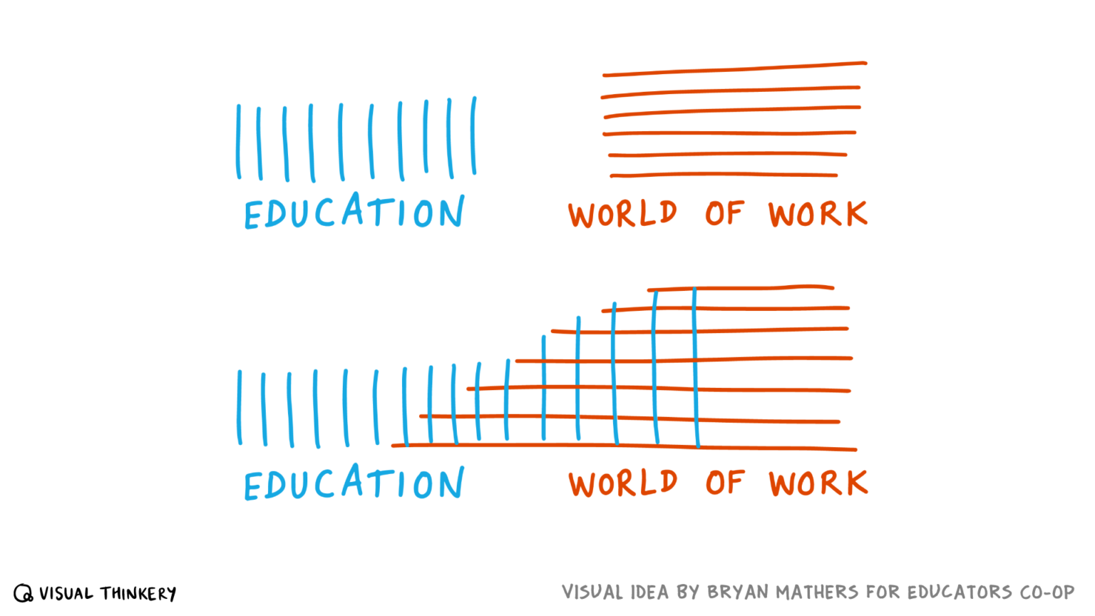
Via Bryan Mathers at https://bryanmmathers.com/education-work/
Title: Delays, Detours, and Forks in the Road: Latent State Models of Training Dynamics Authors: Michael Y. Hu1 Angelica Chen1 Naomi Saphra1 Kyunghyun Cho Note: This paper seems cool, using older interpretable machine learning models, graphical models to understand what is going on inside a deep neural network
Figure 10.7 The flow velocltles in the optic array reflectedfrom the surface of the earth. This is the flow pattern obtainedwith locomotion parallel to the earth in the direction of the pole atthe top of the graph. The vectors are plotted in angular coordinates.This is a view from above, whereas Figure 9.3 was a view from theside.
Visual of the flow velocities in the optic array.
Figure 10.5 The effective array at a stationary convergence point(Stage 5). The solid lines represent the sample of the total optic arraythat is admitted to a human eye in a given posture. The dashed linesrepresent the remainder of the array, which is available for stimulationbut not effective at this moment.
Visual example of an "effective array" along with the broader "optic array".
A paper recommended by Pablo B. which is about the implementation of a software for iterative visualizations. Looks very promising
The resulting system effec-tively models diagram genera-tion as a compilation process,where the compilation targetis a constrained optimizationproblem rather than (say) a bi-nary executable or a static im-age.
A neat idea of using compilation to target [[constrained optimization problem]] instead of a binary executable or static image.
A visual depiction of the transition from effortful to effortless meditation.
Interesting that the [[default mode network]] and [[frontoparietal network]] connectivity goes down (from naïve to developing meditator) and then goes up much higher (from developing meditator to proficient meditator). Seems like the DMN is suppressed to allow for more CEN/FN activation during a developing meditator's practice. Seems like the eventual transition of allowing co-activation of the DMN and the CEN/FN is associated with the "effortless" described in [[nondual awareness]] [[meditation]] like what [[Diana Winston]] calls [[natural awareness]] in the series [[The Spectrum of Awareness]] or what [[Loch Kelly]] teaches in his series [[Effortless Mindfulness]] (both of which are on the [[Waking Up app]]).
This was a tool mentioned by [[Grant Sanderson]] in the description of a video on [[divergence]] and [[curl]]. Helpful tool for visualizing [[vector fields]].
Erin Floto has a metal stencil for a chronodex circular design for use in bullet journals. It's a form of circular calendar with the inner circle containing space for daily, bi-weekly, weekly, monthly and longer time horizons with succeeding rings of the circle containing space for data related to the inner categories. Some of the exterior rings also include numbered squares representing days of the month or week on which a task should be done or for which a habit on an interior part of the circle might be tracked.

The chronodex, a portmanteau of chrono (time) and index, idea is fairly simple, but can be quite complex. For actual use, one may need to be able to spin the visualization around to read and understand it.
Other stencils with habit trackers, etc: https://erinflotodesigns.com/collections/metal-stencils
Found this webpage for a 3D brain model when someone (maybe frymatic?) mentioned a region of the brain I was having trouble imagining.
https://www.napkin.one/
Yet another collection app that belies the work of taking, making, and connecting notes.
Looks pretty and makes a promise, but how does it actually deliver? How much work and curation is involved? What are the outputs at the other end?
Now we are getting somewhere. At this point, we also see that the dimensions of W and b for each layer are specified by the dimensions of the inputs and the number of nodes in each layer. Let’s clean up the above diagram by not labeling every w and b value individually.
There are two main reasons to use logarithmic scales in charts and graphs.
The data values are spread out better with the logarithmic scale. This is what I mean by responding to skewness of large values.
In Figure 2 the difference is multiplicative. Since 27 = 26 times 2, we see that the revenues for Ford Motor are about double those for Boeing. This is what I mean by saying that we use logarithmic scales to show multiplicative factors
One reason for choosing a dot plot rather than a bar chart is that it is less cluttered. We will be learning other benefits of dot plots in this and future posts.
A dot plot is judged by its position along an axis; in this case, the horizontal or x axis. A bar chart is judged by the length of the bar. I don’t like using lengths with logarithmic scales. That is a second reason that I prefer dot plots over bar charts for these data.
a Structure Note can make use of a TOC form, a normal table, a mind map, a flow diagram, a straight list, or even a picture.
Structure notes can take a variety of forms including lists, diagrams, mind maps, tables, and tables of contents.
Data Viz with Python and RLearn to Make Plots in Python and R
data viz with python and R
An independent initiative made by Owen Cornec who has also made many other beautiful data visualizations. Wikiverse vividly captures the fact that Wikipedia is a an awe-inspiring universe to explore.
The only diagram or image in The Origin of Species, a tree depicting divergence (source)
Darwin's On the Origin of Species only contains one diagram, a branching tree diagram which shows divergence of species.
he was working on the same theme with Stefanie Posavec. They completed their piece some time later, depicting the changes as lovely branching trees — a kind of homage to Darwin’s lone diagram in the book.
Greg McInerny of Microsoft Research and Stefanie Posavek created a version of Darwin's On the Origin of Species that displayed variations between the editions as a branching tree diagram, a nod to the only diagram which appeared in Darwin's original work. .
Registered 2022-09-07
https://www.denizcemonduygu.com/philo/browse/
This could be thought of as a form of digital, single-project zettelkasten dedicated to philosophy. It's got people, sources, and ideas which are cross linked in a Luhmann-sense (without numbering) though not in a topical index-sense. Interestingly it has not only a spatial interface and shows spatial relationships between people and ideas over time using a timeline, but it also indicates—using colored links—the ideas of disagreement/contrast/refutation and agreement/similarity/expansion.
What other (digital) tools of thought provide these sorts of visualization affordances?
https://cosma.graphlab.fr/<br /> https://cosma.graphlab.fr/en/
When did this come out?
Appears to be a visualization tool for knowledge work. They recommend it for use with Zettlr, but it looks like it would work with other text based tools. Point it at markdown files to create graphs apparently.
This looks like the sort of standards based tool that would allow greater flexibility when using various data stores that we talk about in Friends of the Link.
<small><cite class='h-cite via'>ᔥ <span class='p-author h-card'>Arthur Perret </span> in And you, what are you doing? (<time class='dt-published'>08/31/2022 02:40:03</time>)</cite></small>
@flancian
For physical note taking on index cards or visualizations provided by computer generated graphs, one can physically view a mass of notes and have a general feeling if there is a large enough corpus to begin writing an essay, chapter, or book or if one needs to do additional research on a topic, or perhaps pick a different topic on which to focus.
(parts suggested by p7, though broadly obvious)
here are several ways I havefound useful to invite the sociological imagination:
C. Wright Mills delineates a rough definition of "sociological imagination" which could be thought of as a framework within tools for thought: 1. Combinatorial creativity<br /> 2. Diffuse thinking, flâneur<br /> 3. Changing perspective (how would x see this?) Writing dialogues is a useful method to accomplish this. (He doesn't state it, but acting as a devil's advocate is a useful technique here as well.)<br /> 4. Collecting and lay out all the multiple viewpoints and arguments on a topic. (This might presume the method of devil's advocate I mentioned above 😀)<br /> 5. Play and exploration with words and terms<br /> 6. Watching levels of generality and breaking things down into smaller constituent parts or building blocks. (This also might benefit of abstracting ideas from one space to another.)<br /> 7. Categorization or casting ideas into types 8. Cross-tabulating and creation of charts, tables, and diagrams or other visualizations 9. Comparative cases and examples - finding examples of an idea in other contexts and time settings for comparison and contrast 10. Extreme types and opposites (or polar types) - coming up with the most extreme examples of comparative cases or opposites of one's idea. (cross reference: Compass Points https://hypothes.is/a/Di4hzvftEeyY9EOsxaOg7w and thinking routines). This includes creating dimensions of study on an object - what axes define it? What indices can one find data or statistics on? 11. Create historical depth - examples may be limited in number, so what might exist in the historical record to provide depth.
As arousal-based meditative practices are associated with a different autonomic state to mindfulness-related practices (PNS withdrawal vs. PNS dominance), they are likely to recruit a different type of alerting attention (selective or focused vs. sustained) and attentional control (modulated by arousal vs. regulated by monitoring continuous thought processes). In particular, my focus is on Vajrayana (Tantric Buddhism) practices, during which a sequence of generation (self-visualization as a deity - Yidam) or completion with sign (inner heat -Tummo) stages necessarily precedes non-dual awareness (NDA) Tantric Mahamudra. I conduct my studies with experienced monks and nuns in Eastern Tibet, Bhutan, and Nepal. I studied these practices using cognitive (visual working memory and attention) assessments as well as electrocardiographic (EKG) and (EEG) measures.
!- for : visualization practice - could this research benefit practitioners who have a hard time visualizing ?
COVID-19 vaccine tracker and landscape. (2022, April 22). https://www.who.int/publications/m/item/draft-landscape-of-covid-19-candidate-vaccines
The forerunner of contemporary Infographics, he initially called this the Vienna Method of Pictorial Statistics.
http://cluster.cis.drexel.edu/~cchen/talks/2011/ICSTI_Chen.pdf
The Nature of Creativity: Mechanism, Measurement, and Analysis<br /> Chaomei Chen, Ph.D.<br /> Editor in Chief, Information Visualization<br /> College of Information Science and Technology, Drexel University<br /> June 7‐8, 2011
Randomly ran across while attempting to source Randall Collins quote from https://hypothes.is/a/8e9hThZ4Ee2hWAcV1j5B9w
Sounds like his philosophy fit may have fit in with the broader prosperity gospel space, Napoleon Hill, Billy Graham, Norman Vincent Peale, et al. Potentially worth looking into. Also related to the self-help movements and the New Thought philosophies.
fascinating that he wrote a book Copywriting and Direct Marketing. This may also tie him into the theses of Kevin Phillips' American Theocracy?
Link to: https://hyp.is/E4I_qgvCEe2rQO9iXvaTgA/www.goodreads.com/author/show/257221.Robert_Collier
80% of data analysis is spent on the process of cleaning and preparing the data
Imagine having unnecessary and wrong data in your document, you would most likely have to experience the concept of time demarcation -- the reluctance in going through every single row and column to eliminate these "garbage data". Clearly, owning all kinds of data without organizing them feels like stuffing your closet with clothes that you should have donated 5 years ago. It is a time-consuming and soul-destroying process for us. Luckily, in R, we have something in R called "tidyverse" package, which I believe the author talks about in the next paragraph, to make life easier for everyone. I personally use dplyr and ggplot2 when I deal with data cleaning, and they are extremely helpful. WIthout these packages' existence, I have no idea when I will be able to reach the final step of data visualization.
Recognizing that the CEC hyperthreat operates at micro and macro scales across most forms of human activity and that a whole-of-society approach is required to combat it, the approach to the CEC hyperthreat partly relies on a philosophical pivot. The idea here is that a powerful understanding of the CEC hyperthreat (how it feels, moves, and operates), as well as the larger philosophical and survival-based reasons for hyper-reconfiguration, enables all actors and groups to design their own bespoke solutions. Consequently, the narrative and threat description act as a type of orchestration tool across many agencies. This is like the “shared consciousness” idea in retired U.S. Army general Stanley A. McChrystal’s “team of teams” approach to complexity.7 Such an approach is heavily dependent on exceptional communication of both the CEC hyperthreat and hyper-response pathways, as well as providing an enabling environment in terms of capacity to make decisions, access information and resources. This idea informs Operation Visibility and Knowability (OP VAK), which will be described later.
Such an effort will require a supporting worldwide digital ecosystem. In the recent past, major evolutionary transitions (MET) (Robin et al, 2021) of our species have been triggered by radical new information systems such as spoken language, and then inscribed language. Something akin to a Major Competitive Transitions (MCT) may be required to accompany a radical transition to a good anthropocene. (See annotation: https://hyp.is/go?url=https%3A%2F%2Fwww.frontiersin.org%2Farticles%2F10.3389%2Ffevo.2021.711556%2Ffull&group=world)
If large data is ingested into a public Indyweb, because Indyweb is naturally a graph database, a salience landscape can be constructed of the hyperthreat and data visualized in its multiple dimensions and scales.
Metaphorically, it can manifest as a hydra with multiple tentacles reach out to multiple scales and dimensions. VR and AR technology can be used to expose the hyperobject and its progression.
The proper hyperthreat is not climate change alone, although that is the most time sensitive dimension of it, but rather the totality of all blowbacks of human progress...the aggregate of all progress traps that have been allowed to grow, through a myopic prioritization of profit over global wellbeing due to the invisibility of the hyperobject, from molehills into mountains.
Ourpre-trained network is nearly identical to the “AlexNet”architecture (Krizhevsky et al., 2012), but with local re-ponse normalization layers after pooling layers following(Jia et al., 2014). It was trained with the Caffe frameworkon the ImageNet 2012 dataset (Deng et al., 2009)
Adam Kucharski on Twitter: "Interesting visualisation of COVID-related data sharing. (2021, March 26). Ttps://t.co/lOc1mzeiHt via @OYCar https://t.co/Im9SWlCA3Q [Tweet]. @AdamJKucharski. https://twitter.com/AdamJKucharski/status/1375350545393840130
Trevor Bedford. (2022, January 10). Given ~680k cases per day, this would in turn suggest 0.8% or 1% of the US being infected with SARS-CoV-2 every day. This would translate to perhaps 5% or 10% of individuals currently infected with SARS-CoV-2 in the US. 15/15 [Tweet]. @trvrb. https://twitter.com/trvrb/status/1480610448563060738
Starting from random noise, we optimize an image to activate a particular neuron (layer mixed4a, unit 11).
And then we use that image as a kind of variable name to refer to the neuron in a way that more helpful than the the layer number and neuron index within the layer. This explanation is via one of Chris Olah's YouTube videos (https://www.youtube.com/watch?v=gXsKyZ_Y_i8)
ReconfigBehSci. (2022, January 10). RT @GeraldGmboowa: Genomic epidemiology of SARS-CoV-2 in Africa focused on different 🌍regions @AfricaCDC https://bit.ly/3tcDuJl. Using A… [Tweet]. @SciBeh. https://twitter.com/SciBeh/status/1480595472834338827
igure 3: i
How did Bengio et al generate this figure? I want access to that software
Professor Susan Michie. (2021, December 27). We (UK) don’t have to be here: It’s a political (and harmful) choice. Https://t.co/gIL3bmA17i [Tweet]. @SusanMichie. https://twitter.com/SusanMichie/status/1475436150420656131
Yaniv Erlich on Twitter. (n.d.). Twitter. Retrieved February 8, 2022, from https://twitter.com/erlichya/status/1482847821397176325
Adam Kucharski. (2022, February 8). Below figure being widely shared (from: Https://cdc.gov/mmwr/volumes/71/wr/mm7106e1.htm), but think it’s important to include uncertainty (i.e. 95% confidence intervals) when reporting estimates: Cloth mask: 56% (-17%-83%) lower odds than no mask Surgical mask: 66% (10%-87%) N95/KN95: 83% (36%-95%) https://t.co/SkPhF7CAJf [Tweet]. @AdamJKucharski. https://twitter.com/AdamJKucharski/status/1490946644837543938
refracted ocean light
I often connect refracted ocean light to summer days at the beach. My body immediately relaxes and that feeling of "nothing to do, nothing to complete" sets in.
haunted house shrieks
This is such a visceral image. I can hear it and see it.
Jorge A. Caballero, MD (jorgecaballero.eth). (2022, January 25). I’m not sure what to say anymore https://t.co/wapOCaoD6X [Tweet]. @DataDrivenMD. https://twitter.com/DataDrivenMD/status/1485914512360235010
Infectious Diseases. (2022, January 26). In France, a recent rise in hospitalizations raises the concern that BA.2 may not just be the harmless wake of BA.1’s powerboat Yellow line—Hospital admission Black line—Death in hospital Red line—ICU admission [Tweet]. @InfectiousDz. https://twitter.com/InfectiousDz/status/1486306246823391237
Zimmerman, M. I., Porter, J. R., Ward, M. D., Singh, S., Vithani, N., Meller, A., Mallimadugula, U. L., Kuhn, C. E., Borowsky, J. H., Wiewiora, R. P., Hurley, M. F. D., Harbison, A. M., Fogarty, C. A., Coffland, J. E., Fadda, E., Voelz, V. A., Chodera, J. D., & Bowman, G. R. (2021). SARS-CoV-2 simulations go exascale to predict dramatic spike opening and cryptic pockets across the proteome. Nature Chemistry, 13(7), 651–659. https://doi.org/10.1038/s41557-021-00707-0
Mike Honey 💉💉💉. (2022, January 22). Here’s the latest variant picture for BA.2 (Omicron). Globally it has been far less common than it’s sibling BA.1 lineage. The frequency of BA.2 is rising rapidly in several countries, notably India, Denmark & Singapore. 🧵 https://t.co/nE926hn9ws [Tweet]. @MikeHoney. https://twitter.com/Mike_Honey_/status/1484707779327950855
casey briggs. (2022, January 22). Both Victoria and New South Wales are seeing continued improvement in COVID-19 hospitalisation https://t.co/O9rB6rqeIV [Tweet]. @CaseyBriggs. https://twitter.com/CaseyBriggs/status/1485013320336052227
Prof. Jose-Luis Jimenez. (2022, January 14). The rise of Omicron Translated from @numeroteca https://t.co/S7HYcEnuQn [Tweet]. @jljcolorado. https://twitter.com/jljcolorado/status/1481799620502061056
Theo Sanderson. (2022, January 5). Version with fewer ages and the CIs plotted: Https://t.co/WI2dA231xM [Tweet]. @theosanderson. https://twitter.com/theosanderson/status/1478740695041073152
James 💙 Neill - 😷 🇪🇺🇮🇪🇬🇧🔶. (2021, December 30). @dgurdasani1 And for age 0-5... Https://t.co/ve3v92iJgR [Tweet]. @jneill. https://twitter.com/jneill/status/1476701258392211456
Dr. Cecília Tomori. (2021, December 27). Maryland—Just awful to watch what’s unfolding. Now at 1714 hospitalizations ⬆️ 130 in 24 hrs. 16.5% test positivity. Some counties have acted but no statewide 😷 policy! No measures to slow the spread. Https://coronavirus.maryland.gov https://t.co/C03cSRO2AX [Tweet]. @DrTomori. https://twitter.com/DrTomori/status/1475503877977948166
Jorge A. Caballero, MD. (2021, December 30). 544 children with #COVID19 were admitted to U.S. hospitals yesterday—This shattered the previous single-day record that was set 2 days ago (421) source: HHS (https://healthdata.gov/Hospital/COVID-19-Reported-Patient-Impact-and-Hospital-Capa/g62h-syeh) https://t.co/bOUylcyZlV [Tweet]. @DataDrivenMD. https://twitter.com/DataDrivenMD/status/1476357620550148100
Kit Yates. (2022, January 4). There are sone issues with data from Wales and Northern Ireland covering the holiday weekend, but still, wow. U.K. breaches the 200k daily cases mark for the first time. Https://t.co/k5P96LeiRU [Tweet]. @Kit_Yates_Maths. https://twitter.com/Kit_Yates_Maths/status/1478414522205577224 i
Kit Yates. (2022, January 5). I can tell you for a fact that it isn’t ‘mild’ for everyone. Https://t.co/9DJHOMBv7F [Tweet]. @Kit_Yates_Maths. https://twitter.com/Kit_Yates_Maths/status/1478651876329594882
Alison Buttenheim. (2022, January 13). How many more days until Rhode Island’s cases line exceeds the word “exceeds” in the text header? 🙁 https://t.co/DFjqjHXutJ [Tweet]. @abuttenheim. https://twitter.com/abuttenheim/status/1481738740318015492
David Spiegelhalter. (2022, January 6). Good news: Admissions for flu not quite as tiny as last year, but close. Https://gov.uk/government/statistics/national-flu-and-covid-19-surveillance-reports-2021-to-2022-season https://t.co/YILvkQ4Vqu [Tweet]. @d_spiegel. https://twitter.com/d_spiegel/status/1479139047515856901
Ariel Karlinsky. (2022, January 2). Russia at 1.04 MILLION excess deaths since March 2020, which is about 240% higher than their reported COVID-19 deaths. This is 1st place worldwide (for countries with data) in absolute excess mortality, 2nd place on per capita terms and 9th on p-score. #poptwitter #epitwitter https://t.co/aLBRRht3z2 [Tweet]. @ArielKarlinsky. https://twitter.com/ArielKarlinsky/status/1477531141510946818
Welcome to the Australian Crisis Mobility Portal. (n.d.). Mobility-Aus. Retrieved January 10, 2022, from https://rsbyrne.github.io/mobility-aus/
Diego Bassani, PhD 🏠😷 💉 💉 💉. (2022, January 7). Seasonality, huh? Https://t.co/WcarGXqRSY [Tweet]. @DGBassani. https://twitter.com/DGBassani/status/1479278943328944130
Carl T. Bergstrom. (2021, December 28). Heck of a time to relax NPIs. Https://t.co/iw4HKNkXz4 [Tweet]. @CT_Bergstrom. https://twitter.com/CT_Bergstrom/status/1475753262246547456
Andrew Account for lags Kunzmann. (2021, December 28). @ProfMattFox Fatalism can be fatal https://t.co/fa4mgVn3OZ [Tweet]. @1987Andrewk. https://twitter.com/1987Andrewk/status/1475825206564376579
Trisha Greenhalgh. (2021, December 27). This is nothing short of scandalous. Unless and until those leading the public health response acknowledge the AIRBORNE nature of the virus and give transmission mitigation advice commensurate with how airborne viruses spread, we will be yo-yoing from wave to wave ad infinitum. [Tweet]. @trishgreenhalgh. https://twitter.com/trishgreenhalgh/status/1475502337594646528
Travelling Tabby. (2021, December 20). Https://travellingtabby.com/scotland-coronavirus-tracker/ There were over 6,700 new cases reported today, which is one of the highest days we’ve had. And a positivity rate of over 15% too, which is the joint highest we’ve had since reporting began. #covid19scotland #coronavirusscotland #DailyCovidUpdate https://t.co/ZvrVGc2J3I [Tweet]. @TravellingTabby. https://twitter.com/TravellingTabby/status/1472952525544255489
Colin Davis. (2021, December 20). Update for 20th Dec. The trend line still reflects 1.8 day doubling (it’s 1.7 days if we look at just the last week). Today’s number is down, but I wouldn’t read too much into that at this point. Https://t.co/kOCjxhRbop [Tweet]. @ProfColinDavis. https://twitter.com/ProfColinDavis/status/1472969632705392640
Benjy Renton. (2021, December 14). New data from CDC finds that the Omicron variant represented 2.9% of new cases in the US last week. Https://covid.cdc.gov/covid-data-tracker/#variant-proportions https://t.co/AqM8a1vekm [Tweet]. @bhrenton. https://twitter.com/bhrenton/status/1470765699907870729
Tom Moultrie. (2021, December 17). A 1-figure Gauteng update, bringing in data through Wednesday 15/12 (PCR only; by date of collection). The turn continues. On similar metrics (not shown) ALL northern provinces (NW, GT, MP, LP) seem to have now turned. Https://t.co/6Bh3kZsooK [Tweet]. @tomtom_m. https://twitter.com/tomtom_m/status/1471723711287996416
Carl Zimmer. (2021, December 15). Connecticut has gone practically vertical https://nytimes.com/interactive/2021/us/covid-cases.html?referringSource=articleShare https://t.co/mBlybyTpAA [Tweet]. @carlzimmer. https://twitter.com/carlzimmer/status/1470986172583317506
Theo Sanderson. (2021, December 16). 71.9% of cases in London with specimens from 13 December were Omicron. Overall London cases are already reaching the maximum values ever seen in the pandemic. Https://t.co/CJF5kQqBpl [Tweet]. @theosanderson. https://twitter.com/theosanderson/status/1471537690650812420
Mallapaty, S., Callaway, E., Kozlov, M., Ledford, H., Pickrell, J., & Van Noorden, R. (2021). How COVID vaccines shaped 2021 in eight powerful charts. Nature. https://doi.org/10.1038/d41586-021-03686-x
Eric Topol. (2021, December 14). Graph of Pfizer 3rd shot (booster) vs Omicron symptomatic infection, restoring to 75% protection, significantly less compared to its effect vs Delta (95%) with 95% CI, @UKHSA data, vs unvaccinated https://ft.com/content/8a6a0ec8-fd07-49cd-a3f5-386a06269a5c by @hannahkuchler @donatopmancini @mroliverbarnes https://t.co/PHMDZGIgDj [Tweet]. @EricTopol. https://twitter.com/EricTopol/status/1470744717398720513
Max Roser. (2021, December 11). The number of confirmed COVID cases is rising in all of Southern Africa. Https://t.co/3hP7f3zoqt [Tweet]. @MaxCRoser. https://twitter.com/MaxCRoser/status/1469634777078710274
💉💉 Henry Madison DPhil. (2021, December 12). Denmark, already up shit creek because of Delta, has just met Omicron. Near-vertical growth. #auspol #covid19aus https://t.co/Jhvs3dWWhK [Tweet]. @RageSheen. https://twitter.com/RageSheen/status/1470125914788818944
100 000+ datapoints). This library solves this by downsampling the signal for the currently selected time window and then plotting the downsampled points.
Optimization plotting library.
Dave Keating. (2021, December 8). Boris Johnson’s continued pretence that UK is one of the most vaccinated countries in the world, repeated again in press conference just now announcing new restrictions, is getting tiresome. That has not been the case for many many months, despite 🇬🇧🇺🇸 vaccine hoarding early on. Https://t.co/tQt6aXGtNI [Tweet]. @DaveKeating. https://twitter.com/DaveKeating/status/1468655107436802052
Trevor Branch. (2021, November 28). countries banned because of the omicron variant vs. Countries with confirmed omicron cases https://t.co/7HAxx03KfE [Tweet]. @TrevorABranch. https://twitter.com/TrevorABranch/status/1464748201601159169
Alistair Haimes. (2021, December 3). @nicfreeman1209 Ok, so vax take-up in Gauteng is 38.6%. Given 9% of inpatients whose vax status is known are vaxxed, I think that’s pretty encouraging (odds, log odds, etc.) https://t.co/eAAfIQ8BQT [Tweet]. @AlistairHaimes. https://twitter.com/AlistairHaimes/status/1466711359329120258
Lindiwe Mazibuko. (2021, November 27). When literally every country “banning” you has a higher infection rate 🙄 https://t.co/NZMuf9Pfx5 [Tweet]. @LindiMazibuko. https://twitter.com/LindiMazibuko/status/1464539078611939333
News, B. N. O. (2021, November 26). Tracking COVID-19 variant Omicron. BNO News. https://bnonews.com/index.php/2021/11/omicron-tracker/
Jorge A. Caballero, MD. (2021, December 3). #Omicron is sending more kids to the hospital than #Delta in South Africa https://t.co/bv5CxIag2u [Tweet]. @DataDrivenMD. https://twitter.com/DataDrivenMD/status/1466658311227404292
Paul Mainwood. (2021, November 29). @mroliverbarnes If it’s anything like Beta, then boosters should clobber it just fine. Https://t.co/LPX0GAXn1y [Tweet]. @PaulMainwood. https://twitter.com/PaulMainwood/status/1465263524104609792
Art Poon. (2021, November 28). Our first https://filogeneti.ca/CoVizu update with B.1.1.529. As expected, number of mutations is well over molecular clock prediction (~13 diffs). Relatively low numbers of identical genomes implies large number of unsampled infections. We update every two days from GISAID. https://t.co/m8w2CjL1c0 [Tweet]. @art_poon. https://twitter.com/art_poon/status/1465001066194481162
Andrew L. Croxford. (2021, December 1). Switzerland just clocked 10,466 cases today, which normalised to the U.K. would be 81,500, with a positive test frequency of 15.83%. Https://t.co/fxjSaL9n3O [Tweet]. @andrew_croxford. https://twitter.com/andrew_croxford/status/1466034479156404226
nference. (2021, November 27). Here is how B.1.1.529 (#Omicron #B11529) compares to Alpha, Beta, Gamma, Delta variants. Omicron has highest novel Spike mutations including striking cluster on the “crown” suggesting significant selection pressure & antigenic distinction from prior strains (Credits: Nference) https://t.co/4oZQbjhbG8 [Tweet]. @_nference. https://twitter.com/_nference/status/1464404770098229250
gianluca c 🏴☠️🇻🇪 #TeamFauci #MaskUp #no GBD. (2021, November 29). Gauteng just updated 47 week and its shit https://t.co/yu5aLzwoJE [Tweet]. @gianlucac1. https://twitter.com/gianlucac1/status/1465300644336738308
Oliver Barnes. (2021, November 30). Presented without comment. #Omicron cc @jburnmurdoch https://t.co/SFGr0y8VlZ [Tweet]. @mroliverbarnes. https://twitter.com/mroliverbarnes/status/1465646339426033667
Prof. Christina Pagel. (2021, November 24). Meanwhile AY.4.2 (Delta grandchild) continues its very slow path to English dominance. Makes life a bit harder by being a bit more transmissible but luckily doesn’t seem any worse than Delta in any other respect. Https://t.co/kB0V0Z66GT [Tweet]. @chrischirp. https://twitter.com/chrischirp/status/1463508172941967365
Chise 🧬🧫🦠💉🔜 MFF. (2021, November 21). If you’re wondering what difference a booster makes. Https://t.co/858ZpST7Kh [Tweet]. @sailorrooscout. https://twitter.com/sailorrooscout/status/1462441020948459525
Charles #GetCovered-ba 🩺. (2021, November 13). America 2021 in one image. Https://t.co/SuTCkCp2Pm [Tweet]. @charles_gaba. https://twitter.com/charles_gaba/status/1459565881214836743
Gaba, C. (2021, November 17). RED SHIFT: How Trump’s attempt to let COVID-19 destroy Blue America reversed itself, animated [Text]. ACA Signups. https://acasignups.net/21/11/17/red-shift-how-trumps-attempt-let-covid-19-destroy-blue-america-reversed-itself-animated
Paul Mainwood. (2021, November 18). Holy guacamole. Https://t.co/mIcWJMHdHJ [Tweet]. @PaulMainwood. https://twitter.com/PaulMainwood/status/1461337249950404625
The following figure presents a simple functional diagram of the neural network we will use throughout the article. The neural network is a sequence of linear (both convolutional A convolution calculates weighted sums of regions in the input. In neural networks, the learnable weights in convolutional layers are referred to as the kernel. For example Image credit to https://towardsdatascience.com/gentle-dive-into-math-behind-convolutional-neural-networks-79a07dd44cf9. See also Convolution arithmetic. and fully-connected A fully-connected layer computes output neurons as weighted sum of input neurons. In matrix form, it is a matrix that linearly transforms the input vector into the output vector. ), max-pooling, and ReLU First introduced by Nair and Hinton, ReLU calculates f(x)=max(0,x)f(x)=max(0,x)f(x)=max(0,x) for each entry in a vector input. Graphically, it is a hinge at the origin: Image credit to https://pytorch.org/docs/stable/nn.html#relu layers, culminating in a softmax Softmax function calculates S(yi)=eyiΣj=1NeyjS(y_i)=\frac{e^{y_i}}{\Sigma_{j=1}^{N} e^{y_j}}S(yi)=Σj=1Neyjeyi for each entry (yiy_iyi) in a vector input (yyy). For example, Image credit to https://ljvmiranda921.github.io/notebook/2017/08/13/softmax-and-the-negative-log-likelihood/ layer.
This is a great visualization of MNIST hidden layers.
European Commission 🇪🇺. (2021, November 23). Data shows us that the higher the vaccination rate, the lower the death rate. #COVID19 #VaccinesWork https://t.co/mORrrQOPsj [Tweet]. @EU_Commission. https://twitter.com/EU_Commission/status/1463119478099693571
COVID-19 Living Evidence. (2021, November 12). As of 12.11.2021, we have indexed 257,633 publications: 18,674 pre-prints 238,959 peer-reviewed publications Pre-prints: BioRxiv, MedRxiv Peer-reviewed: PubMed, EMBASE, PsycINFO https://t.co/ytOhLG90Pi [Tweet]. @evidencelive. https://twitter.com/evidencelive/status/1459163720450519042
Jeffrey Barrett. (2021, October 19). Proportion of AY.4.2 (now on http://covid19.sanger.ac.uk) has been steadily increasing in England, which is a pattern that is quite different from other AY lineages. Several of them rose when there was still Alpha to displace, but none has had a consistent advantage vs other Delta. Https://t.co/mD5gQzKxgV [Tweet]. @jcbarret. https://twitter.com/jcbarret/status/1450408485829718039
Stephen Reicher. (2021, November 10). Look at this quite shameful graph (from Bob Hawkins) on Covid catch up spending per pupil. All four UK nations provide a few hundred pounds per pupil while others provide thousands. But to make things still worse... Https://t.co/Keprj2qzWN [Tweet]. @ReicherStephen. https://twitter.com/ReicherStephen/status/1458380613346541576
BK Titanji #ILookLikeAScientist. (2021, November 2). I simply can’t get over this graph @FT https://t.co/Uozp7yBs9n [Tweet]. @Boghuma. https://twitter.com/Boghuma/status/1455493059534376963
ReconfigBehSci. (2021, November 2). The current JCVI minutes debate clearly illustrates the problems with Twitter and scientific debate: Meaning glossed, hedges and distinctions left behind, claims about arguments conflated with claims about people, paving the way to ramped up, emotive soundbites and claims. 1/7 [Tweet]. @SciBeh. https://twitter.com/SciBeh/status/1455458854637117440
Henk-Jan Westeneng on Twitter. (n.d.). Twitter. Retrieved November 2, 2021, from https://twitter.com/HJWesteneng/status/1455304431038308352 i
Gil Feldman. (2021, October 26). @EricTopol Updated data from Israel. The booster works, without any doubt! Red (empty battery): Un-vax Light green (half battery): 2nd dose without the booster Green (full battery): With the booster https://t.co/HbZBvDMQs6 [Tweet]. @feldman_gil. https://twitter.com/feldman_gil/status/1452845319251767299
Erich Neuwirth. (2021, October 21). Diese Grafik vergleicht die Inzidenz und die Impfquote in den Bezirken. Https://t.co/qd8tXlwhnI [Tweet]. @neuwirthe. https://twitter.com/neuwirthe/status/1451162239726141444
John Roberts on Twitter: “154k booster 💉reported today in 🏴, bringing the total to 1.58m, out of 4.56m. So that’s another 3m eligible for a jab as soon as they can be scheduled in. 1/ https://t.co/tw1JmrOiUo” / Twitter. (n.d.). Retrieved October 15, 2021, from https://twitter.com/john_actuary/status/1445785517774176262
The COVID-19 vaccine race | Gavi, the Vaccine Alliance. (n.d.). Retrieved October 8, 2021, from https://www.gavi.org/vaccineswork/covid-19-vaccine-race
Timothy Caulfield on Twitter: “Will you fall into the conspiracy theory rabbit hole? Https://t.co/8mLQqSBnqb by @databyler @codingyan Good breakdown on some of the social forces (like ideology) that drive conspiracy theories. Despite the fact I study topic, still amazed how many believe this stuff. Https://t.co/L1T0cpy9kB” / Twitter. (n.d.). Retrieved October 8, 2021, from https://twitter.com/CaulfieldTim/status/1445794723101175818
Sam Wang on Twitter: “These are risk levels that you pose to other people. They’re compared with you as—A nonsmoker—A sober driver—A vaccinated person. Unvaccinated? 5x as likely to get sick, for 3x as long. Total risk to others? 15x a vaccinated person Details:https://t.co/ckTWaivK8n https://t.co/PhpLvX2dsm” / Twitter. (n.d.). Retrieved September 19, 2021, from https://twitter.com/SamWangPhD/status/1438361144759132167
Derek Thompson on Twitter: “um, https://t.co/bW1iItRtag” / Twitter. (n.d.). Retrieved September 1, 2021, from https://twitter.com/DKThomp/status/1432708125971333125
Prof. Christina Pagel on Twitter: “THREAD latest on B.1.617.2 variant in England: B.1.617.2 (1st discovered in India) is now dominant in England. Here is a thread summarising latest PHE report and Sanger local data. TLDR: it is NOT good news. 1/7” / Twitter. (n.d.). Retrieved August 24, 2021, from https://twitter.com/chrischirp/status/1399333330286415876
(2) David Fisman on Twitter: “Here’s some really simple modeling that hopefully will help provide some insight into why having a large, unvaccinated minority in Ontario is a problem for the population as a whole.” / Twitter. (n.d.). Retrieved August 23, 2021, from https://twitter.com/DFisman/status/1427940663925092354
t-SNE visualizations of word embeddings.
John Thornhill on Twitter: “Good news: Vaccine hesitancy collapses Smart data analysis from @TheEconomist https://t.co/cQcajRtEM6 https://t.co/IWIbUsEFXG” / Twitter. (n.d.). Retrieved August 1, 2021, from https://twitter.com/johnthornhillft/status/1418510295241269248
Hiroki Sayama. (2021, May 28). Weekly update This will be the last US domestic visualization Details -> https://github.com/hsayama/COVID-19-geographical-animations https://t.co/Mz23MDaa6l [Tweet]. @HirokiSayama. https://twitter.com/HirokiSayama/status/1398344774843781128
Leising, D., Grenke, O., & Cramer, M. (2021). Visual Argument Structure Tool (VAST). PsyArXiv. https://doi.org/10.31234/osf.io/dvfq7
DbRaevn on Twitter: “🗺Australian Covid outbreaks since May 2021—9 outbreaks (1 USA, 1 alpha, 1 kappa, 6 delta) https://t.co/njzgd8oM2T” / Twitter. (n.d.). Retrieved July 19, 2021, from https://twitter.com/dbRaevn/status/1414911457217507329
visualization of the authors referenced together
Not usually one for this type of visual web, but I love this one for how it can be used, in addition to simply being interesting to see. Could be a great way to discover confirmation bias at play, if for instance people with opposing views are never referenced together. It could also simply serve as a way to find "other authors you might like," who write on similar topics to those you already have a founded interest in.
Conor Kelly. (2021, July 14). Correlation between vaccination coverage and COVID hospitalizations per million over time, by state https://t.co/g6AMTDXOzb [Tweet]. @CohoKelly. https://twitter.com/CohoKelly/status/1415310919266095113
BNO Newsroom. (2021, July 14). COVID-19 hospitalizations in Missouri have reached a 5-month high https://t.co/342RW903WS [Tweet]. @BNODesk. https://twitter.com/BNODesk/status/1415105797575610368
(((Howard Forman))) on Twitter: “Cases represented similarly. Https://t.co/hBYBP78dRG” / Twitter. (n.d.). Retrieved July 15, 2021, from https://twitter.com/thehowie/status/1415301861842763778
Adam Kucharski on Twitter: “As Delta spreads, cases starting to rise again across Europe... Https://t.co/mwyFVlUPVY” / Twitter. (n.d.). Retrieved July 12, 2021, from https://twitter.com/AdamJKucharski/status/1412498377619673095
G. Elliott Morris on Twitter: “New weekly The Economist/YouGov national poll shows vaccine reluctance hitting another new low. - 69% of adults say they have been at least partially vaccinated, or plan to get vaccinated soon—17% say they will not get vaccinated—14% say they’re unsure https://t.co/OVLSuHyVrC” / Twitter. (n.d.). Retrieved July 2, 2021, from https://twitter.com/gelliottmorris/status/1392465678309933057
Meaghan Kall 🏳️🌈 on Twitter: “The updated cumulative growth curves showing continued exponential growth of B.1.617.2.. Https://t.co/3fmEwU7cP3” / Twitter. (n.d.). Retrieved July 2, 2021, from https://twitter.com/kallmemeg/status/1397981951907217411
Eve(#AmericaMaskUp)Bloomgarden MD on Twitter: “@CDCDirector @IMPACT4HC https://t.co/Dh0ysFhvTR” / Twitter. (n.d.). Retrieved July 2, 2021, from https://twitter.com/evebmd/status/1398303133302988806
Helen McArdle on Twitter: “The good news: An astonishing 98.2% of over-60s in Scotland are now fully vaccinated. That’s an amazing uptake. It doesn’t mean they are 100% protected of course (and especially not when case rates are high) but their risk of hospitalisation/death is cut by over 90% https://t.co/DzAxkpLvcR” / Twitter. (n.d.). Retrieved June 30, 2021, from https://twitter.com/HMcArdleHT/status/1409821893557768195
Max Roser on Twitter: “Confirmed COVID deaths have increased very rapidly in Namibia. Https://t.co/WKZw6UsZvg” / Twitter. (n.d.). Retrieved June 30, 2021, from https://twitter.com/MaxCRoser/status/1409785445274341376
RichardBrown on Twitter: “@Richard_Florida Still pretty slow recovery in London too @nicolegelinas. Https://t.co/nH9FOpV386” / Twitter. (n.d.). Retrieved June 29, 2021, from https://twitter.com/MinorPlaces/status/1407018950714605574
Eric Topol on Twitter: “As the Delta variant (B.1.617.2) becomes dominant throughout the world, there are 2 patterns emerging: —Countries w/ low vaccination rates are seeing both case and fatality rates increase—Countries w/ high vaccination rate: Some case increase and minimal to no fatality increase https://t.co/sSE4RlSeUJ” / Twitter. (n.d.). Retrieved June 28, 2021, from https://twitter.com/EricTopol/status/1408195243279667204
Spenser Lang on Twitter: “Astounding how we let politics influence public health. Republican, Democrat, who cares—Get vaccinated! Https://t.co/oOKZ5PcTqB” / Twitter. (n.d.). Retrieved June 28, 2021, from https://twitter.com/spenserlang/status/1408126711456276488
Madhu Pai, MD, PhD on Twitter: “South Africa: 3rd wave Only 1% of the population has received 1 dose of the vaccine Vaccine equity is URGENT https://t.co/JZODXO4Xsf” / Twitter. (n.d.). Retrieved June 12, 2021, from https://twitter.com/paimadhu/status/1403306405680062472
Madhu Pai, MD, PhD on Twitter: “#COVID19 surge in Uganda looks ominous Vaccine coverage = 1.5% with 1 dose https://t.co/TRAjEVC59U” / Twitter. (n.d.). Retrieved June 7, 2021, from https://twitter.com/paimadhu/status/1401010082884853768
Prof. Gavin Yamey MD MPH on Twitter: “The defining image of our time https://t.co/KynuxjJpTP” / Twitter. (n.d.). Retrieved June 7, 2021, from https://twitter.com/GYamey/status/1400810637509500933
Prof. Christina Pagel on Twitter: “SHORT THREAD: I was on Sky News earlier where I explained why I thought test 4 (new variant test) for the next stage of the roadmap had not been met, because of B.1.617.2 (the so called ‘Indian’ variant of concern). 1/5 https://t.co/0O3dL2saOR” / Twitter. (n.d.). Retrieved May 17, 2021, from https://twitter.com/chrischirp/status/1392927819504701441
Winton Centre Cambridge. (n.d.). Retrieved May 12, 2021, from https://wintoncentre.maths.cam.ac.uk/news/latest-data-mhra-blood-clots-associated-astra-zeneca-covid-19-vaccine/
ReconfigBehSci on Twitter: ‘the SciBeh initiative is about bringing knowledge to policy makers and the general public, but I have to say this advert I just came across worries me: Where are the preceding data integrity and data analysis classes? Https://t.co/5LwkC1SVyF’ / Twitter. (n.d.). Retrieved 18 February 2021, from https://twitter.com/SciBeh/status/1362344945697308674
The Data Visualizations Behind COVID-19 Skepticism. (n.d.). The Data Visualizations Behind COVID-19 Skepticism. Retrieved March 27, 2021, from http://vis.csail.mit.edu/covid-story/
Eric Topol on Twitter: “The variants of concern/interest fall into a spectrum of immune evasiveness, w/ B.1.351 being most; B.1.1.7, B.1.429 least. This property pertains to potential for reinfection & some reduction in vaccine efficacy My prelim estimates based on publications/preprints, subject to Δ https://t.co/fQZwBCUEGS” / Twitter. (n.d.). Retrieved April 28, 2021, from https://twitter.com/EricTopol/status/1380203664317456385
Benjy Renton on Twitter: “For those who are wondering: There is a slight association (r = 0.34) between the percentage a county voted for Trump in 2020 and estimated hesitancy levels. As @JReinerMD mentioned, GOP state, county and local levels need to do their part to promote vaccination. Https://t.co/ZY2lUqHgLd” / Twitter. (n.d.). Retrieved April 28, 2021, from https://twitter.com/bhrenton/status/1382330404586274817
Shows the effect of the number of samples used. Also, you can see svg vs canvas performance
Maarten van Smeden. (2021, March 25). 🚨🚨NEW EVIDENCE PYRAMID🚨🚨 https://t.co/RnGfl337tD [Tweet]. @MaartenvSmeden. https://twitter.com/MaartenvSmeden/status/1375008127737851904
Undetected Covid Cases Change the True Shape of the Pandemic—Bloomberg. (n.d.). Retrieved March 1, 2021, from https://www.bloomberg.com/opinion/articles/2020-12-01/undetected-covid-cases-change-the-true-shape-of-the-pandemic
Ashish K. Jha, MD, MPH. (2020, December 12). Michigan vs. Ohio State Football today postponed due to COVID But a comparison of MI vs OH on COVID is useful Why? While vaccines are coming, we have 6-8 hard weeks ahead And the big question is—Can we do anything to save lives? Lets look at MI, OH for insights Thread [Tweet]. @ashishkjha. https://twitter.com/ashishkjha/status/1337786831065264128
The COVID Tracking Project. (2020, November 19). Our daily update is published. States reported 1.5M tests, 164k cases, and 1,869 deaths. A record 79k people are currently hospitalized with COVID-19 in the US. Today’s death count is the highest since May 7. Https://t.co/8ps5itYiWr [Tweet]. @COVID19Tracking. https://twitter.com/COVID19Tracking/status/1329235190615474179
Flightradar24. (2020, November 24). The skies above North America at Noon ET on the Tuesday before Thanksgiving. Active flights 2018: 6,815 2019: 7,630 2020: 6,972 📡 https://t.co/NePPWZCDVp https://t.co/WOY9j0BXpx [Tweet]. @flightradar24. https://twitter.com/flightradar24/status/1331286193875640322
Stefan Simanowitz. (2020, November 14). “Sweden hoped herd immunity would curb #COVID19. Don’t do what we did” write 25 leading Swedish scientists “Sweden’s approach to COVID has led to death, grief & suffering. The only example we’re setting is how not to deal with a deadly infectious disease” https://t.co/azOg6AxSYH https://t.co/u2IqU5iwEn [Tweet]. @StefSimanowitz. https://twitter.com/StefSimanowitz/status/1327670787617198087
Back to what railway oriented programming really is. Below is a visual representation of what this looks like:
Cubism.js is a D3 plugin for visualizing time series. Use Cubism to construct better realtime dashboards, pulling data from Graphite, Cube and other sources. Cubism is available under the Apache License on GitHub.
Makulec, A. (2021, February 1). Demystifying Vaccination Metrics. Medium. https://medium.com/nightingale/demystifying-vaccination-metrics-cd0a29251dd2
The syntax itself provides a visualization of the structure of the grid.
What is this an example of? self-referencing? self-presentation? duality?
Treemaps are a visualization method for hierarchies based on enclosure rather than connection [JS91]. Treemaps make it easy to spot outliers (for example, the few large files that are using up most of the space on a disk) as opposed to parent-child structure.
Treemaps visualize enclosure rather than connection. This makes them good visualizations to spot outliers (e.g. large files on a disk) but not for understanding parent-child relationships.
The labor force participation rate is the share of working-age people who are part of the labor force (employed, on temporary layoff or actively searching for work). Jan. ’19Jan. ’206061626364
This chart visually misleads as to the magnitude of the drop by setting the range of the chart’s vertical axis between 60 and 65 percent! Set the minimum to zero percent, at least allow that as an option, for real context. Also go back in time—the horizontal axis—for context regarding past variability. You can do this, NYT!
Kunin, D. (n.d.). Seeing Theory. Retrieved October 27, 2020, from http://seeingtheory.io
Outbreak.info. (n.d.). Outbreak.Info. Retrieved October 25, 2020, from https://outbreak.info/