- May 2021
-
academic.oup.com academic.oup.com
-
Hernán, M. A., Clayton, D., & Keiding, N. (2011). The Simpson’s paradox unraveled. International Journal of Epidemiology, 40(3), 780–785. https://doi.org/10.1093/ije/dyr041
-
- Apr 2021
-
twitter.com twitter.com
-
Benjy Renton on Twitter: “For those who are wondering: There is a slight association (r = 0.34) between the percentage a county voted for Trump in 2020 and estimated hesitancy levels. As @JReinerMD mentioned, GOP state, county and local levels need to do their part to promote vaccination. Https://t.co/ZY2lUqHgLd” / Twitter. (n.d.). Retrieved April 28, 2021, from https://twitter.com/bhrenton/status/1382330404586274817
-
-
www.theguardian.com www.theguardian.com
-
Indian expansion of Covid vaccine drive may further strain supplies | India | The Guardian. (n.d.). Retrieved April 19, 2021, from https://www.theguardian.com/world/2021/apr/19/indian-expansion-of-covid-vaccine-drive-may-further-strain-supplies
-
-
www.theguardian.com www.theguardian.com
-
Fears frontline NHS staff are refusing to get Covid vaccine | Coronavirus | The Guardian. (n.d.). Retrieved April 19, 2021, from https://www.theguardian.com/world/2021/apr/17/fears-frontline-nhs-staff-are-refusing-to-get-covid-vaccine
-
-
twitter.com twitter.com
-
ReconfigBehSci. ‘RT @kareem_carr: PSA: When You Say "there Were 6 Cases in 6.8 Million Doses Therefore We Can Expect about 1 in a Million Incidents Going Fo…’. Tweet. @SciBeh (blog), 15 April 2021. https://twitter.com/SciBeh/status/1382620714633732097.
-
-
stats.libretexts.org stats.libretexts.org
-
The complement of an event AAA in a sample space SSS, denoted AcAcA^c, is the collection of all outcomes in SSS that are not elements of the set AAA. It corresponds to negating any description in words of the event AAA.
The complement of an event \(A\) in a sample space \(S\), denoted \(A^c\), is the collection of all outcomes in \(S\) that are not elements of the set \(A\). It corresponds to negating any description in words of the event \(A\).
The complement of an event \(A\) consists of all outcomes of the experiment that do not result in event \(A\).
Complement formula:
$$P(A^c)=1-P(A)$$
-
-
twitter.com twitter.com
-
Jeremy Faust MD MS (ER physician) on Twitter: “Let’s talk about the background risk of CVST (cerebral venous sinus thrombosis) versus in those who got J&J vaccine. We are going to focus in on women ages 20-50. We are going to compare the same time period and the same disease (CVST). DEEP DIVE🧵 KEY NUMBERS!” / Twitter. (n.d.). Retrieved April 15, 2021, from https://twitter.com/jeremyfaust/status/1382536833863651330
-
-
-
Covid: Red states vaccinating at lower rate than blue states—CNNPolitics. (n.d.). Retrieved April 12, 2021, from https://edition.cnn.com/2021/04/10/politics/vaccinations-state-analysis/
-
-
www.theguardian.com www.theguardian.com
-
UK’s Covid vaccine programme on track despite AstraZeneca problems | Vaccines and immunisation | The Guardian. (n.d.). Retrieved April 12, 2021, from https://www.theguardian.com/society/2021/apr/11/uks-covid-vaccine-programme-on-track-despite-astrazeneca-problems
-
-
twitter.com twitter.com
-
Dr Lea Merone MBChB (hons) MPH&TM MSc FAFPHM Ⓥ. ‘I’m an Introvert and Being Thrust into the Centre of This Controversy Has Been Quite Confronting. I’ve Had a Little Processing Time Right Now and I Have a Few Things to Say. I Won’t Repeat @GidMK and His Wonderful Thread but I Will Say 1 This Slander of Us Both Has Been 1/n’. Tweet. @LeaMerone (blog), 29 March 2021. https://twitter.com/LeaMerone/status/1376365651892166658.
-
- Mar 2021
-
github.com github.com
-
BDI-pathogens/covid-19_instant_tracing. (n.d.). GitHub. Retrieved 13 February 2021, from https://github.com/BDI-pathogens/covid-19_instant_tracing
-
-
www.bloomberg.com www.bloomberg.com
-
Undetected Covid Cases Change the True Shape of the Pandemic—Bloomberg. (n.d.). Retrieved March 1, 2021, from https://www.bloomberg.com/opinion/articles/2020-12-01/undetected-covid-cases-change-the-true-shape-of-the-pandemic
-
-
twitter.com twitter.com
-
Ashish K. Jha, MD, MPH. (2020, December 12). Michigan vs. Ohio State Football today postponed due to COVID But a comparison of MI vs OH on COVID is useful Why? While vaccines are coming, we have 6-8 hard weeks ahead And the big question is—Can we do anything to save lives? Lets look at MI, OH for insights Thread [Tweet]. @ashishkjha. https://twitter.com/ashishkjha/status/1337786831065264128
-
-
-
Coenen, A., & Gureckis, T. (2021). The distorting effects of deciding to stop sampling information. PsyArXiv. https://doi.org/10.31234/osf.io/tbrea
-
-
-
Weber, Hannah Recht, Lauren. ‘As Vaccine Rollout Expands, Black Americans Still Left Behind’. Kaiser Health News (blog), 29 January 2021. https://khn.org/news/article/as-vaccine-rollout-expands-black-americans-still-left-behind/.
-
-
web.stanford.edu web.stanford.edu
-
Freedman, D. A. (n.d.). Ecological Inference and the Ecological Fallacy. 7.
-
-
phil-stat-wars.com phil-stat-wars.com
-
November 19: “Randomisation and control in the age of coronavirus?” (Stephen Senn). (2020, October 30). PhilStatWars. https://phil-stat-wars.com/2020/10/30/november-19-randomisation-and-control-in-the-age-of-coronavirus-stephen-senn/
-
-
twitter.com twitter.com
-
ReconfigBehSci on Twitter: ‘RT @d_spiegel: Excellent new Covid RED dashboard from UCL https://t.co/wHMG8LzTUb Would be good to also know (a) how many contacts isolate…’ / Twitter. (n.d.). Retrieved 6 March 2021, from https://twitter.com/SciBeh/status/1323316018484305920
-
-
twitter.com twitter.com
-
The COVID Tracking Project. (2020, November 19). Our daily update is published. States reported 1.5M tests, 164k cases, and 1,869 deaths. A record 79k people are currently hospitalized with COVID-19 in the US. Today’s death count is the highest since May 7. Https://t.co/8ps5itYiWr [Tweet]. @COVID19Tracking. https://twitter.com/COVID19Tracking/status/1329235190615474179
-
-
twitter.com twitter.com
-
Stefan Simanowitz. (2020, November 14). “Sweden hoped herd immunity would curb #COVID19. Don’t do what we did” write 25 leading Swedish scientists “Sweden’s approach to COVID has led to death, grief & suffering. The only example we’re setting is how not to deal with a deadly infectious disease” https://t.co/azOg6AxSYH https://t.co/u2IqU5iwEn [Tweet]. @StefSimanowitz. https://twitter.com/StefSimanowitz/status/1327670787617198087
-
-
www.usatoday.com www.usatoday.com
-
Sweden’s COVID death toll is unnerving due to herd immunity experiment. (n.d.). Retrieved March 4, 2021, from https://eu.usatoday.com/story/opinion/2020/07/21/coronavirus-swedish-herd-immunity-drove-up-death-toll-column/5472100002/
Tags
- statistics
- COVID-19
- is:blog
- plot
- government
- lang:en
- research
- policy
- WHO
- herd immunity
- modeling
- transmission
- Sweden
- pandemic
- social distancing
- mortality
Annotators
URL
-
-
www.shapingtomorrowsworld.org www.shapingtomorrowsworld.org
-
Armaos, K., Tapper, K., Ecker, U., Juanchich, M., Bruns, H., Gavaruzzi, T., Sah, S., Al-Rawi, A., Lewandowsky, S. (2020). Tips on countering conspiracy theories and disinformation. Available at sks.to/countertips
-
-
twitter.com twitter.com
-
David Spiegelhalter. (2020, December 17). Wow, Our World in Data now showing both Sweden and Germany having a higher daily Covid death rate than the UK https://t.co/EKx7ntil6m https://t.co/YCy4a0DrqP [Tweet]. @d_spiegel. https://twitter.com/d_spiegel/status/1339493869394780160
-
-
psyarxiv.com psyarxiv.com
-
Hyland, P., Vallières, F., Shevlin, M., Bentall, R. P., McKay, R., Hartman, T. K., McBride, O., & Murphy, J. (2021). Resistance to COVID-19 vaccination has increased in Ireland and the UK during the pandemic. PsyArXiv. https://doi.org/10.31234/osf.io/ry6n4
Tags
- Russia
- statistics
- ireland
- COVID-19
- public health
- communication strategies
- longitudinal
- social behavior
- attitudes
- lang:en
- UK
- China
- statistical analysis
- vaccination
- is:preprint
- officials
- vaccine
- cross-sectional data
- vaccine hesitance
- second wave
- pandemic
- resistance
- vaccine resistance
Annotators
URL
-
-
twitter.com twitter.com
-
ReconfigBehSci on Twitter: ‘RT @PsyArXivBot: Resistance to COVID-19 vaccination has increased in Ireland and the UK during the pandemic https://t.co/AgKErDr7Yj’ / Twitter. (n.d.). Retrieved 2 March 2021, from https://twitter.com/SciBeh/status/1366707710151053312
-
-
twitter.com twitter.com
-
ReconfigBehSci. (2020, October 27). RT @JASPStats: How to perform Robust Bayesian Meta-Analysis in JASP. To learn more, have a look at the tutorial video: Https://t.co/4fmkLEH… [Tweet]. @SciBeh. https://twitter.com/SciBeh/status/1321387314887708672
-
-
twitter.com twitter.com
-
Darren Dahly. (2019, September 4). It seems appropriate to do a thread on our recent session about the use of Twitter by statisticians. Https://t.co/eFwLDuXnOU [Tweet]. @statsepi. https://twitter.com/statsepi/status/1169313702715281408
-
- Feb 2021
-
thestatsgeek.com thestatsgeek.com
-
Confounding vs. Effect modification – The Stats Geek. (n.d.). Retrieved February 27, 2021, from https://thestatsgeek.com/2021/01/13/confounding-vs-effect-modification/
-
-
-
WABC. ‘Coronavirus: Glasses Wearers Less Likely to Get COVID, Study Says’. ABC7 New York, 24 February 2021. https://abc7ny.com/10365580/.
-
-
-
Witte, E. H., Stanciu, A., & Zenker, F. (2020, October 28). A simple measure for the empirical adequacy of a theoretical construct. https://doi.org/10.31234/osf.io/gdm
-
-
academic.oup.com academic.oup.com
-
Hernández-Díaz, S., Schisterman, E. F., & Hernán, M. A. (2006). The Birth Weight “Paradox” Uncovered? American Journal of Epidemiology, 164(11), 1115–1120. https://doi.org/10.1093/aje/kwj275
-
-
link.springer.com link.springer.com
-
Cousins, R. D. (2017). The Jeffreys–Lindley paradox and discovery criteria in high energy physics. Synthese, 194(2), 395–432. https://doi.org/10.1007/s11229-014-0525-z
-
-
academic.oup.com academic.oup.com
-
Westreich, D., & Iliinsky, N. (2014). Epidemiology Visualized: The Prosecutor’s Fallacy. American Journal of Epidemiology, 179(9), 1125–1127. https://doi.org/10.1093/aje/kwu025
-
-
errorstatistics.com errorstatistics.com
-
Mayo. (2019, August 2). S. Senn: Red herrings and the art of cause fishing: Lord’s Paradox revisited (Guest post). Error Statistics Philosophy. https://errorstatistics.com/2019/08/02/s-senn-red-herrings-and-the-art-of-cause-fishing-lords-paradox-revisited-guest-post/
-
-
www.researchgate.net www.researchgate.net
-
Efron, B., & Morris, C. (1977). Stein’s Paradox in Statistics. Scientific American - SCI AMER, 236, 119–127. https://doi.org/10.1038/scientificamerican0577-119
-
-
-
Altman, D. G., & Bland, J. M. (1995). Statistics notes: Absence of evidence is not evidence of absence. BMJ, 311(7003), 485. https://doi.org/10.1136/bmj.311.7003.485
-
-
psyarxiv.com psyarxiv.com
-
Lakens, D. (2019, November 18). The Value of Preregistration for Psychological Science: A Conceptual Analysis. https://doi.org/10.31234/osf.io/jbh4w
-
-
qz.com qz.com
-
A fairly comprehensive list of problems and limitations that are often encountered with data as well as suggestions about who should be responsible for fixing them (from a journalistic perspective).
-
-
sebastianrushworth.com sebastianrushworth.com
-
Here’s a graph they don’t want you to see. (2021, January 25). Sebastian Rushworth M.D. https://sebastianrushworth.com/2021/01/25/heres-a-graph-they-dont-want-you-to-see/
-
- Jan 2021
-
twitter.com twitter.comTwitter1
-
Statistics Guy [@Stat_O_Guy] (2020-01-26) When this is over, the 100,000 deaths wil be revised down, by tens of thousands. Twitter. Retrieved from: https://twitter.com/RejectBadSci/status/1354162277059092480
Tags
Annotators
URL
-
-
sciencing.com sciencing.com
-
www.newscientist.com www.newscientist.com
-
Spiegelhalter. D. (2020). David Spiegelhalter: How to be a coronavirus statistics sleuth. New Scientist. Retrieved from: https://www.newscientist.com/article/mg24732954-000-david-spiegelhalter-how-to-be-a-coronavirus-statistics-sleuth/?utm_term=Autofeed&utm_campaign=echobox&utm_medium=social&utm_source=Twitter#Echobox=1597271080
-
- Dec 2020
-
www.metacritic.com www.metacritic.com
-
In addition, for music and movies, we also normalize the resulting scores (akin to "grading on a curve" in college), which prevents scores from clumping together.
Tags
Annotators
URL
-
-
twitter.com twitter.comTwitter1
-
Stuaert Rtchie [@StuartJRitchie] (2020) This encapsulates the problem nicely. Sure, there’s a paper. But actually read it & what do you find? p-values mostly juuuust under .05 (a red flag) and a sample size that’s FAR less than “25m”. If you think this is in any way compelling evidence, you’ve totally been sold a pup. Twitter. Retrieved from:https://twitter.com/StuartJRitchie/status/1305963050302877697
-
-
pubmed.ncbi.nlm.nih.gov pubmed.ncbi.nlm.nih.gov
-
Lakens. D. Etz.. A. J. (2020) Too True to be Bad: When Sets of Studies With Significant and Nonsignificant Findings Are Probably True. Pubmed. Retrieved from: https://pubmed.ncbi.nlm.nih.gov/29276574/
-
-
-
Inferential statistics are the statistical procedures that are used to reach conclusions aboutassociations between variables. They differ from descriptive statistics in that they are explicitly designed to test hypotheses.
Descriptive statistics are used specifically to test hypotheses.
-
- Nov 2020
-
hypothes.is hypothes.is
- Oct 2020
-
seeing-theory.brown.edu seeing-theory.brown.edu
-
Kunin, D. (n.d.). Seeing Theory. Retrieved October 27, 2020, from http://seeingtheory.io
-
-
www.youtube.com www.youtube.com
-
David Spiegelhalter and False Positives. (2020, October 14). https://www.youtube.com/watch?v=XmiEzi54lBI&feature=youtu.be
-
-
www.bmj.com www.bmj.com
-
Smith, G. D., Blastland, M., & Munafò, M. (2020). Covid-19’s known unknowns. BMJ, 371. https://doi.org/10.1136/bmj.m3979
-
-
twitter.com twitter.com
-
Dominique Heinke on Twitter. (n.d.). Twitter. Retrieved October 12, 2020, from https://twitter.com/Epi_D_Nique/status/1314753256556552192
-
-
www.inquirer.com www.inquirer.com
-
McCrystal, J. M., Oona Goodin-Smith, Laura. (n.d.). 1 in 4 Philadelphians knows someone who has died of COVID-19, and nearly half have lost jobs or wages, Pew study says. Https://Www.Inquirer.Com. Retrieved October 9, 2020, from https://www.inquirer.com/news/coronavirus-covid-19-pandemic-philadelphia-protests-george-floyd-city-kenney-response-pew-survey-20201007.html
-
-
www.politico.com www.politico.com
-
CDC reverses course on testing for asymptomatic people who had Covid-19 contact
Take Away
Transmission of viable SARS-CoV-2 RNA can occur even from an infected but asymptomatic individual. Some people never become symptomatic. That group usually becomes non-infectious after 14 days from initial infection. For persons displaying symptoms , the SARS-CoV-2 RNA can be detected for 1 to 2 days prior to symptomatology. (1)
The Claim
Asymptomatic people who had SARS-CoV-2 contact should be tested.
The Evidence
Yes, this is a reversal of August 2020 advice. What is the importance of asymptomatic testing?
Studies show that asymptomatic individuals have infected others prior to displaying symptoms. (1)
According to the CDC’s September 10th 2020 update approximately 40% of infected Americans are asymptomatic at time of testing. Those persons are still contagious and are estimated to have already transmitted the virus to some of their close contacts. (2)
In a report appearing in the July 2020 Journal of Medical Virology, 15.6% of SARS-CoV-2 positive patients in China are asymptomatic at time of testing. (3)
Asymptomatic infection also varies by age group as older persons often have more comorbidities causing them to be susceptible to displaying symptoms earlier. A larger percentage of children remain asymptomatic but are still able to transmit the virus to their contacts. (1) (3)
Transmission modes
Droplet transmission is the primary proven mode of transmission of the SARS-CoV-2 virus, although it is believed that touching a contaminated surface then touching mucous membranes, for example, the mouth and nose can also serve to transmit the virus. (1)
It is still unclear how big or small a dose of exposure to viable viral particles is needed for transmission; more research is needed to elucidate this. (1)
Citations
(1) https://www.who.int/news- room/commentaries/detail/transmission-of-sars-cov-2- implications-for-infection-prevention-precautions
(2) https://www.cdc.gov/coronavirus/2019- ncov/hcp/planning-scenarios.html
(3) He J, Guo Y, Mao R, Zhang J. Proportion of asymptomatic coronavirus disease 2019: A systematic review and metaanalysis. J Med Virol. 2020;1– 11.https://doi.org/10.1002/jmv.26326
-
- Sep 2020
-
lockdownsceptics.org lockdownsceptics.org
-
The lowest value for false positive rate was 0.8%. Allow me to explain the impact of a false positive rate of 0.8% on Pillar 2. We return to our 10,000 people who’ve volunteered to get tested, and the expected ten with virus (0.1% prevalence or 1:1000) have been identified by the PCR test. But now we’ve to calculate how many false positives are to accompanying them. The shocking answer is 80. 80 is 0.8% of 10,000. That’s how many false positives you’d get every time you were to use a Pillar 2 test on a group of that size.
Take Away: The exact frequency of false positive test results for COVID-19 is unknown. Real world data on COVID-19 testing suggests that rigorous testing regimes likely produce fewer than 1 in 10,000 (<0.01%) false positives, orders of magnitude below the frequency proposed here.
The Claim: The reported numbers for new COVID-19 cases are overblown due to a false positive rate of 0.8%
The Evidence: In this opinion article, the author correctly conveys the concern that for large testing strategies, case rates could become inflated if there is (a) a high false positive rate for the test and (b) there is a very low prevalence of the virus within the population. The false positive rate proposed by the author is 0.8%, based on the "lowest value" for similar tests given by a briefing to the UK's Scientific Advisory Group for Emergencies (1).
In fact, the briefing states that, based on another analysis, among false positive rates for 43 external quality assessments, the interquartile range for false positive rate was 0.8-4.0%. The actual lowest value for false positive rate from this study was 0% (2).
An upper limit for false positive rate can also be estimated from the number of tests conducted per confirmed COVID-19 case. In countries with low infection rates that have conducted widespread testing, such as Vietnam and New Zealand, at multiple periods throughout the pandemic they have achieved over 10,000 tests per positive case (3). Even if every single positive was false, the false positive rate would be below 0.01%.
The prevalence of the virus within a population being tested can affect the positive predictive value of a test, which is the likelihood that a positive result is due to a true infection. The author here assumes the current prevalence of COVID-19 in the UK is 1 in 1,000 and the expected rate of positive results is 0.1%. Data from the University of Oxford and the Global Change Data Lab show that the current (Sept. 22, 2020) share of daily COVID-19 tests that are positive in the UK is around 1.7% (4). Therefore, based on real world data, the probability that a patient is positive for the test and does have the disease is 99.4%.
(2) https://www.medrxiv.org/content/10.1101/2020.04.26.20080911v3.full.pdf+html
-
-
robjhyndman.com robjhyndman.com
-
cross-validation is sometimes not valid for time series models
What? Why? Does he mean k-fold specifically?
-
-
psycnet.apa.org psycnet.apa.org
-
Harris, A. J. L., & Hahn, U. (2011). Unrealistic optimism about future life events: A cautionary note. Psychological Review, 118(1), 135–154. https://doi.org/10.1037/a0020997
-
-
-
Transport use during the coronavirus (COVID-19) pandemic. (n.d.). GOV.UK. Retrieved September 18, 2020, from https://www.gov.uk/government/statistics/transport-use-during-the-coronavirus-covid-19-pandemic
-
-
www.theguardian.com www.theguardian.com
-
Facts v feelings: How to stop our emotions misleading us. (2020, September 10). The Guardian. http://www.theguardian.com/science/2020/sep/10/facts-v-feelings-how-to-stop-emotions-misleading-us
-
-
bobbywlindsey.com bobbywlindsey.com
-
H not
I'm sorry but this is kind of lazy from the author. Either write H0, \(H_0\) or H naught. H not sounds like you're saying H "not" (negation)
-
-
www.youtube.com www.youtube.com
-
Susan Athey, July 22, 2020. (2020, August 2). https://www.youtube.com/watch?v=hqTOPrUxDzM
-
-
maxkasy.github.io maxkasy.github.io
-
Kasy, M. (2020). How to run an adaptive field experiment. Retrieved from https://maxkasy.github.io/home/files/slides/adaptive_field_slides_kasy.pdf
-
-
github.com github.com
-
Viechtbauer, W. (2020). Wviechtb/forest_emojis [R]. https://github.com/wviechtb/forest_emojis (Original work published 2020)
-
-
metascience.com metascience.com
-
Steven Goodman: Statistical methods as social technologies versus analytic tools: Implications for metascience and research reform (Video). (n.d.). Metascience.com. Retrieved 2 September 2020, from https://metascience.com/events/metascience-2019-symposium/steven-goodman-statistical-methods-versus-analytic-tools/
-
- Aug 2020
-
academic.oup.com academic.oup.com
-
van Smeden, M., Lash, T. L., & Groenwold, R. H. H. (2020). Reflection on modern methods: Five myths about measurement error in epidemiological research. International Journal of Epidemiology, 49(1), 338–347. https://doi.org/10.1093/ije/dyz251
-
-
-
Karl Friston: Up to 80% not even susceptible to Covid-19. (2020, June 4). UnHerd. https://unherd.com/2020/06/karl-friston-up-to-80-not-even-susceptible-to-covid-19/
-
-
onlinelibrary.wiley.com onlinelibrary.wiley.com
-
Frias‐Navarro, D., Pascual‐Llobell, J., Pascual‐Soler, M., Perezgonzalez, J., & Berrios‐Riquelme, J. (n.d.). Replication crisis or an opportunity to improve scientific production? European Journal of Education, n/a(n/a). https://doi.org/10.1111/ejed.12417
-
-
www.journalofsurgicalresearch.com www.journalofsurgicalresearch.com
-
Althouse, A. D. (2020). Post Hoc Power: Not Empowering, Just Misleading. Journal of Surgical Research, 0(0). https://doi.org/10.1016/j.jss.2019.10.049
-
-
www.journalofsurgicalresearch.com www.journalofsurgicalresearch.com
-
Bababekov, Y. J., Hung, Y.-C., Hsu, Y.-T., Udelsman, B. V., Mueller, J. L., Lin, H.-Y., Stapleton, S. M., & Chang, D. C. (2019). Is the Power Threshold of 0.8 Applicable to Surgical Science?—Empowering the Underpowered Study. Journal of Surgical Research, 241, 235–239. https://doi.org/10.1016/j.jss.2019.03.062
-
-
panopto.lshtm.ac.uk panopto.lshtm.ac.uk
-
CSM_seminar Causal Inference Isn't What You Think It Is. (2020). Retrieved 24 August 2020, from https://panopto.lshtm.ac.uk/Panopto/Pages/Viewer.aspx?id=ac88b49f-7e63-458d-823e-abe50152fb66
-
-
www.youtube.com www.youtube.comYouTube1
-
Communicating statistics, risks and uncertainty in the age of COVID19 | David Spiegelhalter | 5x15. (n.d.). Retrieved 19 August 2020, from https://www.youtube.com/watch?v=m_D9egJHfCw
-
-
twitter.com twitter.com
-
JASP Statistics on Twitter: “How to copy tables directly into your word processor using JASP. #stats #openSource https://t.co/slson1Hxlh” / Twitter. (n.d.). Twitter. Retrieved August 18, 2020, from https://twitter.com/JASPStats/status/1295057741216485376
-
-
-
Laghaie, A., & Otter, T. (2020). Measuring evidence for mediation in the presence of measurement error [Preprint]. PsyArXiv. https://doi.org/10.31234/osf.io/5bz3f
-
-
psyarxiv.com psyarxiv.com
-
Speelman, C., & McGann, M. (2020). Statements about the Pervasiveness of Behaviour Require Data about the Pervasiveness of Behaviour [Preprint]. PsyArXiv. https://doi.org/10.31234/osf.io/bxzm4
-
-
www.cebm.net www.cebm.net
-
Public Health England has changed its definition of deaths: Here’s what it means. (n.d.). CEBM. Retrieved 14 August 2020, from https://www.cebm.net/covid-19/public-health-england-death-data-revised/
-
-
-
Diewert, W. Erwin, and Kevin J Fox. ‘Measuring Real Consumption and CPI Bias under Lockdown Conditions’. Working Paper. Working Paper Series. National Bureau of Economic Research, May 2020. https://doi.org/10.3386/w27144.
-
-
onlinelibrary.wiley.com onlinelibrary.wiley.com
-
Collins, G. S., & Wilkinson, J. (n.d.). Statistical issues in the development a COVID-19 prediction models. Journal of Medical Virology, n/a(n/a). https://doi.org/10.1002/jmv.26390
-
-
covid-19.iza.org covid-19.iza.org
-
Exponential-Growth Prediction Bias and Compliance with Safety Measures in the Times of COVID-19. COVID-19 and the Labor Market. (n.d.). IZA – Institute of Labor Economics. Retrieved August 5, 2020, from https://covid-19.iza.org/publications/dp13257/
-
-
www.bloomberg.com www.bloomberg.com
-
U.S. Economy Shrinks at Record 32.9% Pace in Second Quarter. (2020, July 30). Bloomberg.Com. https://www.bloomberg.com/news/articles/2020-07-30/u-s-economy-shrinks-at-record-32-9-pace-in-second-quarter
-
-
jasp-stats.org jasp-stats.org
-
Introducing JASP 0.11: The Machine Learning Module. (2019, September 24). JASP - Free and User-Friendly Statistical Software. https://jasp-stats.org/2019/09/24/introducing-jasp-0-11-the-machine-learning-module/
-
-
www.bbc.co.uk www.bbc.co.uk
-
BBC Radio 4—The Political School, Episode 1. (n.d.). BBC. Retrieved August 2, 2020, from https://www.bbc.co.uk/programmes/m000kv6v
-
- Jul 2020
-
walker-data.com walker-data.com
-
Working with Census microdata. (n.d.). Retrieved July 31, 2020, from https://walker-data.com/tidycensus/articles/pums-data.html
-
-
www.sg.uu.nl www.sg.uu.nl
-
Dr. Maarten van Smeden (2020, May 11). Understanding the statistics of the coronavirus. Universiteit Utrecht. https://www.sg.uu.nl/video/2020/06/understanding-statistics-coronavirus
-
-
-
Gleeson, J. P., Onaga, T., Fennell, P., Cotter, J., Burke, R., & O’Sullivan, D. J. P. (2020). Branching process descriptions of information cascades on Twitter. ArXiv:2007.08916 [Physics]. http://arxiv.org/abs/2007.08916
-
-
twitter.com twitter.com
-
Maarten van Smeden on Twitter: “This is a kind reminder that most issues with data (e.g. measurement error, incomplete data, confounding, selection) do not disappear just because you have N = ginormous” / Twitter. (n.d.). Twitter. Retrieved July 19, 2020, from https://twitter.com/MaartenvSmeden/status/1283313496382373890
-
-
www.youtube.com www.youtube.com
-
Communicating statistics, risk and uncertainty in the age of Covid—Prof. David Spiegelhalter. (2020, June 30). https://www.youtube.com/watch?v=Dq7W1l7RptQ&feature=youtu.be
-
-
-
Uchikoshi, F. (2020). COVerAGE-JP: COVID-19 Deaths by Age and Sex in Japan [Preprint]. SocArXiv. https://doi.org/10.31235/osf.io/cpqrt
-
-
projecteuclid.org projecteuclid.org
-
Shmueli, G. (2010). To Explain or to Predict? Statistical Science, 25(3), 289–310.
-
-
www.theguardian.com www.theguardian.com
-
Spiegelhalter, D. (2020, July 5). Risks, R numbers and raw data: How to interpret coronavirus statistics. The Observer. https://www.theguardian.com/world/2020/jul/05/risks-r-numbers-and-raw-data-how-to-interpret-coronavirus-statistics
-
-
www.jclinepi.com www.jclinepi.com
-
Sperrin, M., Martin, G. P., Sisk, R., & Peek, N. (2020). Missing data should be handled differently for prediction than for description or causal explanation. Journal of Clinical Epidemiology, 0(0). https://doi.org/10.1016/j.jclinepi.2020.03.028
-
-
jasp-stats.org jasp-stats.org
-
Introducing JASP 0.13. (2020, July 2). JASP - Free and User-Friendly Statistical Software. https://jasp-stats.org/?p=6483
-
- Jun 2020
-
psyarxiv.com psyarxiv.com
-
Lakens, D. (2019). The practical alternative to the p-value is the correctly used p-value [Preprint]. PsyArXiv. https://doi.org/10.31234/osf.io/shm8v
-
-
psyarxiv.com psyarxiv.com
-
Parsons, Sam. ‘Reliability Multiverse’, 26 June 2020. https://doi.org/10.31234/osf.io/y6tcz.
-
-
twitter.com twitter.com
-
Amy Perfors on Twitter: “I’ve been having a difficult time lately — partly because of [insert frantic gesturing at the state of the world], partly personal — but one thing has been a real bright light for me in the last few months. I think it has some broader lessons that might give some hope, so THREAD” / Twitter. (n.d.). Twitter. Retrieved June 26, 2020, from https://twitter.com/amyperfors/status/1275931919897595904
-
-
www.lshtm.ac.uk www.lshtm.ac.uk
-
Causal inference isn’t what you think it is. (n.d.). LSHTM. Retrieved June 26, 2020, from https://www.lshtm.ac.uk/newsevents/events/causal-inference-isnt-what-you-think-it
-
-
Local file Local file
-
higher when Ericksen conflict was present (Figure 2A)
Yeah, in single neurons you can show the detection of general conflict this way, and it was not partitionable into different responses...
-
G)
Very clear effect! suspicious? how exactly did they even select the pseudo-populations, its not clear exactly from the methods to me
-
pseudotrial vector x
one trial for all different neurons in the current pseudopopulation matrix?
-
The separating hyperplane for each choice i is the vector (a) that satisfies: 770 771 772 773 Meaning that βi is a vector orthogonal to the separating hyperplane in neuron-774 dimensional space, along which position is proportional to the log odds of that correct 775 response: this is the the coding dimension for that correct response
Makes sense: If Beta is proportional to the log-odds of a correct response, a is the hyperplane that provides the best cutoff, which must be orthogonal. Multiplying two orthogonal vectors yields 0.
-
X is the trials by neurons pseudopopulation matrix of firing rates
So these pseudopopulations were random agglomerates of single neurons that were recorded, so many fits for random groups, and the best were kept?
-
Within each neuron, 719 we calculated the expected firing rate for each task condition, marginalizing over 720 distractors, and for each distractor, marginalizing over tasks.
Distractor = specific stimulus / location (e.g. '1' or 'left')?
Task = conflict condition (e.g. Simon or Ericksen)?
-
condition-averaged within neurons (9 data points per 691 neuron, reflecting all combinations of the 3 correct response, 3 Ericksen distractors, and 3 692 Simon distractors)
How do all combinations of 3 responses lead to only 9 data points per neuron? 3x2x2 = 12.
-
-
twitter.com twitter.com
-
Twitter. (n.d.). Twitter. Retrieved June 22, 2020, from https://twitter.com/JASPStats/status/1274764017752592384
-
-
twitter.com twitter.com
-
Prof Shamika Ravi on Twitter: “1) ACTIVE cases...shows which countries have 1) Peaked: Germany, S Korea, Japan, Italy, Spain... 2) Plateaued: France 3) Yet to peak: US, UK, Brazil, India...active cases still rising. 4) Second wave: Iran and.... Spain (?) https://t.co/C5c3gAhINc” / Twitter. (n.d.). Twitter. Retrieved June 2, 2020, from https://twitter.com/ShamikaRavi/status/1267664491040440322
-
-
iebh.bond.edu.au iebh.bond.edu.au
-
Institute for Evidence-Based Healthcare. (n.d.) 2 week systematic reviews (2weekSR). https://iebh.bond.edu.au/education-services/2-week-systematic-reviews-2weeksr
-
-
medium.com medium.com
-
Morey, R. D. (2020, June 12). Power and precision. Medium. https://medium.com/@richarddmorey/power-and-precision-47f644ddea5e
-
-
www.r-bloggers.com www.r-bloggers.com
-
Dablander, F. (2020, June 11). Interactive exploration of COVID-19 exit strategies. R-Bloggers. https://www.r-bloggers.com/interactive-exploration-of-covid-19-exit-strategies/
-
-
-
Brodeur, A., Cook, N., & Heyes, A. (2020). A Proposed Specification Check for p-Hacking. AEA Papers and Proceedings, 110, 66–69. https://doi.org/10.1257/pandp.20201078
-
-
rviews.rstudio.com rviews.rstudio.com
-
Views, R. (2020, May 20). An R View into Epidemiology. /2020/05/20/some-r-resources-for-epidemiology/
-
-
psyarxiv.com psyarxiv.com
-
Hopp, F. R., Fisher, J. T., Cornell, D., Huskey, R., & Weber, R. (2020). The Extended Moral Foundations Dictionary (eMFD): Development and Applications of a Crowd-Sourced Approach to Extracting Moral Intuitions from Text [Preprint]. PsyArXiv. https://doi.org/10.31234/osf.io/924gq
-
-
www.tandfonline.com www.tandfonline.com
-
Efron, B. (2020). Prediction, Estimation, and Attribution. Journal of the American Statistical Association, 115(530), 636–655. https://doi.org/10.1080/01621459.2020.1762613
-
-
twitter.com twitter.com
-
Adam Kucharski on Twitter: “I’m getting asked more about the ‘k’ parameter that describes variation in the reproduction number, R (i.e. describes superspreading). But what does this parameter actually mean? A short statistical thread... 1/” / Twitter. (n.d.). Twitter. Retrieved June 4, 2020, from https://twitter.com/AdamJKucharski/status/1267737631481364480
-
-
psyarxiv.com psyarxiv.com
-
Han, H., & Dawson, K. J. (2020). JASP (Software) [Preprint]. PsyArXiv. https://doi.org/10.31234/osf.io/67dcb
-
-
journals.sagepub.com journals.sagepub.com
-
Rosenbusch, H., Hilbert, L. P., Evans, A. M., & Zeelenberg, M. (2020). StatBreak: Identifying “Lucky” Data Points Through Genetic Algorithms. Advances in Methods and Practices in Psychological Science, 2515245920917950. https://doi.org/10.1177/2515245920917950
-
-
twitter.com twitter.com
-
Probability Fact on Twitter: “Random phenomena are not obligated to follow one of the few dozen distributions that humans have given names to.” / Twitter. (n.d.). Twitter. Retrieved June 2, 2020, from https://twitter.com/probfact/status/1267204212972236808
-
-
-
Cantwell, G. T., Liu, Y., Maier, B. F., Schwarze, A. C., Serván, C. A., Snyder, J., & St-Onge, G. (2020). Thresholding normally distributed data creates complex networks. Physical Review E, 101(6), 062302. https://doi.org/10.1103/PhysRevE.101.062302
-
- May 2020
-
twitter.com twitter.com
-
🔥Kareem Carr🔥 on Twitter: “I want to talk about bugs in statistical analyses. I think many data analysts worry unnecessarily about this. I do think it’s important to put a good faith effort into avoiding bugs, but I know data analysts that live in terror of hearing there’s a bug in published work. 1/6” / Twitter. (n.d.). Twitter. Retrieved May 30, 2020, from https://twitter.com/kareem_carr/status/1266029701392412673
-
-
www.theguardian.com www.theguardian.com
-
Richardson, S., & Spiegelhalter, D. (2020, April 12). Coronavirus statistics: What can we trust and what should we ignore? The Observer. https://www.theguardian.com/world/2020/apr/12/coronavirus-statistics-what-can-we-trust-and-what-should-we-ignore
-
-
www.nytimes.com www.nytimes.com
-
Roberts, D. C. (2020, May 22). Putting the Risk of Covid-19 in Perspective. The New York Times. https://www.nytimes.com/2020/05/22/well/live/putting-the-risk-of-covid-19-in-perspective.html
-
-
psyarxiv.com psyarxiv.com
-
Cuskley, C., & Wallenberg, J. (2020, May 14). Noise resistance in communication: Quantifying uniformity and optimality. https://doi.org/10.31234/osf.io/wpvq4
-
-
www.nature.com www.nature.com
-
Li, A., Zhou, L., Su, Q., Cornelius, S. P., Liu, Y.-Y., Wang, L., & Levin, S. A. (2020). Evolution of cooperation on temporal networks. Nature Communications, 11(1), 1–9. https://doi.org/10.1038/s41467-020-16088-w
-
-
www.estimationstats.com www.estimationstats.com
-
For comparisons between 3 or more groups that typically employ analysis of variance (ANOVA) methods, one can use the Cumming estimation plot, which can be considered a variant of the Gardner-Altman plot.
Cumming estimation plot

-
Efron developed the bias-corrected and accelerated bootstrap (BCa bootstrap) to account for the skew whilst obtaining the central 95% of the distribution.
Bias-corrected and accelerated bootstrap (BCa boostrap) deals with skewed sample distributions. However; it must be noted that it "may not give very accurate coverage in a small-sample non-parametric situation" (simply said, take caution with small datasets)
-
We can calculate the 95% CI of the mean difference by performing bootstrap resampling.
Bootstrap - simple but powerful technique that creates multiple resamples (with replacement) from a single set of observations, and computes the effect size of interest on each of these resamples. It can be used to determine the 95% CI (Confidence Interval).
We can use bootstrap resampling to obtain measure of precision and confidence about our estimate. It gives us 2 important benefits:
- Non-parametric statistical analysis - no need to assume normal distribution of our observations. Thanks to Central Limit Theorem, the resampling distribution of the effect size will approach normality
- Easy construction of the 95% CI from the resampling distribution. For 1000 bootstrap resamples of the mean difference, 25th value and 975th value can be used as boundaries of the 95% CI.
Bootstrap resampling can be used for such an example:

Computers can easily perform 5000 resamples:

Tags
Annotators
URL
-
-
psyarxiv.com psyarxiv.com
-
Zinn, S., & Gnambs, T. (2020, April 18). Analyzing nonresponse in longitudinal surveys using Bayesian additive regression trees: A nonparametric event history analysis. https://doi.org/10.31234/osf.io/82c3w
-
-
github.com github.com
-
McElreath, R. Statistical Rethinking: A Bayesian Course Using R and Stan Github.com. https://github.com/rmcelreath/statrethinking_winter2019
Entire course with materials online.
-
-
statmodeling.stat.columbia.edu statmodeling.stat.columbia.edu
-
Statistical Modeling, Causal Inference, and Social Science. (2020 April 22). Blog Post: New analysis of excess coronavirus mortality; also a question about poststratification. https://statmodeling.stat.columbia.edu/2020/04/22/analysis-of-excess-coronavirus-mortality-also-a-question-about-poststratification/
-
- Apr 2020
-
towardsdatascience.com towardsdatascience.com
-
the limitations of the PPS
Limitations of the PPS:
- Slower than correlation
- Score cannot be interpreted as easily as the correlation (it doesn't tell you anything about the type of relationship). PPS is better for finding patterns and correlation is better for communicating found linear relationships
- You cannot compare the scores for different target variables in a strict math way because they're calculated using different evaluation metrics
- There are some limitations of the components used underneath the hood
- You've to perform forward and backward selection in addition to feature selection
-
How to use the PPS in your own (Python) project
Using PPS with Python
- Download ppscore:
pip install ppscoreshell - Calculate the PPS for a given pandas dataframe:
import ppscore as pps pps.score(df, "feature_column", "target_column") - Calculate the whole PPS matrix:
pps.matrix(df)
- Download ppscore:
-
The PPS clearly has some advantages over correlation for finding predictive patterns in the data. However, once the patterns are found, the correlation is still a great way of communicating found linear relationships.
PPS:
- good for finding predictive patterns
- can be used for feature selection
- can be used to detect information leakage between variables
- interpret PPS matrix as a directed graph to find entity structures Correlation:
- good for communicating found linear relationships
-
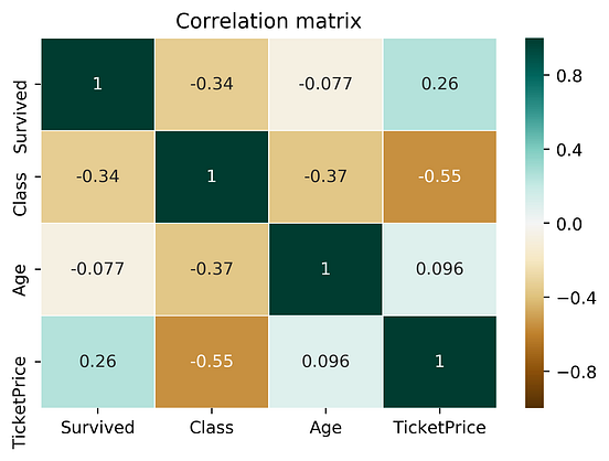
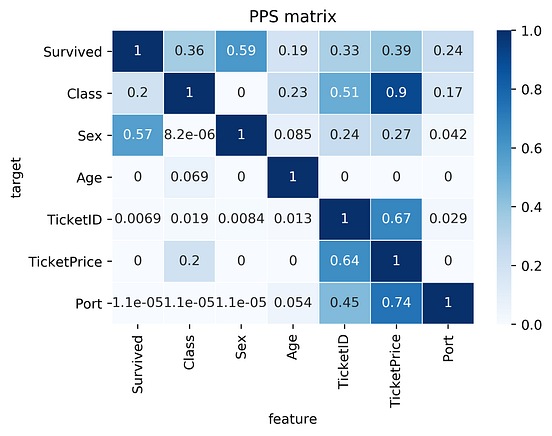
Let’s compare the correlation matrix to the PPS matrix on the Titanic dataset.
Comparing correlation matrix and the PPS matrix of the Titanic dataset:
findings about the correlation matrix:
- Correlation matrix is smaller because it doesn't work for categorical data
- Correlation matrix shows a negative correlation between
TicketPriceandClass. For PPS, it's a strong predictor (0.9 PPS), but not the other wayClasstoTicketPrice(ticket of 5000-10000$ is most likely the highest class, but the highest class itself cannot determine the price)
findings about the PPS matrix:
- First row of the matrix tells you that the best univariate predictor of the column
Survivedis the columnSex(Sexwas dropped for correlation) TicketIDuncovers a hidden pattern as well as it's connection with theTicketPrice
-
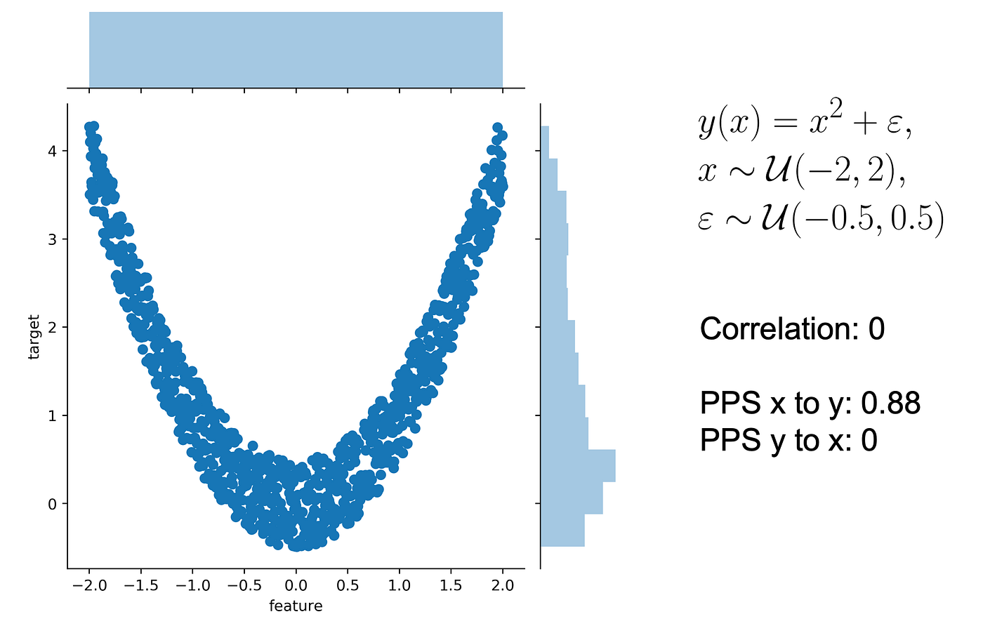
Let’s use a typical quadratic relationship: the feature x is a uniform variable ranging from -2 to 2 and the target y is the square of x plus some error.
In this scenario:
- we can predict y using x
- we cannot predict x using y as x might be negative or positive (for y=4, x=2 or -2
- the correlation is 0. Both from x to y and from y to x because the correlation is symmetric (more often relationships are assymetric!). However, the PPS from x to y is 0.88 (not 1 because of existing error)
- PPS from y to x is 0 because there's no relationship that y can predict if it only knows its own value
-
how do you normalize a score? You define a lower and an upper limit and put the score into perspective.
Normalising a score:
- you need to put a lower and upper limit
- upper limit can be F1 = 1, and a perfect MAE = 0
- lower limit depends on the evaluation metric and your data set. It's the value that a naive predictor achieves
-
For a classification problem, always predicting the most common class is pretty naive. For a regression problem, always predicting the median value is pretty naive.
What is a naive model:
- predicting common class for a classification problem
- predicting median value for a regression problem
-
Let’s say we have two columns and want to calculate the predictive power score of A predicting B. In this case, we treat B as our target variable and A as our (only) feature. We can now calculate a cross-validated Decision Tree and calculate a suitable evaluation metric.
If the target (B) variable is:
- numeric - we can use a Decision Tree Regressor and calculate the Mean Absolute Error (MAE)
- categoric - we can use a Decision Tree Classifier and calculate the weighted F1 (or ROC)
-
More often, relationships are asymmetric
a column with 3 unique values will never be able to perfectly predict another column with 100 unique values. But the opposite might be true
-
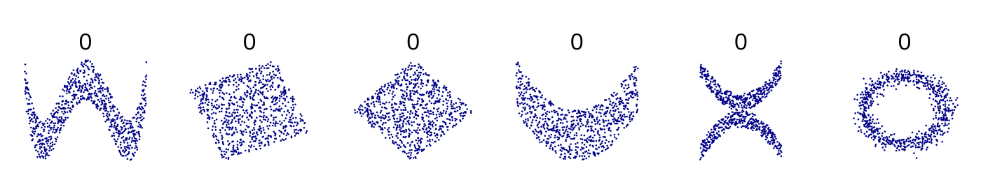
there are many non-linear relationships that the score simply won’t detect. For example, a sinus wave, a quadratic curve or a mysterious step function. The score will just be 0, saying: “Nothing interesting here”. Also, correlation is only defined for numeric columns.
Correlation:
- doesn't work with non-linear data
- doesn't work for categorical values
Examples:
-
-
math.stackexchange.com math.stackexchange.com
-
Suppose you have only two rolls of dice. then your best strategy would be to take the first roll if its outcome is more than its expected value (ie 3.5) and to roll again if it is less.
Expected payoff of a dice game:
Description: You have the option to throw a die up to three times. You will earn the face value of the die. You have the option to stop after each throw and walk away with the money earned. The earnings are not additive. What is the expected payoff of this game?
Rolling twice: $$\frac{1}{6}(6+5+4) + \frac{1}{2}3.5 = 4.25.$$
Rolling three times: $$\frac{1}{6}(6+5) + \frac{2}{3}4.25 = 4 + \frac{2}{3}$$
-
-
math.stackexchange.com math.stackexchange.com
-
Therefore, En=2n+1−2=2(2n−1)
Simplified formula for the expected number of tosses (e) to get
nconsecutive heads(n≥1):$$e_n=2(2^n-1)$$
For example, to get 5 consecutive heads, we've to toss the coin 62 times:
$$e_n=2(2^5-1)=62$$
We can also start with the longer analysis of the 5 scenarios:
- If we get a tail immediately (probability 1/2) then the expected number is e+1.
- If we get a head then a tail (probability 1/4), then the expected number is e+2.
- If we get two head then a tail (probability 1/8), then the expected number is e+2.
- If we get three head then a tail (probability 1/16), then the expected number is e+4.
- If we get four heads then a tail (probability 1/32), then the expected number is e+5.
- Finally, if our first 5 tosses are heads, then the expected number is 5.
Thus:
$$e=\frac{1}{2}(e+1)+\frac{1}{4}(e+2)+\frac{1}{8}(e+3)+\frac{1}{16}\\(e+4)+\frac{1}{32}(e+5)+\frac{1}{32}(5)=62$$
We can also generalise the formula to:
$$e_n=\frac{1}{2}(e_n+1)+\frac{1}{4}(e_n+2)+\frac{1}{8}(e_n+3)+\frac{1}{16}\\(e_n+4)+\cdots +\frac{1}{2^n}(e_n+n)+\frac{1}{2^n}(n) $$
-
-
psyarxiv.com psyarxiv.com
-
Derks, K., de swart, j., van Batenburg, P., Wagenmakers, E., & wetzels, r. (2020, April 28). Priors in a Bayesian Audit: How Integration of Existing Information into the Prior Distribution Can Increase Transparency, Efficiency, and Quality. Retrieved from psyarxiv.com/8fhkp
-
-
stats.stackexchange.com stats.stackexchange.com
-
Repeated measures involves measuring the same cases multiple times. So, if you measured the chips, then did something to them, then measured them again, etc it would be repeated measures. Replication involves running the same study on different subjects but identical conditions. So, if you did the study on n chips, then did it again on another n chips that would be replication.
Difference between repeated measures and replication
-
-
psyarxiv.com psyarxiv.com
-
Olapegba, P. O., Ayandele, O., Kolawole, S. O., Oguntayo, R., Gandi, J. C., Dangiwa, A. L., … Iorfa, S. K. (2020, April 12). COVID-19 Knowledge and Perceptions in Nigeria. https://doi.org/10.31234/osf.io/j356x
Tags
- COVID-19
- misinformation
- public health
- descriptive statistics
- perception
- infection
- general public
- lang:en
- precaution
- China
- misconception
- prevention
- lockdown
- information
- is:preprint
- questionnaire
- behavior
- Nigeria
- knowledge
- transmission
- health information
- data collection
- symptom
- news
- media
Annotators
URL
-
-
arxiv.org arxiv.org
-
Taleb, N. N. (2019). On the Statistical Differences between Binary Forecasts and Real World Payoffs. ArXiv:1907.11162 [Physics, q-Fin]. http://arxiv.org/abs/1907.11162
-
-
doi.org doi.org
-
Hossain, M. A. (2020). Is the spread of COVID-19 across countries influenced by environmental, economic and social factors? [Preprint]. Epidemiology. https://doi.org/10.1101/2020.04.08.20058164
-
-
users.ox.ac.uk users.ox.ac.uk
-
Bird, S., Nielsen, B. (2020 April 20). Now-casting of Covid-19 deaths in English Hospitals. http://users.ox.ac.uk/~nuff0078/Covid/index.htm
-
-
doi.org doi.org
-
Atchison, C. J., Bowman, L., Vrinten, C., Redd, R., Pristera, P., Eaton, J. W., & Ward, H. (2020). Perceptions and behavioural responses of the general public during the COVID-19 pandemic: A cross-sectional survey of UK Adults [Preprint]. Public and Global Health. https://doi.org/10.1101/2020.04.01.20050039
Tags
- adult
- quarentine
- statistics
- COVID-19
- handwashing
- survey
- perception
- risk perception
- lang:en
- government
- UK
- cross-sectional
- policy
- economy
- self-isolation
- lockdown
- prevention
- is:preprint
- behavior
- minority
- modeling
- response
- demographics
- data collection
- transmission dynamics
- social distancing
- face mask
Annotators
URL
-
-
twitter.com twitter.com
-
ReconfigBehSci en Twitter: “an interesting source of statistics, both on COVID-19 and other issues that help provide some context to numbers https://t.co/T0wBZIlCfR” / Twitter. (n.d.). Twitter. Retrieved April 17, 2020, from https://twitter.com/SciBeh/status/1246714565850734592
-
-
www.ons.gov.uk www.ons.gov.uk
-
Deaths involving COVID-19, England and Wales—Office for National Statistics. (n.d.). Retrieved April 20, 2020, from https://www.ons.gov.uk/peoplepopulationandcommunity/birthsdeathsandmarriages/deaths/bulletins/deathsinvolvingcovid19englandandwales/deathsoccurringinmarch2020
-
- Mar 2020
-
datagenetics.com datagenetics.com
-
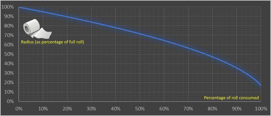
This volume of paper should be the same as the coaxial plug of paper on the roll.
Calculating volume of the paper roll: $$\mathbf{Lwt = \pi w(R^2 - r^2)} \~\ L = \text{length of the paper} \ w = \text{width of the paper} \ t = \text{thickness} \ R = \text{outer radius} \ r = \text{inner radius}$$ And that simplifies into a formula for R: $$\color{red} {\bf R = \sqrt{\frac{Lt}{\pi}+r^2}}$$
-
This shows the nonlinear relationship and how the consumption accelerates. The first 10% used makes just a 5% change in the diameter of the roll. The last 10% makes an 18.5% change.
Consumption of a toilet paper roll has a nonlinear relationship between the:
- y-axis (outer Radius of the roll (measured as a percentage of a full roll))
- x-axis (% of the roll consumed)
-
Toilet paper is typically supplied in rolls of perforated material wrapped around a central cardboard tube. There’s a little variance between manufacturers, but a typical roll is approximately 4.5” wide with an 5.25” external diameter, and a central tube of diameter 1.6” Toilet paper is big business (see what I did there?) Worldwide, approximately 83 million rolls are produced per day; that’s a staggering 30 billion rolls per year. In the USA, about 7 billion rolls a year are sold, so the average American citizen consumes two dozen rolls a year (two per month). Americans use 24 rolls per capita a year of toilet paper Again, it depends on the thickness and luxuriousness of the product, but the perforations typically divide the roll into approximately 1,000 sheets (for single-ply), or around 500 sheets (for double-ply). Each sheet is typically 4” long so the length of a (double-ply) toilet roll is approximately 2,000” or 167 feet (or less, if your cat gets to it).
Statistics on the type and use of toilet paper in the USA.
1" (inch) = 2.54 cm
Tags
Annotators
URL
-
-
-
In the interval scale, there is no true zero point or fixed beginning. They do not have a true zero even if one of the values carry the name “zero.” For example, in the temperature, there is no point where the temperature can be zero. Zero degrees F does not mean the complete absence of temperature. Since the interval scale has no true zero point, you cannot calculate Ratios. For example, there is no any sense the ratio of 90 to 30 degrees F to be the same as the ratio of 60 to 20 degrees. A temperature of 20 degrees is not twice as warm as one of 10 degrees.
Interval data:
- show not only order and direction, but also the exact differences between the values
- the distances between each value on the interval scale are meaningful and equal
- no true zero point
- no fixed beginning
- no possibility to calculate ratios (only add and substract)
- e.g.: temperature in Fahrenheit or Celsius (but not Kelvin) or IQ test
-
As the interval scales, Ratio scales show us the order and the exact value between the units. However, in contrast with interval scales, Ratio ones have an absolute zero that allows us to perform a huge range of descriptive statistics and inferential statistics. The ratio scales possess a clear definition of zero. Any types of values that can be measured from absolute zero can be measured with a ratio scale. The most popular examples of ratio variables are height and weight. In addition, one individual can be twice as tall as another individual.
Ratio data is like interval data, but with:
- absolute zero
- possibility to calculate ratio (e.g. someone can be twice as tall)
- possibility to not only add and subtract, but multiply and divide values
- e.g.: weight, height, Kelvin scale (50K is 2x hot as 25K)
Tags
Annotators
URL
-
-
towardsdatascience.com towardsdatascience.com
-
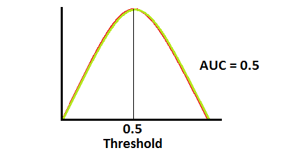
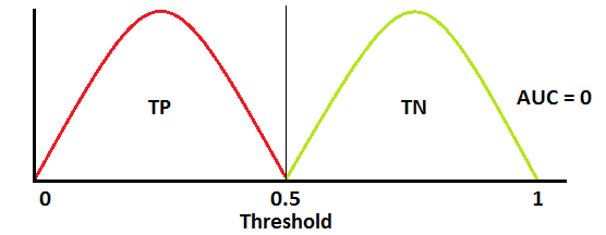
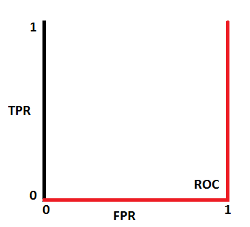
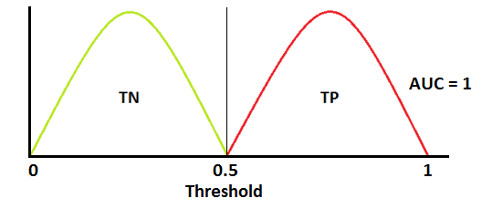
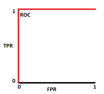
when AUC is 0.5, it means model has no class separation capacity whatsoever.
If AUC = 0.5
-
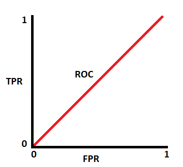
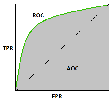
ROC is a probability curve and AUC represents degree or measure of separability. It tells how much model is capable of distinguishing between classes.
ROC & AUC
-
In multi-class model, we can plot N number of AUC ROC Curves for N number classes using One vs ALL methodology. So for Example, If you have three classes named X, Y and Z, you will have one ROC for X classified against Y and Z, another ROC for Y classified against X and Z, and a third one of Z classified against Y and X.
Using AUC ROC curve for multi-class model
-
When AUC is approximately 0, model is actually reciprocating the classes. It means, model is predicting negative class as a positive class and vice versa
If AUC = 0
-
AUC near to the 1 which means it has good measure of separability.
If AUC = 1
-
-
-
Softmax turns arbitrary real values into probabilities
Softmax function -
- outputs of the function are in range [0,1] and add up to 1. Hence, they form a probability distribution
- the calcualtion invloves e (mathematical constant) and performs operation on n numbers: $$s(x_i) = \frac{e^{xi}}{\sum{j=1}^n e^{x_j}}$$
- the bigger the value, the higher its probability
- lets us answer classification questions with probabilities, which are more useful than simpler answers (e.g. binary yes/no)
Tags
Annotators
URL
-
-
www.linkedin.com www.linkedin.comLinkedIn1
-
1. Logistic regression IS a binomial regression (with logit link), a special case of the Generalized Linear Model. It doesn't classify anything *unless a threshold for the probability is set*. Classification is just its application. 2. Stepwise regression is by no means a regression. It's a (flawed) method of variable selection. 3. OLS is a method of estimation (among others: GLS, TLS, (RE)ML, PQL, etc.), NOT a regression. 4. Ridge, LASSO - it's a method of regularization, NOT a regression. 5. There are tens of models for the regression analysis. You mention mainly linear and logistic - it's just the GLM! Learn the others too (link in a comment). STOP with the "17 types of regression every DS should know". BTW, there're 270+ statistical tests. Not just t, chi2 & Wilcoxon
5 clarifications to common misconceptions shared over data science cheatsheets on LinkedIn
-
-
www.linkedin.com www.linkedin.comLinkedIn1
-
An exploratory plot is all about you getting to know the data. An explanatory graphic, on the other hand, is about telling a story using that data to a specific audience.
Exploratory vs Explanatory plot
-
- Feb 2020
-
www.magasinetparagraf.se www.magasinetparagraf.se
-
(Återkommande forskning visar att 85-90 procent av tonårskillar begår brott. Allt från snatteri upp till rån och mord. Och det oavsett om de har invandrarbakgrund eller inte. Cirka 97-98 procent av de här killarna blir sedan skötsamma arbetande vuxna medborgare – som beklagar sig över ungdomsbrottsligheten.)
-
- Jan 2020
-
www.theglobeandmail.com www.theglobeandmail.com
-
In the dark: the cost of Canada's data deficit
-
- Dec 2019
-
www.ncbi.nlm.nih.gov www.ncbi.nlm.nih.gov
-
The average IQs of adopted children in lower and higher socioeconomic status (SES) families were 85 (SD = 17) and 98 (SD = 14.6), respectively, at adolescence (mean age = 13.5 years)
I'm looking for the smallest standard deviation in an adopted sample to compare the average difference to that of identical twins. This study suggests that the SD in adoption is identical to the SD in the general population. This supports the idea that lower SD in adopted identical twins is entirely down to genes (or, in principal, prenatal environment).
Note that this comment is referring to this Reddit inquiry.
-
-
andrewmaclachlan.github.io andrewmaclachlan.github.io
-
If you are running a regression model on data that do not have explicit space or time dimensions, then the standard test for autocorrelation would be the Durbin-Watson test.
Durbin-Watson test?
-
- Nov 2019
-
users.hist.umn.edu users.hist.umn.edu
-
For most of the twentieth century, Census Bureau administrators resisted private-sector intrusion into data capture and processing operations, but beginning in the mid-1990s, the Census Bureau increasingly turned to outside vendors from the private sector for data captureand processing. Thisprivatization led to rapidly escalating costs, reduced productivity, near catastrophic failures of the 2000 and 2010 censuses, and high risks for the 2020 census.
Parallels to ABS in Australia
-
-
a-little-book-of-r-for-time-series.readthedocs.io a-little-book-of-r-for-time-series.readthedocs.io
-
This booklet itells you how to use the R statistical software to carry out some simple analyses that are common in analysing time series data.
what is time series?
-
-
docdrop.org docdrop.org
-
Top 20 topic categories.
Immigration, Guns, Education, that exactly what I choose for my three letters comments. I think this result is also influenced by media. Every day these three areas are the main subject developed on media. 10 years ago the result will show different areas.
-
- Aug 2019
-
ec.europa.eu ec.europa.eu
-
Pages in category "Passengers"
Statistics for transportation in EU
-
-
www.uitp.org www.uitp.org
-
On public transport ridership in the EU
A screenshot is needed
-
-
www.sanalabs.com www.sanalabs.com
-
ie. decision tree split, entropy minimum or information max at 0.5:0.5 split
-
- Jul 2019
-
www.jwilber.me www.jwilber.me
-
In statistical testing, we structure experiments in terms of null & alternative hypotheses. Our test will have the following hypothesis schema: Η0: μtreatment <= μcontrol ΗA: μtreatment > μcontrol Our null hypothesis claims that the new shampoo does not increase wool quality. The alternative hypothesis claims the opposite; new shampoo yields superior wool quality.
hypothesis schema; statistics
-
- Jun 2019
-
pib.nic.in pib.nic.in
-
Ministries will be involved in close monitoring and supervision of the field work to ensure data quality and good coverage. This is the first time that the rigours of monitoring and supervision of field work exercised in NSS will be leveraged for the Economic Census so that results of better quality would be available for creation of a National Statistical Business Register. This process has been catalysed by the establishment of a unified National Statistical Office (NSO).
Tags
Annotators
URL
-
- May 2019
-
www.theatlantic.com www.theatlantic.com
-
It’s as if they’d been “describing the life cycle of unicorns, what unicorns eat, all the different subspecies of unicorn, which cuts of unicorn meat are tastiest, and a blow-by-blow account of a wrestling match between unicorns and Bigfoot,” Alexander wrote.
-
-
en.wikipedia.org en.wikipedia.org
-
Parametric statistics is a branch of statistics which assumes that sample data comes from a population that can be adequately modelled by a probability distribution that has a fixed set of parameters.[1] Conversely a non-parametric model differs precisely in that the parameter set (or feature set in machine learning) is not fixed and can increase, or even decrease, if new relevant information is collected.[2] Most well-known statistical methods are parametric.[3] Regarding nonparametric (and semiparametric) models, Sir David Cox has said, "These typically involve fewer assumptions of structure and distributional form but usually contain strong assumptions about independencies".[4]
Non-parametric vs parametric stats
-
-
en.wikipedia.org en.wikipedia.org
-
Statistical hypotheses concern the behavior of observable random variables.... For example, the hypothesis (a) that a normal distribution has a specified mean and variance is statistical; so is the hypothesis (b) that it has a given mean but unspecified variance; so is the hypothesis (c) that a distribution is of normal form with both mean and variance unspecified; finally, so is the hypothesis (d) that two unspecified continuous distributions are identical. It will have been noticed that in the examples (a) and (b) the distribution underlying the observations was taken to be of a certain form (the normal) and the hypothesis was concerned entirely with the value of one or both of its parameters. Such a hypothesis, for obvious reasons, is called parametric. Hypothesis (c) was of a different nature, as no parameter values are specified in the statement of the hypothesis; we might reasonably call such a hypothesis non-parametric. Hypothesis (d) is also non-parametric but, in addition, it does not even specify the underlying form of the distribution and may now be reasonably termed distribution-free. Notwithstanding these distinctions, the statistical literature now commonly applies the label "non-parametric" to test procedures that we have just termed "distribution-free", thereby losing a useful classification.
Non-parametric vs parametric statistics
-
Non-parametric methods are widely used for studying populations that take on a ranked order (such as movie reviews receiving one to four stars). The use of non-parametric methods may be necessary when data have a ranking but no clear numerical interpretation, such as when assessing preferences. In terms of levels of measurement, non-parametric methods result in ordinal data. As non-parametric methods make fewer assumptions, their applicability is much wider than the corresponding parametric methods. In particular, they may be applied in situations where less is known about the application in question. Also, due to the reliance on fewer assumptions, non-parametric methods are more robust. Another justification for the use of non-parametric methods is simplicity. In certain cases, even when the use of parametric methods is justified, non-parametric methods may be easier to use. Due both to this simplicity and to their greater robustness, non-parametric methods are seen by some statisticians as leaving less room for improper use and misunderstanding. The wider applicability and increased robustness of non-parametric tests comes at a cost: in cases where a parametric test would be appropriate, non-parametric tests have less power. In other words, a larger sample size can be required to draw conclusions with the same degree of confidence.
Non-parametric vs parametric statistics
-
-
en.wikipedia.org en.wikipedia.org
-
The concept of data type is similar to the concept of level of measurement, but more specific: For example, count data require a different distribution (e.g. a Poisson distribution or binomial distribution) than non-negative real-valued data require, but both fall under the same level of measurement (a ratio scale).
-
-
-
Even if Muslims were hypothetically behind every single one of the 140,000 terror attacks committed worldwide since 1970, those terrorists would represent barely 0.009 percent of global Islam
This is a veryyy relevant statistic, thank god.
-
That is, deaths from terrorism account for 0.025 of the total number of murders, or 2.5%
Irrelevant statistics IMO
-
American Muslims have killed less than 0.0002 percent of those murdered in the USA during this period
selection of detail
-
How many people did toddlers kill in 2013? Five, all by accidentally shooting a gun
selection of detail of outlandish statistic to emphasise main point
-
you actually have a better chance of being killed by a refrigerator falling on you
selection of detail of outlandish statistic to emphasise main point
-
Since 9/11, Muslim-American terrorism has claimed 37 lives in the United States, out of more than 190,000 murders during this period
stats
-
pproximately 60 were carried out by Muslims. In other words, approximately 2.5% of all terrorist attacks on US soil between 1970 and 2012 were carried out by Muslims.
stats
-
94 percent of the terror attacks were committed by non-Muslims
stats
-
Muslim terrorists were responsible for a meagre 0.3 percent of EU terrorism during those years.
stats
-
in 2013, there were 152 terrorist attacks in Europe. Only two of them were “religiously motivated”, while 84 were predicated on ethno-nationalist or separatist beliefs
stats
-
in the 4 years between 2011 and 2014 there were 746 terrorist attacks in Europe. Of these, only eight were religiously-inspired, which is 1% of the total
stats
-
official data from Europol
Stats
Tags
Annotators
URL
-
-
bengoldhaber.com bengoldhaber.com
-
info-request
What is the current price of cyber insurance? Has it gone up in price?
-
info-request
Looking for statistics on the number of cybercrime prosecutions over time.
Tags
Annotators
URL
-
- Apr 2019
-
mp.weixin.qq.com mp.weixin.qq.com果壳4
-
要保持谦逊:兼容性评估的前提是用于计算区间的统计假设是正确的
應翻為確認統計假設的正確性。這點看出他們的立論基於估計的參數,而非實在的科學理論。統計假設是科學理論推理的延伸,只用推理合乎有效的邏輯形式,有效結果與無效結果都會是科學理論的證據。
-
在给定假设的情况下,区间内数值与研究数据的兼容性并不完全相同
原文“not all values inside are equally compatible with the data, given the assumptions. ” 這裡的assumption是指估計的參數,還是科學理論對現實狀況的預測,並沒有明確說明。如果是估計的參數,Amrhein等人也許將P(D|theta)當成P(theta)。
-
我们看到了大量具有“统计学显著性”的结果;而不具有“统计学显著性”的结果则被显著低估
豈止低估。不顯著的研究結果經常被鎖起來不見天日。
-
在置信区间包含风险显著增高的情况下,仅因为结果不具有统计学显著性就推论药物与房颤发生“无关”十分可笑;据此就认为前后两项研究矛盾——即便风险比完全一致——同样非常荒谬。这些常见情况表明我们依赖的统计学显著性阈值有可能误导我们。
Amrhein 等人以此例子顯示confidence interval能突顯不一致的研究之間,評估要測量的效應其實一致的資訊。
Tags
Annotators
URL
-
- Mar 2019
-
medium.economist.com medium.economist.com
-
At The Economist, we take data visualisation seriously. Every week we publish around 40 charts across print, the website and our apps. With every single one, we try our best to visualise the numbers accurately and in a way that best supports the story. But sometimes we get it wrong. We can do better in future if we learn from our mistakes — and other people may be able to learn from them, too.
This is, factually and literally speaking, laudable in the extreme.
Anybody can make mistakes; the best one can do is to admit that one does, and publicly learn from them - if one is a magazine. This is beauteously done.
-